
If you follow me on Instagram, you will have seen that recently I have been posting a lot of writing samples using my take on the architect handwriting font. It is not claiming to be an official type or font, it is my way of lettering in an architect style font. Many of you seemed to like it, so I will attempt to explain how this font is built up. I am by no means a typographer, nor an architect, just an enthusiastic amateur trying to help you in case you like to know a bit about how you can try and write in this style yourself. I will update this post as I go along and learn more about it.
The architect print font was and is used for written descriptions on designs and blueprints because of its legibility. Michelle on Instagram rightly added that architects use the uppercase lettering. I use the lowercase lettering because then my kids can read my handwriting, my co-workers can decifer my notes and I am forced to take concise notes because the lettering is slower than cursive writing. It is a universal style that can be learned by everybody because of its simple basic elements. The basic shapes are “stick and oval”, vertical sticks and oval shapes that tilt slightly forward. The angle at which the oval shapes tilt, may vary with your personal writing style.
Images speak louder than words, so let’s take a look at the uppercase alphabet.

As you can see, all uppercase letters stay within the height of twork dot grid lines. This gives a very structured visual. The stick verticals are upright in most letters, except those that are written in an angle, such as the A and X. The vertical sticks are the basic support for the oval shapes. The angle of the ovals may vary with your natural hand, just keep legibility in mind.
Let’s take a look at the lowercase letters:
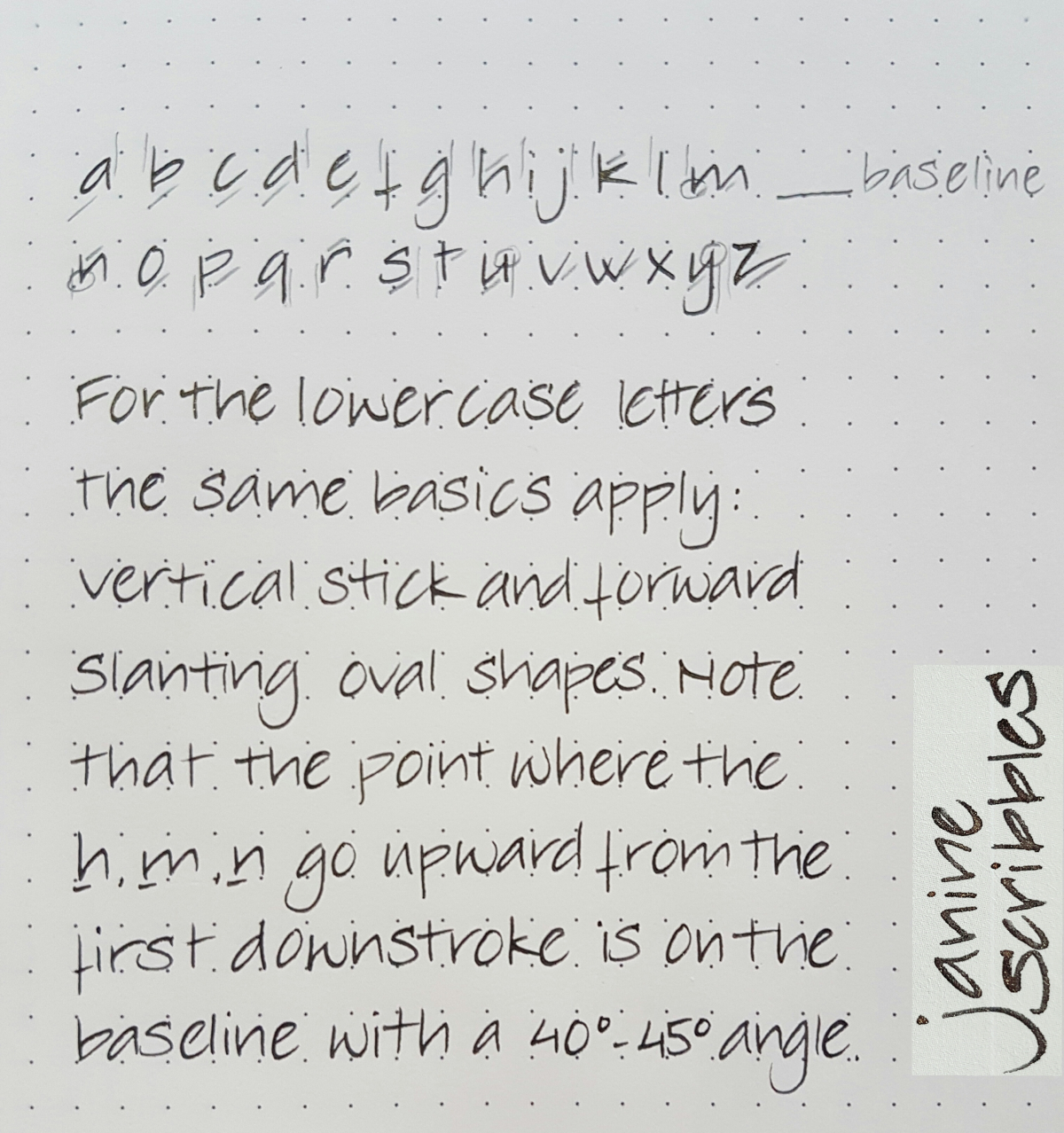
For the lowercase letters, the same basic shapes apply: the upright vertical sticks serves as a base for the letters that include an oval to complete the letter. These sticks may peek at tiny bit over the upper dotted grid line. The verticals that drop down, are about the same length as the upward verticals.
Remember to make quick, sharp strokes and ovals. Each letter is written separately. As soon as you get comfortable, you can include ligatures (lines that join certain letter combinations) if you wish. When I write quickly, I tend to use those more. However, personally I prefer the separate strokes style.
As said before, I will keep this post updated, so please let me know what is missing or what is unclear.
Hope you enjoyed this and don’t forget to keep the fun number one in practicing!

Congratulations on your new blog.
A refreshingly crisp font. Look forward to the blog showing your pen angle and whether flex or stub preferred.
LikeLike
Thank you! You can expect more handwriting posts on Sundays, which I will alternate with other stationery matters. Tuesday will be pen day and Friday ink day. At least, that’s what I will hope to achieve. 😆
LikeLike
I have been interested in architect font for so ,so long. I am going to enjoy following this.
LikeLiked by 1 person
Hi Jeanne, good to know. Have you seen the “print lettering” post? There I deal with the structure of the letters. Please let me know what you think of it.
LikeLiked by 1 person
The Architect nib grind have me what I was looking for, line variation in my normal handwriting .. this is difficult to achieve normally as my handwriting slopes to the left. I think the Architect style looks very elegant & distinctive ..
LikeLike
Nicely explained … Good reading all the way … Great to have a template to follow…
LikeLiked by 1 person
Thank you, good to know it is of use to you.
LikeLike
In Romania we are not taught how to write in print. We only do cursive.
It is why i have been fascinated by the print handwriting, but the architect is just exceptional.
This is the very first tutorial I see that is useful and comprehensive to me. I feel like back in school. 🙂 Thank you so much, I already started practicing!
LikeLiked by 1 person
So interesting! In Holland schools start with cursive but many kids switch to print around the age of ten. Some children forget letters when writing in cursive but do not do that when writing in print. It forces you to contemplate each letter separately. I hope this blog post will be helpful to you.
LikeLike
Yes, that is so true. It has been a recent teaching method that they teach uppercase print alphabet in preschool grade, but in first grade they switch to cursive and calligraphyc writing by second grade. Indeed, print is easier to read/memorise and visualise.
I myself am writing in print for the first time ever and I am happy like a child. 🙂 again, thank you!
LikeLike
Thank you for bringing up this topic. I like the way you present and maintain all of the
facts in addition to your overall writing style. Sometimes,
there is a shortage of time to study long bits,
but is brief and succinct, I spent only a couple of minutes to read the entire article.
It’s vital since no one has sufficient time to browse.
LikeLike
Refreshing reward for this mornings search for something completely different! Think I can feel a new interest coming on.
Looking forward to getting back into letter writing and away from OMGs and F’ing embodies and Love Island !!
LikeLike
https://waterfallmagazine.com
Every weekend i used to go to see this web site, for the reason that i want enjoyment,
since this this site conations really nice funny stuff too.
LikeLike
Nice calligraphy.I am interested in calligraphy.I enjoined this style. Please post vedio calligraphy .it helps me to improve my calligraphy. Thanks dear mam
LikeLike
Hi, thank you for your appreciation. I have a couple of videos on handwriting on my YouTube channel Janine Scribbles. You can also find videos on my Instagram account Janinescribbles. Due to the lockdown, I currently do not have opportunity to record videos soon, but hopefully in the future I can do some more.
LikeLike
Hi Janine,
I came across your blog while looking for the architectural scribbling tutorials. I am an architect by education and my writing is only capital letters (Big and small). Recently I have bought the apple pencil for my iPad, willing to take all notes in a digital format, but have realised that my writing style is not “seen” properly by the software. So I’m back to school, 25 years after completion of my diploma 🙂
My biggest problem is that I’m a leftie, so your writing style is a bit difficult – slanting in the opposite direction.
How to overcome this?
Have a great New Year!
Tomasz
LikeLike
Hi Tomasz,
That’s so interesting, let me know how the iPad is working for you. You may want to try turning the iPad to such an angle (as if it was a regular notepad) that you write top to bottom instead of left to right, keeping the writing in its usual direction. In this way, you may be able to form the letters more comfortably. Please let me know if this works for you.
LikeLike
Janine,
The app I use is Goodnotes 5 and it allows for adjustment of the hand “pose”, i.e., can be left or right, parallel to the text flow or slightly under or above. My main problem is to learn again the cursives (I write with capitals only for last 30 years), and then to slant it lower left to upper right, whereas a natural slanting for a left-handed would be opposite. So I will try to write the lower characters just straight and round, without slanting.
It’s quite easy to find notebooks for first-graders on how to learn writing in general, but this is just plain hand writing and I would love to retain my legible, architectural lettering style. I have found out that this has been extensively covered by Frank Ching, an architect who developed the whole concept, probably in the 50-ties, and an Adobe typeface “Tekton” has been developed as a result of his work. I would love to find Tekton practice book for handwriting if it was only available.
https://artdepartmental.com/blog/architectural-lettering/
My current writing (although not as nice and repetitive, especially when fast noting) is very similar to the typeface “Prov Architect NDP” linked above.
I will try your hint anyway, hopefuly it helps.
Thanks a lot,
Tomasz
LikeLike
Oh, I really like the NDP style and am familiar with the styles mentioned in the article. It’s always nice to retain a bit of your own handwriting character in a new style. I’ll keep a lookout for the style you want to practice.
LikeLike
Janine why don’t you publish your scripts in a book?
LikeLike
Thank you, Christopher. I appreciate your kind reaction. I don’t consider myself well-rounded enough to publish a book. I would be too intimidated by true calligraphers, tbh! And the market would be too small to make it a viable plan. Perhaps, one day, when my time allows and I’m better educated and funds allow, it would be a cool idea, though.
LikeLike