
Today I started out by prepping a review of the J. Herbin 1670 Stormy Grey only. But was frustrated to once again find the Lamy fine putting down a broader line than the medium and a much wetter line than the broad. So, single ink reviews will resume once I get a fine and extra fine that are actually more true to size in general. Until that time, I’ll do comparisons and the odd Page of Shame (that is a page filled with writing samples of all currently inked pens… *blush*… that’s usually a sizable number of pens with me)
So, as I had already inked the Lamy Vista up with Stormy Grey, I thought it would be nice to compare it to its Diamine cousin, Sparkling Shadows. Both are grey inks with golden shimmery bits in them.

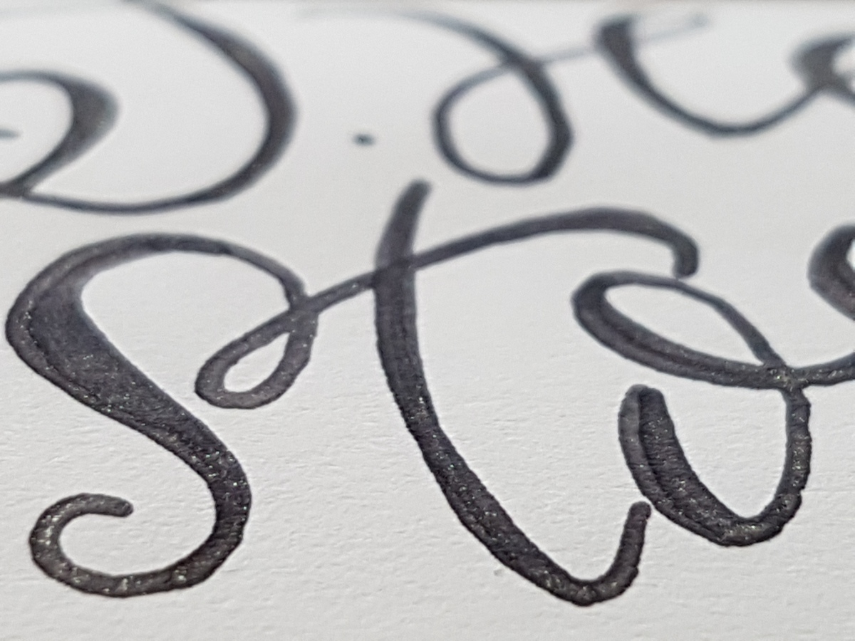
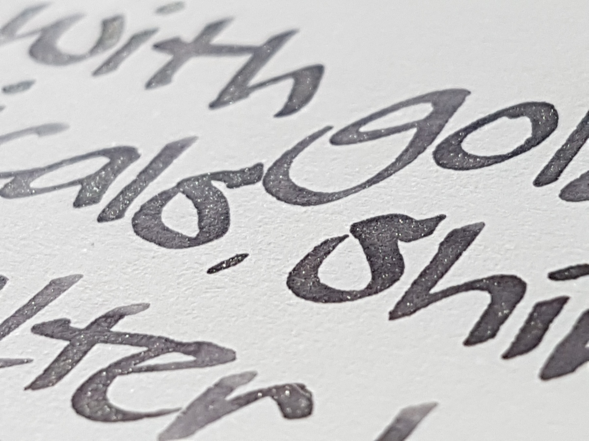
To the left the Diamine Sparkling Shadows, to the right the J. Herbin 1670 Stormy Grey. Looking with the naked eye (I am a woman of a certain age so I have to take of my glasses to take an up-close look), the particles in the Diamine look more yellowy golden and a little less finely milled than those in the Herbin. The Herbin particles look a bit more rose gold to me.
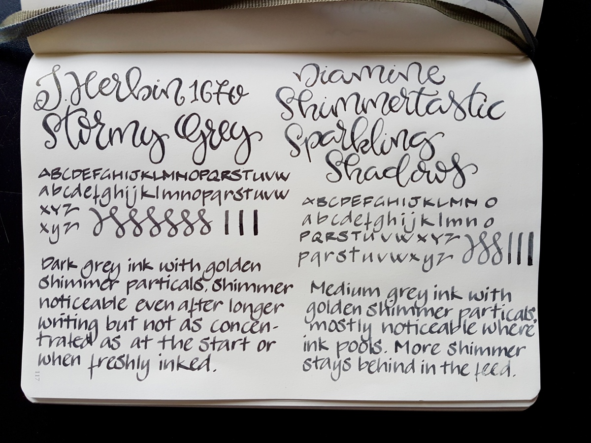
Above the writing samples side by side. Both inks felt about moderately wet in the Lamy fine with which I did the faux calligraphy, and in the 1.5 used for the alphabets, passes and writing. The J. Herbin Stormy Grey is a darker grey that seems to have a little more depth in color than the Diamine Sparkling Shadows, although the Diamine shades better. That will be due to it being a lighter grey. The particles look to be better suspended in the J. Harbin, but with both inks you do need to give your pen a gentle shake regularly to get the shimmer to float again.
Above: Stormy Grey

Above: Sparkling Shadows
Above: Stormy Grey

Above: Sparkling Shadows

Above comparison shots of the feed. Top left with Herbin Stormy Grey, bottom left with Diamine Sparkling Shadows, to the right the feed after cleaning. It does take a good couple of rinses and thorough flushing to remove the particles from the feed, but that is to be expected from an ink containing glitter. Both inks’ glitter does rub off a little on paper and hands, so be aware of that. But if you are writing something worthy of glitter, you should not mind throwing a little extra glitter around!
Let’s have a look at the chromatography I did with these inks… First a glimpse of my highly professional chromatography gear:

Yes, a soy sauce dish! Everything for the “science” of it! Tonight, there will be mushroom soy sauce and light soy sauce in it again for dipping dumplings. Or perhaps tonight we’ll have pizza… Anyway, the outcome of the chromatography was pretty spectacular.
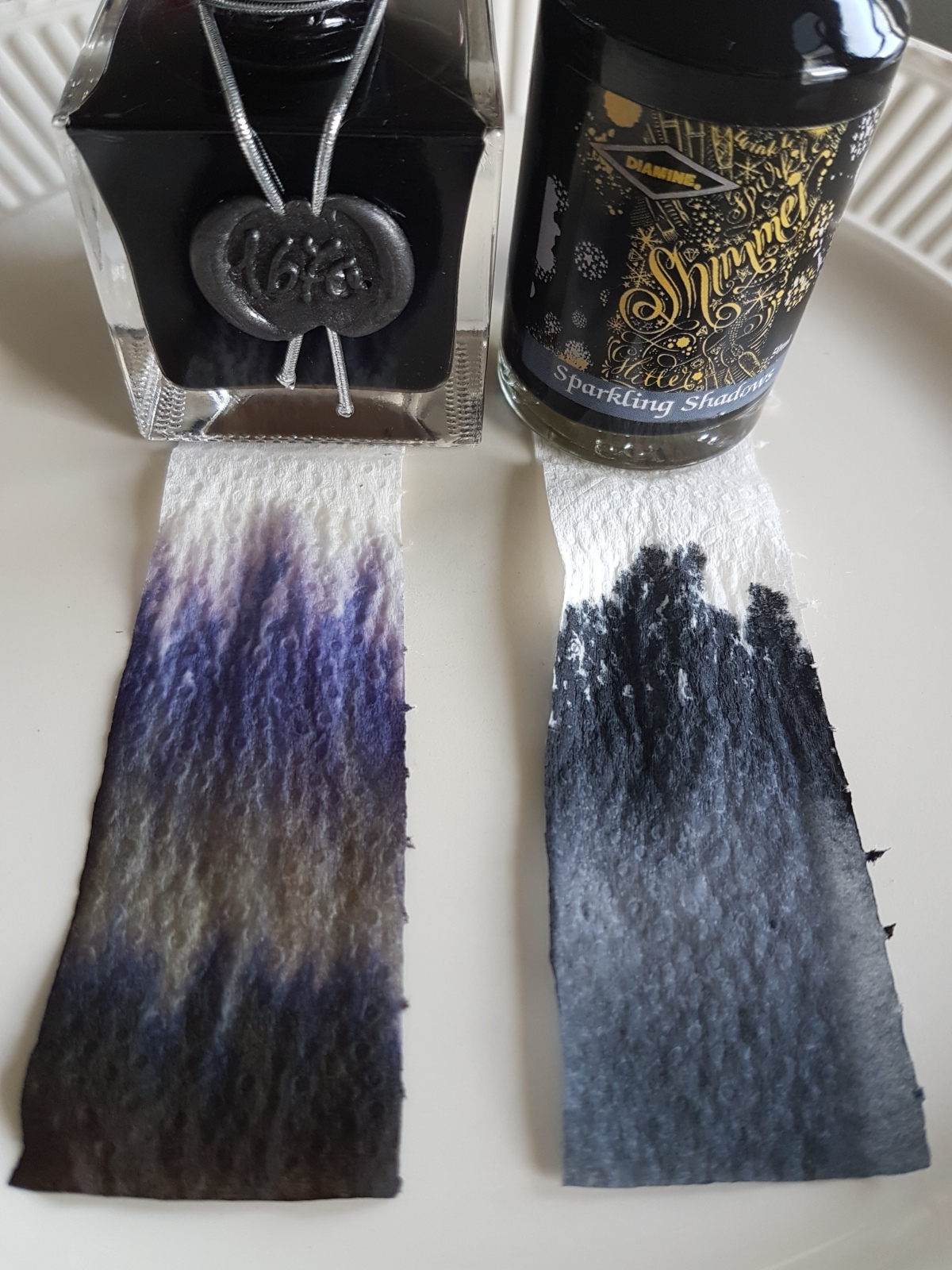
Wow! The Herbin consists of separate pigments and the particles are clearly visible at the bottom of the strip. The Diamine is a single pigment ink and the particles are, well, they seem to be gone. Absorbed by the paper strip?
A closer side-by-side look:

Well, that accounts for the shading in the Diamine and the depth in the Herbin, I suspect.
What would I use them for? Now that I have seen them side-by-side, I think I would use the Diamine for a congratulations card for a wedding or anniversary, it being a bit more subtle ink, yet it gives your message a little something extra. The Stormy Grey is more of a personal favorite and I actually use that in a Kaweco Classic Sport Demonstrator on a daily basis for journaling and for personal notes or shopping lists. At least when the subject is boring, the ink keeps it interesting.
Which is your favorite and what use did you find for your sparkly inks?

I have neither of those, but from your pretty photographs I think I like Stormy Grey more. It just feels right 🙂
LikeLike
Great choice! The Stormy Grey and Emerald of Chivor are my favorites of the Herbin 1670s. Let me know what you think of the ink when you have used it.
LikeLike
J. Herbin 1670s… I have the Rouge Hematite in – I think – an example of every nib size from EF to a rather exotic 1.9mm stub! I live in jealousy of your calligraphy.
LikeLike