
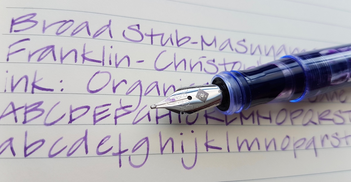
Ever since I received the Model 65 Antique Glass recently, I knew I would be doing this blog post and so I held out on flooding my Instagram feed with photos. I think I managed to keep it to one picture. And then of course the one to announce this blog post. Having three different grinds on broad steel Franklin-Christoph nibs, a comparison is in order. Let’s start with the largest pen and the biggest nib. These writing were done in a Rhodia lined soft cover A5 notebook.
Franklin-Christoph Model 66 Stabilis Solid Ice, broad nib with a cursive italic grind by Mike Masuyama (BCI)

First, the Franklin-Christoph steel nibs are made of a company specific alloy called HPS, which stands for High Performance Steel. It is said to give a gold nib-like writing experience. The nibs are very beautifully polished with a laser engraved Franklin-Christoph logo and stamped (I presume) scroll-work. You will find the original nib size at the base of the nib where it meets the section.
The nib on the quite large Model 66 is a #6 steel nib, ground by nib meister Mike Masuyama into a broad cursive italic. When you order a pen from the Franklin-Christoph website, having a Masuyama grind is an option that is offered in the drop down nib choosing menu. The nib grinds are priced pretty decently, but there is no conferring up front on your writing preferences such as wetness or writing angle, so the grind comes as it is. Masuyama is a master at nibmeistering, so you can be assured that the italic is going to be super crisp and the stub is an actual smooth stub. The crispness is clear from the fact that there is no tipping material left on the tip of the nib after this grind.
The ink line that this broad cursive italic puts down is a really crisp italic. This means practicing to get your angle of writing so that you do not get the edges of the nib caught on/in the paper. I prefer holding stubs and italics in an angle (almost as if writing with an architect nib, but at a slight angle of 70-60 degrees instead of a full 90 degrees. I find I have to write with a very light hand with this nib so as not to get caught in the paper. It gives a very crisp and delicate thin stroke combined with a much broader thick stroke. Beautiful, but this is not a nib for daily note taking for me. I use it for letter writing, card messages or anything I want to write down with a certain flair. The nib is not scratchy, the pen stroke actually feels like writing with a freshly sharpened pencil that will not wear. Even when you have small handwriting, you can use this broad nib and remain legible.
Franklin-Christoph Model 65 Antique Glass, broad nib with a Stub.Italic.Gradient (S.I.G.) grind

The Model 65 is quite a bit smaller than the 65 and has an elegant #5 nib. For my Antique Glass FC (aka Coke Bottle) I opted for a broad stub-italic gradient, largely because I wanted to try that grind. And I am not disappointed. This is a great grind if you are used to stubs and want to venture into italic territory. It has the user-friendliness of a stub with just a dash of crispness to lure you into italic writing. The crispy touch of this nib fits this print writing style nicely. It will also work great for cursive writing. This nib and the nib that is up next, the stub, are fighting over which is my favorite broad FC nib so far… So, up next, the stub.
Franklin-Christoph Model 45 (XLV) Italian Ice, broad nib with a stub grind by Mike Masuyama
This is the most democratic of the grinds compared in this post. This stub has a boxy grind as you can tell from the picture above, which is just the way I like it. It is very forgiving and I use it daily. It has a smooth line with a hint of interesting line variation caused by the stub grind. As you can see, for a Western broad nib all broads nibs here are more like Asian nib sizes, so all are pretty nicely usable on paper that is not very fountain pen friendly. Although I would use fountain pen friendly paper for the broad cursive italic, or you might find yourself shredding copy paper while learning to wield that nib. These are broad nibs that are suitable for smaller handwriting, if you want to get the most shading out of your ink without your handwriting becoming illegible.
Let’s look at the ink lines side by side:
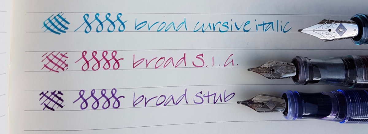 The line variation is clearly most pronounced in the broad cursive italic. The S.I.G. is italic on the upside of the nib and a stubbish bottom nib where there is a tiny bit of tipping left. The stub has tipping material left on the upside of the nib and on the bottom. The uttermost tip of all broads is pretty flat to account for the line variation. All pretty interesting nibs and I am happy I chose them. The BCI gets its use on special occasion writing and the S.I.G. and stub are pretty much daily writers.
Do you want to know what other nib options and nib grinds Franklin-Christoph offers? Check their site in this link. (Not affiliated, just an FC fan)
Have you used a specific grind by either Franklin-Christoph or from other nib misters? Be sure to leave me a comment.
As ever, thank you for reading!

Thanks for doing this comparison! It’s especially timely for me right now as I have F-C pens with medium Masuyama stubs in both steel and gold, and am in the process of choosing my next purchase. After seeing your analysis it will be the medium SIG for sure. Now I just have to decide steel or gold, and choose the body model … they don’t make it easy at Franklin-Christoph, just beautiful. And the writing experience is guaranteed excellent.
LikeLiked by 1 person
Hi Rebecca, I can fully recommend the M S.I.G. It’s on my Cherry Ice FC. I’ll tag you in a good picture on Insta. 😘
LikeLike
Another great post, Janine! I definitely see a S.I.G. in my future (probably a Fine in some Marietta). Seems like Jim Rouse is doing a decent job on these nibs. Regarding your question: I have a Masuyama Medium CI in a model 45/XLV, and love it a lot. Had to increase the flow, although – out of the box, the nib was too dry. Besides, I have a Minuskin 0.8 stub in a Parker 51 Vac (my best writer ever), three nibs reground by Pablo Carrasco of FPnibs.com (Dolcevita stub, former OB, Sheaffer Snorkel Saratoga MCI, former M, and Kaweco Sport FCI, former M). To this, I can add three Italix nibs (#6 Broad stub, #5 FCI and OM Italic) – for the best of my knowledge, they were hand-ground by Mr. Ford. Happy writing!
LikeLiked by 1 person
Thank you Eli, it was a pleasure doing this post. As all of them are. And thanks for sharing your experiences with them. Your handwriting is always immaculate!
LikeLike
Nice review! Looking to get a Broad S.I.G. or the cursive italic when I get my first Franklin Christoph Pen. I was quite surprised how thin your writing looked despite using broad nibs! I guess you hold you pens with a rotated angle. Keep up with the reviews Janine!
LikeLiked by 1 person
Thank you, Andy! Yes, that’s right, I only like fat downstrokes from flex pens, so I have always held stubs and italics on an angle. In my personal opinion the ink line is more subtle and elegant like that. But that is just my thing. This angle also works better for people with smaller writing (of which I am not one…) because their loops tend to fill up less easily. So I say: just hold the nib in the angle that is comfortable for you and your handwriting.
LikeLiked by 1 person
I am now not sure where you are getting your info, however good topic. I must spend a while studying much more or figuring out more. Thank you for wonderful info I used to be searching for this info for my mission.
LikeLike
Hi Alex, the material data are from the FC site, my opinion is my own.
LikeLike
You actually make it seem really easy along with your presentation however I find this matter to be actually one thing which I believe I would never understand. It kind of feels too complex and very broad for me. I’m looking forward to your subsequent post, I’ll try to get the dangle of it!
LikeLike
Does this concern the Franklin-Christoph fountain pens or do you mean something else?
LikeLike