
Had I not started this blog, I would not have thought twice about trying extra fine nibs. I have been a broad, stub, italic, gushing nibs user for most of my fountain pen life. But when writing reviews, you have to look past your own preferences. And when doing ink reviews I like to show what the ink looks like in most nib sizes. The hunt for the finer nib began. At first I got all Lamy nibs from EF through 1.9mm, but the quality of those nibs, especially the size accuracy on the EF through B nibs left a lot to be desired. Then I ordered three Preppies in EF through M. Those will do nicely for ink reviews, but I wanted to try more fine nibs to get more comfortable with them.
Then I saw a lovely Instagram pic by @pixiegeek and was smitten. Not only by her beautiful handwriting, but especially by the ink line from a particular extra fine pen she used, a Delike New Moon. It looked like the finest of architect grinds. And I love the line effect of the architect. Thank you for enabling, Christiana! I looked them up online and found a great deal on eBay, two pens, including shipping from China, for about 32 Euros. The color options included a mock celluloid material and a sky blue and pink solid plastic set. I opted for those. The close-ups of the nibs gave the impression of two very thin metal disks pressed together, indeed much like very fine architect grinds. Hardly any tipping at all! So for the blog’s sake, I ordered them straight away.

About two weeks later the package arrived and much to my surprise it also included a powder blue PU leather pen case. The pens were wrapped in individual plastic sleeves that mention “Hero” but I am yet to find out if Delike is a Hero sub brand. Please comment if you know more about this. The pen case is quite nice, but the elastic strap offers only room for one and a half pen, so I usually put one in the strap and I let the other sort of roll around next to it. At this price point, I’m not too bothered about that.

The case also has a little top and bottom flap to protect the pen that is lucky enough to be put in the strap, from scratching by the zipper. Still, a nice extra and the great thing is, the case doesn’t smell too much like PU… I am afraid though that hoisting this around in my bag will make the edges fray so I will not use it as an office pen case. Plus, it looks nice just sitting at my desk.
On to the pens. Since there aren’t many reviews around about them, here are some measurements and statistics:
- weight capped and filled: around 12 grams;
- length capped: 123mm;
- length uncapped: 110mm;
- length posted: 135mm;
- cap band diameter: 14mm;
- section (grip) diameter: 9mm.
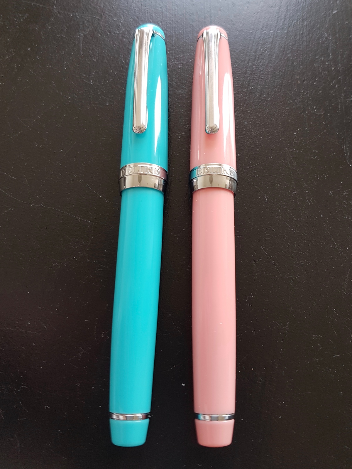
The pens have a screw-on cap, the cap posts pretty securely. I like the pens having the same color plastic throughout, so no black section or blind cap. The blind cap has a silver colored decorative ring. It does not screw off. The clip has enough spring to be functional and can be lifted up with the same hand while holding your pen. It is tight enough to secure your pen to a pocket. There is a slight hollow rim between the cap ring and the plastic but not enough to make it fragile or to be aesthetically annoying. The cap screw thread on the section has some leftover loose plastic bits from thread turning, but those are easily wiped away. The cap band has “DELIKE” stamped beneath the clip and “New Moon” on the opposite sight. A nice detail, let’s say “borrowed” from Japanese pen models. To which this pen bears quite a resemblance… So a nice pen to “fake it until you make it” as they say. All in all, this pen is about as refined as you might expect for the money. Still, refined enough to bring to school, uni or even the work place.

Another pleasant surprise was that the pens came with a converter. There is a small metal band around the nipple and a broad metal band with a nice flower stamped on above the turning nob. Pretty decently performing converters so far. I haven’t yet tried standard international cartridges in the pens, but judging from the converter nipple, those will fit.
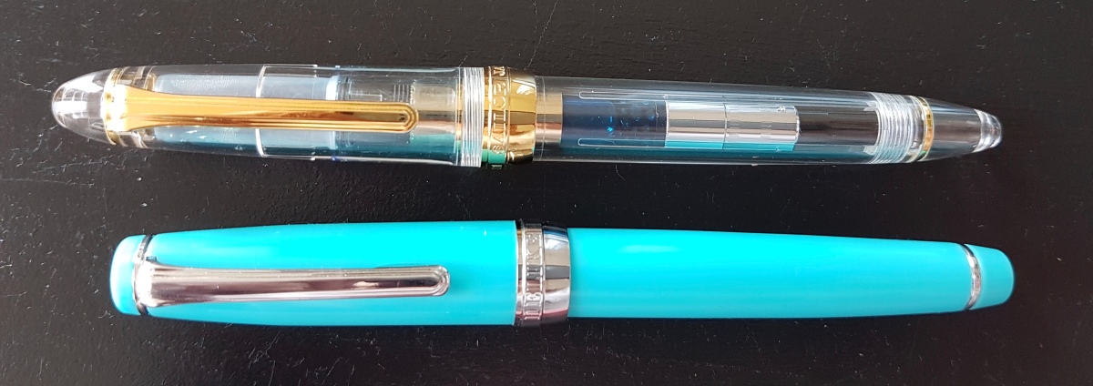
For a size comparison, I put the Delike New Moon next to my Sailor 1911 Standard, which is already a relatively small pen. This makes the Delike a nice writer for people with smallish hands, like myself. So if the 1911 Standard is too small for you, you will feel the same about the Delike. Still, when posted it might just be comfortable enough and girth-wise they are the same.

The steel nib has a sphere-like engraving over “DELIKE” and “EF” under the breather hole. The tines end without any noticeable tipping and this makes for the very slight line variation effect. This also gives the writing experience a slight bit of feedback. I have not experienced either nib as being scratchy but with these very fine nibs I have found keeping a very light hand works best. Which is good practice for me because normally I write with quite a bit of pressure.

I have found writing with both pens a pleasant surprise. These nibs are not the wettest writers as you can see from the smeared wriggles and I could feel the difference between the Diamine in the sky blue pen and the much more lubricated Noodler’s in the pink pen. The pink pen as a result writes a tiny bit more smoothly, but if I were to put a more lubricated ink in the blue pen, I bet I would get the same result. I love that these pens are comfortable for me when writing in my usual largish hand as well as when writing small. I am not good at small writing, and I bet experienced small writers can get these pens to write even smaller. Ideal pens for starters in the pen world who have to write on paper that they cannot choose themselves, for maths, bullet journaling or just to have around with some pretty inks in them.
In conclusion, I was very happy to be enabled in this starter’s investment into extra fine nibs. The only problem is -and don’t tell me you don’t recognize it- that now I am curious about other extra fine Asian pens. Well, that’s fountain pen life for ya! I’ll be sure to keep you posted on further extra fine experiences from this spot as well as on Instagram. And if you have any pointers on good (extra) fine nibs out there, be sure to share!

Amazing review! You’re welcome for enabling and thanks for the shout out! 😀
LikeLiked by 1 person
My pleasure! Keep on posting those lovely quotes.
LikeLike
Nice review Janine! This one is on my eBay list, but like you I like broad nibs. Otoh, I just got gifted a Platinum # 3776 with an SF nib and it’s wonderful! I’m getting there 😉
I’m trying to decide between this one and the Lingmo Lorelei in the same powder blue colour… Maybe just get both?
LikeLiked by 1 person
Thank you, Afke! That’s a great gift! I hope to try one of those SFs at a meet or show. Oh, and now you have reminded me of the Lingmo…. saw that as well. It’s so hard to keep from “trying” these kind of pens… 😉 Cheers, Janine
LikeLike
Thank you for doing this review. I’m curious to see how these guys hold up over time. Might have to throw my cash in the game and find out first hand.
LikeLike
Based on your review I ordered one which arrived today (in blue) and I’m very happy with the result. Thankyou
LikeLiked by 1 person
Wow, thank you for letting me know! I am glad you like it. Looking forward to seeing your writing with the pen.
LikeLiked by 1 person
As I will visit Hero Shanghai’s factory in less than a month, I will try to know more but the logo on the converter is the HERO logo so I would say this is a HERO sub brand. Also another reviewer on FPN mentions the box of another delight pen (similar to the Kaweco Brass) mentions “Product of Hero”. Nice review!
LikeLiked by 1 person
Thank you, Fabio. The plastic pen sleeve mentioned Hero, so I assumed that is where the pens are made. I really enjoy my Delikes. The nib shape is perfect for fine lettering.
LikeLike
Thank you for the review, Janine, I really want one of these now! Is the eBay seller you purchased from still available? I want to see if I can get that pen case too 🙂
LikeLiked by 1 person
Hi Crystal, I am sorry, I cannot remember this specific seller. When buying from unknown eBay sources, I usually choose the one with the highest trust rate, combined with number of sales.
LikeLike
I also enjoy this pen. Have the blue “celluloid” version. Also have a bent nib one. Love the nib. Check out my videos on YouTube – channel chrisrap52.
LikeLiked by 1 person
Hi Chris, great! Have seen some of your vids, thank you for mentioning your YT account!
LikeLike
Oh man ! More pens to try…. 😂
LikeLike
Hi Janine, I’m fond of gushy nibs too, but read your review and decided to take the plunge. I’ve ordered one in ‘Bamboo Green’, believe it’s the third version of this model. Might have made a mistake ordering the nib size, though. Is a 0.6 mm nib equal to an F or EF? Also, what’s the difference that a bent nib makes to the writing experience vs a regular F or EF nib?
LikeLike
Hi, the EF is usually around 0.3mm, a true EF in that sense. The 0.6 will be more like Japanese medium. The bent nib will give a slight “fude” or brushlike effect to your strokes. I tried to order a bent Delike once, but they sent me a regular nib, so I can’t show writing samples, I’m afraid. I hope your nib will be to your liking.
LikeLike
That is the Hero flower logo on the Delike New Moon converters. Interesting. I have the blue/pink set, and your post coaxed me into taking them out and loading them up again. I think they’re about the same size and shape as the Sailor Sapporo.
LikeLiked by 1 person
Hi, yes, they are Sapporo (Pro Gear Slim) size. Hope yours have good nibs, my pink one has one of my most preferred EF nibs.
LikeLike