
One of my first blogposts was on a style of print lettering, which is inspired by the architect style lettering. The philosophy of this style of lettering is that it is clear, easy to reproduce and easy to read. Some time ago I started using a stick-and-ball lettering type when helping my kids with their homework but still writing in a semi-cursive hand for regular writing. I had been using all caps mostly throughout secondary school and uni and only started writing in cursive again at work. Still I used all caps whenever writing post-its to colleagues. I love the regularity of all caps and stick-and-ball writing styles. Since trying my take on a stick-and-oval, architect inspired style, I almost always use this style when not doing some form of (faux) calligraphy.

Ever since I did that first blogpost, I wanted to expand on it a bit more and break the style down into manageable shapes and forms. So I sat down this morning and started to ‘dissect’ the letters into the basic shapes and forms with which you can build the alphabet. Now, I could describe all the letter shapes here in a painstaking, wordy and utterly befuddling manner, so I thought it best to try and capture it in image.
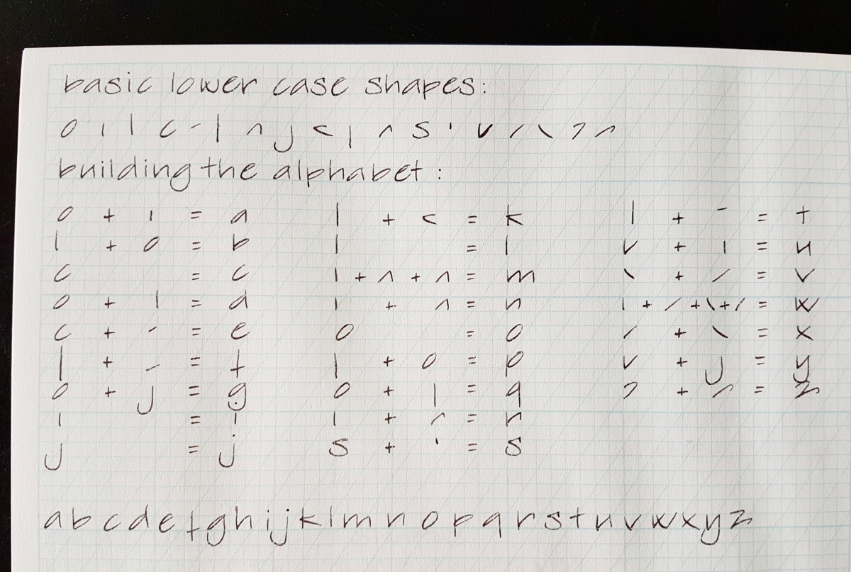
Above is the lower case alphabet, broken down in 18 basic shapes with which you can ‘build’ all the letters in the alphabet. To make it an easy visual, I have made sums of shapes to show the letters as the sums are added up. The angled guide lines on these calligraphy practice sheets are at 56º to the x-line. You can see I loosely follow those, but since it is handwriting, not a computer font, deviations and personal quirky handwriting attributions are allowed, as far as I am concerned. The same goes for you if you want to practice this style. Do not force your personal letter shape into the exact same shapes, but follow the general direction of the shapes and forms to acquire your personal style of this type.
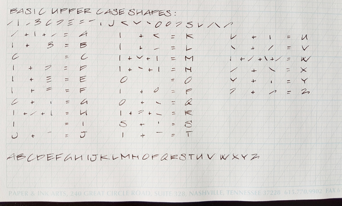
And of course the basic upper case shapes, which I broke down into 22 shapes. For the upper case letters I also made sums to arrive at the letters. If all 22 are really necessary is debatable, but I wanted to keep the sums per letter manageable for you as well as myself.
Let me know if this was helpful and if you would like to see more handwriting styles explained. I very much enjoyed doing this post and am also thinking of doing something downloadable in the future. Would you be interested in that? I would love to know!
Tools used in this post:
- Paper & Ink Arts guide line practice sheets
- Esterbrook “J” with a 9556 firm fine nib
- J. Herbin Cacao du Brésil ink
Of course, any paper and writing instrument will do to practice.
Thank you as ever for reading and until the next post!
Janine

Wow, this is a really thorough breakdown of your (amazing) writing. I’ll definitely have to give this a shot sometime.
LikeLike
That’s very kind of you 😙, thank you! Let me know if anything is unclear.
LikeLike
OMG this is sooo helpful! Thank you for sharing this!
LikeLike
My pleasure, so glad you find it helpful.
LikeLike
I really appreciate the effort you put in to doing this! As a fan of your writing style, I’m working on improving my handwriting to something I like, so this will definitely come in handy. And yes downloads would always be welcome. 😜
LikeLiked by 1 person
Hi Sherree, thank you so much for your kind comment. Today, if my internet connection will work with me, I will do a post on a type of swoop cursive. Which is actually more a glorified print, so it’s like a “cursive print hack”. Downloads will follow later.
LikeLike
Great stuff, thank you for sharing. Would like to see numbers as well…
LikeLiked by 1 person
Sure, great idea. Will add those when I have a moment to spare.
LikeLike
Downloadable PDF please?
LikeLike
I’m going to try this over the weekend. Thank you
LikeLiked by 1 person
That’s geeat! Have fun practicing!
LikeLike
Do you think that you will have time to do downloads soon?
LikeLike
I surely hope so, Rebecca. Please hang on a little longer!
LikeLike
Thanks, I have your page booked and check all the time and re-read your writing. You have so much talent and are a joy to follow on social media platforms!
LikeLiked by 1 person
Just excellent!
LikeLiked by 1 person
hi, love your print! did you ever download this? any numbers? Thanks so much!
LikeLike
I just love your penmanship 😍💯
LikeLiked by 1 person
Thats really impressive. Can you please point to Some downloadable sheets which I can Use to learn? Thanks
LikeLike
Hi Ajit, I’m sorry I don’t have those yet. Because of busy family times, I don’t have time to provide those before the summer holidays. I hope you can practice freehand until then.
LikeLike
Thanks. Will try to learn from pics you posted.
LikeLike
Hi Janine
Love the detail you have provided here! I’ve always loved this style of handwriting and having a visual example with the individual strokes/shapes is fantastic. Quick question– on the graphic where you show what strokes/shapes are used, is the order listed meant to infer the order that you make the strokes? Example: the “H”. Do you make the left vertical first, then the crossbar and then the right vertical, as illustrated? Or do you make the left vertical, the right vertical, and then join with the crossbar? It appears to me that your order listed of strokes moves from left side of the letter to the right, which would seem to move you closer to the next letter formation. I’m trying to pick the pace of my lettering a little and nuances like that would be helpful to know as I learn it to make the flow better as I get better.
LikeLiked by 1 person
Hi Drew
Thank you for your appreciation. Kerning, the space you leave between the letters, is a matter of practicing and of trying out which spacing works best for which letter combinations. An i or l takes up less space than a letter built from more shapes. With letters that have their stem, the carrying shape to the left, such as the h, I start with the long stem and continue with the connecting shoulder towards the short stem to the right. An oval letter, such as the a, d or g I start with the oval, top right, tilted oval towards bottom left and then attach the stem, in the case of g ending in the descending half loop. I lift my pen often, so that there are no “speed loops” where the nib would keep touching the paper. I am a rather slow writer and a crisp print is not a style for very speedy writing. For practical, quick notetaking, I’d recommend a natural to you cursive. For pure enjoyment of writing, a crisp print is very enjoyable. Have fun practicing!
LikeLike
I love what you do. All of it. Will you put out a book or something so I can learn ? Thank you so much. Mary
LikeLike
Thank you, Mary. A book is quite a project and I don’t consider myself enough of an expert to “tell people how to do things”. The most important thing I wish to express is having fun in writing, no matter what style or level of proficiency you have.
LikeLike