One of the very democratic aspects of fountain pen writing is that there is a nib for all hands and for all tastes. There are those who prefer to stick to one size or one shape, but even then you encounter the differences between how much tipping (that is the part of the tines that touches the paper and distributes the ink) a brand or nib maker puts on the end of the tines, and how they do that final grind or tuning.
In this post I would like to focus on some randomly chosen nib shapes or nib sizes and random brands, modern and vintage. I plan to do more of these posts, either focusing on various nib sizes or nib sizes between brands or a one brand focus. All written samples are done on Tomoe River paper.
Starting with the first pen on the left: the Sailor 1911 Standard Demonstrator. Sailor is a brand that offers an amazing range of nib sizes. The sizes available for this model are the usual EF through B (including a medium-fine) and a three tined music nib which looks like a stubby italic and a zoom nib. This particular pen came with a 14k gold zoom nib, a big blob of tipping shaped to write with different strokes when held at different angles. This zoom nib was ground by nibmeister John Mottishaw of Nibs.com into an architect shape.
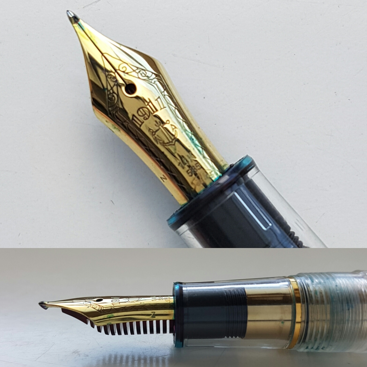
As you can see, the nib is slender in length but still has enough tipping left to make for a very interesting ink stroke.
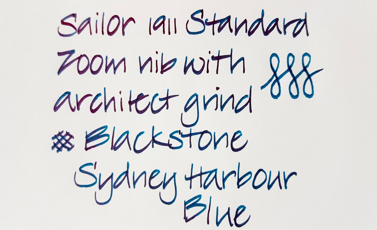 The down stroke is narrow and the side stroke is wide. I think it produces a very elegant ink line. It is one of my very favorite nibs to write with, also for daily writing and especially with a nicely wet and shining ink as the Blackstone. This pen model is still available, should you be interested. The Standard is a rather small pen though, so if you have bigger hands, you might want to look into a Sailor 1911 Large.
Second from the left is my favorite pen for drawing, doodling and faux calligraphy, the Aurora Optima in Burgundy. This nib is a standard Aurora factory medium. It writes with a medium to wet ink line and the nib has some tooth, which makes it a very comfortable writer if you like to have control over your ink line. The 14k gold nib has been rhodium plated to match with the silver colored trimming of the pen.

The nib gives a mostly regular line with a very slight stubbiness due to the flattened tipping. The edges are perfectly smooth though, so your ink line will be mostly consistently even with the slightest bit of swirl where you lift the nib off the paper.
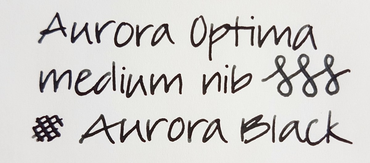
The regular writing shows a consistent inks line. So an ideal nib if you are looking for a writer that puts down such a line. The figure-eights are done with a hint of pressure on the down stroke. I did the same with the cross-hatches, to give you an idea of the possible line difference. The nib is responsive, but absolutely not a flex nib. Should you be interested in that, Aurora has recently issued a flex version. Aurora offers a very wide range of nib choices, for that matter, including stubs and italics. Hip hip hooray for modern brands that still dare to offer other nib sizes besides F through B! I love the Aurora black ink in this pen, because I use it mostly for doodles in black. The ink is not waterproof, but I do not use colors when doodling, so to me that is not a problem.
The middle pen is actually an antique, as it will be around 100 years old. It is a Mabie Todd Swan 1500 eye-dropper pen with an over- and underfeed on the nib. Eye-dropper means the ink goes straight into the body. This gold nib was meant to be flexed and has an over- and underfeed to supply the tines with a steady ink flow.
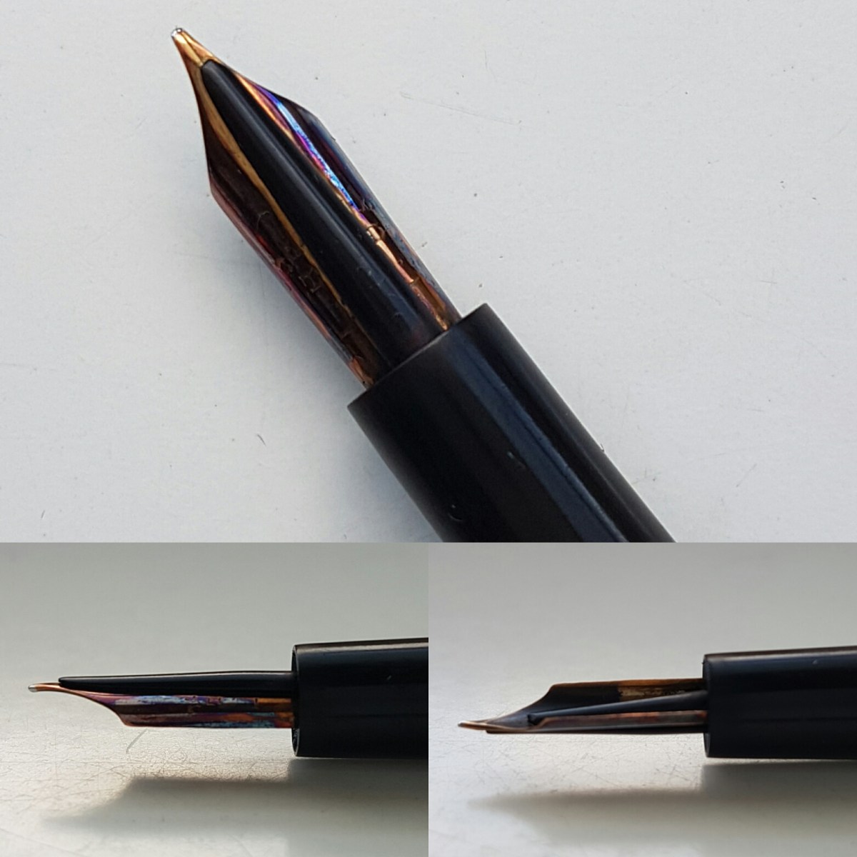
The nib can use some cleaning, but I am hesitant what to clean it with. Should you have a pointer into that direction, please let me know in the comments or contact me.
This is one pen I cherish a lot. I bought it from one of my first Instagram friends and I keep it boxed in the box it came with. I ink it up or dip it for special use. I love the line variation this nib offers.
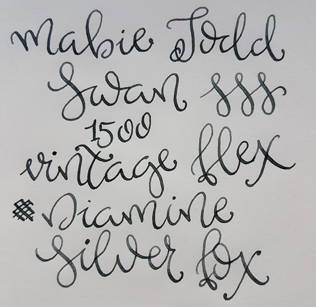
Sorry for the wobbly lines, I did not take the time for a proper warm-up. This is a lovely nib for practicing freestyle or traditional calligraphy, or even for regular letter writing if you have a cursive hand. This is a pen that is available at pen shows or at specialized dealers. If you are new to the vintage game and are looking for decent vintage flex, I recommend checking with a trusted vintage pen dealer.
Second from the right is the very charming Bexley Jim Gaston Holiday 2002. If you follow me on Instagram, you will have no doubt seen this pen before and might even know it is the first pen I bought at my first Pen Show at the table of the One Man Pen Show, Sarj Minhas. He is an extremely knowledgeable vintage and modern pen dealer and a nice guy extraordinaire! I asked him if he had brought any nice stubs and he handed me this red and silvery-white beauty. I was happy because I wanted my very first pen show acquisition to be something special. This pen ticked that box.
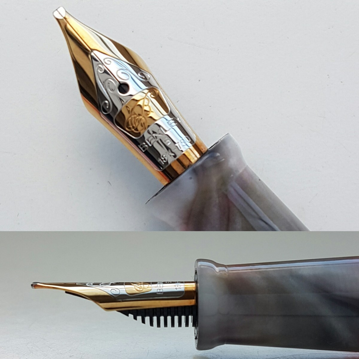
The tipping work on this 18k gold nib is just amazing. I love the careful grinding and smooth edges. It has a lovely bounce to it and is a very wet writer. I have had this pen in my EDC since I bought it. It truly graces the paper.

It gives inks the most lovely shading and depth. I have yet to come across an ink that does not work in this nib. If you are looking for a Bexley, try Vanness Pens or Nibs.com. Be aware that not all Bexleys are still supplied with the Bexley nib if you are looking for a specific nib size.
The pen to the right is – I assume – the Quasi Imperial (330?) model Sheaffer with the iconic inlaid nib. If you know the name of this model (I bought it online for a steal with a twin stub brother and the seller did not know the model), please let me know so I can offer full info to other readers. The nib is a factory oblique italic, but thicker than most italic nibs I have seen on other pens. Perhaps more a very crisp oblique stub.

I have loved these inlaid nibs since my sister first got a Targa. I later was given a Targa when I went to university but it was borrowed there permanently. So I was extremely happy to find this great nib in perhaps a lesser spectacular model pen, but oh my, does this nib write… Sheaffer makes some of the best ground and tuned factory nibs out there.
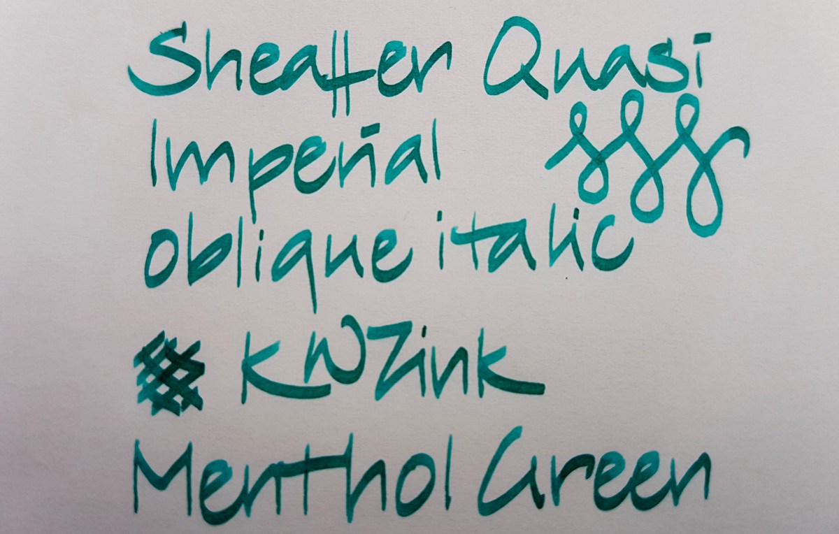
This pen cost me next to nothing compared to the writing quality it offers and I will never part with this one or its stub brother, if I can help it. It writes incredibly smooth for a steel nib, even though it is quite crisp. I have never experienced getting caught in the paper. I’m telling you, if you come across one of these oblique Sheaffers, buy it. You will not regret it and if you do, by all means let me know.
Guys, it was a lot of fun doing this post so it will definitely be followed by anther “random nibs”. Let me know if you would like to see any nib size or shape in particular. Thank you once again for sticking it out!

Great post, I would love the Sheaffer – and that menthol green ink is just stunning!
LikeLiked by 1 person
Thank you! And I really cherish those Sheaffers. Wonderful pens!
LikeLike
Amazing! I just found your blog today and I’m in love ❤
LikeLiked by 1 person
That’s so sweet of you! Thank you! Just doing what I really really love here, so happy to be part of this fountain pen corner of the world! 😊
LikeLike
Hello Janine, maybe this link is useful?
http://www.peytonstreetpens.com/resources/pen-resources/sheaffer_models_part_3
LikeLiked by 1 person
Thanks, Liz, absolutely! Now I know I have a 330 and a 440! Brilliant, much appreciated! 😙
LikeLike
Anytime, Janine! I have two 440’s, a Broad and a fine. Love them to bits! Would like to have one of your stubs though!😉
LikeLike
Hello Janine
I just discovered your blob and really enjoy it. Thank you
LikeLike
Thank you for your appreciation, Brian.
LikeLike