
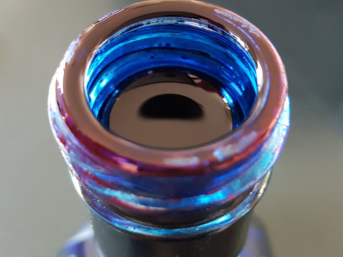
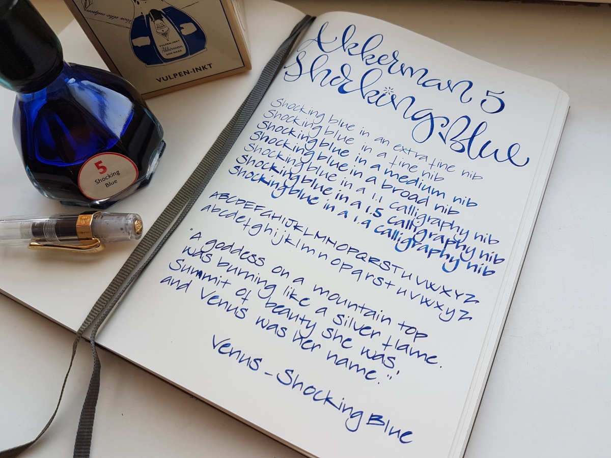
A rim like this on your ink bottle neck surely looks promising! P.W. Akkerman’s #5 ink, Shocking Blue, is the most loved and best known of the Akkerman inks. A deep, bright blue you just cannot go wrong with. Before we take a look at the writing samples, let me tell you about the name of this ink. Perhaps you are already aware of this fact, or it is new to you, but P.W. Akkerman is one of Holland’s oldest fountain pen stores, located in The Hague in one of Holland’s very first “malls”. Akkerman uses names for their inks that are all associated with the town’s phenomena. The Hague was Holland’s birth ground of quite a number of blues bands in the 60s. The Golden Earring for example, who you may know from their song Radar Love, Brainbox who covered Summertime in a bluesy-funky way and Shocking Blue, who had a hit in 1968 with Venus. Some of you may know the Bananarama cover version of that song. I used a couple of lines in my writing samples. Enough of that, on to the ink!
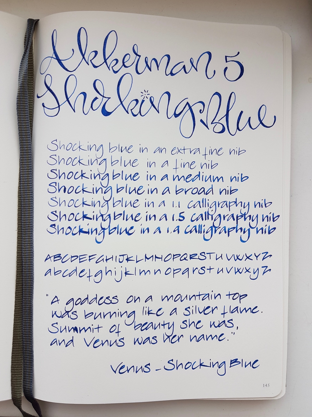
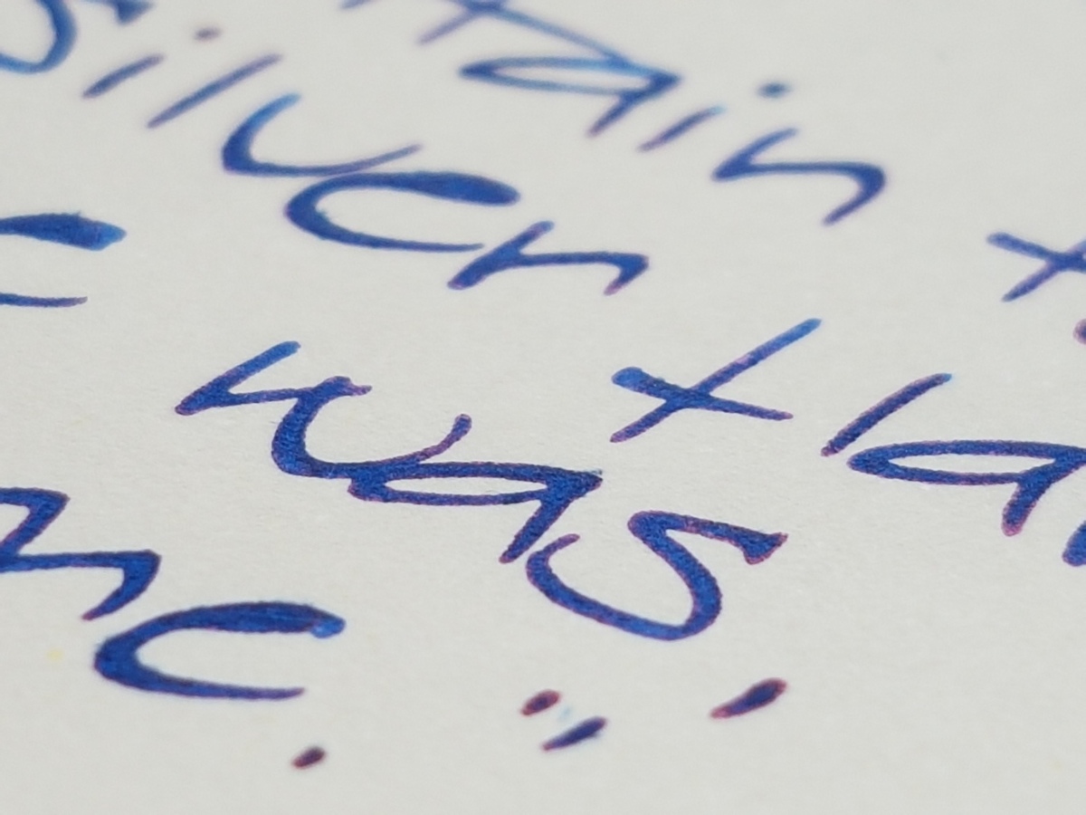
Shocking Blue is a classic, intensely deep royal blue with its renowned red sheen. As you can see above, it almost pops of the page! The ink behaved decently in all nibs sizes and has relatively quick drying time, especially in finer nibs. My husband is a lefty overwriter and always has his TWSBI Eco inked up with Shocking Blue. Another reason he loves this ink is a matter of ritual. The Akkerman inks all come in that very distinctive marble-in-the-bottleneck ink bottle. You tip the capped bottle upside down so that some ink gathers in the top part of the bottle from where you fill your pen. This was the ink his parents used many years ago, so refilling the pen from the bottle brings back memories for him.
Let’s look at the writing up close to find that illustrious sheen!
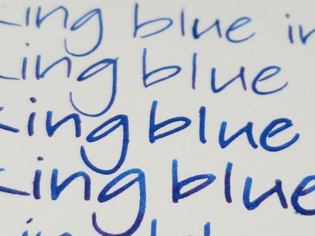
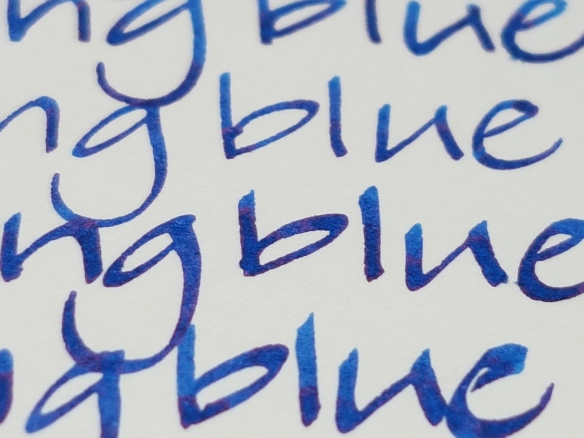
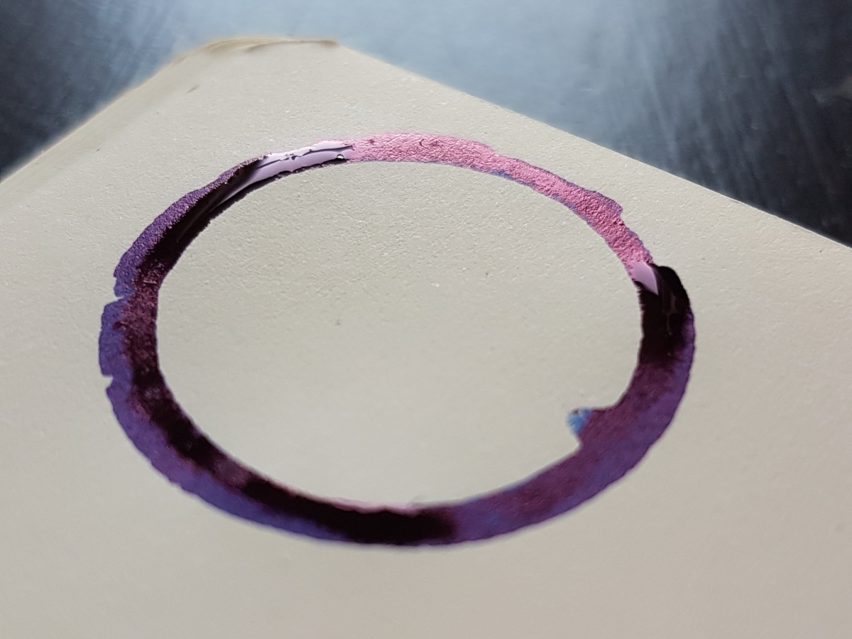
Yes, a wonderful deep deep blue ink, really vibrant with a lovely red sheen and outline. It pops up in every nib, especially on more absorbing paper. I made a rim stamp in my Leuchtturm journal to show the ink’s sheening capacity.
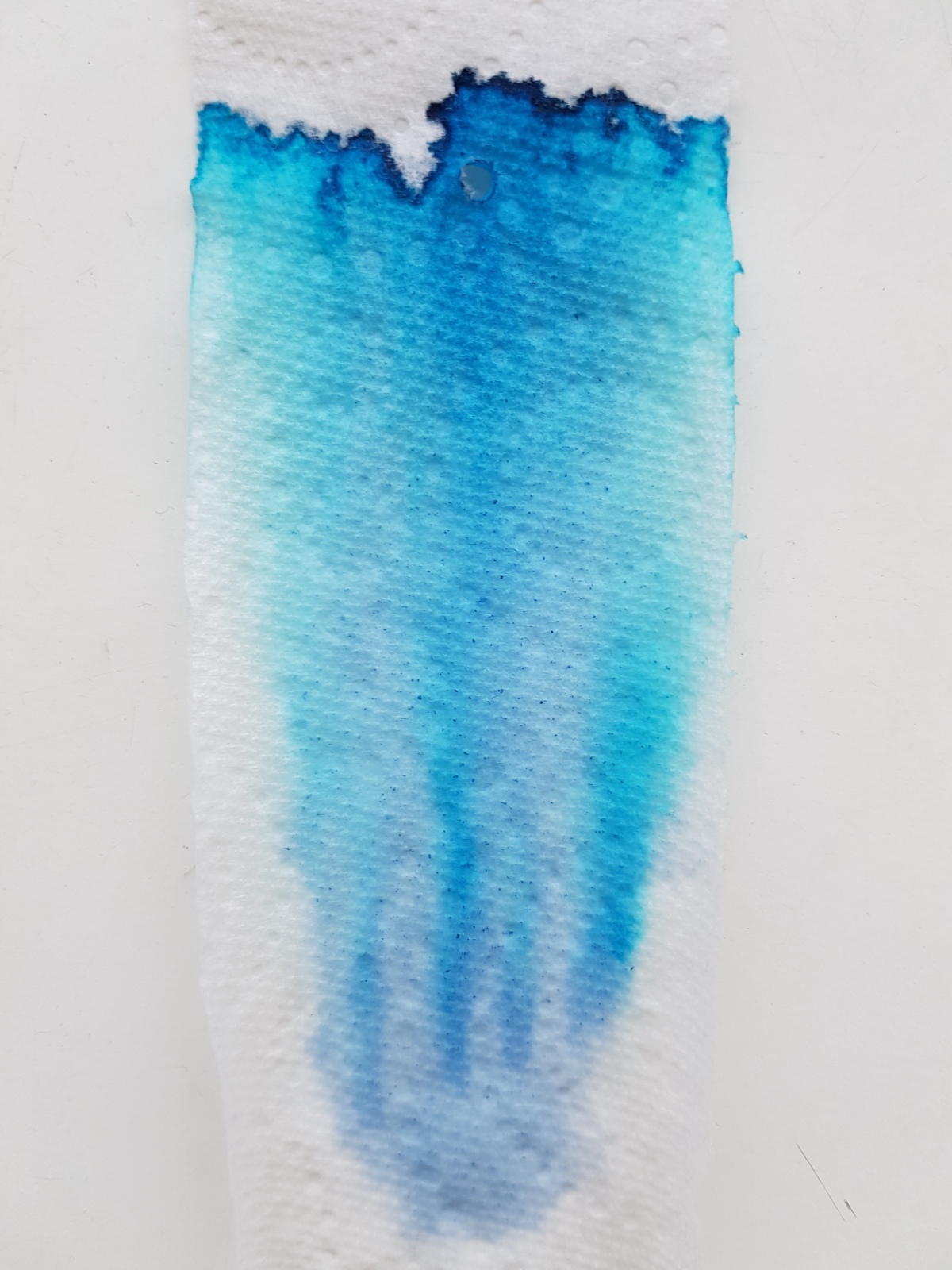
Oh yes, here we see that the ink is so intense that it leans towards a purple. The sheen is nice and thick, almost oily. The chromatography shows the purple aspects in the lavender hue in the base. The ink trail develops into a bright blue and ends in a dark blue outer line where the pigments are deposited.
This ink is usable in most situations -apart from those where you want your ink to be waterproof, it isn’t- school, university, the office, personal use, correspondence that doesn’t require bulletproofness. It is a crowd pleaser! And I can see why. It is blue without being run-of-the-mill.
How about you, do you have a deep royal blue with a red sheen of choice? Let me know, so I can do a side-by-side at some point.
Thank you as ever for reading and until the next post!
All pictures taken in natural light, no filters used.
Disclaimer: I bought this ink wit my own money for my own use. No affiliate links.
Tools used:
- Leuchtturm A5 blank notebook;
- Akkerman Shocking Blue ink;
- Platinum Preppies EF, F, M;
- Lamy Vista B, 1.1, 1.5, 1,9;
- Kaweco Classic Sport BB architect grind;
- a strip of paper kitchen towel;
- Samsung S7 phone camera.

I’ve used this ink for months and had no idea it was named after the Venus song… or that Venus was from The Hague.
I went to The Hague several years ago and absolutely LOVED the city. I went there before I was into pens, but I’d love to go back and visit the Akkerman store.
LikeLiked by 1 person
If/when you do, let me know! 😊 And perhaps you can meet the Dutch pen meet up then!
LikeLiked by 1 person
That would be so fun!
LikeLiked by 1 person
Shockingly blue ..Buy now button pressed 😱💙💙💙💙💙💙💞💙👍
LikeLiked by 1 person
Enjoy that super blue ink! 😘
LikeLike
Suddenly starting to hum Venus and Mars. McCartney in The Hague with Wings?
LikeLiked by 1 person
I honestly would not know. Not the biggest McCartney fan to be honest. My better half is though. I’ll ask him. 😊
LikeLike
Janine, I want to buy a blue Akkerman ink, but not toooo dark. I was thinking of buying Royal Akkerman Blauw or Binnenhof Blues but Shocking Blue is the most famous blue Akkerman ink. In most of the reviews this ink is very dark but in your pictures this ink seems to be a kind of vibrant kobaltblue, not dark at all! I like what I see! I have only pens with EF and F nib. How will this ink show up? Any suggestions which Akkerman Blue to buy?
LikeLiked by 1 person
Hi Liz, I am actually about to try Shocking Blue in a fine-ish medium and will post that on IG. It can show up pretty intense and with a heavy red sheen. The other bright blue, Akkerman Blauw is a bit more like a school blurple-blue. Passage Blauw is more periwinkle blue. Hard to decide for someone else… It’s really up to you. The Akkermans I have tried so far are all very well behaved inks. So keep an eye out for my IF feed for Shocking Blue in a porcelain Jinhao.
LikeLike
Yes, I know, it’s quite personal, but I am not familiair with the Akkerman inks so that makes it very difficult. Normally I like a much lighter blue but your pictures of Shocking Blue blew me away! If the color is what is is on my screen, that’s the color I’ll go for! I can’t wait for your post on IG. Thanks! Liz.
LikeLike
Have you compared this to Diamine Blue Velvet?
LikeLiked by 1 person
No, will compare it to Diamine Majestic Blue. They seem very similar.
LikeLike