Yenderings Toronto YYZAM01 Pen Roll

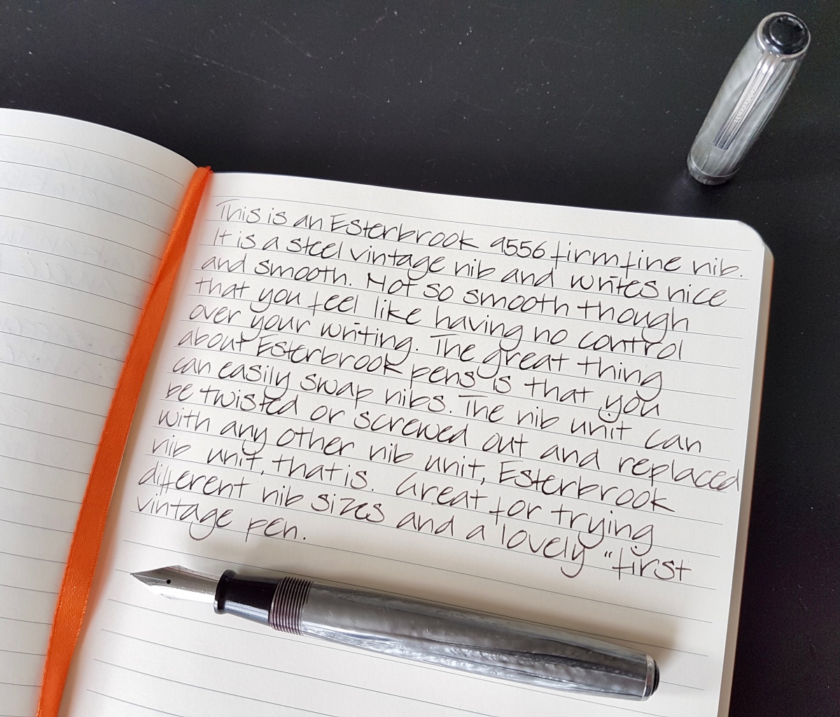
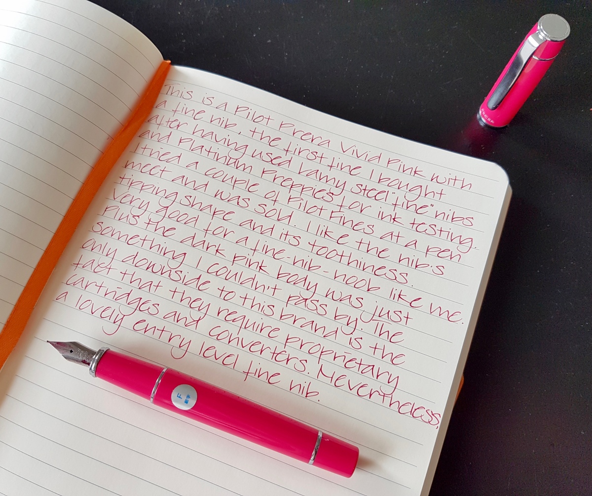
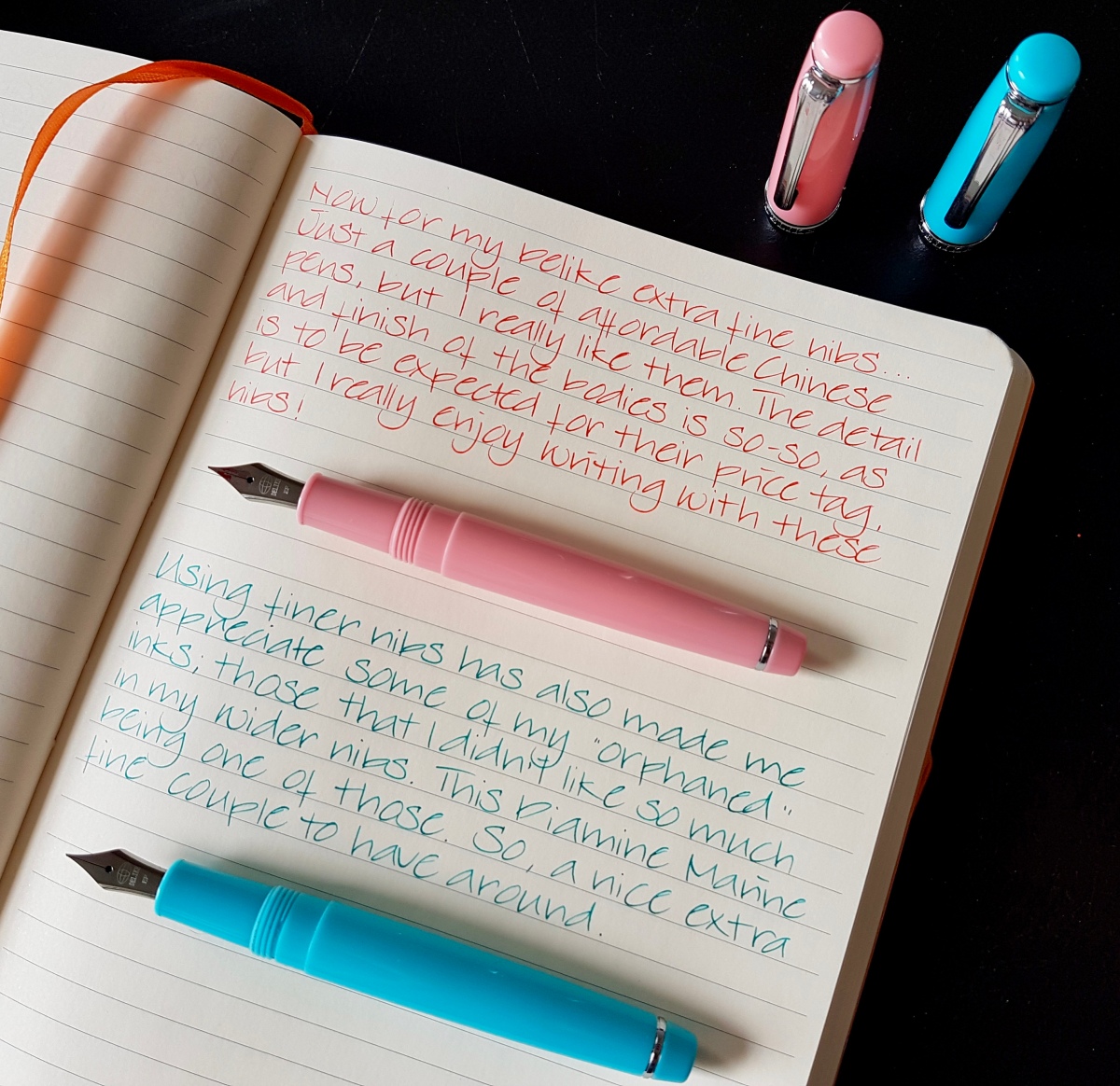
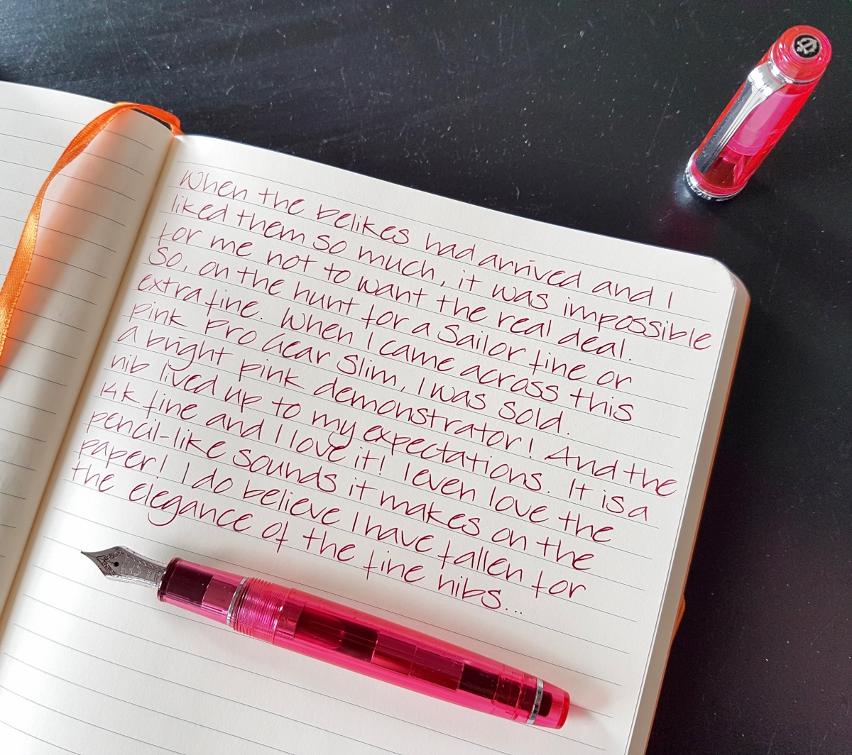
August of 2017 I had the unbelievable opportunity to visit the DC Fountain Pen Super Show, which was an amazing experience. Apart from being overwhelmed by all the stunning pens, the best thing about the show was meeting the wonderful pen people and seeing online friends in real life. One of them is Yen Yen, also known as @2Yens on Instagram. We talked pens and small business and she told me about her dream plan of selling the pen rolls she made herself. I loved the roll she was carrying with her and she asked if I would be interested in doing a review of one as soon as she was ready to launch her shop. I happily said yes and a couple of months after DC when Yen Yen was on the brink of launching Yenderings I had the opportunity to test drive the site, together with a couple of other insta pen friends. Her website is a joy to visit, beautiful pictures, clear, concise item descriptions and a lovely choice of fabrics. I chose a Toronto AM pen roll to try out and review because I love monochrome base colors with a good red pop of color to dress it up a little. I have had a good few months to try it out and I love it! So, let me tell you a little bit about it…

fullsizeoutput_509

WHAT IS IT

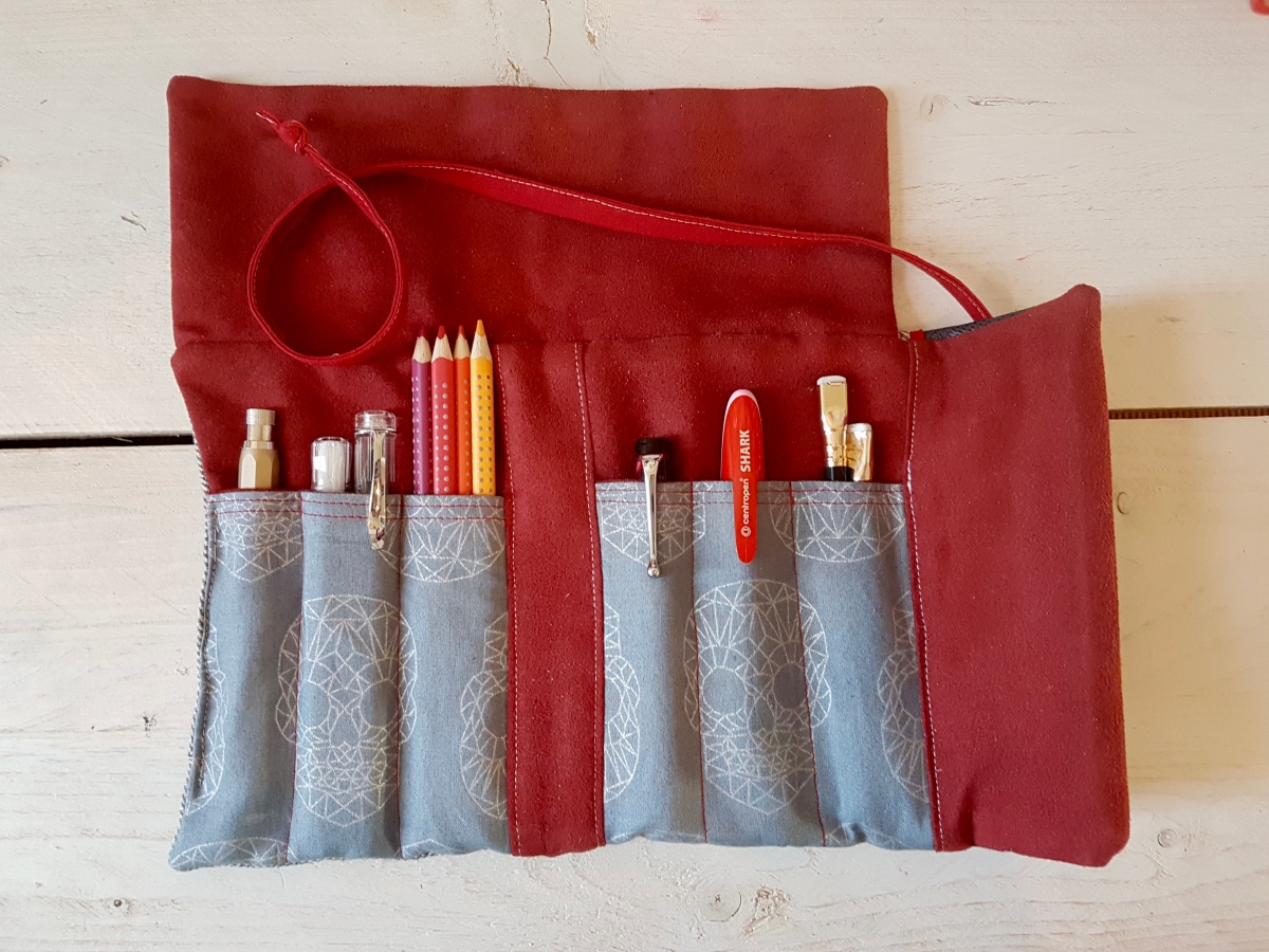
The Yenderings Toronto YYZAM01 Ride the Rocket pen roll is a fabric fold-over pen roll to hold six or more pens or other stationery necessities that fit in the pen pockets. The back pocket holds at least two A6/Field Notes sized notebooks and has room for even more pens. The pen roll folds open to six pen slots, three on each side of the “spine”. The back has a slanted notebook slot. The stitching is very neatly done and the spine is stitched so that it provides a good support when the roll is folded. The fold-over flap is made with a nice contrasting leather. The inner material is a soft ultrasuede that will not be abrasive to your pens. The pen roll closes with a hand-sewn wrapping chord.

Apart from the Toronto model, Renderings also offers the London models which will hold an A5 sized notebook and more stationery supplies.

fullsizeoutput_508

MATERIALS USED

Yen Yen gives nice comprehensive lists of the materials she uses for each of her models and choice options. The Toronto AM01 Ride the Rocket is made of a grey herringbone cotton/linen blend on the outside. The lining is of red ultra suede, a soft ultrasuede that will be very kind to your pens. A hand-sewn cotton chord is attached to close the pen roll when folded over. The feature fabric -as Yen Yen calls it- is the material used for the pen slots, a grey fabric with a graphic silver skulls pattern. The material used for the fold-over flap is a pressed leather. It gives the suit-like herringbone a nice little edgy oomph. I love the combination of materials, a neutral base with plenty of attention-grabbing elements. An EDC roll that is something quite different from what’s available from large-scale producers.

fullsizeoutput_507

WHAT DO I CARRY IN IT

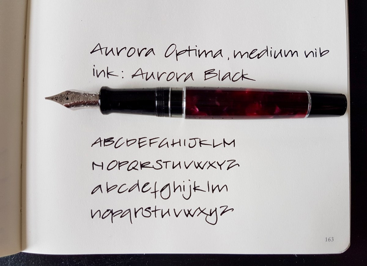
Because the Toronto in this color scheme fits perfectly with the A5 red leather diary I use for family matters, I have been carrying my diary and journaling supplies in it. Left to right above: a Koh-I-Noor Hardtmuth 5.6mm lead holder aka mechanical pencil (a Dutch Pen Club gift from Dries), a Pilot Kaküno Clear and a Caliarts Ego that fit snugly together in the next pocket, four Faber-Castell colour grip pencils, an Aurora Optima, a Centroped Shark (kindly gifted to me by the lovely Mishka) and two Blackwing pencils. In the back pocket is an Ed the Cat Notebook, which is Field Notes sized. I have also carried small rulers and correction fluid pens in the pockets.

For watercolorists, I imagine the back pocket will easily hold a small pallet of pans and a small watercolor art book. Super nice for nature hikes or urban sketching!


This slideshow requires JavaScript.


WHAT’S IT LIKE IN USE

As I have been using the pen roll for my daily family diary, I have used it intensively over a couple of months and the one thing that I noticed is how nicely the materials have settled pretty quickly. It is like a pair of jeans, it warms up with wear and use and holds your stationery items with style and comfort. I was worried that I might find the roll too soft, being used to hard shell and leather covers and pen cases, but the double material layers and lining helps to give this pen roll sturdiness. The hardwearing stitching and having a notebook in the back pocket all add to the backbone of this pen roll. That’s what I enjoy about it: it is pettable practicality! It’s ideal for carrying your school, uni or office essentials with care and style. I love the combination of fabrics, colors and materials. I did have to get the hang of using the wrapping chord, but that is just me being clumsy. The chord is long enough for a wrap and tie. Sometimes I fold the chord one turn extra and tuck it in the back pocket for “quick release”.

SHOP AGAIN?

For sure! I love supporting small businesses and owning original things. Yen Yen will also take custom orders for special fabric combinations. The attention to design, use of fabric and color combinations make these rolls stand out from other pen rolls and journal covers. So a huge thank you to Yen Yen for reaching out to me and trusting me to try her design! Wishing you every bit of success Yen Yen and so hope to see you again one day!

DISCOUNT CODE!

Yen Yen is kindly offering a discount code for my blog readers. Use the coupon code Janine10 to get a 10% discount at check-out. Thank you, Yen yen for this gracious discount! Visit her webshop at www.yenderings.com.

Disclaimer:

I received this item for test and review purposes. I paid for shipping myself. I was not otherwise rewarded for this review. All views, opinions and pictures are my own. This blog post does not contain affiliate links.

The year calendar lay-out in the top photo is designed by Laura Krenk of @nerdy.teacher.  I purchased her diary lay-outs through her Etsy shop.


Ink log pages

Recently I have started to log inks in a fountain pen friendly journal, the Pen Addict Dot-Dash (Nockco) pocket notebook. Every time I share a page on Instagram, I will also upload it here. No reviews, no properties, just the colors next to each other. Reviews will be done separately, under the same page in different posts. If you have any questions or want to share your experience about the inks, please comment.

fullsizeoutput_48c
Orange inks, May 2017
fullsizeoutput_48b
Red inks, May 2017
fullsizeoutput_48d
Red-purple inks, May 2017
fullsizeoutput_48f.jpeg
Magenta and reddish pink inks

Five steel nibs

Yesterday I posted a picture on Instagram where I had apparently alternated gold and steel nibbed pens. Steel nibs are often and unjustified thought “less” of than gold nibbed pens. Granted, there are steel nibs out there that are not really that impressive. However, when executed properly, steel nibs are often as enjoyable (and some even more so) than many a lesser well-finished gold nibbed pen. Basically, if you mess up a gold nib or steel nib, it is not going to write properly. If finished and set well, both are equally enjoyable in my opinion. Plus, steel nibs are often a lot more affordable. So this morning I selected five pens with steel nibs and I set myself one rule: that they still had the shape they left the factory with at some point. And all of these are still available in some way, either through regular sellers or through vintage sellers. These are the pens I ended up with: an Esterbrook “J” with a 9556 firm fine nib, a Montegrappa Fortuna with a medium nib, a Franklin-Christoph model 45 with an extra-fine nib, a Sheaffer 330 with a factory stub nib, a Pelican Twist with the standard medium nib.

Esterbrook “J”, #9556 firm fine steel nib

fullsizeoutput_48a
Esterbrook #9556 firm fine, Rohrer & Klingner Leipzicher Schwarz


This Esterbrook is one of my favorite pens ever. Not because of how it looks -to be honest, I am not a big fan of this material- but purely for its very democratic design and interchangeable nibs. Anyone can write with an Esterbrook and if you are looking into vintage pens, this is the brand to seek out. If you have any Esterbrook model, any of the screw-in nib units still widely available will fit in that body. My current tally is two bodies and four different nib units. This firm fine #9556 and the flex #9128 being my favorite two so far. The Esterbrook nibs are renowned for their smoothness. I dare say that these are the smoothest steel nibs I have had the pleasure of owning or trying so far. Always tuned properly, no misalignments, giving a decent but not too wet ink line. I do actually like nibs to be a bit toothy for control. My hands tend to shake a bit because of hyper mobility so a hint of tooth makes your nib not go all over the place. These nibs just seem to know where to go. If ever there was a steel nib suitable for school use and if cursive fountain pen writing was ever reinstated in schools, I would heartily suggest trying to make the nibs as great as these. If you are looking for a good value pen with a steel nib to practice cursive writing, try and find yourself an Esterbrook, with a properly working sac and lever. I bet you will not regret it. This nib has a slight hint of architect shaped tipping, which I absolutely love. It is pretty rigid, so no flexing here. If you are after that, try to hunt down the 9128 Esterbrook nib.

Montegrappa Fortuna Mosaico Marrakech, medium nib

fullsizeoutput_489.jpeg
Montegrappa Fortuna Mosaico Marrakech medium nib, Sailor Jentle Souten


Franklin-Christoph Model 45 XLV ES, extra-fine nib

fullsizeoutput_488
Franklin-Christoph M45 extra-fine nib, Robert Oster Signature Spearmint

Okay, this particular finish may not be easily accessible, but the nib is the standard #5 extra-fine nib that is available on each of the smaller Franklin-Christoph (later mentioned as FC) models. This also goes for the larger models that hold a #6 nib. I have written with various broad grinds from FC, and all are beautiful. Italics are on the crisp side, though. This extra-fine is a perfect medium between smooth and toothy, a great nib to try if you want to explore fine-nib-territory. It is definitely a western extra-fine, comparable to medium-fine or fine Asian nibs. It has a bit of bounce, but do not flex it, it is not meant to be flexed so the tines may spring if you do that. I would definitely recommend this nib if you have to write on unforgiving feathering paper. The model is a great pocket pen and will definitely turn heads, in any of the available finishes. It is with reason one of the most collected FC models. Many a pen user who is familiar with this maker has set their heart on collecting a “rainbow” of FC Model 45s. The other nice aspect of the FC pens is that the nib units are changeable and most are readily available on the Franklin-Christoph website.

Sheaffer 330 (Quasi Imperial), stub nib

fullsizeoutput_487.jpeg
Sheaffer 330 factory (italic) stub nib, Diamine Oxblood

This Sheaffer from the 70s was a very fortunate auction find. The typical inlaid nib is also found in gold on more higher end models. I love this nib, even though changing nibs means changing entire sections. Which can be done, because these nib unit-sections are still to be found with vintage pen sellers. I have also spotted stub inlaid nibs on eBay and I suspect pen shows are also a place where you can find these pens. This model was quite common in the seventies. It is not the most refined Sheaffer material out there. The body is basically cast plastic but the section is very pretty and the pen has the Sheaffer aerometric converter. But back to the nib. This nib is in a league of its own. It is a crisp, italic-like stub. It puts down a very elegant ink line that is nice and generous. Definitely a nib for expressive writing. Granted, the crispness also gives it a bit of a sweet spot which can cause hard starts if held so that just one of the tines hit the paper. But hold it properly and it gives you the most gorgeous ink line. For some reason I keep inking this up with deep reddish inks. First Montblanc Corn Poppy, now Diamine Crimson. Diamine Oxblood may also have been in this pen at some point. Very dramatic and very chic. This is an adult pen. Businesslike exterior, but a naughty nib.

Pelikan Twist Bronze, medium nib

fullsizeoutput_486.jpeg
Pelikan Twist Bronze medium nib, Kaweco Caramel Brown

Talking about an adult pen, I think that this particular finish of the very affordable Pelikan Twist is a perfect alternative if you want to try this pen and do not care for the regular bright colors this model also comes in. The ergonomic grip makes this an ideal pen for adults who need a little support gripping their pen or for young(er) subtle-bling lovers getting into fountain pen writing. The Twist comes in only one nib size: medium. The three Twists I have tried so far have been pretty consistent in nib width and ink flow. As is common with Pelikan nibs, their nib width is quite generous. This medium ink line compares easily to other (also European) broad nibs. The ink line has a slightly stub-like character and it is in between rigid and bouncy. It has a good amount of tooth for grip on the paper. Perhaps just a bit too much for first-time fountain pen users, but for people with unsteady hands who want to keep on using fountain pens, this pens is ideal. I love using it for cursive, because of the grip it offers in shape as well as on the paper. At €8-9 it is a pen you can easily take it with you, toss in your bag and carry around. The triangular and sweeping shape makes it also pretty sturdy. One of the best pens in this price range, if you ask me.

So, great steel nibs to be had in every price range! It is good to know that you don’t need to sell a kidney or take out a second mortgage to be able to enjoy a great pen. Or two. Or… more… Of course, it is so very thrilling to buy that first gold nibbed pen, but until then, and after, there are so many pens with steel nibs worthy of our love and attention! What is your favorite steel nib? I would love to know! Do leave me a comment.

Thank you as ever for reading and until the next post!


Disclaimer: the link in this post is not an affiliate link.


Two juicy broads

Hey, I’m a girl and a fountain pen geek. I am perfectly allowed to publish a post with this title. Honi soit qui mal y pense. Anyway, two juicy broad nabbed pens, is what I will be dealing with in this post. Both these pens are fairly recent acquisitions and both have a broad nib. The pens in question are the ASAPens.in Galactic and a unnamed pen from WoodshedPenCo, both two relatively small makers. ASAPens.in being a somewhat broader equipped company than Woodshed, as far as I am able to judge. It was my 2017 resolution to buy more small makers’ pens, and when my pen money jar fills up a bit more, I will be looking into other makers as well. But first, these pretty pens.

fullsizeoutput_478.jpeg
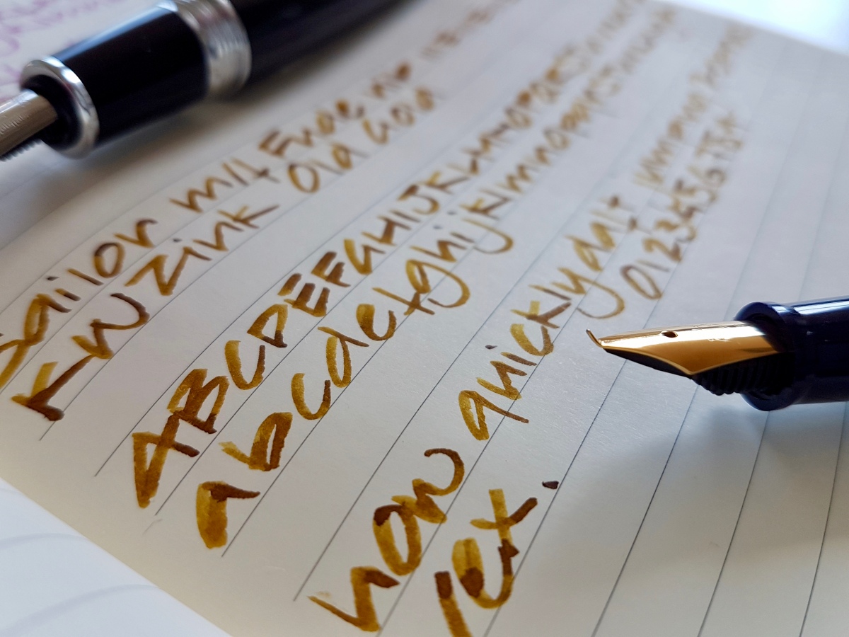
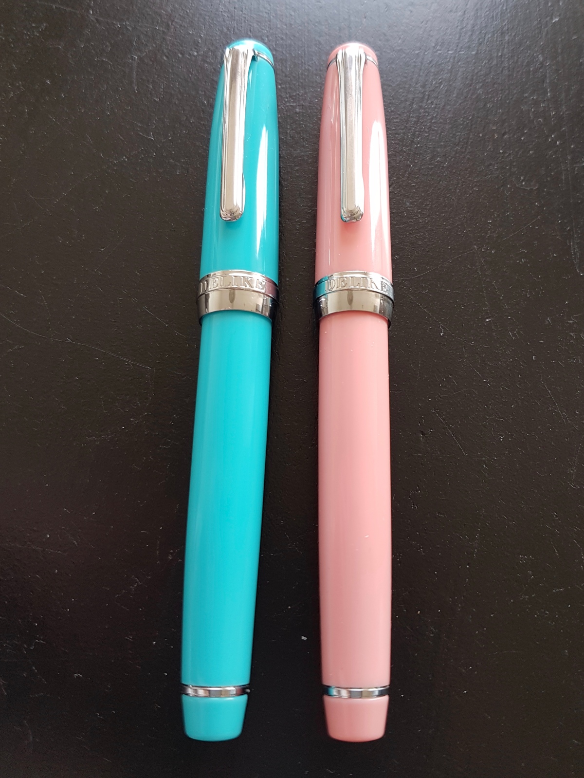
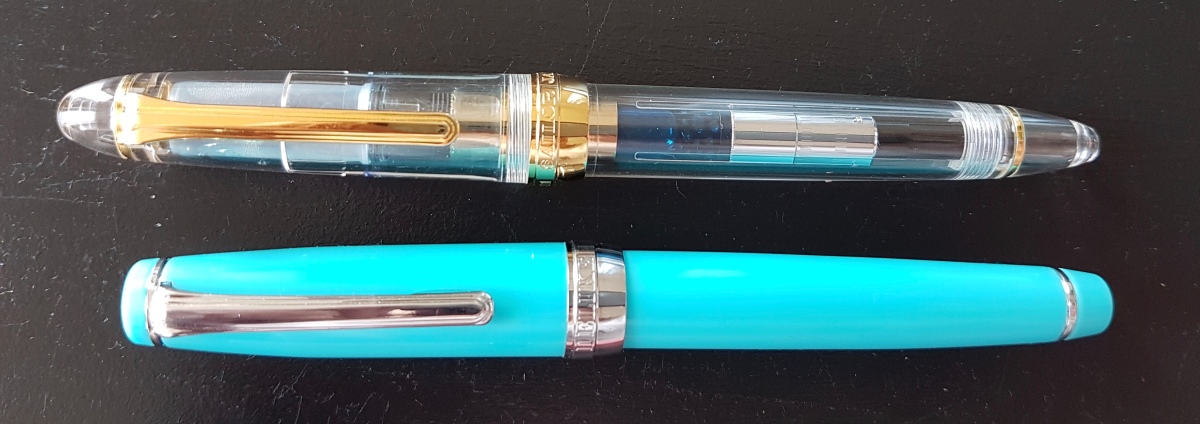
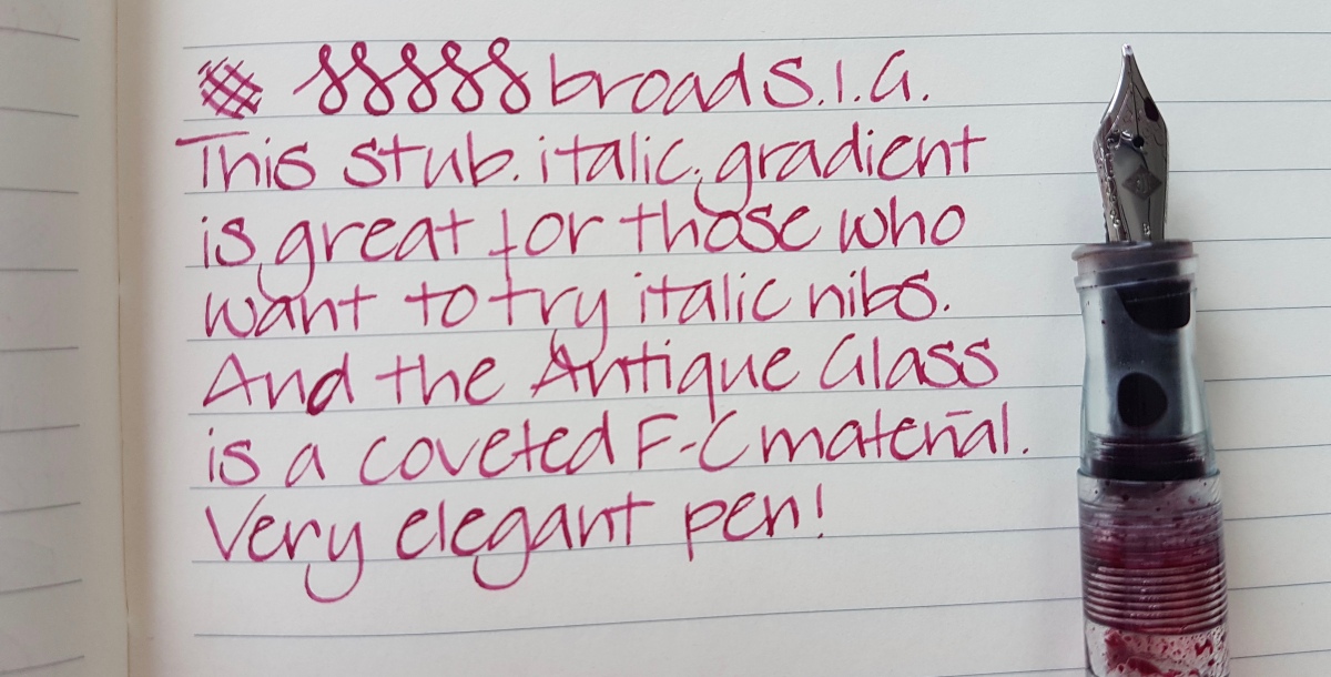
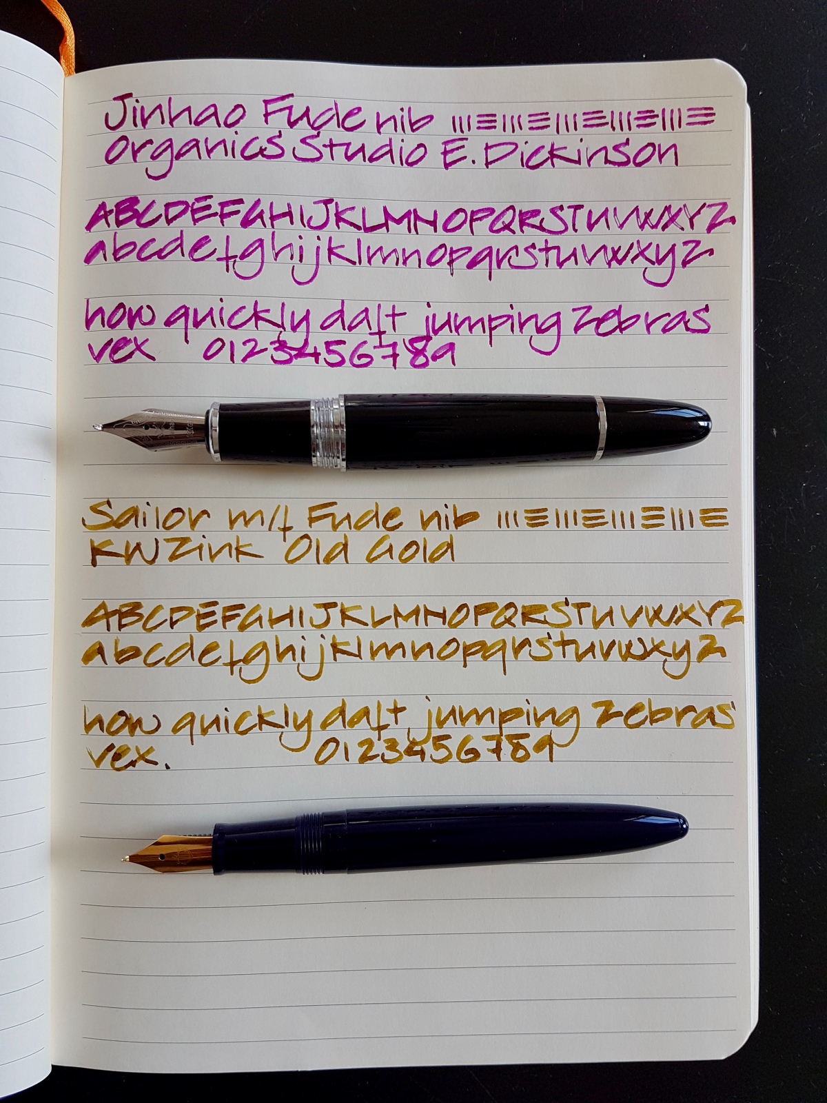
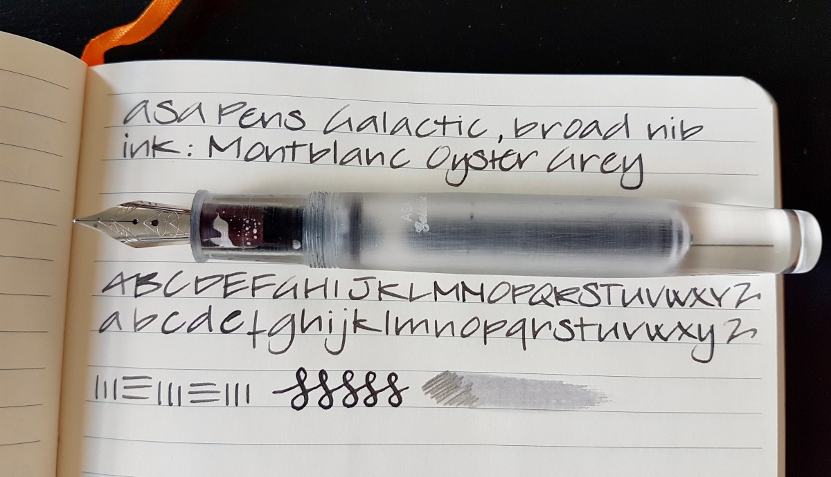
ASAPens.in is a pen maker based in India who sells his own hand turned pens as well as Gama, Wality, Jinhao. The Galactic is one of ASAPens.in own series and it comes in the flat top and barrel design, such as the one I chose, as a cigar shaped (rounded) design. You can safely say this is a sizable pen. Capped it is 15.8 cm, uncapped 14 cm, the section tapers from 14 mm at the body to 13 mm near the nib. The broadest part of the barrel measures 16 mm. The cap can be posted, but that will make the pen suspiciously long. This pen was designed to be used as an eyedropper so cartridges or a converter are not supplied. I haven’t measured the ink capacity, but my guess is at least 6 ml. ASAPens.in offers free worldwide shipping, but the tracking details are not always accurate. However, the pen did arrive safe and sound in a nice blue velvety pen pouch in a bubble wrap envelope.

fullsizeoutput_476.jpeg
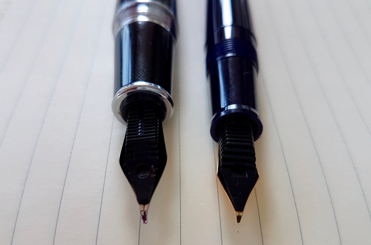
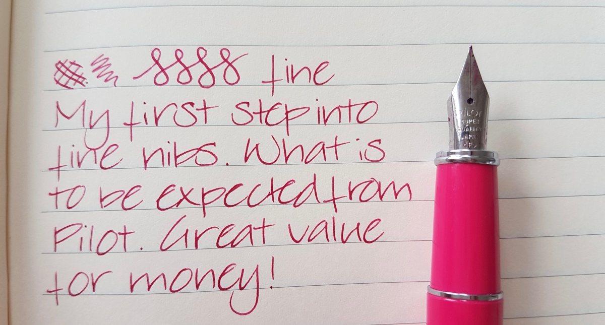
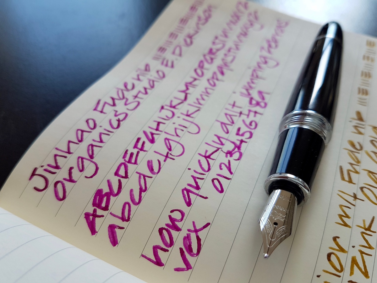
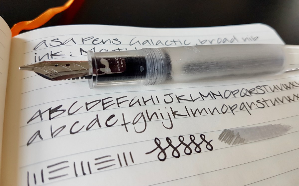
The pen is turned out of a transparent acrylic resin blank, the barrel and cap are treated so that they have an opaque, icy appearance. This contrasts nicely with the clear finial and barrel end. The barrel has the ASA logo and the word Galactic in cursive engraved on it. I have not been able (or patient enough) to screw the barrel on the section to get the logo in line with the nib. The sparse trims are chrome; the clip feels very limber. The #6 nib is decorated with scrolled banners on the tines and the ASA logo under the breather hole. The feed is plastic and flat like vintage feeds, with ribs along the sides. When I first inked up the pen, it burped ink blobs a couple of times, but after tipping over the pen a couple of times to let the air bubbles out of the feed, is hasn’t done so since. The tipping is a nice generous, true broad size. Together with the generous feed, this pen is a very wet writer, as you can see from the swiped ink scribble in the picture. The tipping is quite round, so the with a light touch you get minimal line variation, but because the tines have quite a bit of bounce to them, it is possible to get some variation as shown in the figure-8s. General opinion after a couple of weeks of use is that this is a nice, juicy writer.  I love the transparent barrel end and the girth does not bother me, even though I have small hands. I especially love this Montblanc ink in the pen, and the barrel has easily gulped down the last few drops I had left as a sample. Will have to commit to a full bottle, I fear…

fullsizeoutput_477 
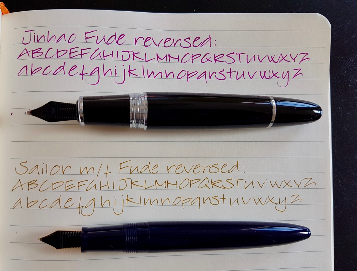
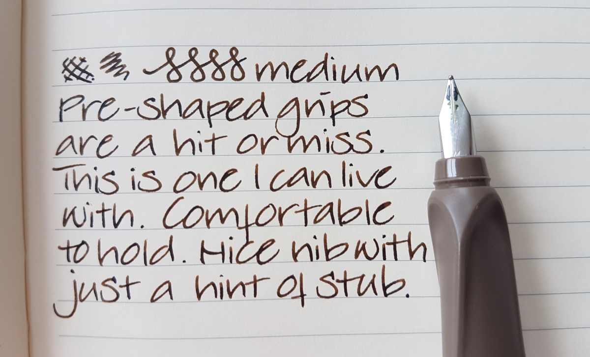
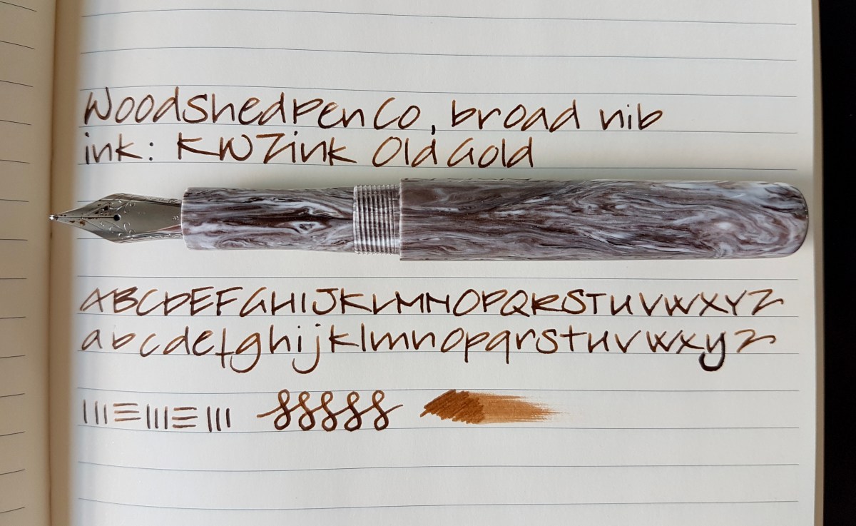
WoodshedPenCo is the nom de plume of Mike Allen, based in South Carolina, USA. He makes and sells pens of lovely acrylics and the above pen was on my mind for about a month before I decided to buy it. The pen was shipped together with a complementary home-made pen wrap, which was a lovely surprise. I chose the broad nib as well as a spare 1.1 stub. So far, I have only tried the broad nib. The pen came supplied with a converter, but it can also be used as an eyedropper. I am currently using the converter though. The pen is a lot smaller than the Galactic, but by no means is it a small pen. This is a size that will be comfortable for many a pen user. The measurements are: 13.5 cm capped, 12.8 cm uncapped, the slightly tapered section measures around 10 mm, the cap measures 16 mm and the barrel 13 mm. There is a step between cap and barrel as well as between section and barrel. It does not bother me, because I hold pens pretty close to the nib. The screw threads near the barrel are not sharp. The pen is rather straight in shape, which I like. The cap does not post, but I hardly think that will be a problem, even if you have large hands and hold the pen close to the barrel. The pen does not have a clip, which I don-t mind because that would only distract from the material. A subtle roll stopper would have been nice, though. The material is a beautiful taupe-cool brown with creamy white swirls and subtle golden sparkles. It looks like a cappuccino galaxy, I think. The #6 nib has the classic scrolls on the tines and the nib size stamped where the nib enters the section.

fullsizeoutput_475.jpeg
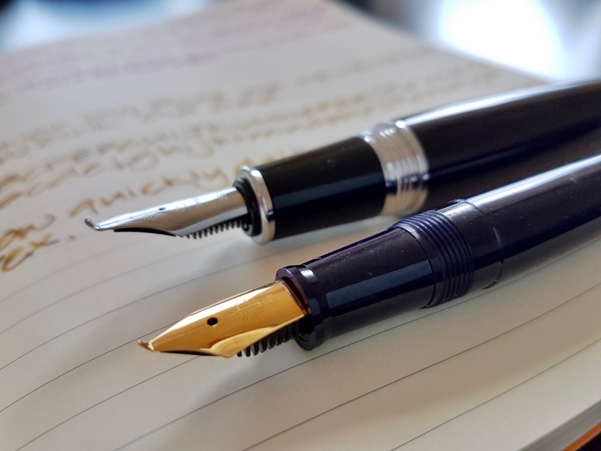
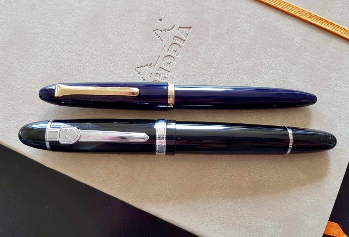
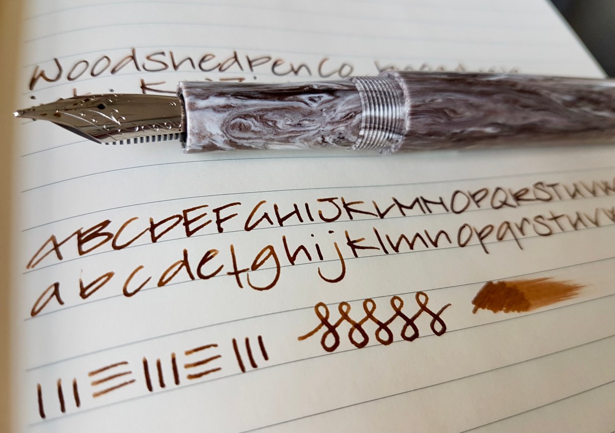
For its test run, I inked the pen up with KWZ Ink Cappuccino (yes, I mistakenly wrote Old Gold, still needed coffee, I think), I love how the smell of that ink combines with the look of the material. This nib is also true to size but with a slightly smaller tip than the ASA. The line width is a bit stubbish, with a broader down stroke than side stroke, which I appreciate. Especially since this nib is more rigid, this stubbishness gives just a nice hint of line variation. The flexed figure-8s show hardly any line variation. The smeared ink scribble also shows this is a nice wet writer, but a little drier than the ASA. General impression is that this is a very pretty and comfortable pen, the design and shape give the material the attention that it deserves. A beauty in an understated way. I love it! And I love the way these two pens look next to each other, especially with the ASA being inked up with a warm gray ink. I often air this pens when using them. So as a final picture, a capped side-by-side on my trusted Rhodia which I used for the above writing samples.
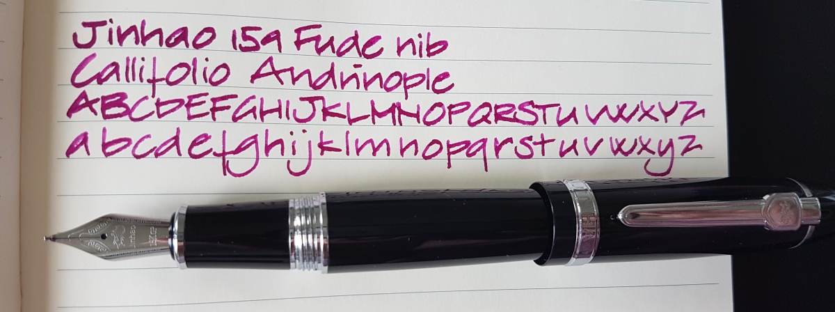
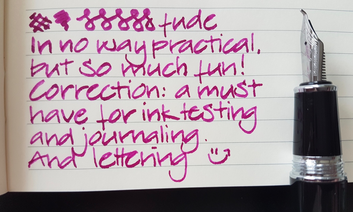
fullsizeoutput_474.jpeg

If you have any specific questions about these juicy broads, please drop me a comment.

Thank you as ever for reading my blog and until the next post!

Janine

Two fude pens compared

Lately you might have caught me basically fan-girling over fine nibs. As it turns out, I really, really like writing with finer nibs, especially on densely written pages. However, that doesn’t mean that my crazy big wide “unpractical” nibs are forgotten. Far from. So for today’s post, we’re taking a look at two Asian pens with fude nibs. No, spelling checker, not dude nibs, nude nibs, fuse nibs or oude (Dutch for old) nibs… Fude nibs! Wait, I’ll show you:

fullsizeoutput_469.jpeg

A sideways close-up of fude nibs. As you can see, it looks like they took a nose-dive from my desk and folded over on impact. However, these nibs are bent like this for a purpose. Fude is Japanese for “writing, or painting, brush”. In Asian calligraphy, a brush was and is an important tool for drawing the characters. So as soon as the fountain pen came along and had proven its practicality, it was no more than logical to try and mimic a brush stroke with a fountain pen nib. In my opinion, by simply bending the nib, that effect has pretty much been achieved. Of course there are fountain pens with brush nibs available, but this is a very practical solution as far as I am concerned.

fullsizeoutput_463.jpeg

The two pens

The pens I am using in this comparison are the Jinhao 159 (bottom) and a Sailor Fude pen (top). Both pens are ” entry level” pens, both have steel nibs. Still, they are quite different, in use as in the resulting ink line. The Jinhao 159 Fude, as well as other Jinhao models with a fude nib, are available online through eBay and possibly through other mega-sellers as well. The vary in price from around $10-15. The Sailor Fude is more widely available through online pen dealers as well as brick-and-mortar shops. In Europe, it is around $25-29. Lucky me was gifted this Sailor by a wonderful pen friend at a pen meet. I am in his debt for this gesture as well as his encouragement to start this blog. Thank you, Dries!

fullsizeoutput_468.jpeg

Above a bird’s eye view of the writing samples of the pens side-by-side. I used a Rhodia soft cover lined A5 notebook for these writing samples. As you can see, the line width both nibs produce will differ a lot with the angle the pen is touching the paper. That not only goes for how you hold the pen, it also goes for the shape of the page. At the left of the page, where the paper tends to bulge a bit, your ink line will be wider because the paper embraces the nib and as such picks up a fat line of ink. The more you hold the pen upright on flat paper, the thinner the ink line becomes because less of the bent surface touches the paper. The lower you hold the nib, the more surface touches the paper, the fatter the ink line. It is a fun tool! Unfortunately, I have no Asian calligraphy skills, so I kept it to my regular architect-ish print. How did these nibs perform?

fullsizeoutput_467.jpegThe Jinhao 159 Fude

The Jinhao 159 is a big and heavy pen. It imitates the Montblanc 149 and it is a show-off kind of pen. The body is metal, the standard nib size is a #6. Which means you can swap with other nibs, if you want to use this pen for more regular writing as well. The pen usually comes with a standard international converter and takes standard cartridges as well. The standard Jinhao nibs are a bit of a gamble. You might get a decently functioning one or you might have to tweak it a bit. I have bought and used three Jinhao 159 Fudes and all functioned rather decently. The nice thing about Jinhao nibs – and that goes for the fudes as well – is that they have a decent amount of spring. Not flex, but a good deal of bounciness. So writing with the Jinhao Fude is nice, with a bit of spring for extra line width. This can result in railroading, as you can see in my writing sample. The plastic feed cannot keep up with the ink demanded by the nib. However, when you want your ink line to look like it is painted on with a brush, the odd bit of railroading just adds to that effect. So I did not mind but if railroading gives you the creeps, you are warned. The brush effect is also emphasized by the regular kugel (round) medium tipping on the tines. This slightly curvaceous tipped nib gives a bit of extra structure to the writing.

fullsizeoutput_466.jpeg

The Sailor Fude

The sailor Fude is a plastic pen, the size of a 1911 Standard, so quite a bit smaller and lighter than the Jinhao. The body is molded plastic, which shows by a “weld” line on the section where the two halves were stuck together. Considering the price point, this is not a major issue for me. The nib is a gold-plated steel MF Sailor nib with the tip bent upward. Where the Jinhao still has tipping, the Sailor is untapped and therefore produces a much smoother ink line, with quite a bit of width difference depending on your angle of writing – how high you hold the nib towards the paper – as well as on the angle of your writing stroke. The Sailor gives great definition to your ink line and shows off shading and sheen to the max. By the way, the Sailor is also – proprietary -cartridge/converter filled.

Which of these I prefer? If I want a nicely ruffled brush line and I don’t have to use it for prolonged writing, I grab the Jinhao. If I want a pen that is more comfortable for me, grip wise as well as weight, with a slightly smoother ink line, I whip out the Sailor.  I use these nibs for ink swabbing, the odd high-lighted/faux hand-lettered name on envelopes, headers in journals. Not your everyday writer, but if you want to see what your inks are capable of, if you are a lettering artist or make art work with ink, journal or make mixed media art, investing in (one of) these affordable fun pens is something I heartily recommend.

Before I forget, you can also write with the nibs flipped upside down!

fullsizeoutput_46b.jpeg

This produces a finer line. The Jinhao however felt a bit rubbery on the upstroke, very weird. The Sailor gives a nice line, but the sweet spot is very small and deviating from it results in scratching your paper. A look at the reversed nibs:

fullsizeoutput_46a.jpeg

Fingerprints… yes, the inevitable result of using one’s pens… One more to look at the upturned nibs side by side.

fullsizeoutput_469

Once more, in short, a recommended pen (either of them) of you want to play with inks, make inky art, journal or want to hand letter envelopes in a jiffy.

Thank you as ever for reading and until the next post!

Janine

Fine nib noob

I must tell you, I am slightly confused and very much delighted at the same time. For more than a small handful of decades I have been a dedicated broad, stub, oblique, italic nib user. Yet I have always felt like missing out on something by not enjoying writing with finer nibs. It just somehow never clicked. Only recently, when switching back from a semi-cursive writing style to print lettering, and from starting this blog and doing ink swatches across the nib width board, I felt the need to give finer nibs another go. Only to find out I love them…

How did that happen? Well, first of all because I had to let go of many of the assumptions I had on fine nibs. That they would be scratchy, that my large handwriting would become wobbly and all over the place, that I would not enjoy my inks so much in them. The first extra fine and fine nibs I tried were the Lamy interchangeable steel Safari/AL nibs. However, I did not care for those and quickly changed to Platinum Preppies, which I liked a bit more. At a pen meet I got to try a fellow pen lover’s Pilot Metropolitan and Kaküno (thank you, Neseli!) and was surprised at how “friendly” the writing felt. Not too smooth, certainly not scratchy and I actually liked the ink lines they produced. So in the last couple of months I took some first steps into the world of the finer fountain pen nib. Let’s have a look at those I have tried so far.

fullsizeoutput_45f.jpeg
Esterbrook “J”, 9556 firm fine nib unit with J. Herbin Cacao du Bresil

Since most of us use pens for writing pages full of text, I thought showing a written piece would give you a nice idea the “read back” of these nibs. Esterbrook is a great pen in the first place. It is a widely available and affordable vintage pen with nib units in any shape or size that are interchangeable between all models. So the risk of getting one with a nib you do not like, is a calculated one, because you can always go for another nib (which are separately available through many places online). I already owned this Esterbrook with a 2284 stub nib, which is very nice and smooth, by the way, and recently was gifted this 9956 Firm Fine nib by a fellow Estie fan. I switched them out immediately and am loving this firm fine. It has a slightly architect-esque nib shape -as I found out many finer and extra fine nibs have- so just a nice hint of line variation. What I mean by that is that the nib has slightly elongated tipping, which makes for a thin downstroke and a slightly wider sidestroke. Very elegant, if only ever so slight in these finer nibs.

fullsizeoutput_460.jpeg
Pilot Prera Vivid Pink, fine nib with KWZ Ink Raspberry

Having tried the Pilots at the pen meet, I tried to look for a fine Metropolitan but only found medium nib pens in the vicinity. Then I saw the Prera in a couple of videos online and looked around for one of those. I found a Japanese seller through Amazon.de that would ship them internationally at no extra charges. The pen arrived after about a week, which was surprisingly quickly. It had a complementary pack of cute tissues included as a “thank you for shopping with us” gift, a sweet gesture that definitely rings my bell. As described in the picture, I liked this nib from the start. It wrote straight out of the box. I had had no issues with the writing experiences so far. The only thing is that it didn’t come with a converter, which I ordered separately. I do belief that the Pilot MR (the European Metropolitan) is designed to take standard international cartridges/converters. Please leave a comment if you happen to know more about that. — In the mean time, readers have commented their experiences in the comments. I recommend reading the comments if you want to know how they got along with the MR, cartridge and converter wise. —

fullsizeoutput_45e.jpeg
Delike New Moon, extra fine nib with Noodler’s Dragon’s Napalm and Diamine Marine

There is already a more extensive post on the Delikes on my blog if you want to read more about these pens. All I want to add here is that -for the money- these are lovely little pens. What I especially love about these extra fine nibs is that the inks I would hardly use because of the harsh read back a full written page would produce, I now love to use in these finer, thinner lines. So I will get more out of the inks that I do not like so much in my broader nibs! These are very much “inspired” by Sailors like the Lecoule and Pro Gear Slim, so I felt somehow justified to go after the next pen…

fullsizeoutput_461.jpeg
Sailor Professional Gear Slim Pink, fine nib with Noodler’s Ottoman Rose

Oh, guys… this pen. I knew from having a 1911 Standard I would like it, but that nib has came to me meistered by John Mottishaw, so I was curious what an out-of-the-box fine would feel like. And I so love it. The feeling of writing with this pen is and sounds like a pencil. Writing with this nib is a pleasure to the senses. I have always found writing a very sensuous activity to begin with, but using a nib as tactile as this… It’s a very, very nice writing experience. Okay, you get my point. I can see more fine or extra fine Sailors in the future, perhaps even a Saibi Togi. Mama needs a new pen money jar, kids!

What I have found to enjoy most about the finer nibs is the read back experience, the look of a page after you have filled it with writing, as Brian Goulet has formulated it. Especially with brighter, bolder inks, the look of the page is much more pleasing to the eye, which also makes more inks office or work appropriate. Plus, the already widely acclaimed pro of writing on not so FP-friendly paper and writing in between printed lines for comments and editing. And I have always enjoyed writing on dot grid or graph paper, which means my big print is more easily legible with a finer ink line. So, in conclusion, I must admit at having been converted into finer nibs. That does not mean I love my broader, stubbiest, italic wide-a** nibs less. It just means there is more to love!

How about you? Have you changed nib sizes drastically at some point or do you stay true to one size? I would love to hear from you.

Thank you as ever for reading and until the next post!

Janine

Three very different piston fillers

Piston fillers, or piston filled fountain pens, have something of a status in the pen community. There is absolutely something to be said for a fountain pen that comes with its own integrated ink filling system. A piston filler is not as finicky as a vac filler and is considered a step up from cartridge/converter filled fountain pen. In this post I will look into three very different piston fillers: an entry level pen, a design icon and a classic beauty.

As with most fountain pen users, my first fountain pens were all cartridge filled. During secondary school in the eighties, I discovered the delight of the converter and started hoarding those to fill my pens with inks from pots instead of cartridges. Since then, my pen family has grown quite a bit and I have used piston filled fountain pens in different formats for some time. I am certainly not a piston filler expert, but I am very happy to share with you some thoughts on three different piston fillers.

First I have done a very basic “what’s what” for a piston filler, demonstrated by my lovely assistant Aurora below.

fullsizeoutput_45d
Parts of a piston filler

As a matter of fact, the innards of the piston filler consist of more parts than described above, but since this is just an introduction and not a “how to dissect your piston” blogpost (and because each brand will have a slightly different piston mechanism) I have limited the above picture to the most basic parts. The piston filler is operated by turning the blind cap or piston knob, which will push down the piston seal towards the nib unit. Holding the nib unit in the ink bottle and twisting the blind cap or piston knob back towards the body, will result in the ink being drawn into the body.

Cleaning the piston filler is done in much the same way. I usually rinse the nib unit first under a dripping tap, expel the final drops of ink and draw up clean water from a cup, expel, rinse, repeat, until the water that comes out of the pen is clear. This is the beauty and much beloved aspect of piston fillers: the draw up loads of ink and clean out pretty easily. I have not yet had the need to take my pistons apart for lubricating the seal, but when I do, I will definitely do a post on that. Not using pen flush or detergent when cleaning your piston filler, will help keep the piston greased up longer. Use it if you absolutely must because of a sticky ink, but with regular inks just plain water will do fine for cleaning. Now, on to the pens!

fullsizeoutput_45a

TWSBI Eco Clear, 1.1 stub

TWSBI has revolutionized piston fillers by bringing very affordable, self-maintenance-friendly piston fillers on the market. And demonstrators to boot! This is very nice, because this allows you to see the mechanism in working order. And look at your ink sloshing around in your pen during meetings. The TWSBI Eco has an ink capacity of a whopping 1.76ml. The pen has a nice range of steel nib options from extra fine through B and a 1.1 stub as shown above. The pen is made of resin, has a screw-on cap which pushes to post very securely on the blind cap. The rubber ring that secures the cap keeps you from operating the piston knob by accident. However, posting the cap will make the pen as long as Harry Potter’s wand. The unposted pen is long enough to be used by hands of any size. A very decent and fun entry piston filler, for around $29-35 depending on where you live.

fullsizeoutput_45c

Lamy 2000, medium nib

The Lamy 2000, or L2K as affectionately dubbed by aficionados, was designed in the mid 60s at the request of Dr. Manfred Lamy, son of Lamy founder C. Josef Lamy, by Gerd Muller, who had previously been an influential designer at Braun. Manfred Lamy wanted to bring an entirely new clear and functional pen design on the market, aimed at “successful middle-aged men… image-conscious but tended toward understatement”, according to the Lamy website. Well, they certainly succeeded in bringing a very successful new design on the market, because more than 50 years later, this design is still much loved and widely coveted. I used to belong to the “nah, I do not care for that boring black pen” school for a long time. Until I took a better look at the zeppelin shaped body. Hmmm, did I actually start to like the pen…? Still there was that cap that did not yet ring my bell. But then again, I was very curious about the Lamy 2000 nib.

At a Pen Show, I got to try The Pencilcase Blog’s Lamy (thank you for trusting me with your pen, Dries) and was sold. The clip is spring-loaded, which I absolutely love. And I finally started to appreciate the contrast of the cap and body combined with the feel of the Makrolon material. The way in which the blind cap fuses seemingly seamlessly with the body. So when I spotted a set of a fountain pen and ballpoint Lamy 2000 at an auction site, I set a limit for myself and even managed to stay under it. Very happy to have taken that step! Now for some statistics: the Lamy holds 1.35ml of ink, it comes with a 14k springy (not flexy, just springy) nib available in EF through OBB. The material is Makrolon, a black fibre-glass, and stainless steel. The L2K has a snap cap and is portable, but I love using it unposted because of the nice body shape. The hooded nib allows for using the pen held close to the nib (not too close though, the pen will then be pushed backwards out of your grip) or anywhere on the body because of its sleek design. A new Lamy 2000 Makrolon will set you back about $150.

fullsizeoutput_45b

Aurora Optima Burgundy, medium nib

I must be honest and tell you up front that this is the darling of my piston fillers. It is such a classic beauty! The nib writes like a pencil and it sings to me when it’s happy with the paper I use her on. And just look at that material… But first things first. Aurora is an Italian pen brand that was founded in 1919 in Turin. Up to today, it is still housed in its original Turin factory. All the parts of this pen are made in the factory; this goes for the nibs as well. The trims are hand-finished, the pen has an ebonite feed which is a lovely dark red and a hidden ink reservoir. Because of the pencil-like feel of the nib, I love using this pen for doodling and faux calligraphy. But this is also the pen I use as my bullet journal pen or when I have to fill in or sign documents. It gives that moment a bit of extra meaning. I love the grip on the section, which surprised me pleasantly because I hold pens pretty close to the nib, but the step between section and nib is so pleasant to the touch, that I can write with this pen for hours without feeling cramped up. And of all the pens dealt with here, this has the most smooth running piston. The pen is cleaned and filled in no time. The nib unit can be screwed out completely for a good rinse. Or for switching up between nib sizes. Which is a very nice aspect of this design.

I find myself staring at the scroll work on the nib when I use the pen, it’s so pretty. Oh yes, back to business, sorry… the 14k nib comes in many options, from EF through OB, plus stub and italic. The piston holds an impressive 1.43ml of ink, and the ink window between section and body allows you to see how much ink you have left. The body is made of Auroloid which contains antique celluloid materials. The depth and colors of this material are notoriously hard to justify in pictures. My friend bought herself an Optima in Nero Perla and that is a very sexy see-through material. You can just see the nib peep at you through the cap… very alluring. The cap screws on the body and can be pushed to post. This will lengthen the pen for people with large hands, although the pen will still rest easily between index finger and thumb when unposted. The Auroloid feels very organic to the touch, it’ll warm up just ever so slightly without becoming slippery.

The Aurora is a staple in my every day carry and as such one of the pens I use on a daily basis. The nib is one of my rare mediums and the one I like using the best. If you get the chance to try one out, by all means do so. The price ranges from $450-495, and there are sellers who are currently having pretty good offers on Optimas… just saying… It is a bit of an investment, I am aware of that, but one that will bring you pleasure every time you use it. So, for a special occasion or just to treat yourself to a beautiful, functional writing instrument, this is definitely a pen I would recommend.

To round up, a couple of side-by-side images.

fullsizeoutput_457
The pens, capped

fullsizeoutput_456.jpeg

fullsizeoutput_455.jpeg
The pens, unposted

I hope you enjoyed reading this post. If you have questions about these (or other) pens or pen issues, be sure to let me know. If I do not know the answer, I can usually direct you to someone who can.

Thank you as ever for reading and until the next post!

Janine

Page of Shame revisited

Some time ago I posted a Page of Shame of 30+ inked fountain pens. I know…. That was becoming a bit too much for daily use, even for my doing. So I did the inevitable and had my pens undergo a “fountain pen triage”. I divided them in pens to keep in my EDC (or at least at hand), pens to clean and store and pens to consider for sale. Now deciding which pen to store was hard enough, but deciding which to sell… That is still really hard. There is one pen I have decided to put up for sale some time ago, because I just do not use it enough. I’ll mention that pen later on.

Most of the pens I cleaned and stored are vintage pens, TWSBI’s and a couple of my numerous Jinhaos. I love them all, but wanted to store the vintage just to be a little more careful with them, the TWSBI’s because I already have a lot of stubs and demonstrators in action and the Jinhaos because they take up a lot of room in my EDC. For cleaning I first flush the pens under a running tap and drain the pen by flushing it with water a couple of times from a cup or glass, then a spin in the sonic cleaner (a jeweler’s cleaner, available at jewelers and drug stores) and then a final flush with clean water and putting them out on a towel to dry.

Let’s rather go over the pens I kept inked or re-inked and why.

fullsizeoutput_449.jpeg

Clockwise from the left:

  • Aurora Optima Burgundy; this pen has been inked up since I received it last Winter.  Sometimes with burgundy inks, but I usually keep it inked with Aurora Black because I love how this combination behaves. I use it for doodling, faux calligraphy and bullet journaling.
  • Bexley Jim Gaston Holiday 2002; my first Pen Show acquisition from the dangerous tables of Sarj Minhas. This stub is so juicy and generous, it makes your writing look amazingly effortless. I love using it for addressing envelopes and packages.
  • ASA Pens Galactic; a recent acquisition so I need to get a few more writing miles under my belt to tell you how this is working for me. First writing impressions are very favorable.
  • Pelikan Twist Bronze; I first bought the Jungle you will see later on online from Germany and liked it so much I ordered this Bronze within 24 hours… It has a really lovely medium nib, not too wet, certainly not too dry. I just love these “adult”  Pelikan Twist versions. Good pens to just chuck in your bag.
  • Mabie Todd Swan 3250; one of the first vintage pens I bought just from looking at the nib and the writing sample the seller provided. This is a great writer. It is not much of a looker, but every time I put nib to paper, I don’t care about that. Usually inked with a deep burgundy or brown ink.
  • Sheaffer 330 “Quasi” Imperial; one of two Sheaffers bought in one lot. The other one is an oblique and I cleaned and stored that one. This is a beautiful crisp stub and I love having shading red inks in this pen.
  • Delike New Moon Pink; if you want to know more about this pen, please click here for a full “first impressions” review.
  • Pilot Prera Vivid Pink; bought after falling in love with fine Pilot nibs I tried at a pen meet. If you are a broad nib lover, Pilot fines are good fines to try. The Kanuno, Metropolitan or MR also come in fine.
  • Franklin-Christoph M65 Antique Glass; I really loved getting a FC pen in this material so when I was in time for a sign-up waiting list, I was over the moon. More on this and other FC’s in this link.
  • Franklin-Christoph M45 Cherry Ice; a lovely little pen and one of the Stub.Italic.Gradient FC nibs. Also more on this pen under the link in the previous bullet.
  • Kaweco Skyline Sport Pink; I love Kaweco Sports for nib grinding. This has the final drops of a Noodler’s sample. I’ll be sorry when that is gone.
  • Online Germany; also a victim of my nib grinding exercises. A colorful pen. I used to get an Online fountain pen fix every now and then wen my boys where babes and the money mostly went to diapers.
  • Franklin-Christoph M45 Italian Ice; one of my favorite color-model combinations from the Franklin-Christoph range. Also more on this pen here.
  • Pelikan Twist Jungle; a stealthy pen that suits every situation. It will even stand up for itself in the boardroom.
  • Montegrappa Fortuna Mosaico Marrakech; no picture does the depth in this material justice. When the pen arrived, the nib wrote on the dry side, but I tuned it up and it’s a great writer. I am always on the hunt for the perfect blue to match up with the material.
  • Montblanc 254 oblique medium; this nib is something else, in shape as well as in performance. Read all about it here.
  • Franklin-Christoph M66 Stabilis Solid Ice; the first FC I ordered and a beautiful expressive nib.
  • Sailor 1911 Standard Zoom Architect; always in my EDC. A nib that offers stunning line variation. Read more about this pen here.
  • Delike New Moon Sky Blue; a great first extra fine nib.
  • Inoxcrom Agatha Ruiz de la Prada; just a fun pen. I was mostly lured to it because of the polka dots but the nib isn’t half bad.
  • Kaweco Skyline Sport Mint; these fifties colors are so cheerful and suit this pen shape very well. Another double broad ground into an architect.
  • Lamy 2000; what can I say. A pen that many of us female pongees thought just a bit “meh” at first. But then I really fell for that torpedo shape and when I had the opportunity to try one, I was smitten and hunted one down at an online auction. I believe it is a medium but I gave it a crisp stub. It is surprisingly springy for a hooded nib.
fullsizeoutput_44a.jpeg
Writing samples of the pens that survived my triage. Plus an Emily Dickinson ink blob on Emily Dickinson… 

Now I have one more pen on its way, to be completely honest. If I write one of the above dry in the mean time, that one will be switched out for the new pen. To see which pen is currently in transit… keep an eye out on my Instagram feed.

Unfortunately I do not have one pen case to carry all 22 and still fit in my work bag, so here’s a bird’s eye view of the current pen cases. Usually I choose which to bring to work the night before.

fullsizeoutput_447

The pen I will be putting up for sale is a Montblanc Chopin (145) from the year 2000 with an oblique double broad nib. It is a beautiful pen but I just do not use it enough to justify keeping it. If you are interested, please contact me for pictures and price.

If I will be able to continue whittling down my EDC… I will keep you posted.

Thank you as ever for reading!

Delike New Moon fountain pens

Had I not started this blog, I would not have thought twice about trying extra fine nibs. I have been a broad, stub, italic, gushing nibs user for most of my fountain pen life. But when writing reviews, you have to look past your own preferences. And when doing ink reviews I like to show what the ink looks like in most nib sizes. The hunt for the finer nib began. At first I got all Lamy nibs from EF through 1.9mm, but the quality of those nibs, especially the size accuracy on the EF through B nibs left a lot to be desired. Then I ordered three Preppies in EF through M. Those will do nicely for ink reviews, but I wanted to try more fine nibs to get more comfortable with them.

Then I saw a lovely Instagram pic by @pixiegeek and was smitten. Not only by her beautiful handwriting, but especially by the ink line from a particular extra fine pen she used, a Delike New Moon. It looked like the finest of architect grinds. And I love the line effect of the architect. Thank you for enabling, Christiana! I looked them up online and found a great deal on eBay, two pens, including shipping from China, for about 32 Euros. The color options included a mock celluloid material and a sky blue and pink solid plastic set. I opted for those. The close-ups of the nibs gave the impression of two very thin metal disks pressed together, indeed much like very fine architect grinds. Hardly any tipping at all! So for the blog’s sake, I ordered them straight away.

20170328_130445.jpg

About two weeks later the package arrived and much to my surprise it also included a powder blue PU leather pen case. The pens were wrapped in individual plastic sleeves that mention “Hero”  but I am yet to find out if Delike is a Hero sub brand. Please comment if you know more about this. The pen case is quite nice, but the elastic strap offers only room for one and a half pen, so I usually put one in the strap and I let the other sort of roll around next to it. At this price point, I’m not too bothered about that.

20170328_130743.jpg

The case also has a little top and bottom flap to protect the pen that is lucky enough to be put in the strap, from scratching by the zipper. Still, a nice extra and the great thing is, the case doesn’t smell too much like PU… I am afraid though that hoisting this around in my bag will make the edges fray so I will not use it as an office pen case. Plus, it looks nice just sitting at my desk.

On to the pens. Since there aren’t many reviews around about them, here are some measurements and statistics:

  • weight capped and filled: around 12 grams;
  • length capped: 123mm;
  • length uncapped: 110mm;
  • length posted: 135mm;
  • cap band diameter: 14mm;
  • section (grip) diameter: 9mm.


fullsizeoutput_444.jpeg

The pens have a screw-on cap, the cap posts pretty securely. I like the pens having the same color plastic throughout, so no black section or blind cap. The blind cap has a silver colored decorative ring. It does not screw off. The clip has enough spring to be functional and can be lifted up with the same hand while holding your pen. It is tight enough to secure your pen to a pocket. There is a slight hollow rim between the cap ring and the plastic but not enough to make it fragile or to be aesthetically annoying. The cap screw thread on the section has some leftover loose plastic bits from thread turning, but those are easily wiped away. The cap band has “DELIKE” stamped beneath the clip and “New Moon” on the opposite sight. A nice detail, let’s say “borrowed” from Japanese pen models. To which this pen bears quite a resemblance… So a nice pen to “fake it until you make it” as they say. All in all, this pen is about as refined as you might expect for the money. Still, refined enough to bring to school, uni or even the work place.

fullsizeoutput_442.jpeg

Another pleasant surprise was that the pens came with a converter. There is a small metal band around the nipple and a broad metal band with a nice flower stamped on above the turning nob. Pretty decently performing converters so far. I haven’t yet tried standard international cartridges in the pens, but judging from the converter nipple, those will fit.

fullsizeoutput_443.jpeg

For a size comparison, I put the Delike New Moon next to my Sailor 1911 Standard, which is already a relatively small pen. This makes the Delike a nice writer for people with smallish hands, like myself. So if the 1911 Standard is too small for you, you will feel the same about the Delike. Still, when posted it might just be comfortable enough and girth-wise they are the same.

20170328_131900

The steel nib has a sphere-like engraving over “DELIKE” and “EF” under the breather hole. The tines end without any noticeable tipping and this makes for the very slight line variation effect. This also gives the writing experience a slight bit of feedback. I have not experienced either nib as being scratchy but with these very fine nibs I have found keeping a very light hand works best. Which is good practice for me because normally I write with quite a bit of pressure.

20170328_133718
Delike writing sample in a lined Rhodia Soft Cover A5 notebook

I have found writing with both pens a pleasant surprise. These nibs are not the wettest writers as you can see from the smeared wriggles and I could feel the difference between the Diamine in the sky blue pen and the much more lubricated Noodler’s in the pink pen. The pink pen as a result writes a tiny bit more smoothly, but if I were to put a more lubricated ink in the blue pen, I bet I would get the same result. I love that these pens are comfortable for me when writing in my usual largish hand as well as when writing small. I am not good at small writing, and I bet experienced small writers can get these pens to write even smaller. Ideal pens for starters in the pen world who have to write on paper that they cannot choose themselves, for maths, bullet journaling or just to have around with some pretty inks in them.

In conclusion, I was very happy to be enabled in this starter’s investment into extra fine nibs. The only problem is -and don’t tell me you don’t recognize it- that now I am curious about other extra fine Asian pens. Well, that’s fountain pen life for ya! I’ll be sure to keep you posted on further extra fine experiences from this spot as well as on Instagram. And if you have any pointers on good (extra) fine nibs out there, be sure to share!


Four more nibs plus one extra

Hi everybody and Happy Mothers Day if you live in a country that celebrates it today! Over here we Mothers Day is celebrated in May, but I do have the house to myself right now and I am going to make the most of that by taking it pretty easy in this post. I feel a cold coming on so I’ll be taking a load off after posting this by rewatching some amazing YouTube videos on Japanese Masters of Fountain Pens. So relaxing!

But first four nibs plus one extra. Why one extra? Because the writing sample of the fifth didn’t fit on the written page as shown above. Practicality first! Because of the budding cold I am keeping it mainly to writing samples and nib shots of:

  • Delike New Moon extra fine nib (for which I was completely inspired by Instagram’s @pixiegeek. Go check out her feed if/when you’re on Insta, follow and give her some FP love!);
  • Pilot Prera Vivid Pink fine nib;
  • Pelikan Twist Bronze medium nib;
  • Franklin-Christoph broad stub.italic.gradient (S.I.G.);
  • Jinhao 159 fude nib.

So as you can see, there’s a nib size for everybody in today’s post. I think writing samples are great references for nib performance, plus I really enjoy doing them. And I always enjoy seeing other people’s writing online. I have a couple of handwriting crushes, but I will go into that in a later post. Let me know if you do!

The paper used is a Rhodia Soft Cover A5 lined journal.

Hope you enjoy the pictures, and if you have any questions, please do leave a comment. I always enjoy reading your messages!

Delike New Moon extra fine nib

fullsizeoutput_441.jpeg

Pilot Prera Vivid Pink fine nib

fullsizeoutput_440.jpeg

Pelikan Twist Bronze medium nib

fullsizeoutput_43f.jpeg

Franklin-Christoph M65 Antique Glass broad stub.italic.gradient (S.I.G.)

fullsizeoutput_43e

Jinhao 159 fude nib

fullsizeoutput_43d

fullsizeoutput_43c

Thank you for reading (watching :-)) this post and until the next one!