
Yesterday I posted a picture on Instagram where I had apparently alternated gold and steel nibbed pens. Steel nibs are often and unjustified thought “less” of than gold nibbed pens. Granted, there are steel nibs out there that are not really that impressive. However, when executed properly, steel nibs are often as enjoyable (and some even more so) than many a lesser well-finished gold nibbed pen. Basically, if you mess up a gold nib or steel nib, it is not going to write properly. If finished and set well, both are equally enjoyable in my opinion. Plus, steel nibs are often a lot more affordable. So this morning I selected five pens with steel nibs and I set myself one rule: that they still had the shape they left the factory with at some point. And all of these are still available in some way, either through regular sellers or through vintage sellers. These are the pens I ended up with: an Esterbrook “J” with a 9556 firm fine nib, a Montegrappa Fortuna with a medium nib, a Franklin-Christoph model 45 with an extra-fine nib, a Sheaffer 330 with a factory stub nib, a Pelican Twist with the standard medium nib.
Esterbrook “J”, #9556 firm fine steel nib

This Esterbrook is one of my favorite pens ever. Not because of how it looks -to be honest, I am not a big fan of this material- but purely for its very democratic design and interchangeable nibs. Anyone can write with an Esterbrook and if you are looking into vintage pens, this is the brand to seek out. If you have any Esterbrook model, any of the screw-in nib units still widely available will fit in that body. My current tally is two bodies and four different nib units. This firm fine #9556 and the flex #9128 being my favorite two so far. The Esterbrook nibs are renowned for their smoothness. I dare say that these are the smoothest steel nibs I have had the pleasure of owning or trying so far. Always tuned properly, no misalignments, giving a decent but not too wet ink line. I do actually like nibs to be a bit toothy for control. My hands tend to shake a bit because of hyper mobility so a hint of tooth makes your nib not go all over the place. These nibs just seem to know where to go. If ever there was a steel nib suitable for school use and if cursive fountain pen writing was ever reinstated in schools, I would heartily suggest trying to make the nibs as great as these. If you are looking for a good value pen with a steel nib to practice cursive writing, try and find yourself an Esterbrook, with a properly working sac and lever. I bet you will not regret it. This nib has a slight hint of architect shaped tipping, which I absolutely love. It is pretty rigid, so no flexing here. If you are after that, try to hunt down the 9128 Esterbrook nib.
Montegrappa Fortuna Mosaico Marrakech, medium nib

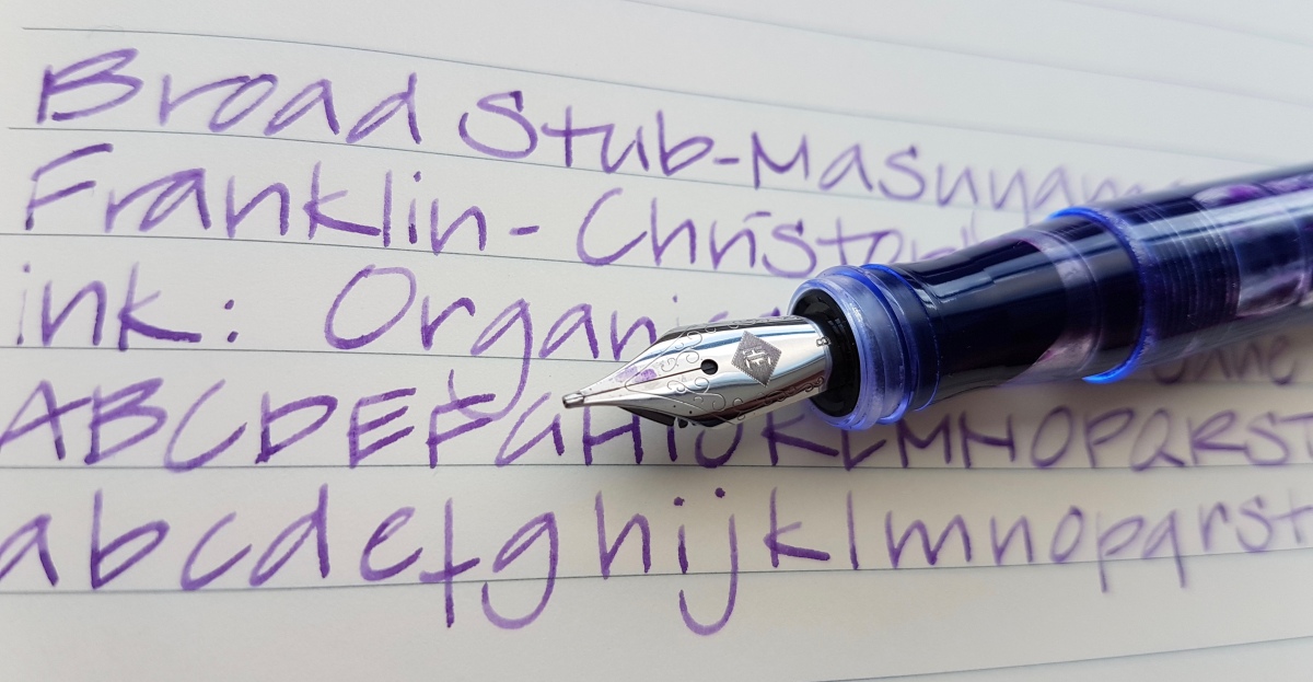
Franklin-Christoph Model 45 XLV ES, extra-fine nib

Okay, this particular finish may not be easily accessible, but the nib is the standard #5 extra-fine nib that is available on each of the smaller Franklin-Christoph (later mentioned as FC) models. This also goes for the larger models that hold a #6 nib. I have written with various broad grinds from FC, and all are beautiful. Italics are on the crisp side, though. This extra-fine is a perfect medium between smooth and toothy, a great nib to try if you want to explore fine-nib-territory. It is definitely a western extra-fine, comparable to medium-fine or fine Asian nibs. It has a bit of bounce, but do not flex it, it is not meant to be flexed so the tines may spring if you do that. I would definitely recommend this nib if you have to write on unforgiving feathering paper. The model is a great pocket pen and will definitely turn heads, in any of the available finishes. It is with reason one of the most collected FC models. Many a pen user who is familiar with this maker has set their heart on collecting a “rainbow” of FC Model 45s. The other nice aspect of the FC pens is that the nib units are changeable and most are readily available on the Franklin-Christoph website.
Sheaffer 330 (Quasi Imperial), stub nib

This Sheaffer from the 70s was a very fortunate auction find. The typical inlaid nib is also found in gold on more higher end models. I love this nib, even though changing nibs means changing entire sections. Which can be done, because these nib unit-sections are still to be found with vintage pen sellers. I have also spotted stub inlaid nibs on eBay and I suspect pen shows are also a place where you can find these pens. This model was quite common in the seventies. It is not the most refined Sheaffer material out there. The body is basically cast plastic but the section is very pretty and the pen has the Sheaffer aerometric converter. But back to the nib. This nib is in a league of its own. It is a crisp, italic-like stub. It puts down a very elegant ink line that is nice and generous. Definitely a nib for expressive writing. Granted, the crispness also gives it a bit of a sweet spot which can cause hard starts if held so that just one of the tines hit the paper. But hold it properly and it gives you the most gorgeous ink line. For some reason I keep inking this up with deep reddish inks. First Montblanc Corn Poppy, now Diamine Crimson. Diamine Oxblood may also have been in this pen at some point. Very dramatic and very chic. This is an adult pen. Businesslike exterior, but a naughty nib.
Pelikan Twist Bronze, medium nib

Talking about an adult pen, I think that this particular finish of the very affordable Pelikan Twist is a perfect alternative if you want to try this pen and do not care for the regular bright colors this model also comes in. The ergonomic grip makes this an ideal pen for adults who need a little support gripping their pen or for young(er) subtle-bling lovers getting into fountain pen writing. The Twist comes in only one nib size: medium. The three Twists I have tried so far have been pretty consistent in nib width and ink flow. As is common with Pelikan nibs, their nib width is quite generous. This medium ink line compares easily to other (also European) broad nibs. The ink line has a slightly stub-like character and it is in between rigid and bouncy. It has a good amount of tooth for grip on the paper. Perhaps just a bit too much for first-time fountain pen users, but for people with unsteady hands who want to keep on using fountain pens, this pens is ideal. I love using it for cursive, because of the grip it offers in shape as well as on the paper. At €8-9 it is a pen you can easily take it with you, toss in your bag and carry around. The triangular and sweeping shape makes it also pretty sturdy. One of the best pens in this price range, if you ask me.
So, great steel nibs to be had in every price range! It is good to know that you don’t need to sell a kidney or take out a second mortgage to be able to enjoy a great pen. Or two. Or… more… Of course, it is so very thrilling to buy that first gold nibbed pen, but until then, and after, there are so many pens with steel nibs worthy of our love and attention! What is your favorite steel nib? I would love to know! Do leave me a comment.
Thank you as ever for reading and until the next post!
Disclaimer: the link in this post is not an affiliate link.


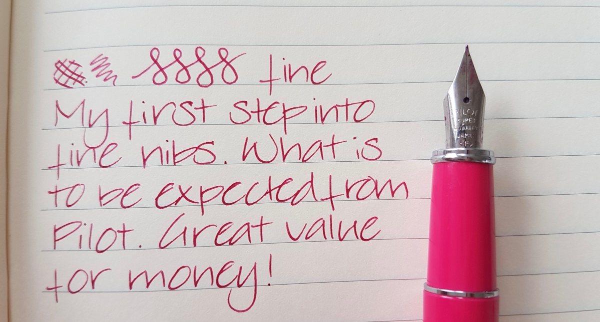
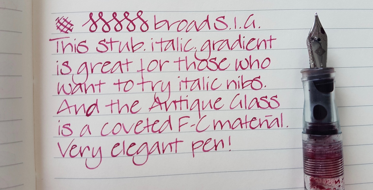


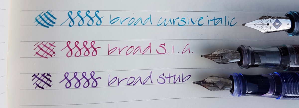 The line variation is clearly most pronounced in the broad cursive italic. The S.I.G. is italic on the upside of the nib and a stubbish bottom nib where there is a tiny bit of tipping left. The stub has tipping material left on the upside of the nib and on the bottom. The uttermost tip of all broads is pretty flat to account for the line variation. All pretty interesting nibs and I am happy I chose them. The BCI gets its use on special occasion writing and the S.I.G. and stub are pretty much daily writers.