Yenderings Toronto YYZAM01 Pen Roll

August of 2017 I had the unbelievable opportunity to visit the DC Fountain Pen Super Show, which was an amazing experience. Apart from being overwhelmed by all the stunning pens, the best thing about the show was meeting the wonderful pen people and seeing online friends in real life. One of them is Yen Yen, also known as @2Yens on Instagram. We talked pens and small business and she told me about her dream plan of selling the pen rolls she made herself. I loved the roll she was carrying with her and she asked if I would be interested in doing a review of one as soon as she was ready to launch her shop. I happily said yes and a couple of months after DC when Yen Yen was on the brink of launching Yenderings I had the opportunity to test drive the site, together with a couple of other insta pen friends. Her website is a joy to visit, beautiful pictures, clear, concise item descriptions and a lovely choice of fabrics. I chose a Toronto AM pen roll to try out and review because I love monochrome base colors with a good red pop of color to dress it up a little. I have had a good few months to try it out and I love it! So, let me tell you a little bit about it…

fullsizeoutput_509

WHAT IS IT

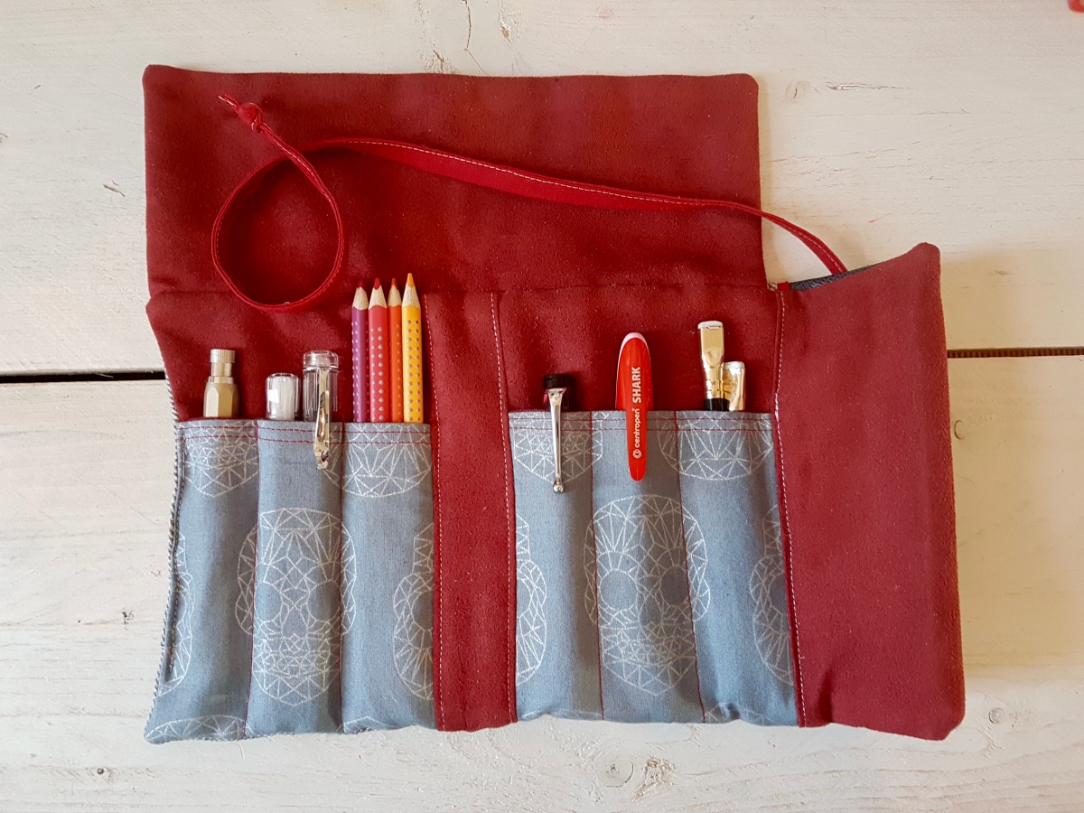
The Yenderings Toronto YYZAM01 Ride the Rocket pen roll is a fabric fold-over pen roll to hold six or more pens or other stationery necessities that fit in the pen pockets. The back pocket holds at least two A6/Field Notes sized notebooks and has room for even more pens. The pen roll folds open to six pen slots, three on each side of the “spine”. The back has a slanted notebook slot. The stitching is very neatly done and the spine is stitched so that it provides a good support when the roll is folded. The fold-over flap is made with a nice contrasting leather. The inner material is a soft ultrasuede that will not be abrasive to your pens. The pen roll closes with a hand-sewn wrapping chord.

Apart from the Toronto model, Renderings also offers the London models which will hold an A5 sized notebook and more stationery supplies.

fullsizeoutput_508

MATERIALS USED

Yen Yen gives nice comprehensive lists of the materials she uses for each of her models and choice options. The Toronto AM01 Ride the Rocket is made of a grey herringbone cotton/linen blend on the outside. The lining is of red ultra suede, a soft ultrasuede that will be very kind to your pens. A hand-sewn cotton chord is attached to close the pen roll when folded over. The feature fabric -as Yen Yen calls it- is the material used for the pen slots, a grey fabric with a graphic silver skulls pattern. The material used for the fold-over flap is a pressed leather. It gives the suit-like herringbone a nice little edgy oomph. I love the combination of materials, a neutral base with plenty of attention-grabbing elements. An EDC roll that is something quite different from what’s available from large-scale producers.

fullsizeoutput_507

WHAT DO I CARRY IN IT

Because the Toronto in this color scheme fits perfectly with the A5 red leather diary I use for family matters, I have been carrying my diary and journaling supplies in it. Left to right above: a Koh-I-Noor Hardtmuth 5.6mm lead holder aka mechanical pencil (a Dutch Pen Club gift from Dries), a Pilot Kaküno Clear and a Caliarts Ego that fit snugly together in the next pocket, four Faber-Castell colour grip pencils, an Aurora Optima, a Centroped Shark (kindly gifted to me by the lovely Mishka) and two Blackwing pencils. In the back pocket is an Ed the Cat Notebook, which is Field Notes sized. I have also carried small rulers and correction fluid pens in the pockets.

For watercolorists, I imagine the back pocket will easily hold a small pallet of pans and a small watercolor art book. Super nice for nature hikes or urban sketching!


This slideshow requires JavaScript.


WHAT’S IT LIKE IN USE

As I have been using the pen roll for my daily family diary, I have used it intensively over a couple of months and the one thing that I noticed is how nicely the materials have settled pretty quickly. It is like a pair of jeans, it warms up with wear and use and holds your stationery items with style and comfort. I was worried that I might find the roll too soft, being used to hard shell and leather covers and pen cases, but the double material layers and lining helps to give this pen roll sturdiness. The hardwearing stitching and having a notebook in the back pocket all add to the backbone of this pen roll. That’s what I enjoy about it: it is pettable practicality! It’s ideal for carrying your school, uni or office essentials with care and style. I love the combination of fabrics, colors and materials. I did have to get the hang of using the wrapping chord, but that is just me being clumsy. The chord is long enough for a wrap and tie. Sometimes I fold the chord one turn extra and tuck it in the back pocket for “quick release”.

SHOP AGAIN?

For sure! I love supporting small businesses and owning original things. Yen Yen will also take custom orders for special fabric combinations. The attention to design, use of fabric and color combinations make these rolls stand out from other pen rolls and journal covers. So a huge thank you to Yen Yen for reaching out to me and trusting me to try her design! Wishing you every bit of success Yen Yen and so hope to see you again one day!

DISCOUNT CODE!

Yen Yen is kindly offering a discount code for my blog readers. Use the coupon code Janine10 to get a 10% discount at check-out. Thank you, Yen yen for this gracious discount! Visit her webshop at www.yenderings.com.

Disclaimer:

I received this item for test and review purposes. I paid for shipping myself. I was not otherwise rewarded for this review. All views, opinions and pictures are my own. This blog post does not contain affiliate links.

The year calendar lay-out in the top photo is designed by Laura Krenk of @nerdy.teacher.  I purchased her diary lay-outs through her Etsy shop.


A swoopy cursive

There are days when I wake up feeling like trying a new style of writing, just for the fun of it. Right now, I am pretty happy with the print lettering style for everyday use, but I also love to see cursive writing. My only problem with cursive is that I cannot keep the pen on the paper without lifting to write one word in one wriggly stroke. For me, it is a lot more comfortable to do a “stop-and-lift” style of writing, so I can move my arm from the shoulder further down the paper instead of writing from hand and wrist alone. So I took the idea of stroke-like print lettering along when trying a cursive style. I didn’t want it to look like a cursive, italic print, but to have a swooping flow to it. So what it ended up as is a sort of “cursive print hack”, a cursive style for people who print. I’ll show you my first attempts. Disclaimer: I am not a calligrapher and just doing this for the love of writing, and out of the idea that it would be nice to take you along with me for the ride. So this is a style still in development!

fullsizeoutput_484.jpeg

These Paper and Ink Arts guide-ruled sheets are great for practicing any style of writing, except pointed pen, unfortunately. The paper bleeds and feathers but does have a nice tooth to it for control. I first wrote out the alphabet with all letters connected, to show how the connecting lines set the letters at a regular interval. Then I wrote out the separate letters with a lead-in stroke and exit stroke (the start and end stroke). The up- and downstrokes and counters (loops, the rounded shapes on the base line as well as in descenders) are at a 56° angle, which is the angel of the supporting graph lines. The ascenders, or strokes that go over the letters, are not looped to keep the style light and legible. The descenders (strokes that go under the letters) are not closed, for the very same reason. The exit stroke for descenders starts just a hairline apart from the letter. This keeps the style light and able to be written like print lettering.

fullsizeoutput_483.jpeg

This style requires light but deliberate strokes, and this is something I really need to practice on. I have written heavy-handed for years; the print lettering in finer nibs I have switched up to already requires a much lighter hand and this style needs a really quick. light hand. You can see where I hesitated, such as the z in zebras and after the i in quickly and jumping, where I ascended the exit stroke too early so the connecting stroke became too short. I am also not yet sure of this style of z; I might still change that but the idea is too keep it simple yet “swoopy”. After each stroke, I pause for a bit to consider the next stroke and place my hand and arm to be able to put that stroke down lightly but quickly. Once you get the hang of that, there is a lovely rhythm to this style of writing.

fullsizeoutput_481.jpeg

Then I tried this in a couple of different nib widths, to see if it would work in other sizes as well. Next to the firm fine I used for the earlier samples, I chose a wet broad and a wet stub for that.

fullsizeoutput_480.jpeg

This style will definitely suit a wide variety of nib sizes, so you can try it out whatever nib size your fountain pen has. Or practice with a pencil, which is always a great practicing tool. You can see that no matter what nib size, lengthwise each size takes up about the same line width when written out. The stub is a bit longer, but not as much as I suspected it would. Let’s take a closer look for the aspects to look out for.

fullsizeoutput_47e.jpeg

You can see where I hesitated: the descending line of the d in daft written with the fine nib, the z in zebras and v in vex. Also the z in zebras written with the broad nib looks a bit out of place. Still, a nice style to practice more and further develop. So bear with me for a bit longer for a more detailed downloadable explanation of this style, in which I will also try to go into the basics and the terminology I have slightly touched upon in this post. I am learning here together with you!

Thank you for bearing through these first attempts at a cursive print hack with me and I will let you know via Instagram when the more elaborated downloads are available.

Until the next post!

Janine


Print lettering

One of my first blogposts was on a style of print lettering, which is inspired by the architect style lettering. The philosophy of this style of lettering is that it is clear, easy to reproduce and easy to read. Some time ago I started using a stick-and-ball lettering type when helping my kids with their homework but still writing in a semi-cursive hand for regular writing. I had been using all caps mostly throughout secondary school and uni and only started writing in cursive again at work. Still I used all caps whenever writing post-its to colleagues. I love the regularity of all caps and stick-and-ball writing styles. Since trying my take on a stick-and-oval, architect inspired style, I almost always use this style when not doing some form of (faux) calligraphy.

fullsizeoutput_46f.jpeg

Ever since I did that first blogpost, I wanted to expand on it a bit more and break the style down into manageable shapes and forms. So I sat down this morning and started to ‘dissect’ the letters into the basic shapes and forms with which you can build the alphabet. Now, I could describe all the letter shapes here in a painstaking, wordy and utterly befuddling manner, so I thought it best to try and capture it in image.

fullsizeoutput_470

Above is the lower case alphabet, broken down in 18 basic shapes with which you can ‘build’ all the letters in the alphabet. To make it an easy visual, I have made sums of shapes to show the letters as the sums are added up. The angled guide lines on these calligraphy practice sheets are at 56º to the x-line. You can see I loosely follow those, but since it is handwriting, not a computer font, deviations and personal quirky handwriting attributions are allowed, as far as I am concerned. The same goes for you if you want to practice this style. Do not force your personal letter shape into the exact same shapes, but follow the general direction of the shapes and forms to acquire your personal style of this type.

fullsizeoutput_473.jpeg

And of course the basic upper case shapes, which I broke down into 22 shapes. For the upper case letters I also made sums to arrive at the letters. If all 22 are really necessary is debatable, but I wanted to keep the sums per letter manageable for you as well as myself.

Let me know if this was helpful and if you would like to see more handwriting styles explained. I very much enjoyed doing this post and am also thinking of doing something downloadable in the future. Would you be interested in that? I would love to know!

Tools used in this post:

  • Paper & Ink Arts guide line practice sheets
  • Esterbrook “J” with a 9556 firm fine nib
  • J. Herbin Cacao du Brésil ink

Of course, any paper and writing instrument will do to practice.

Thank you as ever for reading and until the next post!

Janine

Ink review: KWZ Ink Raspberry

A pink ink crush is one of my most recent fountain pen related revolutions. I never  cared much for pink inks until I was gently ushered back towards them by using and loving burgundies and purples. The Fall of 2016 saw me falling for oranges and now that Spring is upon us, I ink my pens up with pinks. Now pink inks are somewhat of an issue when it comes to the delicate matter of “office appropriateness”. There are pinks that are and those that are not. For me the rule of thumb is: can I stand looking at a full written page for as long as it takes to read the text? If not, do not use the ink for business correspondence. Use it for journaling, editing, or writing messages on cards. Or any situation where is is okay for your written word to pop cheerfully into the reader’s spectrum.

fullsizeoutput_46d.jpeg

KWZ Ink Raspberry is an ink I do use in office situations, where I take notes for myself in small paragraphs during a meeting. The lively, but not too “in your face” pink is bound to attract my attention later on when I am flipping through my notes. It is also a nice ink to use for editing printed texts. Especially in the extra fine nib, the ink shows up more as a pinkish burgundy than a bright pink. The wider the nib, the lighter and brighter the ink, the less work-appropriate it becomes. The color is beautiful, though, and I think this is a pink that will suit the many other uses you might have for your inks apart from using them in the office. A perfect ink for leaving a loving message to your better half when and where they least expect it.

20170421_101335.jpg

As for the properties: this is a medium wet ink. It flows very good in my fine nibs. I have it in a Pilot Prera fine and that is always ready to write, with the ink still “respecting” the fine line this nib is supposed to lay down. My Lamy 1.5 is a well-used and very wet nib, so you can see it puts a much fatter ink line on the page than the much newer 1.1 and 1.9 Lamy nibs. In the Kaweco it behaves excellently, not too wet, certainly not dry. There is not a lot of shading, especially on this Leuchtturm paper. On more ink resistant paper such as Rhodia or Tomoe River, there is a bit more shading. I have not been able to detect any noteworthy sheen on any paper (perhaps if you put a blob of ink on Tomoe River) but the loveliness of the color makes up for that as far as I am concerned. Plus, it is nice to not be bedazzled by a lot of sheen on your written page when you use a bright color. Cleaning is done in a jiffy, which also means that the ink is not waterproof. So, very nice for letter writing, but the address will not survive a rain shower if the ink is used for addressing the envelope. One thing I almost forgot to mention is the smell. This KWZ ink has the most subtle smell of all the inks I have used so far. A little on the herbal side, and very light. Where inks like Honey, Old Gold and Menthol Green are really noticeable, Raspberry only has a hint of smell.

20170421_102422

Looking at my always very scientifically executed -not- chromatography, you can see this ink consists of quite a lovely mix of pigments. Yellow-oranges, reds, going upwards into pinks and almost lavenders. This bit of tissue makes me very cheerful, actually!

fullsizeoutput_46c

Comparing KWZ Raspberry to a couple of other inks, you can see that it leans more towards the cherry-burgundy ink family where Amaranth and Black Swan in Australian Roses can be categorized. Diamine Hope Pink is truly a much more “Barbie” pink and Diamine Deep Magenta leans more towards the purple spectrum. Raspberry clearly has more of a reddish-pink component than those two.

All in all, a lovely pink. Since I bought the bottle, there has always been a pen inked up with this ink. I am curious how it will compare to Robert Oster’s Cherry Blossom and Pinky, and I am sure I will do a side by side of those inks one day. If I forget, do remind me.

Do you have a pink ink that has become a staple in your collection? Please leave a comment, I would love to know. Especially the guys out there “brave” enough to use pink inks!

Tools used:

  • KWZ Ink Raspberry, of course
  • Leuchtturm A5 notebook
  • Platinum Preppies EF, F, M
  • Lamy Vista B, 1.1, 1.5, 1.9
  • Kaweco Classic Sport BB architect grind
  • Lots of water and tissue
  • Diamine Hope Pink, Deep Magenta and Amaranth
  • Noodler’s Black Swan in Australian Roses

Thank as ever for reading and until the next post!

Janine

Four more nibs plus one extra

Hi everybody and Happy Mothers Day if you live in a country that celebrates it today! Over here we Mothers Day is celebrated in May, but I do have the house to myself right now and I am going to make the most of that by taking it pretty easy in this post. I feel a cold coming on so I’ll be taking a load off after posting this by rewatching some amazing YouTube videos on Japanese Masters of Fountain Pens. So relaxing!

But first four nibs plus one extra. Why one extra? Because the writing sample of the fifth didn’t fit on the written page as shown above. Practicality first! Because of the budding cold I am keeping it mainly to writing samples and nib shots of:

  • Delike New Moon extra fine nib (for which I was completely inspired by Instagram’s @pixiegeek. Go check out her feed if/when you’re on Insta, follow and give her some FP love!);
  • Pilot Prera Vivid Pink fine nib;
  • Pelikan Twist Bronze medium nib;
  • Franklin-Christoph broad stub.italic.gradient (S.I.G.);
  • Jinhao 159 fude nib.

So as you can see, there’s a nib size for everybody in today’s post. I think writing samples are great references for nib performance, plus I really enjoy doing them. And I always enjoy seeing other people’s writing online. I have a couple of handwriting crushes, but I will go into that in a later post. Let me know if you do!

The paper used is a Rhodia Soft Cover A5 lined journal.

Hope you enjoy the pictures, and if you have any questions, please do leave a comment. I always enjoy reading your messages!

Delike New Moon extra fine nib

fullsizeoutput_441.jpeg

Pilot Prera Vivid Pink fine nib

fullsizeoutput_440.jpeg

Pelikan Twist Bronze medium nib

fullsizeoutput_43f.jpeg

Franklin-Christoph M65 Antique Glass broad stub.italic.gradient (S.I.G.)

fullsizeoutput_43e

Jinhao 159 fude nib

fullsizeoutput_43d

fullsizeoutput_43c

Thank you for reading (watching :-)) this post and until the next one!

Ink review: P.W. Akkerman Shocking Blue

20170324_161155.jpg

A rim like this on your ink bottle neck surely looks promising! P.W. Akkerman’s #5 ink, Shocking Blue, is the most loved and best known of the Akkerman inks. A deep, bright blue you just cannot go wrong with. Before we take a look at the writing samples, let me tell you about the name of this ink. Perhaps you are already aware of this fact, or it is new to you, but P.W. Akkerman is one of Holland’s oldest fountain pen stores, located in The Hague in one of Holland’s very first “malls”. Akkerman uses names for their inks that are all associated with the town’s phenomena. The Hague was Holland’s birth ground of quite a number of blues bands in the 60s. The Golden Earring for example, who you may know from their song Radar Love, Brainbox who covered Summertime in a bluesy-funky way and Shocking Blue, who had a hit in 1968 with Venus. Some of you may know the Bananarama cover version of that song. I used a couple of lines in my writing samples. Enough of that, on to the ink!

fullsizeoutput_43b

Shocking Blue is a classic, intensely deep royal blue with its renowned red sheen. As you can see above, it almost pops of the page! The ink behaved decently in all nibs sizes and has relatively quick drying time, especially in finer nibs. My husband is a lefty overwriter and always has his TWSBI Eco inked up with Shocking Blue. Another reason he loves this ink is a matter of ritual. The Akkerman inks all come in that very distinctive marble-in-the-bottleneck ink bottle. You tip the capped bottle upside down so that some ink gathers in the top part of the bottle from where you fill your pen. This was the ink his parents used many years ago, so refilling the pen from the bottle brings back memories for him.

Let’s look at the writing up close to find that illustrious sheen!

20170324_15574220170324_15562920170324_160358

Yes, a wonderful deep deep blue ink, really vibrant with a lovely red sheen and outline. It pops up in every nib, especially on more absorbing paper. I made a rim stamp in my Leuchtturm journal to show the ink’s sheening capacity.

20170324_161416

Oh yes, here we see that the ink is so intense that it leans towards a purple. The sheen is nice and thick, almost oily. The chromatography shows the purple aspects in the lavender hue in the base. The ink trail develops into a bright blue and ends in a dark blue outer line where the pigments are deposited.

20170324_170241

This ink is usable in most situations -apart from those where you want your ink to be waterproof, it isn’t- school, university, the office, personal use, correspondence that doesn’t require bulletproofness. It is a crowd pleaser! And I can see why. It is blue without being run-of-the-mill.

How about you, do you have a deep royal blue with a red sheen of choice? Let me know, so I can do a side-by-side at some point.

Thank you as ever for reading and until the next post!

All pictures taken in natural light, no filters used.

Disclaimer: I bought this ink wit my own money for my own use. No affiliate links.

Tools used:

  • Leuchtturm A5 blank notebook;
  • Akkerman Shocking Blue ink;
  • Platinum Preppies EF, F, M;
  • Lamy Vista B, 1.1, 1.5, 1,9;
  • Kaweco Classic Sport BB architect grind;
  • a strip of paper kitchen towel;
  • Samsung S7 phone camera.

20170324_160313

Ink comparison: Akkerman 15 Voorhout Violet and Montblanc Lavender Purple

At the end of the first Dutch Pen Meet-up, when we had besieged Akkerman The Hague, we were graciously given a wonderful goodie bag plus an Akkerman ink of our choice. I went back and forth between Voorhout Violet and Groenmarkt Smaragd, but finally opted for Voorhout Violet, Akkerman ink no. 15. One of my fountain pen friends from that meet-up, Neseli, asked if I could do a comparison between this ink and Montblanc Lavender Purple and I hereby happily oblige.

fullsizeoutput_42f.jpeg
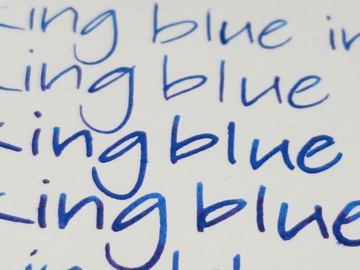
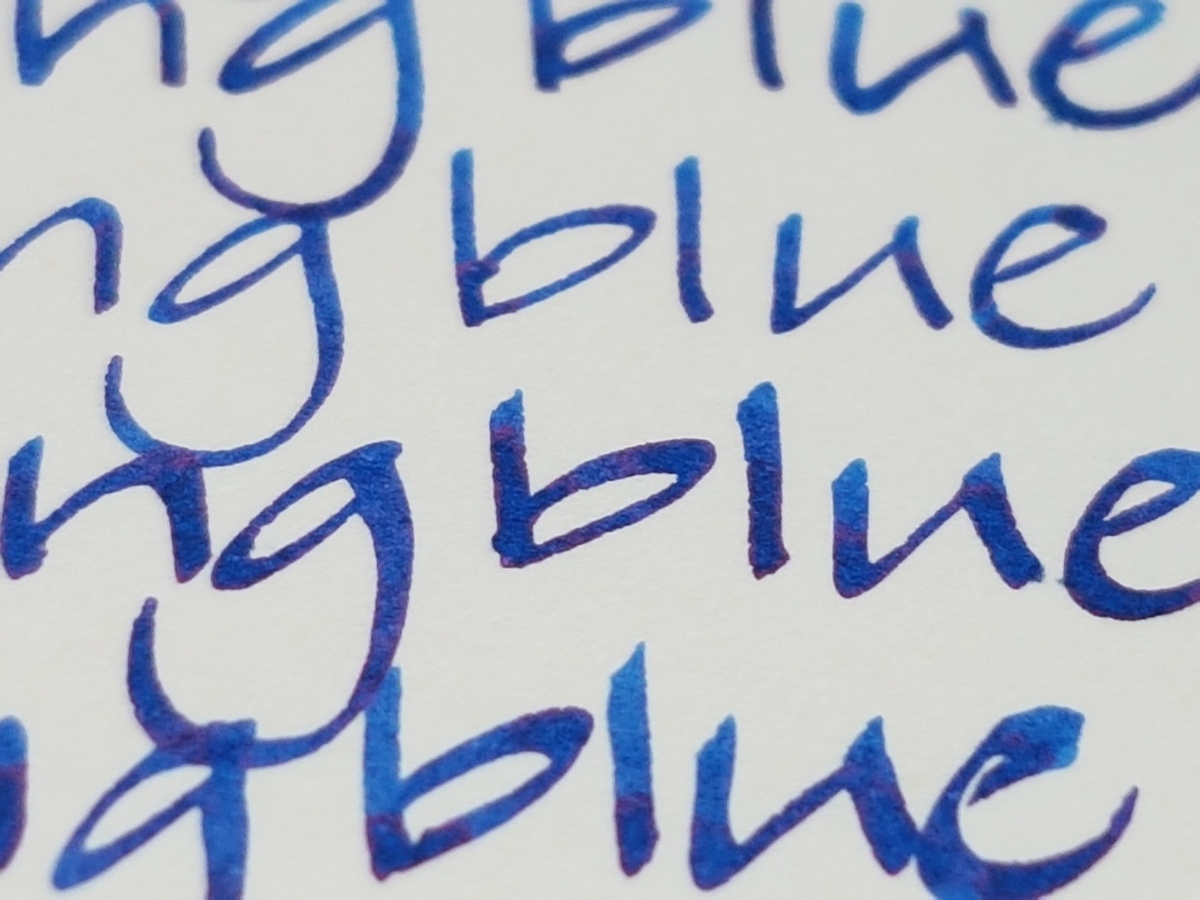
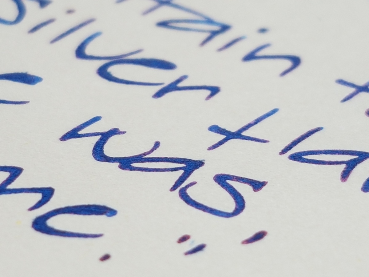
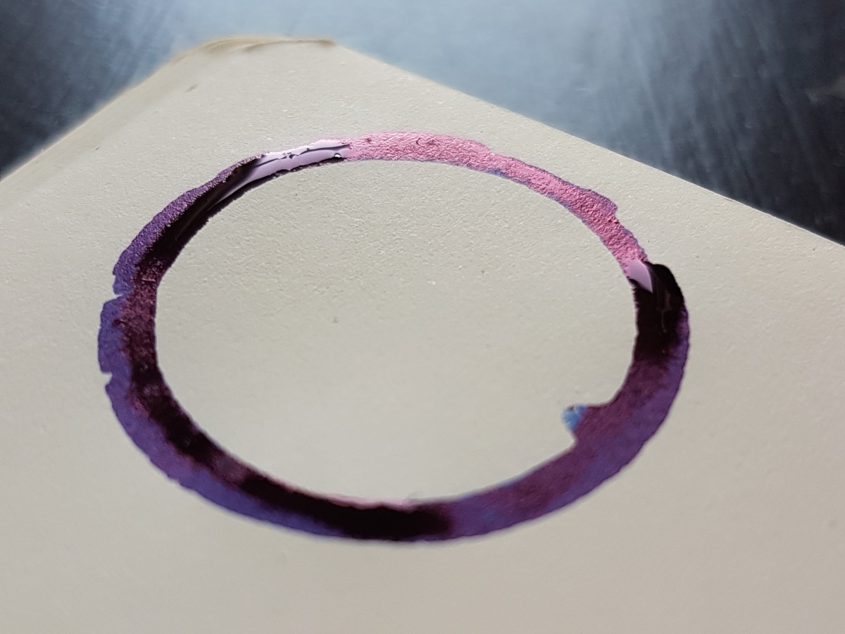
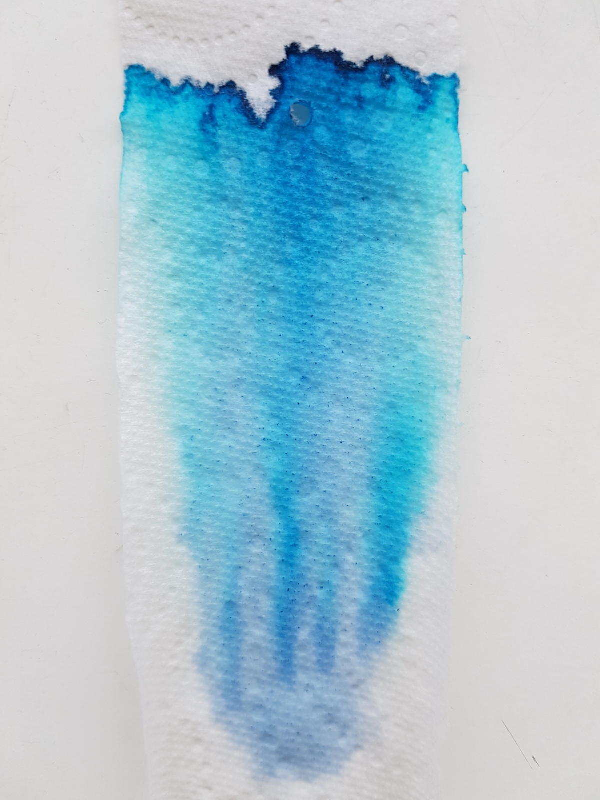
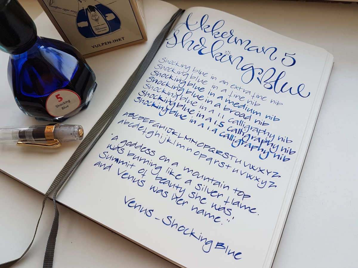
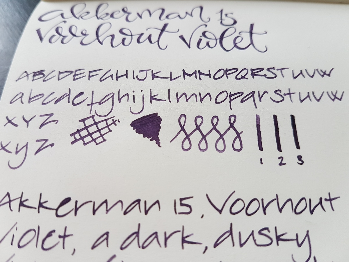
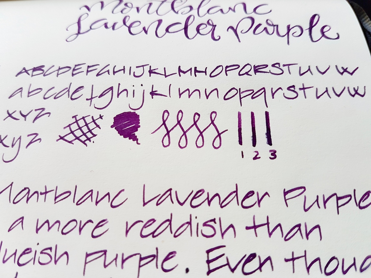
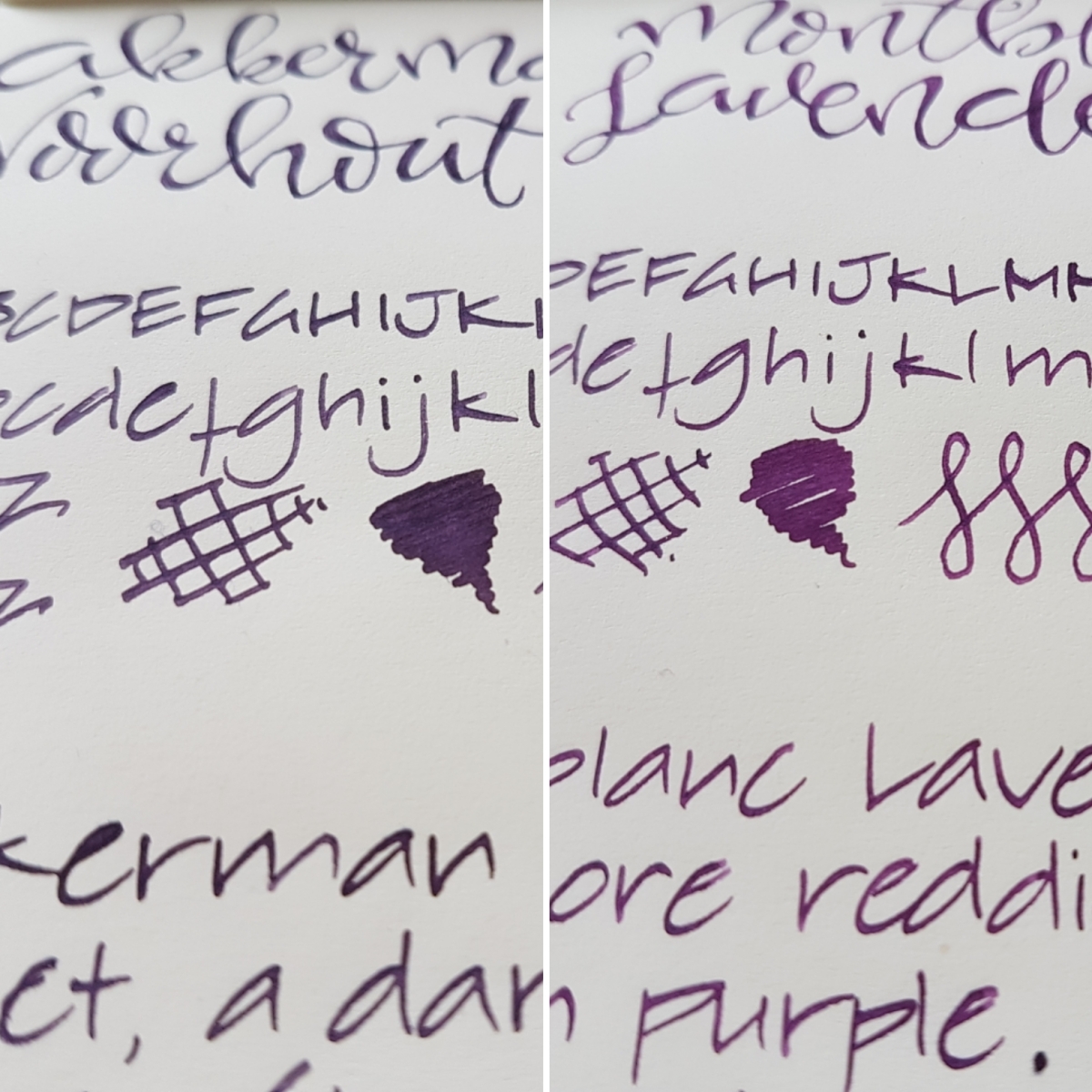
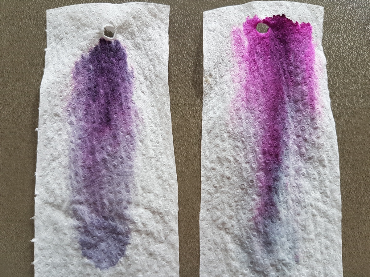
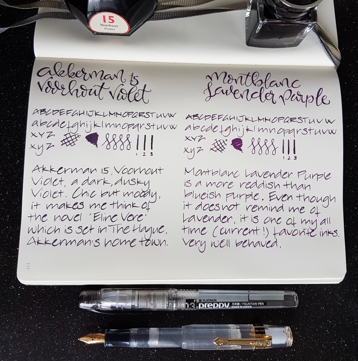
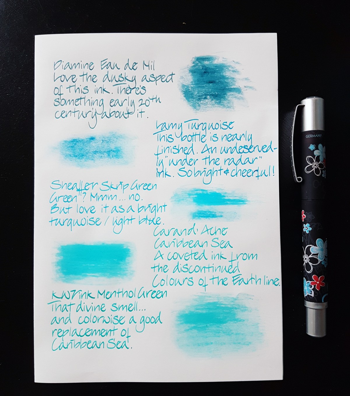
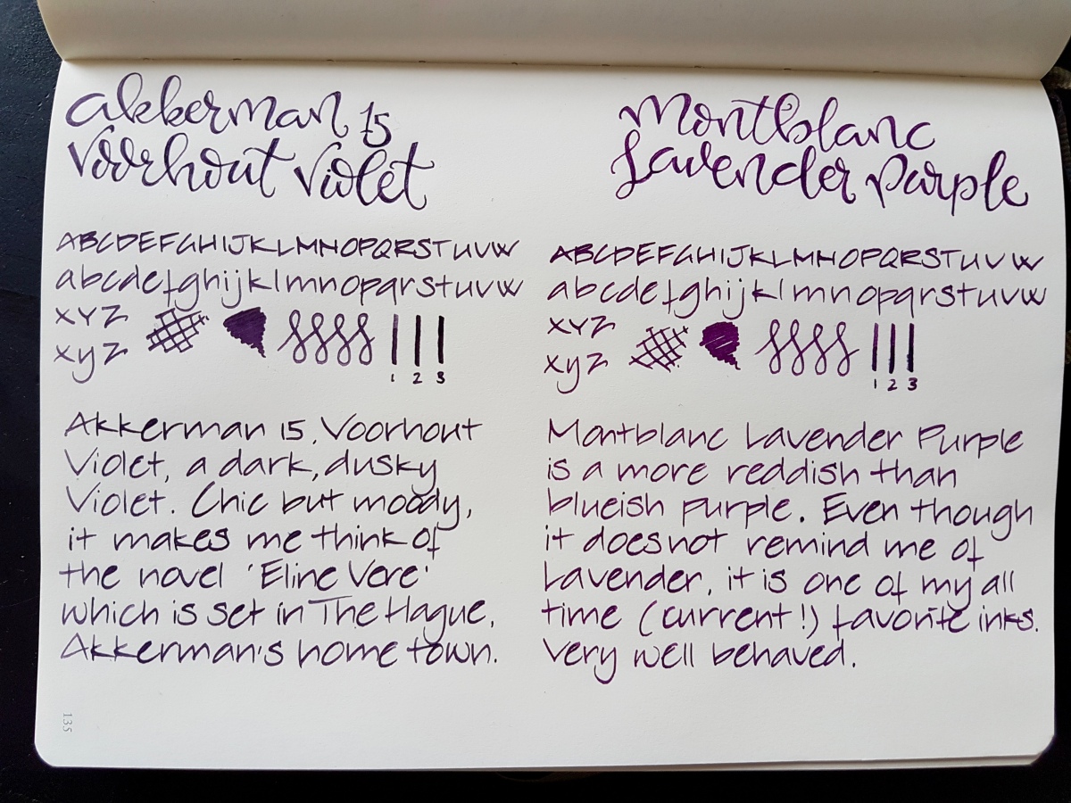
Both inks are of very good quality, decently behaved, easily cleaned and both are not waterproof. Both come in a 60 ml bottle. The bottles are very distinctive and good looking bottles in their own right. Dry times on this Leuchtturm paper was about the same for both inks. On Tomoe River the Montblanc dries more quickly. In the Netherlands, the price of both inks fall in the same 15-20 Euros category, the Montblanc being about 3 Euros more expensive for 60 ml.

Seen from above in natural light, the inks both are dark purples. So let’s take a closer look at them. Pens used, by the way, are a fine Preppy for the faux brand calligraphy and a Kaweco BB with an architect grind for the alphabets, squiggles and scribbles.

20170319_093114.jpg

The Voorhout Violet is a dusky violet purple on the blueish scheme. It is actually pretty close to the darker shades in the pansy after which it was named. Voorhout is a chic avenue in The Hague and the ink reminds me of Eline Vere, a novel named after its main character by Dutch fin-de-siecle novelist Louis Couperus. Eline Vere was quite a hysteric character, misled by her day dreams and misplaced romantic illusions, fed by her male equivalent cousin. A beautiful novel that portrays the ennui of the upper classes in The Hague at that time pretty impressively. This ink fits the atmosphere in that novel very well. Ill-lit rooms, crammed with dusty expensive furniture and people stifled by their bourgeois rules. Chic, but gloomy. I love the novel and I love this ink. Great for letter writing on good quality paper, journaling and I would consider it office appropriate.

fullsizeoutput_430.jpeg

The Lavender Purple is a much pinker, redder purple than the Voorhout Violet. It reminds me of the dark purple that was fashionable in the 70s, but a little more subdued and fit for everyday use. To me it is much more purple than lavender. Lavender in bloom tends to lean more to the blueish spectrum. Nevertheless, a beautiful ink. I love using it as an office ink in my Hobonichi office planner, because it dries pretty quickly, even in a broad nib. I would qualify the Lavender Purple as a bit more cheerful than the Voorhout Violet, without jumping off the page in screaming purpleness.

A closer look side-by-side, in natural light:

IMG_20170319_102213.jpg

This picture shows equal qualities in shading. No sheen to speak of on this Leuchtturm paper, but both do sheen on even more ink resistant paper. Both lovely inks in their own right and I am happy to have both as a full bottle. These dark, decent purples will surely get good daily use because I consider both office appropriate.

Now for my crude chromatography, picture taken in natural light:

fullsizeoutput_431.jpeg

To the left the Voorhout Violet, to the right the Lavender Purple. Both show dark blue at the base, lavender hues in the middle coming up to still dark purple with a light pink halo in the Voorhout Violet. The Lavender Purple shows a bright nearly hot pink halo.

As said, I am happy to have both the inks at my disposal, and both will get a good deal of written mileage. Now that leaves just one thing… one day I will still have to go for that bottle of Groenmarkt Smaragd… The struggles of an inkaholic!

One final picture, just for the heck of it. Let me know what your purple ink of choice is. And as ever, thank you for reading!

fullsizeoutput_433.jpeg


Blackstone ink samples

Ever since I got around to color labeling a full rack of ink samples, I have been wanting to do writing samples of the Blackstone samples I had ordered from Appelboom Pennen quite some time ago. I will do full reviews on what I have left of the samples, but for now a nice quick overview of a handful of alphabet scribbles. I must say, I’m quite smitten with them…

The Blackstone ink line consists of two waterproof inks: the Barrister Black and Blue, as well as six inks which are highly saturated new takes on regular colors, black, blue, turquoise, red, green and yellow. The only ink from the Blackstone line that is missing in this overview is the yellow, Golden Wattle, which I traded in an ink swap. I will add that ink to this post once I get another sample. Without further ado: Blackstone inks! All writing samples are done with a Kaweco Classic Sport BB, which I ground into an architect shape, to show thicker and thinner lines in the writing samples.

Barrister Black

fullsizeoutput_425.jpeg

A black ink just as I like them: opaque and no shading. An intense black black. Since it is waterproof, it should be nice for layering in mixed-media art and adding detail to watercolor or other ink art. Mind you: when I rubbed it with a wet finger, it gave off a gray wash, but the words remained legible. So be aware of that when using with other materials. Perhaps adding detail when the other layers have been applied and are dry. Unless you are after the washed out effect, of course.

20170317_094123.jpg

The ink is so opaque that the sheen is silvery, as you can see above. The smell is an intense inky smell, the smell of the desks at my elementary school in Delft, which still had ink bottle cubby holes.

Black Stump

fullsizeoutput_426.jpeg

Black Stump is actually a quite interesting black ink. It has a heavy brown-red hue when used in a very wet and broad nib. The Kaweco does not show that as well as my Esterbrook 2284 does. The term Black Stump is said to mean an imaginary landscape marker beyond which uncivilized territory lies. But since the origin of the term is much discussed, please don’t hold me accountable for this explanation.

20170317_094206.jpg

Because the reddish hue shows better in a broader nib, I’m keeping the ink for use in a broad gusher. If you are after a nice “warm” black ink that does not have to be waterproof, this is a good one.

Uluru red

fullsizeoutput_427.jpeg

This is a very intense red. Only a smudge of shading. A much bluer red than the earthy red color of its name sake, Uluru – or Ayers Rock. I love a dark red like this, but it is an accent or lettering color for me. It is too heavy to use as a daily writer ink for me, because a pageful would be quite harsh to read. A stunning red though.

20170317_094111.jpg

A red like a classic lipstick. If you want to write a couple of seductive words but still in the best possible taste, this is your ink.

Barrister Blue

fullsizeoutput_428.jpeg

The most sensible of the Blackstone inks, if you ask me. A classic waterproof blue, nudging toward blue-black so that it has an almost purplish hue. A nice bit of shading to make it interesting enough. It writes the driest of the Blackstone inks, so suitable for crappy office paper, if you have to suffer through that kind of ordeal. Plus the waterproofness makes it a suitable signature ink.

20170317_094104.jpg

I could live with this ink as a workplace ink. It also has that typical inky-ink smell. So if you are bothered by your colleague’s peanut butter sandwich, just take a quick sniff o’ the nib.

Sydney Harbour Blue

fullsizeoutput_429.jpeg

This ink is fiercely competing with the next for being my favorite of the Blackstone colors. From above, -it appears to be just a very dark tealish blue-black with a heavy red sheen and outline. But mind you, it’s not an ink for the faint of heart. This ink is so saturated and flows so thick, there is hardly any shading but who cares! Look at that sheen!

20170317_093946.jpg

Each letter is set apart by a very distinct red outline. If you have to write on ink-sucking paper, don’t waste this beauty on that. You’ll be through your converter within a single page. This is nice paper – special letter – journaling ink. Now which one do I like best, this one or…

Barrier Reef Blue

fullsizeoutput_42a.jpeg

This is a slightly darker than regular turquoise ink, bordering on intense sky blue. Some shading, a heavy shining blue ink, like its darker brother. This ink does not only make me very happy to look at, it works slightly hypnotic even.

20170317_094023.jpg

Isn’t that a looker! If I use this, I can’t help but taking a sideways glance at it. An immediate picker-upper. I have had both this and the Sydney Harbour blue in the architect Sailor 1911 and I cannot decide which I like best. Might have to get both bottles when my samples have been squeezed dry of their final drops.

Daintree Green

fullsizeoutput_42c

This is a green ink for people who think they do not like green inks. It is cheerful and bright, but not blinding or sickening. It has a very lovely red sheen, but not so much that it makes you dizzy. It is named after the Daintree Rainforest and if you still do not like green inks, at least look up the pictures of this rainforest online. Those are instant stress relievers.

20170317_093959.jpg

This ink would make a very nice daily writer, as well as a great accent ink for journaling. If you love green inks, this is a great addition to your green stash. It’s the next to go into my mint Kaweco when I’ve finished the current load of Akkerman Groenmarkt Smaragd.

Have you tried Blackstone inks or any of the other Australian ink brands currently on the market? I’d love to hear what you think if them.

Quick disclaimer: I bought these samples myself, for my own use, pleasure and testing. I am not affiliated with Blackstone or Appelboom.

Thank you as ever for reading and until the next post!

Page of Shame February 26, 2017

What is a Page of Shame… it is a page filled with pens currently inked. 32… yes, a sizable number. These are all pens I have in rotation at the moment, especially with InCoWriMo2017 going on. I must be honest and tell you that there are four fude pens inked, which I have not included on this page. Purely for aesthetics.

So, 32 pens inked… let’s got to it!

fullsizeoutput_3fe.jpeg

Top to bottom:

  1. Esterbrook Grey “J” nib no. 2284, Blackstone Black Stump
  2. Kaweco Classic Sport Demonstrator, double broad architect nib, J. Herbin 1670 Stormy Grey
  3. Jinhao 159 Germany iridium point italic grind, Rober Oster Signature Purple Rock
  4. Bexley Jim Gaston Holiday 2002 stub nib, Robert Oster Signature Melon Tea
  5. Jinhao 159 original nib, Noodler’s Lexington Gray (bulletproof)
  6. Pelikan Pelikano medium, Kaweco Caramel Brown
  7. Mabie Todd Swan 3250 oblique medium/broad, Noodler’s Kiowa Pecan
  8. Montblanc Meisterstuck Chopin oblique double broad nib, Rober Oster Signature Copper
  9. TWSBI Eco White 1.1 stub nib, Rober Oster Signature Ng Special ’16
  10. Pelikan 400 oblique broad nib, Diamine Autumn Oak
  11. TWSBI Diamond 580 broad (crisp grind) nib, Pelikan Edelstein Mandarin
  12. ASA Pens Nauka Translucent 1.1 stub, Diamine Coral
  13. Montblanc 264 oblique double broad, Diamine Sunset
  14. Sheaffer Quasi Imperial italic stub nib, Diamine Crimson
  15. Franklin-Christoph m45 Cherry Ice IPO S.I.G. medium, Kyo-iro Cherry Blossom of Keage
  16. Kaweco Skyline Sport Pink double broad architect nib, Noodler’s Cactus Fruit Eel
  17. Online medium architect nib, Organics Studio Emily Dickinson
  18. Franklin-Christoph m45 Italian Ice Organics Studio Jane Austen
  19. Sailor 199 Standard demonstrator zoom architect nib, Blackstone Sydney Harbour Blue
  20. Pelikan 140 oblique double broad nib, Akkerman Deep Duinwater Blauw
  21. Montbland 254 oblique medium nib, Sailor Jentle Yama Dori
  22. ASA Pens Porus Jumbo White Acrylic flex nib, Rober Oster Signature Blue Denim
  23. Franklin-Christoph m66 Stabilis Solid Ice broad cursive italic nib, Rober Oster Signature Fire & Ice
  24. Bexley Gaston’s Angels stub nib, L’Artisan Pastellier Callifolio Olifants
  25. TWSBI Eco Clear 1.1 stub nib, Rober Oster Signature Bondi Blue
  26. Sheaffer Quasi Imperial oblique italic stub nib, KWZ ink Menthol Green
  27. Italix Parson’s Essential oblique italic broad nib, Organics Studio L. Frank Baum
  28. Inoxcrom Agatha Ruiz de la Prada fine architect nib, Graf von Faber-Castell Deep Sea Green plus a blob of green ink left over in the feed
  29. Kaweco Skyline Sport Mint double broad architect nib, Ackerman Groenmarkt Smaragd
  30. Jinhao 159 Noodler’s flex nib, Diamine Shimmertastic Green Oasis
  31. Lamy 2000, medium (crisp grind) nib, Rohrer & Klingner Alt Gold-Gruen
  32. Franklin-Christoph m40 fine cursive italic nib, Kyo-iro Koke-iro.

What is your number of inked pens?

fullsizeoutput_3ff.jpeg

Private Reserve Daphne Blue

20170216_125826

Private Reserve is an artisan ink maker based in Zionsville, Indiana USA. Terry Johnson and Susan Schube, at the time working at Avalon Jewelers, wanted to offer their fountain pen department customers a wider range of colors than those available through pen brands. According to the Private Reserve website, where I gained this knowledge, they started making inks in their basement. Every aspect of the production process, as is often the case with small ink makers, is done by hand. Their inks became a big success and they had to relocate to a larger facility in Zionsville. At this point in time, Private Reserve offers 53 shades of ink, bottled or in international standard short and long cartridges. Some iconic Private Reserve inks include Shoreline Gold, Avocado, Spearmint and DC Supershow Blue. If I can get my hands on these, reviews will follow and be linked to this item.

20170217_164502

Private Reserve Daphne Blue is a light sky blue, leaning towards turquoise. The simple chromatography above leads me to believe that this ink is dyed with one pigment.

Even though it is light in color, it seems quite saturated as it hardly shades in my Lamy nibs. Only in the two broadest calligraphy nibs, this ink shows some nice shading. Perhaps the single pigment accounts for that aspect. If anyone can add to this assumption, please post a comment.

20170216_125748

A written pageful is very pleasant on the eye, and I could very well see this ink being used for writing personal letters, gratulation cards for new-borns or in journaling. It is a fun school color and I will and have used it at the office to use as a mild highlighter or comments ink.

It is not waterproof and as such cleans easily. I have had two bottles of Private Reserve inks for over a year and have not experienced any gooey bits or sediment in both (this Daphne Blue and Lake Placid Blue)

fullsizeoutput_3f1

The writing samples above are all done with a Lamy Vista, using the Lamy nibs extra fine through the 1.9 mm calligraphy nib. The faux calligraphy title was done using a fine nib to write the basic letter shapes. Then I emphasized the down strokes where a flex nib would put down a thicker line by adding that effect by hand. Where I colored the flex effect in, you can see slight shading.

20170216_125939

Some similar inks in my possession are shown below. I think Sheaffer Skrip Green comes pretty close, as does Robert Oster Bondi Blue, which is not included in the picture below. I will link to a review of that ink once that is up.

img_20170207_062244_633

The paper is a Leuchtturm A5 blank journal.

Thank you for reading. Let me know if there are inks you would like to see reviewed.