
There are days when I wake up feeling like trying a new style of writing, just for the fun of it. Right now, I am pretty happy with the print lettering style for everyday use, but I also love to see cursive writing. My only problem with cursive is that I cannot keep the pen on the paper without lifting to write one word in one wriggly stroke. For me, it is a lot more comfortable to do a “stop-and-lift” style of writing, so I can move my arm from the shoulder further down the paper instead of writing from hand and wrist alone. So I took the idea of stroke-like print lettering along when trying a cursive style. I didn’t want it to look like a cursive, italic print, but to have a swooping flow to it. So what it ended up as is a sort of “cursive print hack”, a cursive style for people who print. I’ll show you my first attempts. Disclaimer: I am not a calligrapher and just doing this for the love of writing, and out of the idea that it would be nice to take you along with me for the ride. So this is a style still in development!
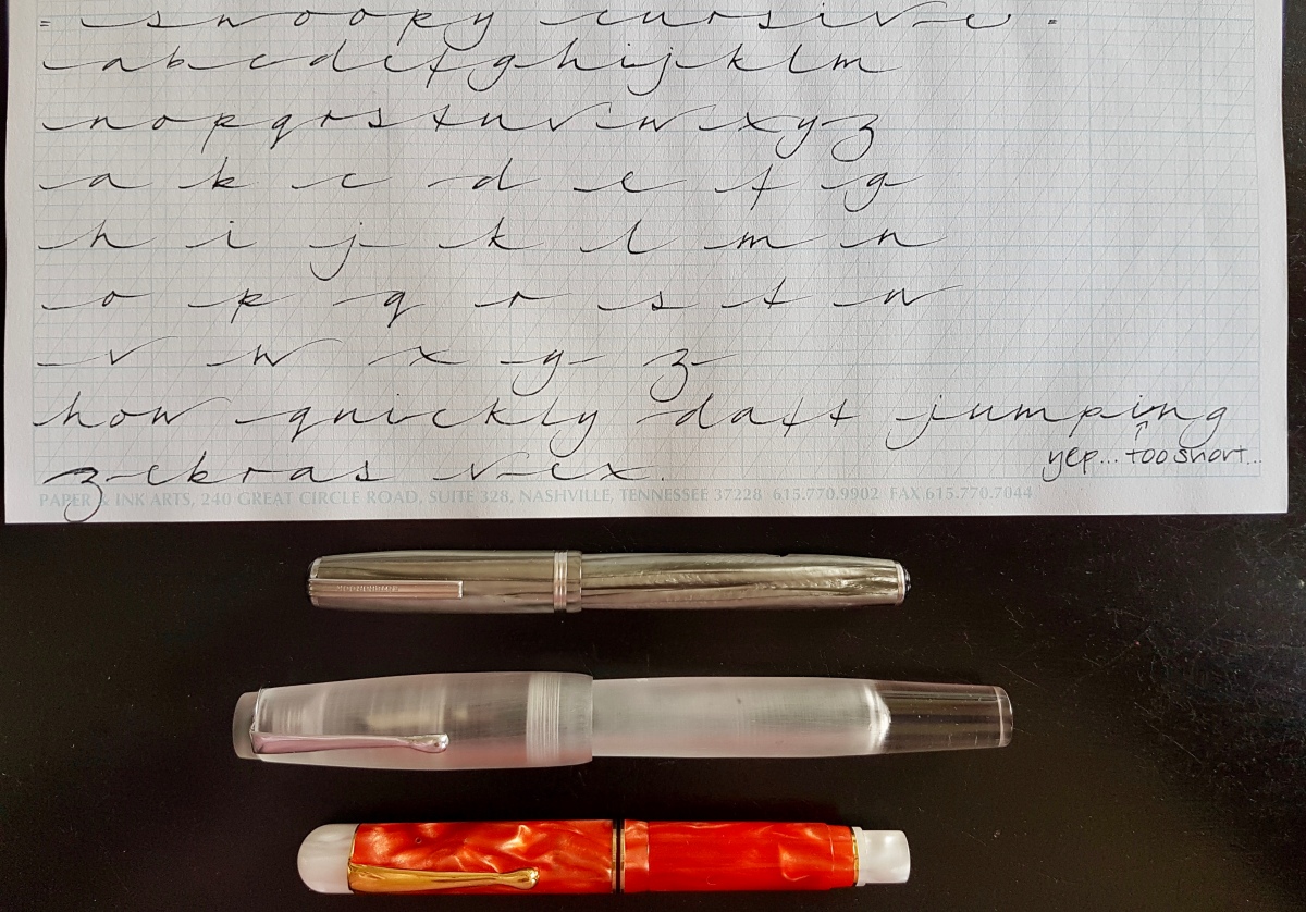
These Paper and Ink Arts guide-ruled sheets are great for practicing any style of writing, except pointed pen, unfortunately. The paper bleeds and feathers but does have a nice tooth to it for control. I first wrote out the alphabet with all letters connected, to show how the connecting lines set the letters at a regular interval. Then I wrote out the separate letters with a lead-in stroke and exit stroke (the start and end stroke). The up- and downstrokes and counters (loops, the rounded shapes on the base line as well as in descenders) are at a 56° angle, which is the angel of the supporting graph lines. The ascenders, or strokes that go over the letters, are not looped to keep the style light and legible. The descenders (strokes that go under the letters) are not closed, for the very same reason. The exit stroke for descenders starts just a hairline apart from the letter. This keeps the style light and able to be written like print lettering.

This style requires light but deliberate strokes, and this is something I really need to practice on. I have written heavy-handed for years; the print lettering in finer nibs I have switched up to already requires a much lighter hand and this style needs a really quick. light hand. You can see where I hesitated, such as the z in zebras and after the i in quickly and jumping, where I ascended the exit stroke too early so the connecting stroke became too short. I am also not yet sure of this style of z; I might still change that but the idea is too keep it simple yet “swoopy”. After each stroke, I pause for a bit to consider the next stroke and place my hand and arm to be able to put that stroke down lightly but quickly. Once you get the hang of that, there is a lovely rhythm to this style of writing.

Then I tried this in a couple of different nib widths, to see if it would work in other sizes as well. Next to the firm fine I used for the earlier samples, I chose a wet broad and a wet stub for that.

This style will definitely suit a wide variety of nib sizes, so you can try it out whatever nib size your fountain pen has. Or practice with a pencil, which is always a great practicing tool. You can see that no matter what nib size, lengthwise each size takes up about the same line width when written out. The stub is a bit longer, but not as much as I suspected it would. Let’s take a closer look for the aspects to look out for.

You can see where I hesitated: the descending line of the d in daft written with the fine nib, the z in zebras and v in vex. Also the z in zebras written with the broad nib looks a bit out of place. Still, a nice style to practice more and further develop. So bear with me for a bit longer for a more detailed downloadable explanation of this style, in which I will also try to go into the basics and the terminology I have slightly touched upon in this post. I am learning here together with you!
Thank you for bearing through these first attempts at a cursive print hack with me and I will let you know via Instagram when the more elaborated downloads are available.
Until the next post!
Janine
