
Private Reserve is an artisan ink maker based in Zionsville, Indiana USA. Terry Johnson and Susan Schube, at the time working at Avalon Jewelers, wanted to offer their fountain pen department customers a wider range of colors than those available through pen brands. According to the Private Reserve website, where I gained this knowledge, they started making inks in their basement. Every aspect of the production process, as is often the case with small ink makers, is done by hand. Their inks became a big success and they had to relocate to a larger facility in Zionsville. At this point in time, Private Reserve offers 53 shades of ink, bottled or in international standard short and long cartridges. Some iconic Private Reserve inks include Shoreline Gold, Avocado, Spearmint and DC Supershow Blue. If I can get my hands on these, reviews will follow and be linked to this item.
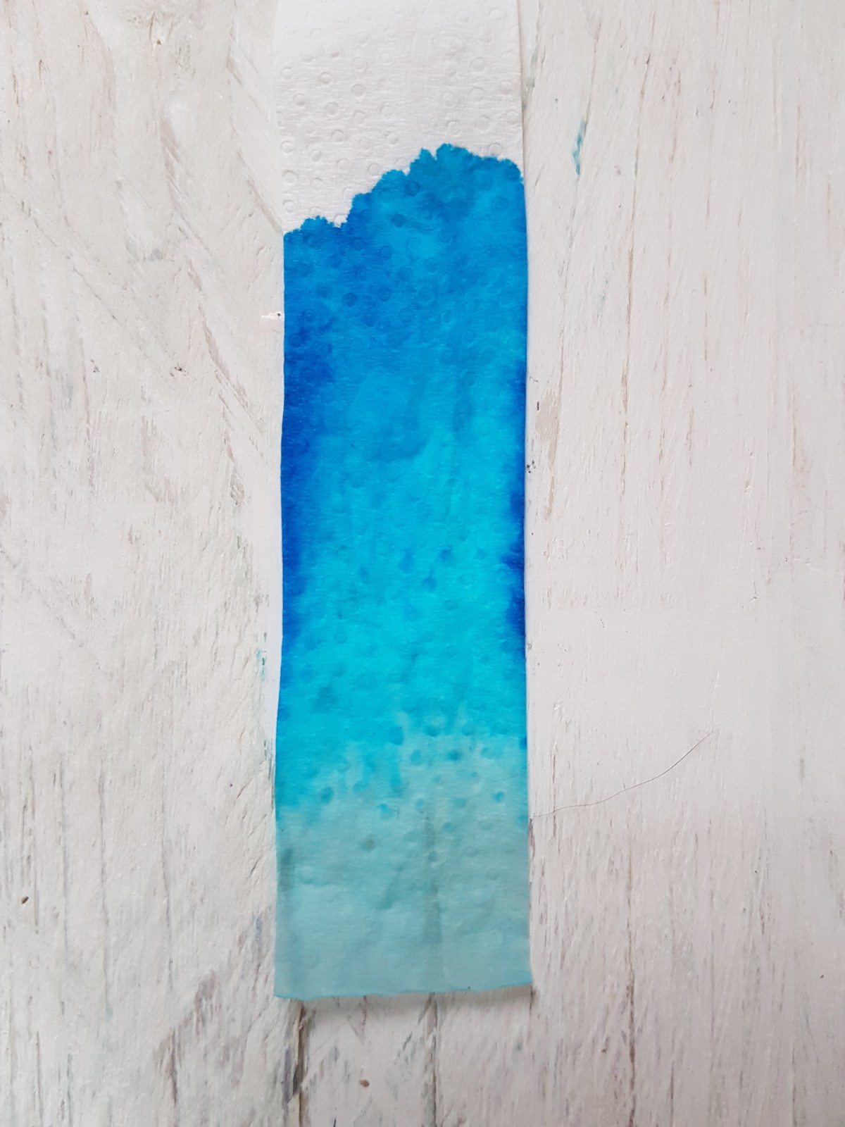
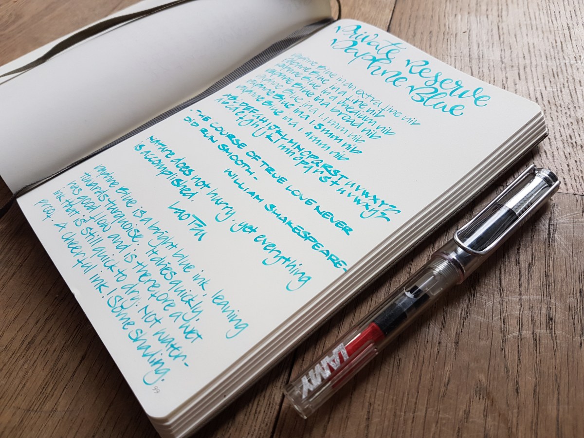
Private Reserve Daphne Blue is a light sky blue, leaning towards turquoise. The simple chromatography above leads me to believe that this ink is dyed with one pigment.
Even though it is light in color, it seems quite saturated as it hardly shades in my Lamy nibs. Only in the two broadest calligraphy nibs, this ink shows some nice shading. Perhaps the single pigment accounts for that aspect. If anyone can add to this assumption, please post a comment.

A written pageful is very pleasant on the eye, and I could very well see this ink being used for writing personal letters, gratulation cards for new-borns or in journaling. It is a fun school color and I will and have used it at the office to use as a mild highlighter or comments ink.
It is not waterproof and as such cleans easily. I have had two bottles of Private Reserve inks for over a year and have not experienced any gooey bits or sediment in both (this Daphne Blue and Lake Placid Blue)

The writing samples above are all done with a Lamy Vista, using the Lamy nibs extra fine through the 1.9 mm calligraphy nib. The faux calligraphy title was done using a fine nib to write the basic letter shapes. Then I emphasized the down strokes where a flex nib would put down a thicker line by adding that effect by hand. Where I colored the flex effect in, you can see slight shading.

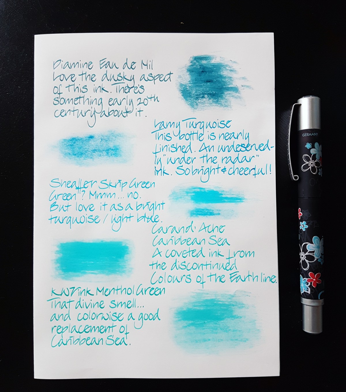
Some similar inks in my possession are shown below. I think Sheaffer Skrip Green comes pretty close, as does Robert Oster Bondi Blue, which is not included in the picture below. I will link to a review of that ink once that is up.
The paper is a Leuchtturm A5 blank journal.
Thank you for reading. Let me know if there are inks you would like to see reviewed.

Reminds me of J. Herbin “Diabolo Menthe”, a personal favourite. Thanks for pointing this one out – I’m adding it to my list of upcoming ink purchases, along with that Diamine “Eau de Nil”. Both gorgeous!
LikeLike
Eau de Nil is also a fave of mine. It has something 1920s about it, I think.
LikeLike
Really enjoyed this review. I’d love to see how Private Reserve’s Naples Blue compares to Waterman’s Inspired Blue. To my mind they’re the same.
LikeLiked by 1 person
Hi Sherree, thank you for your appreciation. Unfortunately, I have neither of the inks you mention. If I do get them, I’ll do a side by side. Be sure to stick around for more reviews. Cheers, Janine
LikeLike