Ever since I got around to color labeling a full rack of ink samples, I have been wanting to do writing samples of the Blackstone samples I had ordered from Appelboom Pennen quite some time ago. I will do full reviews on what I have left of the samples, but for now a nice quick overview of a handful of alphabet scribbles. I must say, I’m quite smitten with them…
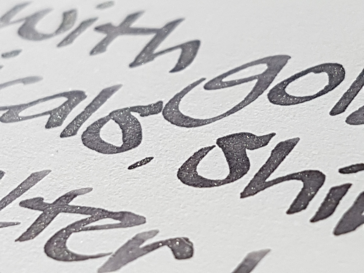
The Blackstone ink line consists of two waterproof inks: the Barrister Black and Blue, as well as six inks which are highly saturated new takes on regular colors, black, blue, turquoise, red, green and yellow. The only ink from the Blackstone line that is missing in this overview is the yellow, Golden Wattle, which I traded in an ink swap. I will add that ink to this post once I get another sample. Without further ado: Blackstone inks! All writing samples are done with a Kaweco Classic Sport BB, which I ground into an architect shape, to show thicker and thinner lines in the writing samples.
Barrister Black
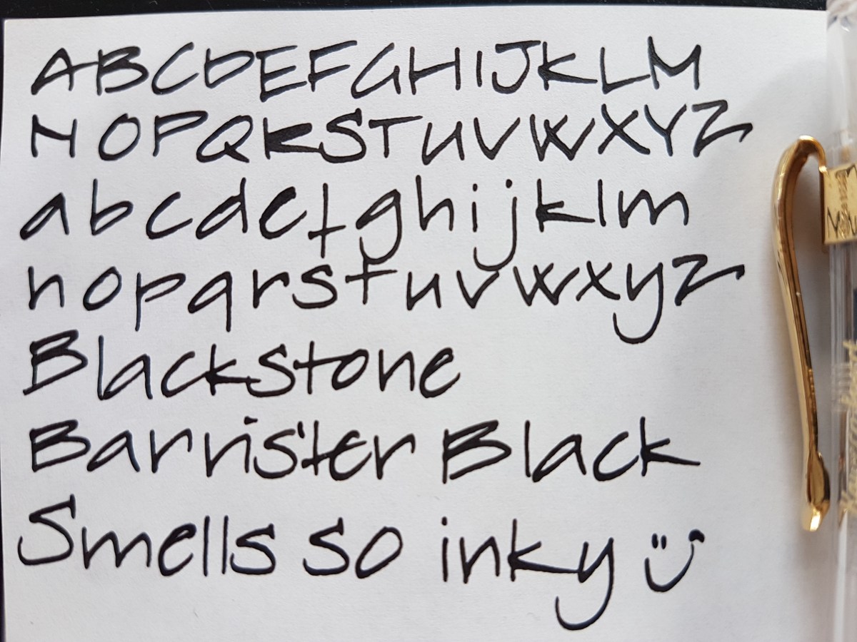
A black ink just as I like them: opaque and no shading. An intense black black. Since it is waterproof, it should be nice for layering in mixed-media art and adding detail to watercolor or other ink art. Mind you: when I rubbed it with a wet finger, it gave off a gray wash, but the words remained legible. So be aware of that when using with other materials. Perhaps adding detail when the other layers have been applied and are dry. Unless you are after the washed out effect, of course.

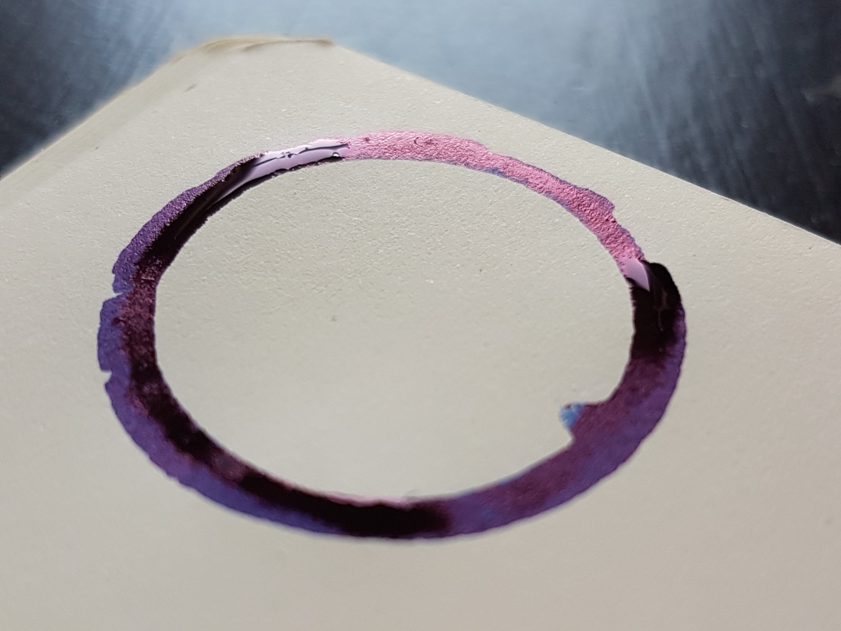
The ink is so opaque that the sheen is silvery, as you can see above. The smell is an intense inky smell, the smell of the desks at my elementary school in Delft, which still had ink bottle cubby holes.
Black Stump

Black Stump is actually a quite interesting black ink. It has a heavy brown-red hue when used in a very wet and broad nib. The Kaweco does not show that as well as my Esterbrook 2284 does. The term Black Stump is said to mean an imaginary landscape marker beyond which uncivilized territory lies. But since the origin of the term is much discussed, please don’t hold me accountable for this explanation.
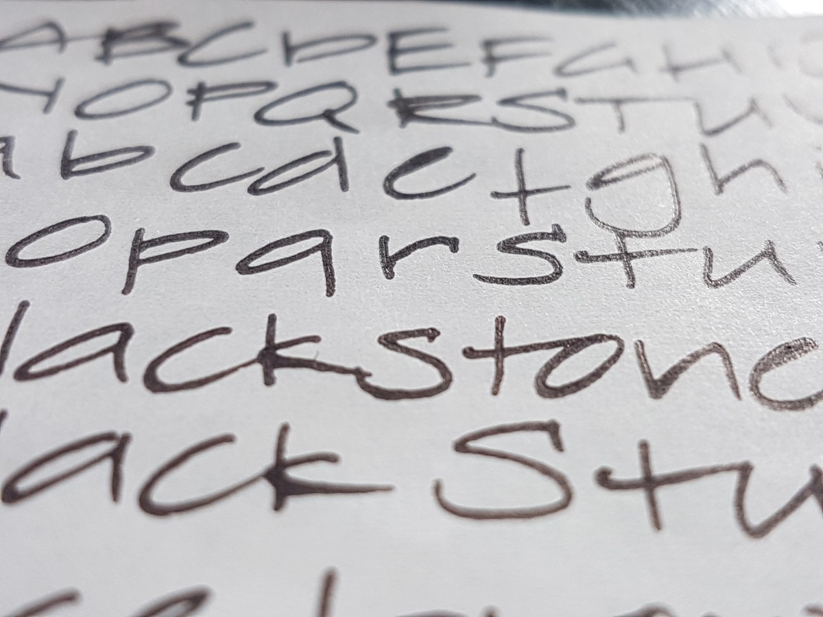
Because the reddish hue shows better in a broader nib, I’m keeping the ink for use in a broad gusher. If you are after a nice “warm” black ink that does not have to be waterproof, this is a good one.
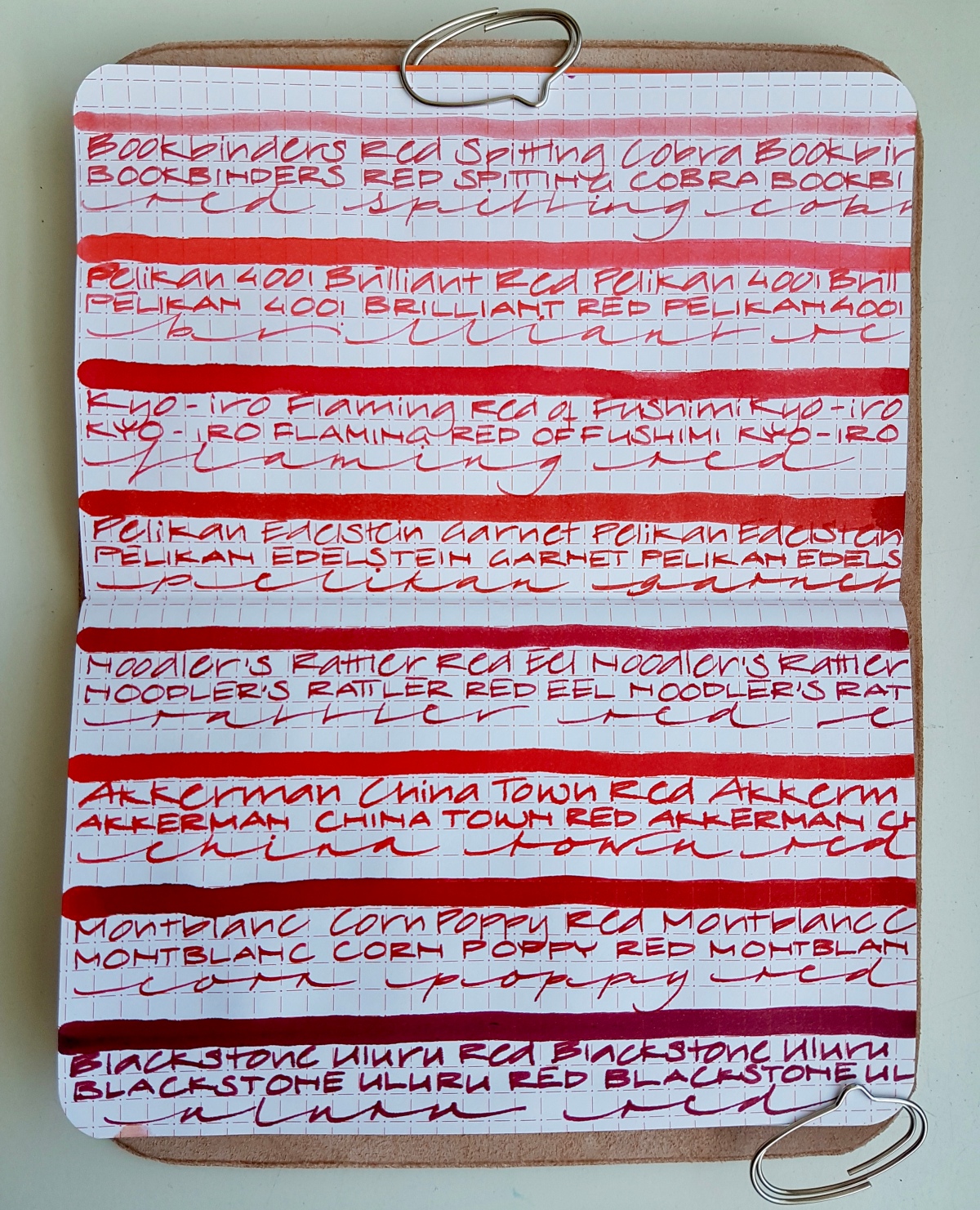
Uluru red

This is a very intense red. Only a smudge of shading. A much bluer red than the earthy red color of its name sake, Uluru – or Ayers Rock. I love a dark red like this, but it is an accent or lettering color for me. It is too heavy to use as a daily writer ink for me, because a pageful would be quite harsh to read. A stunning red though.

A red like a classic lipstick. If you want to write a couple of seductive words but still in the best possible taste, this is your ink.
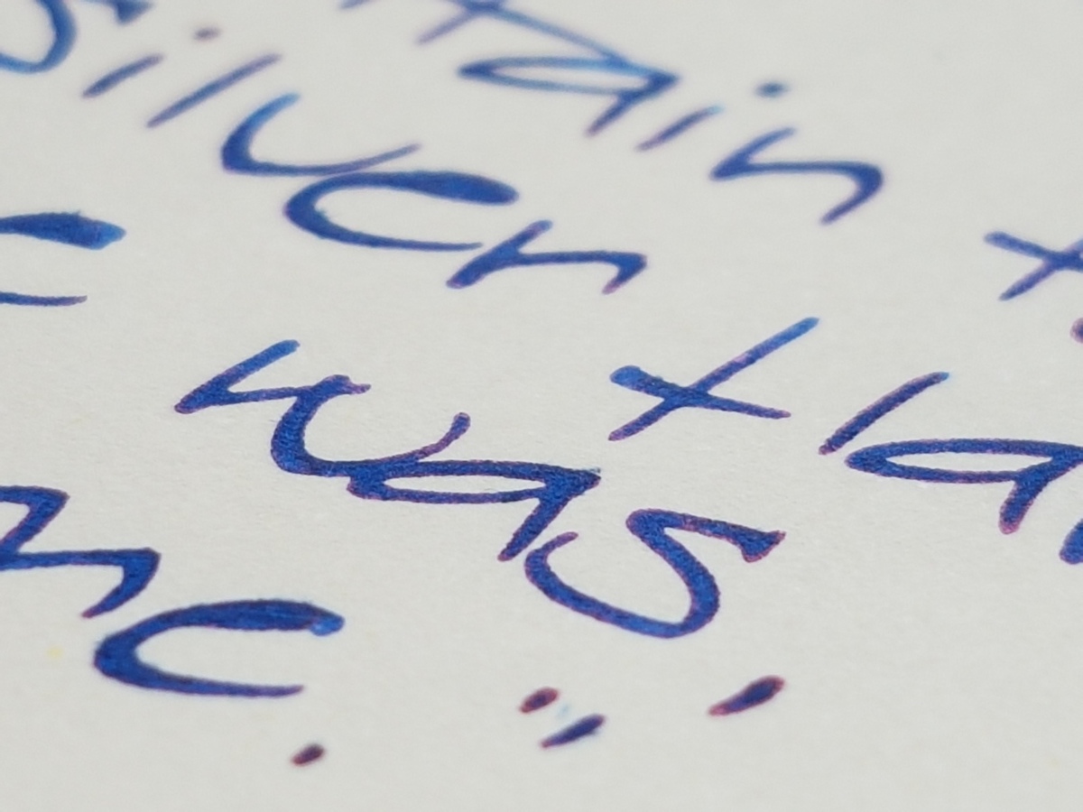
Barrister Blue

The most sensible of the Blackstone inks, if you ask me. A classic waterproof blue, nudging toward blue-black so that it has an almost purplish hue. A nice bit of shading to make it interesting enough. It writes the driest of the Blackstone inks, so suitable for crappy office paper, if you have to suffer through that kind of ordeal. Plus the waterproofness makes it a suitable signature ink.

I could live with this ink as a workplace ink. It also has that typical inky-ink smell. So if you are bothered by your colleague’s peanut butter sandwich, just take a quick sniff o’ the nib.
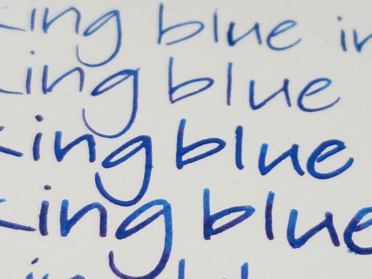
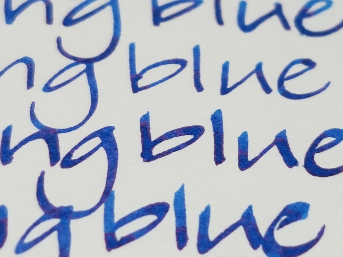
Sydney Harbour Blue
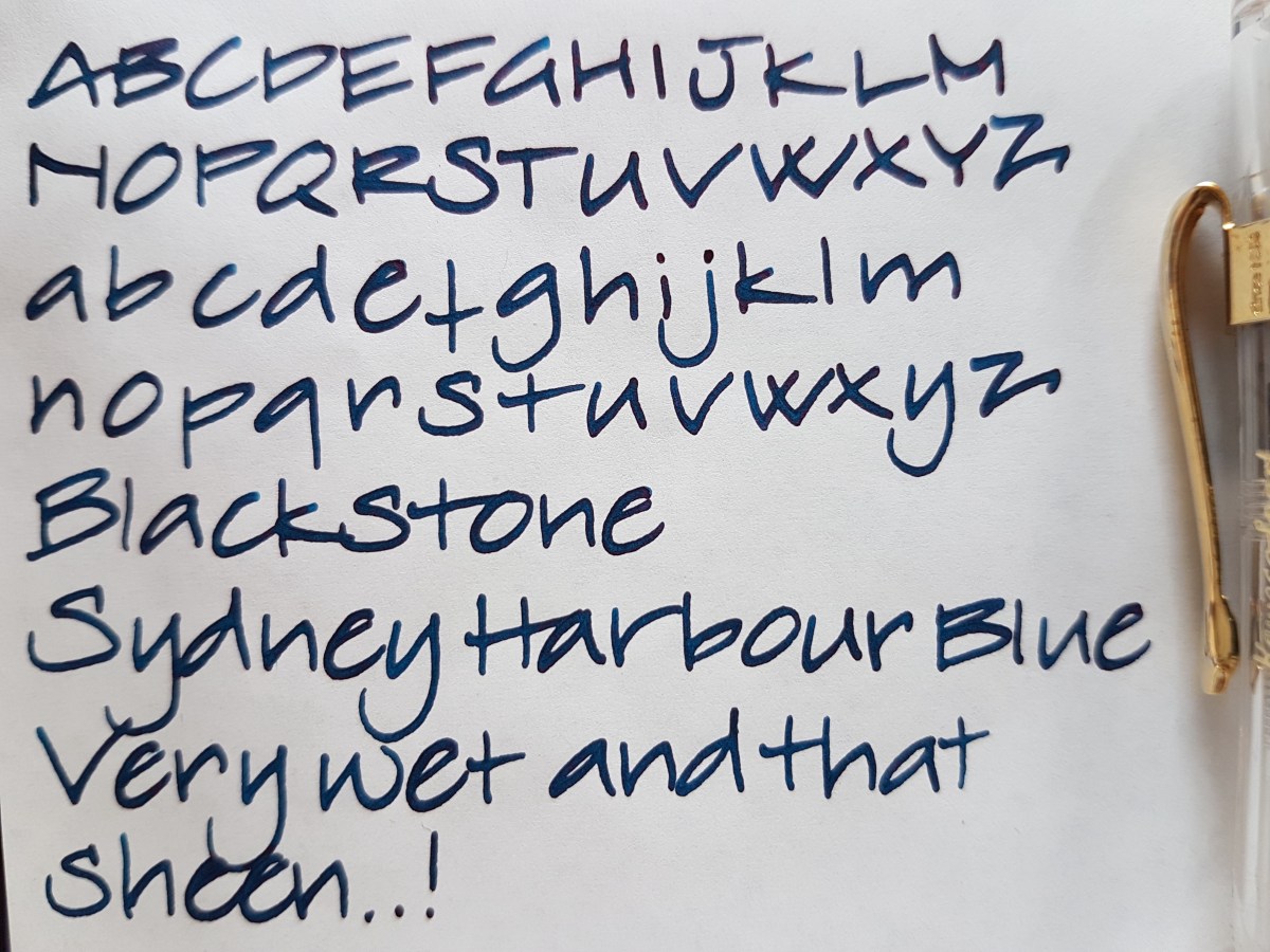
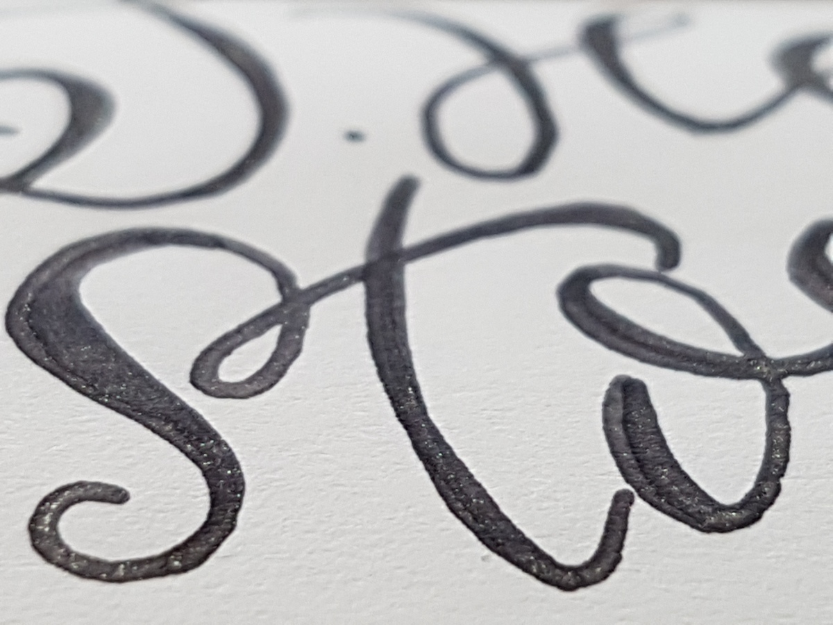
This ink is fiercely competing with the next for being my favorite of the Blackstone colors. From above, -it appears to be just a very dark tealish blue-black with a heavy red sheen and outline. But mind you, it’s not an ink for the faint of heart. This ink is so saturated and flows so thick, there is hardly any shading but who cares! Look at that sheen!

Each letter is set apart by a very distinct red outline. If you have to write on ink-sucking paper, don’t waste this beauty on that. You’ll be through your converter within a single page. This is nice paper – special letter – journaling ink. Now which one do I like best, this one or…
Barrier Reef Blue
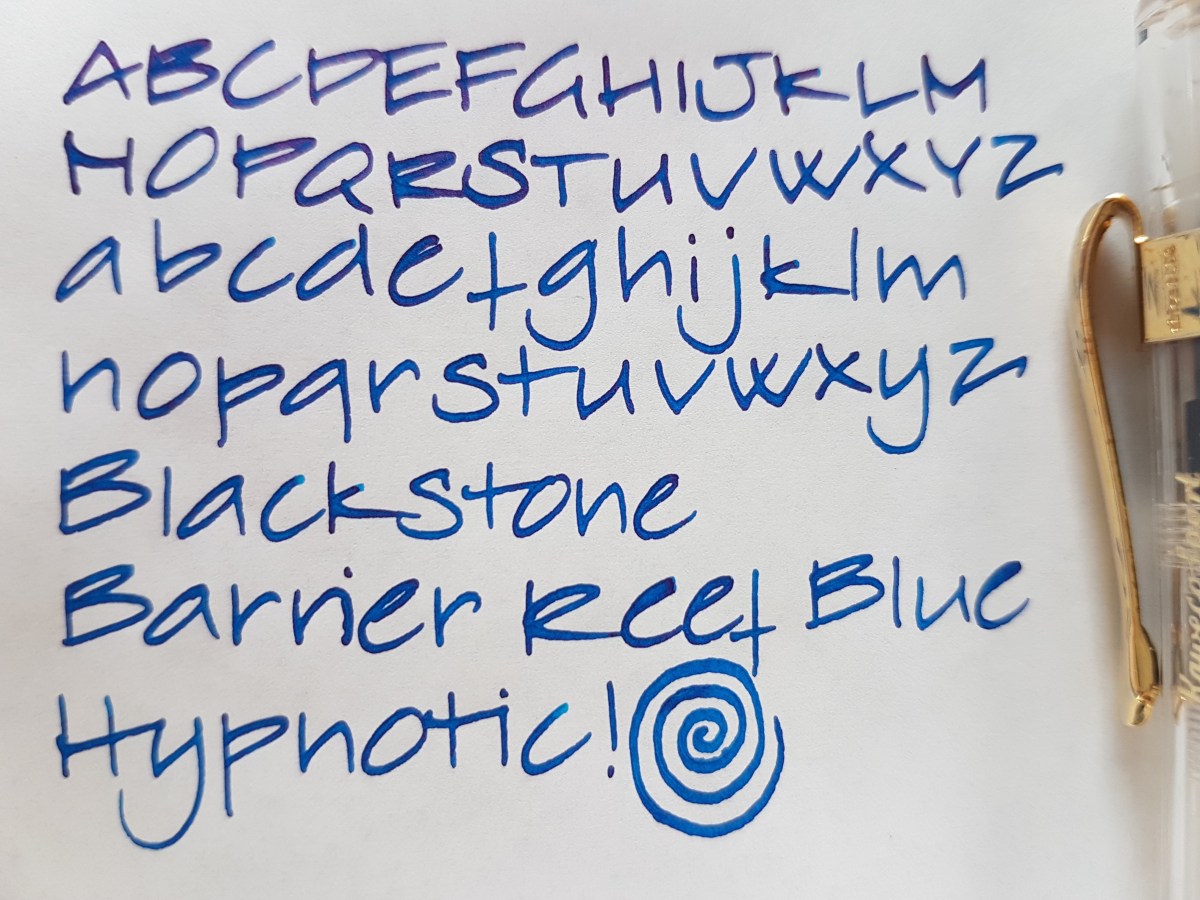
This is a slightly darker than regular turquoise ink, bordering on intense sky blue. Some shading, a heavy shining blue ink, like its darker brother. This ink does not only make me very happy to look at, it works slightly hypnotic even.

Isn’t that a looker! If I use this, I can’t help but taking a sideways glance at it. An immediate picker-upper. I have had both this and the Sydney Harbour blue in the architect Sailor 1911 and I cannot decide which I like best. Might have to get both bottles when my samples have been squeezed dry of their final drops.
Daintree Green
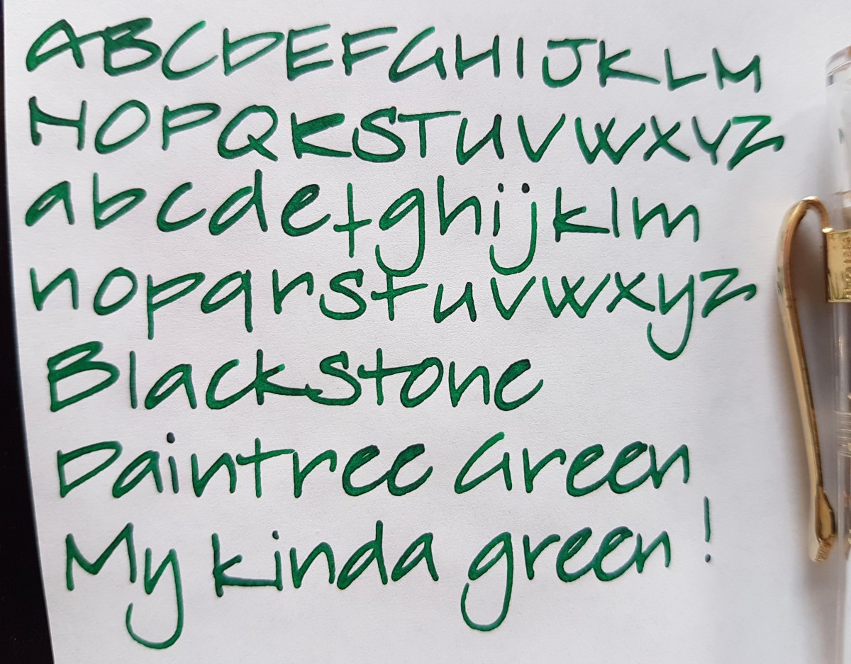
This is a green ink for people who think they do not like green inks. It is cheerful and bright, but not blinding or sickening. It has a very lovely red sheen, but not so much that it makes you dizzy. It is named after the Daintree Rainforest and if you still do not like green inks, at least look up the pictures of this rainforest online. Those are instant stress relievers.

This ink would make a very nice daily writer, as well as a great accent ink for journaling. If you love green inks, this is a great addition to your green stash. It’s the next to go into my mint Kaweco when I’ve finished the current load of Akkerman Groenmarkt Smaragd.
Have you tried Blackstone inks or any of the other Australian ink brands currently on the market? I’d love to hear what you think if them.
Quick disclaimer: I bought these samples myself, for my own use, pleasure and testing. I am not affiliated with Blackstone or Appelboom.
Thank you as ever for reading and until the next post!


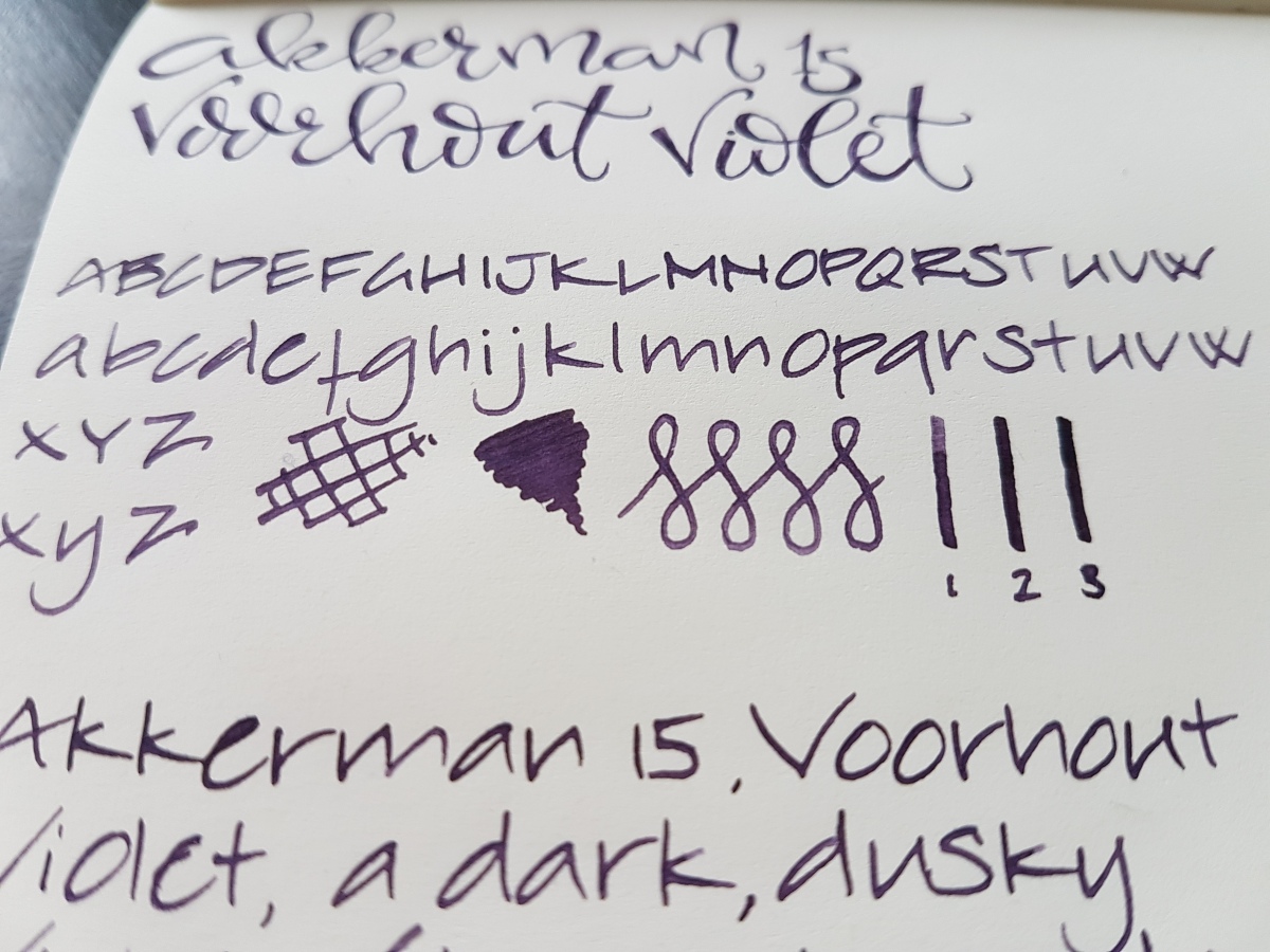
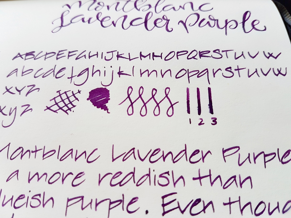
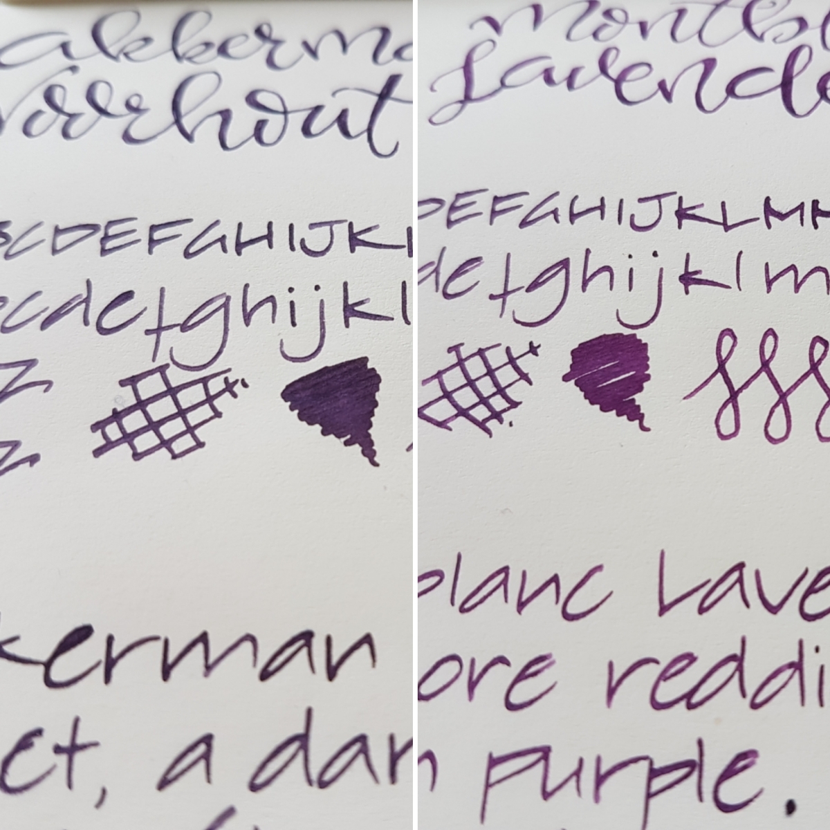
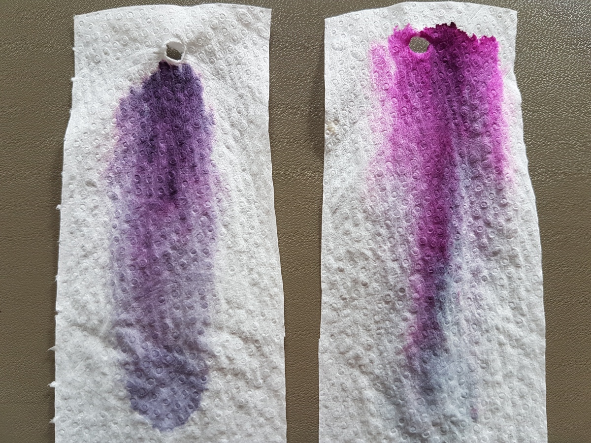
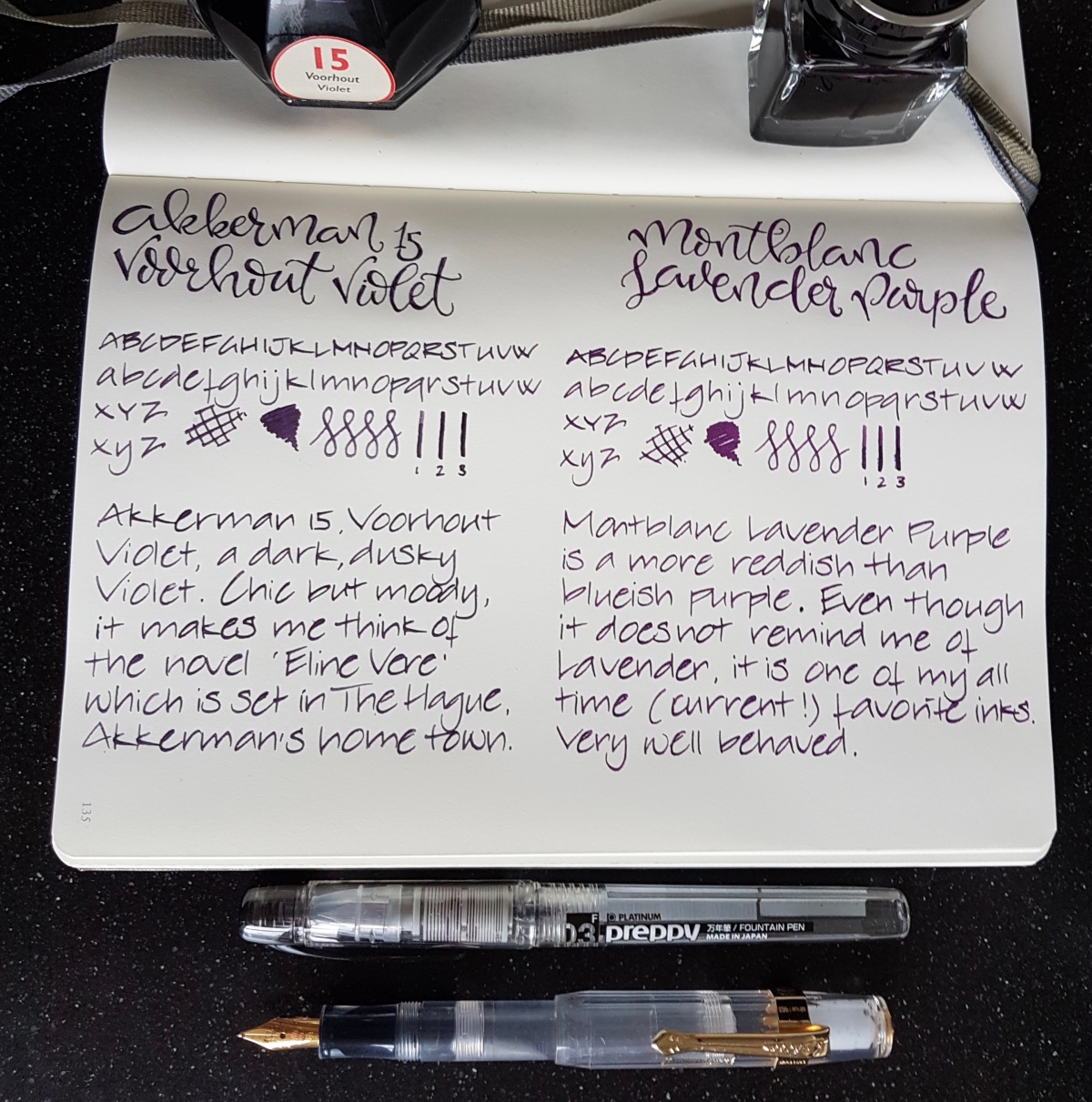
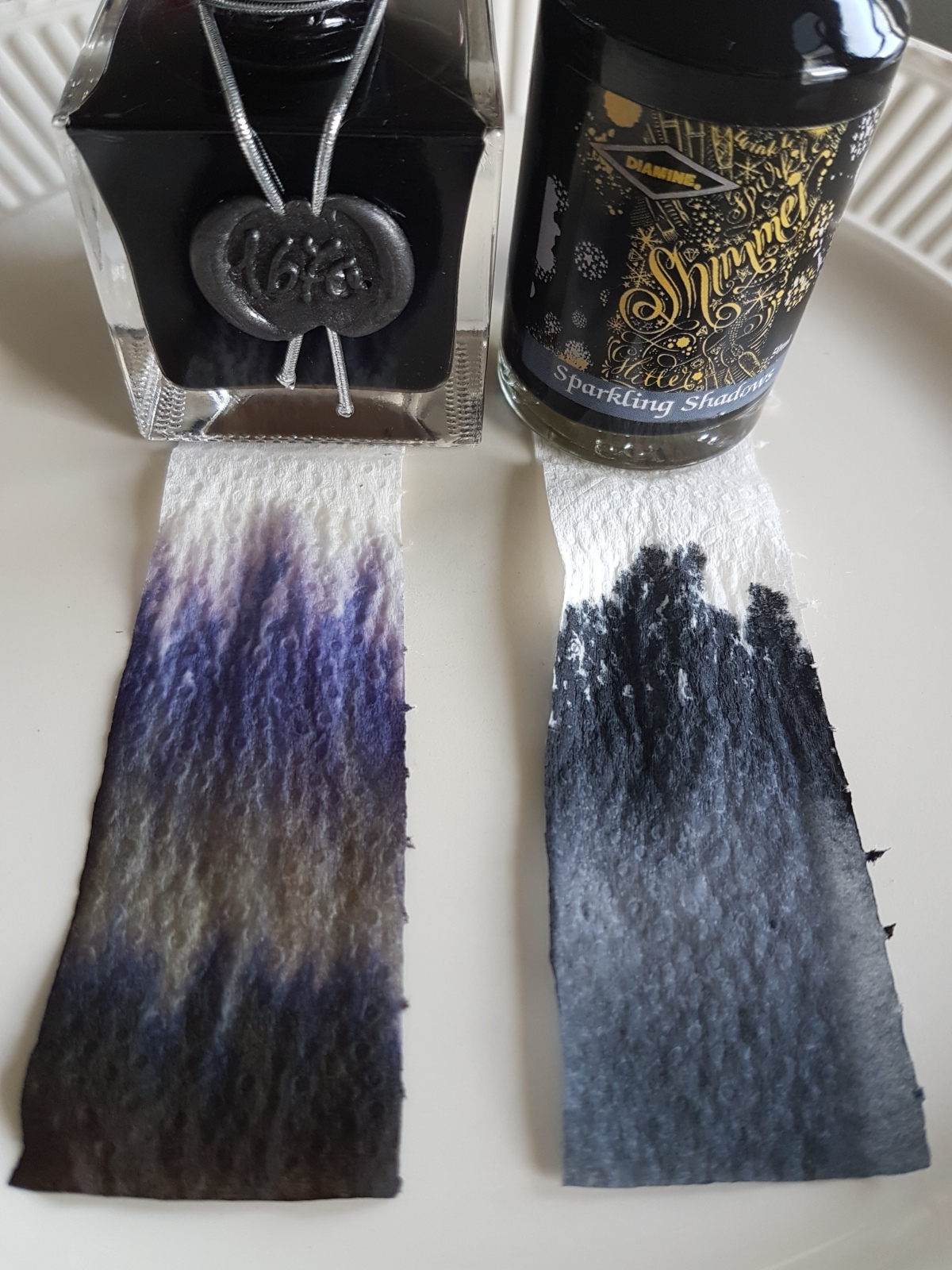
 Both inks are of very good quality, decently behaved, easily cleaned and both are not waterproof. Both come in a 60 ml bottle. The bottles are very distinctive and good looking bottles in their own right. Dry times on this Leuchtturm paper was about the same for both inks. On Tomoe River the Montblanc dries more quickly. In the Netherlands, the price of both inks fall in the same 15-20 Euros category, the Montblanc being about 3 Euros more expensive for 60 ml.