Freshly inked and first impressions

It’s a lovely sunny, activity-filled Sunday, so a quick post of some freshly inked pens and a couple of first thoughts of pens that came in over the last couple of weeks.

fullsizeoutput_41b.jpeg

From top to bottom:

  • Pen: Aurora Optima Burgundy, medium nib. Ink: Aurora Black. I love this pen-and-ink combination, I have started using it as my bujo pen and ink, because I find that the simple bujo style in black suits me best. More on that next Sunday when I’ll update you on my bujo experiences.
  • Pen: Bexley Gaston’s Angels, stub nib. Ink: Noodler’s Lexington Gray. I needed a bulletproof ink in one of my pens, but I will not hang on to this combination. The Lexington Gray is just too wet in the Bexley, even for my taste. Might try it in the much dryer-writing black Kaweco later.
  • Pen: Montegrappa Fortuna Mosaico Marrakech, medium nib. Ink: Private Reserve Lake Placid Blue. I really like this pen and ink combination, the ink complements the blue hues in the lovely material of the Marrakech. The ink tends to run dry in the nib pretty quickly, so it needs to be used regularly.
  • Pen: Kaweco Skyline Sport Black, medium nib. Ink: Graf von Faber-Castell Deep Sea Green. I bought this pen because I wanted to try the medium Kaweco nib. I was not happy at all with how it wrote out of the box. Dry, scratchy and more like a fine. So I rinsed the pen, flossed the tines and feed with a brass sheet. Didn’t help. Then I stubbed the nib and the ink line has slightly improved. Next ink in is the Noodler’s Lexington Gray, to see if that will give a better ink flow.
  • Pen: Sailor 1911 Standard, Zoom nib, ground to an architect by John Mottishaw. Ink: Blackstone Barrier Reef Blue. Another great shading and sheening Blackstone ink in this pen after the Sydney Harbour Blue I had in it before. I only have samples of both inks, so now I’m contemplating which to get as a full bottle…
  • Pen: TWSBI Eco Clear 1.1 stubby italic nib. Ink: Robert Oster Signature Forest Green. A lovely combination, I think. The ink sloshes around like a lovely jewel in the piston filler and the flow is excellent. Nice calm green, good shading but not much sheen on this paper (G. Lalo Verge de France).
  • Pen: Pilot Prera Vivid Pink, fine nib. Ink: KWZ Ink Raspberry. This is my now favorite modern fine steel nib. It feels just right, this is definitely a fine nib that suits people with largish handwriting like I have when writing in this style. Great pen for office use on not so great paper. The pink of the body is very hard to capture in photos, so if you are one for hot pink pens, this is one for you. I love the combination with the bright yet still eye-friendly pink Raspberry ink.
  • Pen: Pelikan Twist Jungle, medium nib (comes in only this nib size) which I ground into a fine-medium architect. Ink: J. Herbin Poussiere de Lune. The soft violet ink combined with the light taupe of the pen is a combination that speaks to me. The Pelikan writes very well for an 8-9 Euros pen. I liked it so much, I ordered the final pen in this list not long after…
  • Pen: Pelikan Twist Bronze, medium nib. Ink: Kaweco Caramel Brown. I have not worked on this nib, because I like it as it is. And you cannot grind all your nibs into architects. That would not be sane… right…? Anyway, this nib has a slightly stubby feel to it so there is some very slight line variation. I love the Kaweco ink in this pen. The cola-colored ink suits the bronze Pelikan very nicely. It’s a nice pen if you are looking for an ergonomic grip but you are not after a kiddy-colored pen. Even though those are darn cute as well! This grip suits both right- and left-handed writers, by the way.

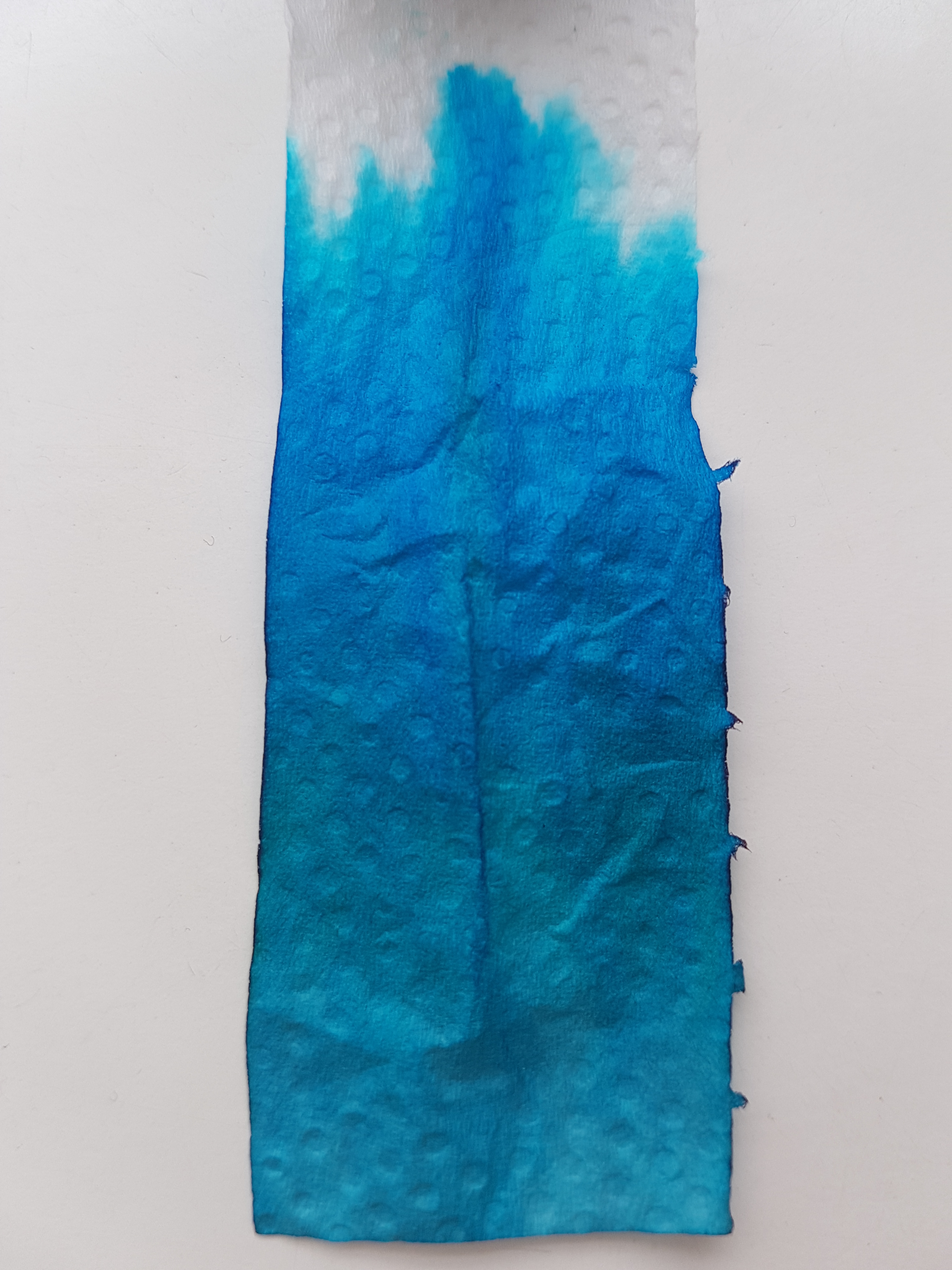
Would you like to know more about these or other pens or inks on my blog, be sure to send me a comment. Have  great week and thank you as ever for reading! As always much appreciated! OK, one more pic…

fullsizeoutput_41a.jpeg

Robert Oster Signature Fire & Ice

Now that I have “invested” in an extra-fine, fine and medium Platinum Preppy and tweaked my Lamy steel broad to actually write like a broad nib, I feel sort of kitted out to do an ink review. By the way, before I continue with the ink: the step up from the fine to the medium Preppy is quite a substantial one. Have you experienced that as well? Anyhow, back to the ink. I thought it would be nice to do a genuine “it” ink, an ink of the moment: Robert Oster Signature Fire & Ice (we’re talking February-March 2017, if you are reading this blog in future years). The first runs were sold out in no time and I have seen new batches ready for shipment to dealers. So if you are waiting for yours, hang on just a little bit longer. It’s on its way!

fullsizeoutput_406.jpeg

Above is a full page view of Robert Oster Signature Fire & Ice in a Leuchtturm A5 blank journal. At first glance this is a very becoming, dark side of light blue ink, if you catch my drift. It does not have enough green in it to be a true turquoise and it is a lot more more grayish than a royal blue. It has beautiful shading qualities as well as a red sheen and outline. When used in a wet nib and on the right paper, I must add. I tried the ink in the same nibs on different paper qualities, to see how it behaved.

fullsizeoutput_407.jpeg

Above the various paper qualities next to each other. Clockwise from top left: cheap copy paper, Leuchtturm A5 blank, Rhodia 90gsm dot grid, Tomoe River white loose sheet A4. By the by, bottom right are writing samples of Robert Oster’s Blue Denim and Bondi Blue.

Let’s have a closer look.

fullsizeoutput_408.jpeg

Oh my! This paper does not do the ink justice. Not even that much shading, to be honest. Well, I’d suggest not using this lovely ink for your office notes, unless you absolutely cannot do without this color. The extra-fine nib, which seems slightly wetter than the fine (I have another fine nib on the way, don’t worry) already shows quite (un)impressive feathering. I write in a slightly large hand but as soon as I write in this broad, it becomes nearly illegible.Flipping the page showed substantial bleed-through. Next!

fullsizeoutput_40a.jpeg

This is the Leuchtturm journal paper. I’m a lot happier with this! Hardly any feathering, very nice shading and some fiery red outline with wet and broad nibs. Some bleed-through though. But I expected that from Leuchtturm paper, so I am not surprised about that.

20170303_104033.jpg

The Jinhao Fude nib shows the fire best, although you really don’t need a paint brush nib like this fude to bring out the sheen. Take a look at the extra-fine Platinum Preppy on the Tomoe River:

fullsizeoutput_40b.jpeg

There is definitely a fiery outline on this extra fine ink line. Even a very slight outline on the fine. Very subtle, but it’s there.

fullsizeoutput_409.jpeg

What about the ink on Rhodia paper? Loads of nice shading (yes, I wrote “Fir” with the medium… blame a slow eye-brain connection), no feathering, no bleed-through. Slight outline and sheen on the very wet pooling bits. Definitely an ink that deserves an decent base. Not a standard work horse ink, unless you bring a Hobonichi with Tomoe River paper or a Rhodia journal to the office. So, just to top that off, a Tomoe River overview of nib lines:

fullsizeoutput_40c.jpeg

A nice and calm ink when viewed from above, with a surprise fiery edge when viewed from aside. I’d say: a great ink for art journaling and art work, where you can really bring out that sheen by generously applying it to good paper. A great ink for letter writing, because a pageful is quite pleasant and calm to the eye, but with that lovely sheen as a bonus. A great ink for making special entries in your journal or diary, or on fountain pen friendly greeting cards. Just use a waterproof ink to address the envelope, because this ink is not waterproof.

Talking about waterproofness, let’s take a look at the chromatography.

20170303_093932.jpg

All blues, with the concentrated pigment on the edge of the tissue forming the illustrious outline. The bottom shows the more grayish aspects while at the top the bright bright blue almost leaps off the tissue. No greens or yellows peeping out at the top, so just blue pigment, making for the outline and sheen where it concentrates on the paper. It cleans out pretty easily.

All in all, a well behaved ink for special-occasion-writing on old quality paper. I have said on Instagram before that Robert Oster has revamped and de-dulled blue inks and I stand by that. Not only this Fire & Ice, also the bright and happy Bondi Blue, the new take on a shading blue-black with Blue Denim, the sunny Australian Sky. All blue colors to make you fall in love with blue inks all over again.

Have you used any of his inks? Please let me know if you would like to seen another Robert Oster Signature reviewed.