Now that I have “invested” in an extra-fine, fine and medium Platinum Preppy and tweaked my Lamy steel broad to actually write like a broad nib, I feel sort of kitted out to do an ink review. By the way, before I continue with the ink: the step up from the fine to the medium Preppy is quite a substantial one. Have you experienced that as well? Anyhow, back to the ink. I thought it would be nice to do a genuine “it” ink, an ink of the moment: Robert Oster Signature Fire & Ice (we’re talking February-March 2017, if you are reading this blog in future years). The first runs were sold out in no time and I have seen new batches ready for shipment to dealers. So if you are waiting for yours, hang on just a little bit longer. It’s on its way!

Above is a full page view of Robert Oster Signature Fire & Ice in a Leuchtturm A5 blank journal. At first glance this is a very becoming, dark side of light blue ink, if you catch my drift. It does not have enough green in it to be a true turquoise and it is a lot more more grayish than a royal blue. It has beautiful shading qualities as well as a red sheen and outline. When used in a wet nib and on the right paper, I must add. I tried the ink in the same nibs on different paper qualities, to see how it behaved.
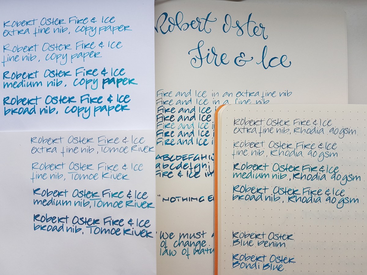
Above the various paper qualities next to each other. Clockwise from top left: cheap copy paper, Leuchtturm A5 blank, Rhodia 90gsm dot grid, Tomoe River white loose sheet A4. By the by, bottom right are writing samples of Robert Oster’s Blue Denim and Bondi Blue.
Let’s have a closer look.

Oh my! This paper does not do the ink justice. Not even that much shading, to be honest. Well, I’d suggest not using this lovely ink for your office notes, unless you absolutely cannot do without this color. The extra-fine nib, which seems slightly wetter than the fine (I have another fine nib on the way, don’t worry) already shows quite (un)impressive feathering. I write in a slightly large hand but as soon as I write in this broad, it becomes nearly illegible.Flipping the page showed substantial bleed-through. Next!

This is the Leuchtturm journal paper. I’m a lot happier with this! Hardly any feathering, very nice shading and some fiery red outline with wet and broad nibs. Some bleed-through though. But I expected that from Leuchtturm paper, so I am not surprised about that.
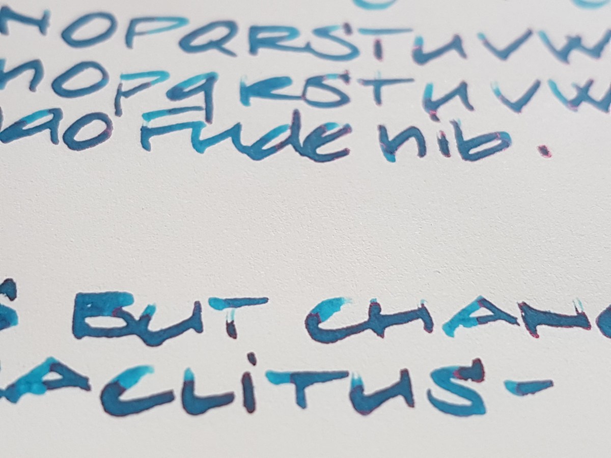
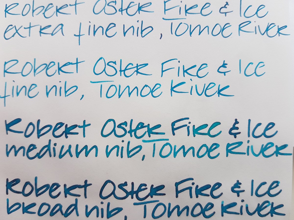
The Jinhao Fude nib shows the fire best, although you really don’t need a paint brush nib like this fude to bring out the sheen. Take a look at the extra-fine Platinum Preppy on the Tomoe River:
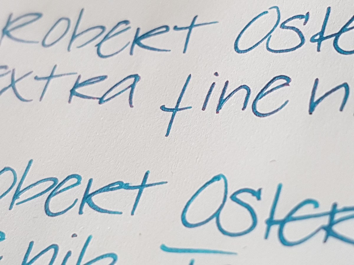
There is definitely a fiery outline on this extra fine ink line. Even a very slight outline on the fine. Very subtle, but it’s there.
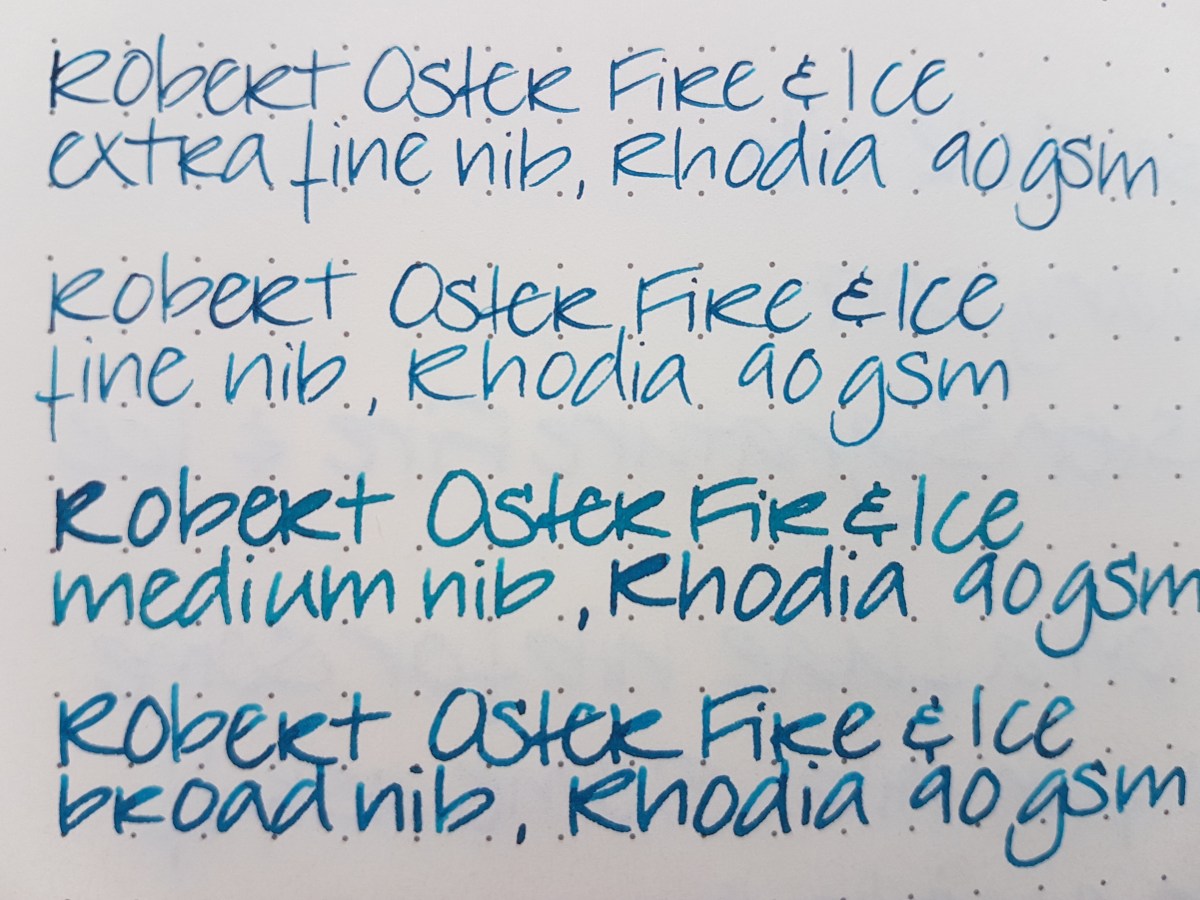
What about the ink on Rhodia paper? Loads of nice shading (yes, I wrote “Fir” with the medium… blame a slow eye-brain connection), no feathering, no bleed-through. Slight outline and sheen on the very wet pooling bits. Definitely an ink that deserves an decent base. Not a standard work horse ink, unless you bring a Hobonichi with Tomoe River paper or a Rhodia journal to the office. So, just to top that off, a Tomoe River overview of nib lines:
A nice and calm ink when viewed from above, with a surprise fiery edge when viewed from aside. I’d say: a great ink for art journaling and art work, where you can really bring out that sheen by generously applying it to good paper. A great ink for letter writing, because a pageful is quite pleasant and calm to the eye, but with that lovely sheen as a bonus. A great ink for making special entries in your journal or diary, or on fountain pen friendly greeting cards. Just use a waterproof ink to address the envelope, because this ink is not waterproof.
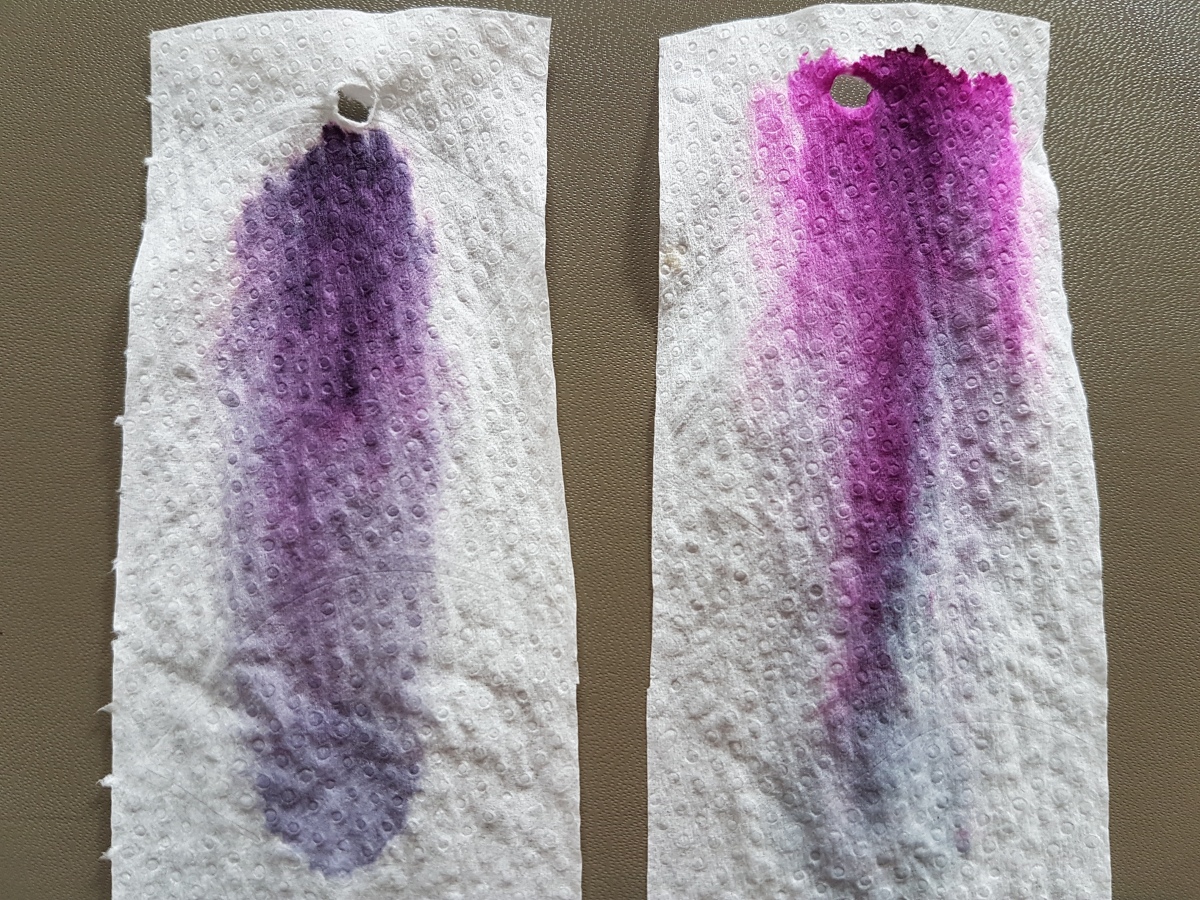
Talking about waterproofness, let’s take a look at the chromatography.
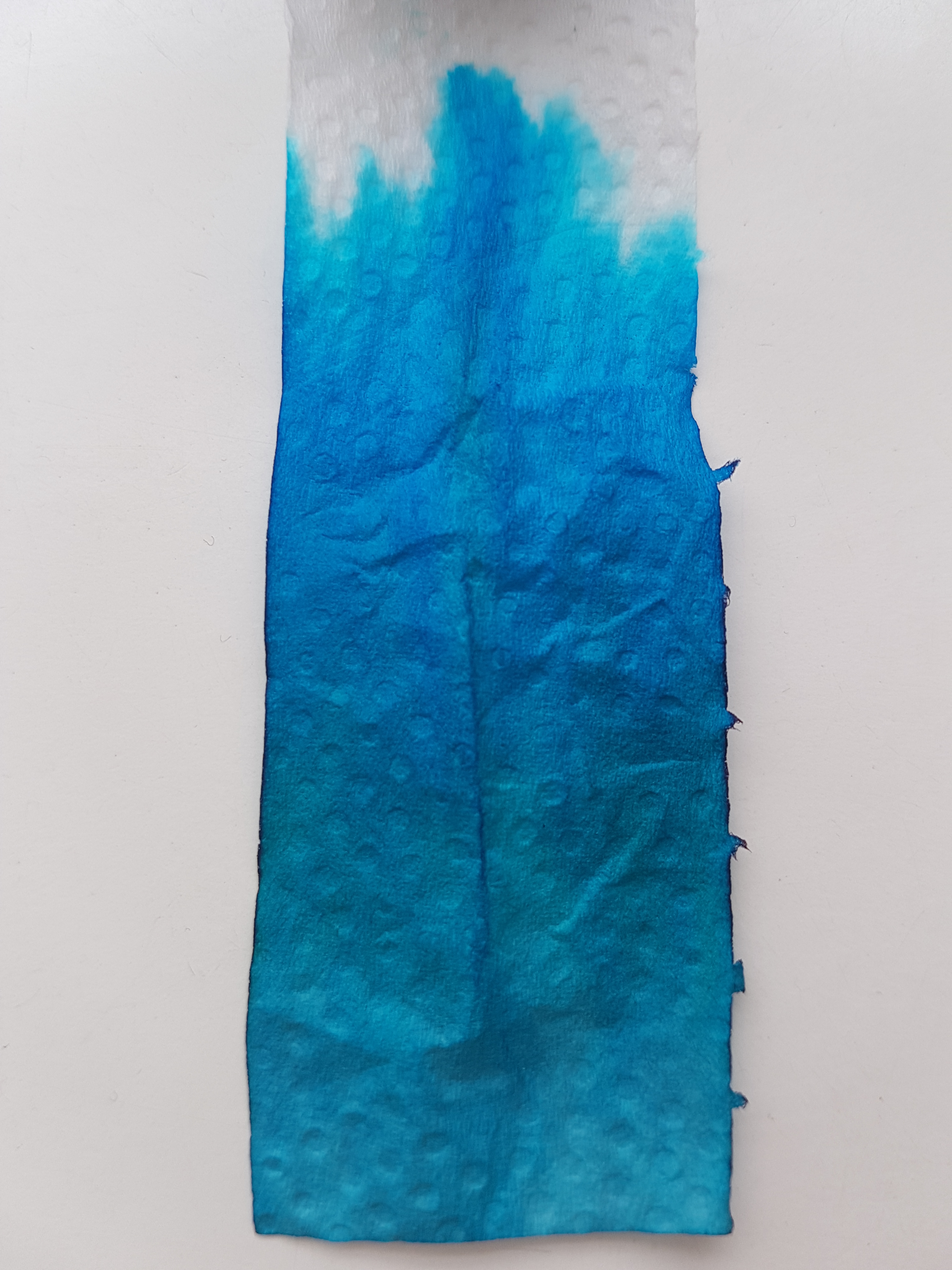
All blues, with the concentrated pigment on the edge of the tissue forming the illustrious outline. The bottom shows the more grayish aspects while at the top the bright bright blue almost leaps off the tissue. No greens or yellows peeping out at the top, so just blue pigment, making for the outline and sheen where it concentrates on the paper. It cleans out pretty easily.
All in all, a well behaved ink for special-occasion-writing on old quality paper. I have said on Instagram before that Robert Oster has revamped and de-dulled blue inks and I stand by that. Not only this Fire & Ice, also the bright and happy Bondi Blue, the new take on a shading blue-black with Blue Denim, the sunny Australian Sky. All blue colors to make you fall in love with blue inks all over again.
Have you used any of his inks? Please let me know if you would like to seen another Robert Oster Signature reviewed.


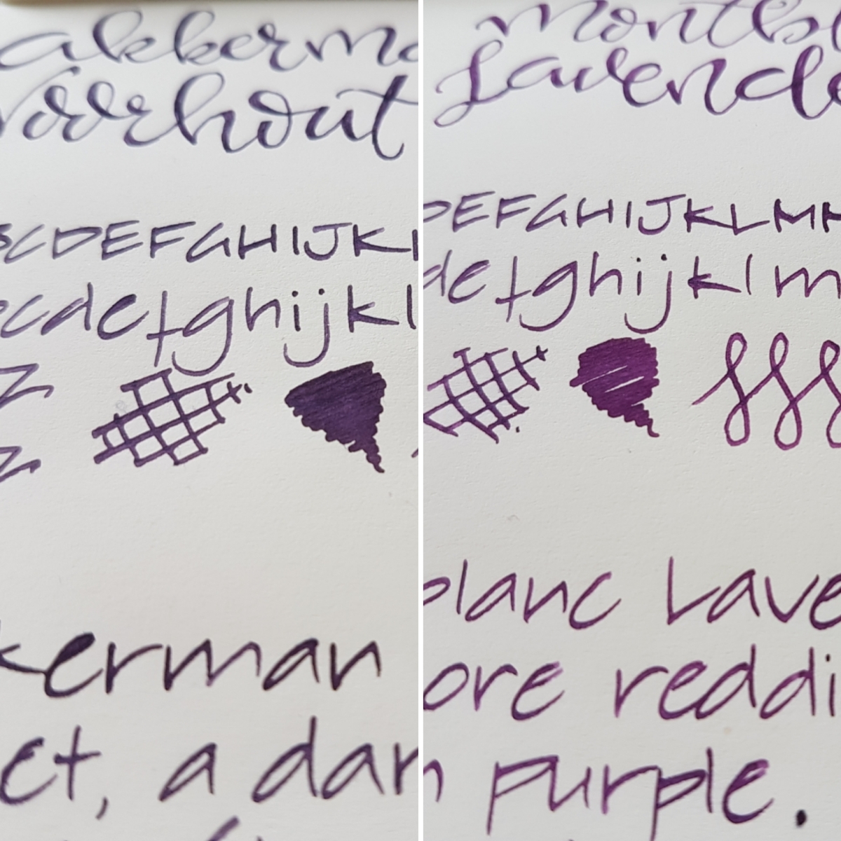
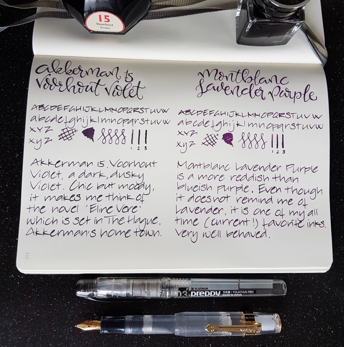
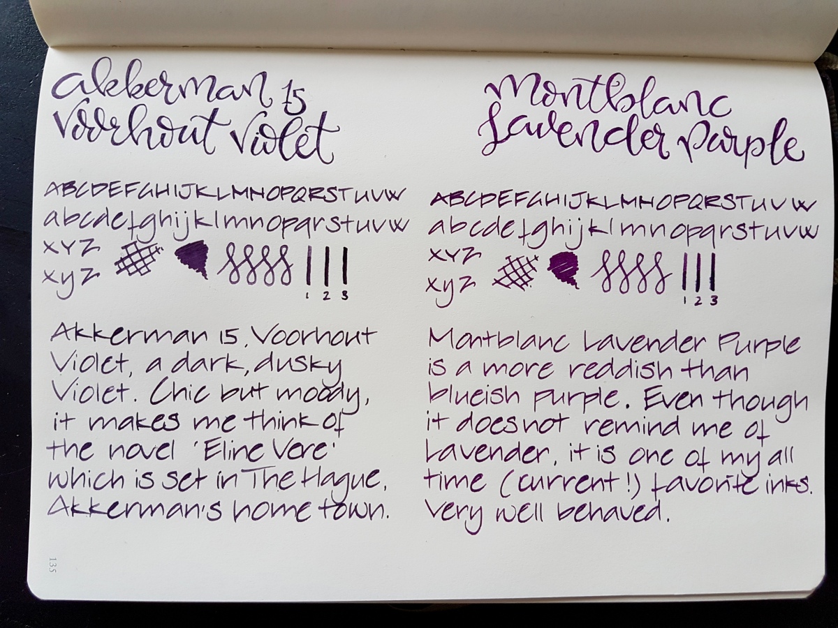 Both inks are of very good quality, decently behaved, easily cleaned and both are not waterproof. Both come in a 60 ml bottle. The bottles are very distinctive and good looking bottles in their own right. Dry times on this Leuchtturm paper was about the same for both inks. On Tomoe River the Montblanc dries more quickly. In the Netherlands, the price of both inks fall in the same 15-20 Euros category, the Montblanc being about 3 Euros more expensive for 60 ml.