At the end of the first Dutch Pen Meet-up, when we had besieged Akkerman The Hague, we were graciously given a wonderful goodie bag plus an Akkerman ink of our choice. I went back and forth between Voorhout Violet and Groenmarkt Smaragd, but finally opted for Voorhout Violet, Akkerman ink no. 15. One of my fountain pen friends from that meet-up, Neseli, asked if I could do a comparison between this ink and Montblanc Lavender Purple and I hereby happily oblige.
 Both inks are of very good quality, decently behaved, easily cleaned and both are not waterproof. Both come in a 60 ml bottle. The bottles are very distinctive and good looking bottles in their own right. Dry times on this Leuchtturm paper was about the same for both inks. On Tomoe River the Montblanc dries more quickly. In the Netherlands, the price of both inks fall in the same 15-20 Euros category, the Montblanc being about 3 Euros more expensive for 60 ml.
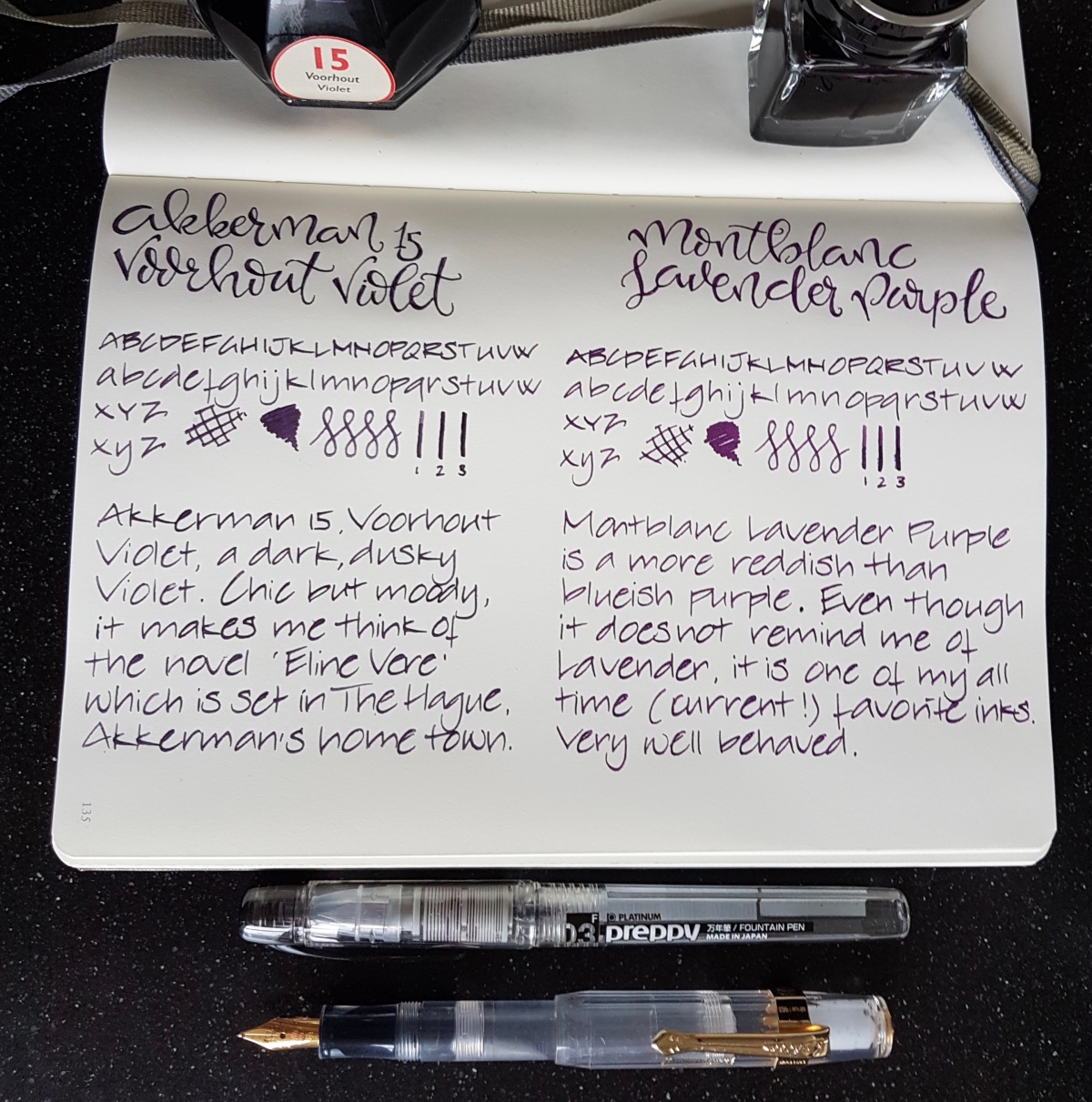
Seen from above in natural light, the inks both are dark purples. So let’s take a closer look at them. Pens used, by the way, are a fine Preppy for the faux brand calligraphy and a Kaweco BB with an architect grind for the alphabets, squiggles and scribbles.
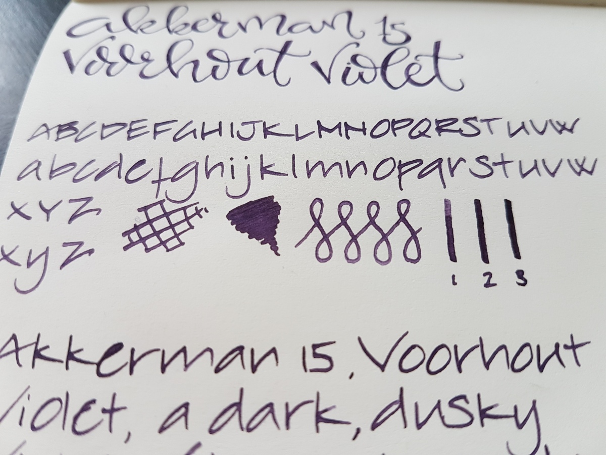
The Voorhout Violet is a dusky violet purple on the blueish scheme. It is actually pretty close to the darker shades in the pansy after which it was named. Voorhout is a chic avenue in The Hague and the ink reminds me of Eline Vere, a novel named after its main character by Dutch fin-de-siecle novelist Louis Couperus. Eline Vere was quite a hysteric character, misled by her day dreams and misplaced romantic illusions, fed by her male equivalent cousin. A beautiful novel that portrays the ennui of the upper classes in The Hague at that time pretty impressively. This ink fits the atmosphere in that novel very well. Ill-lit rooms, crammed with dusty expensive furniture and people stifled by their bourgeois rules. Chic, but gloomy. I love the novel and I love this ink. Great for letter writing on good quality paper, journaling and I would consider it office appropriate.
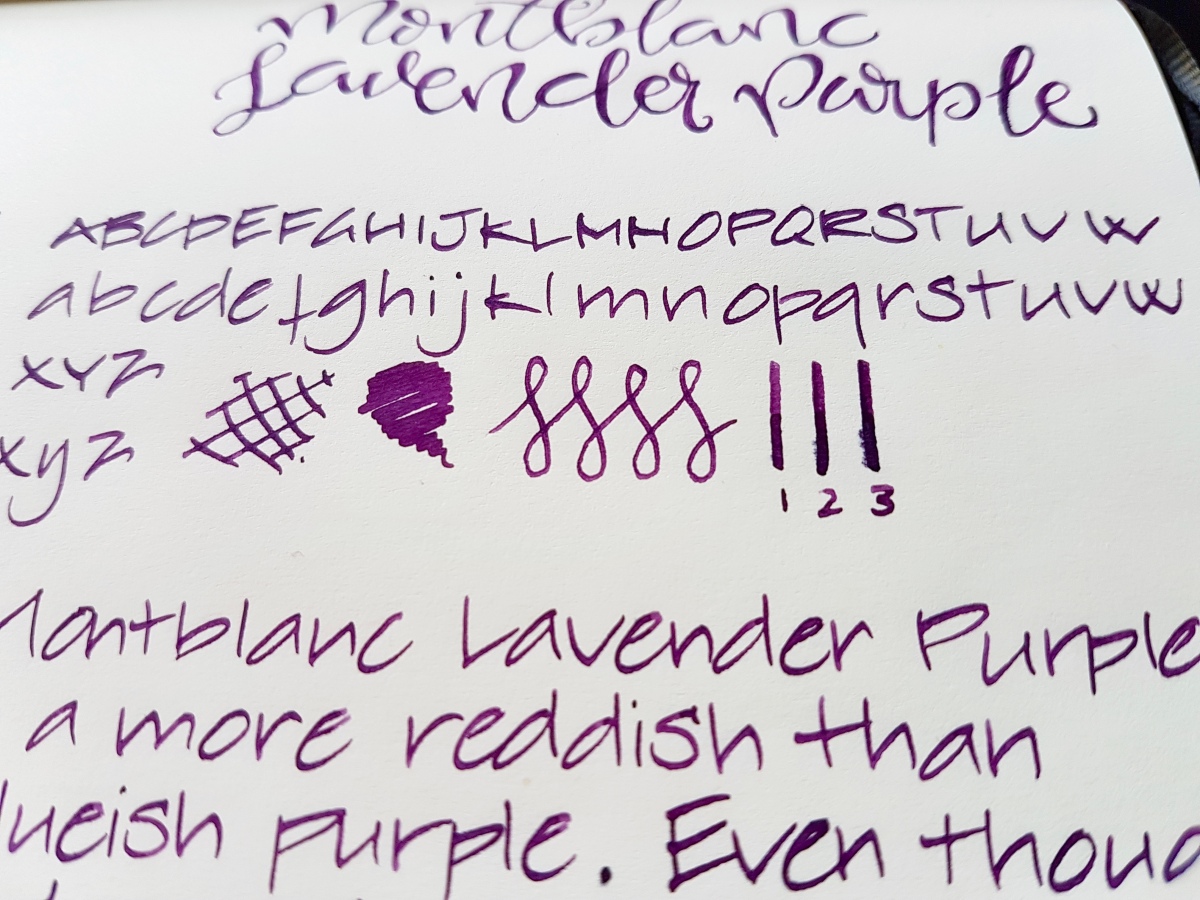
The Lavender Purple is a much pinker, redder purple than the Voorhout Violet. It reminds me of the dark purple that was fashionable in the 70s, but a little more subdued and fit for everyday use. To me it is much more purple than lavender. Lavender in bloom tends to lean more to the blueish spectrum. Nevertheless, a beautiful ink. I love using it as an office ink in my Hobonichi office planner, because it dries pretty quickly, even in a broad nib. I would qualify the Lavender Purple as a bit more cheerful than the Voorhout Violet, without jumping off the page in screaming purpleness.
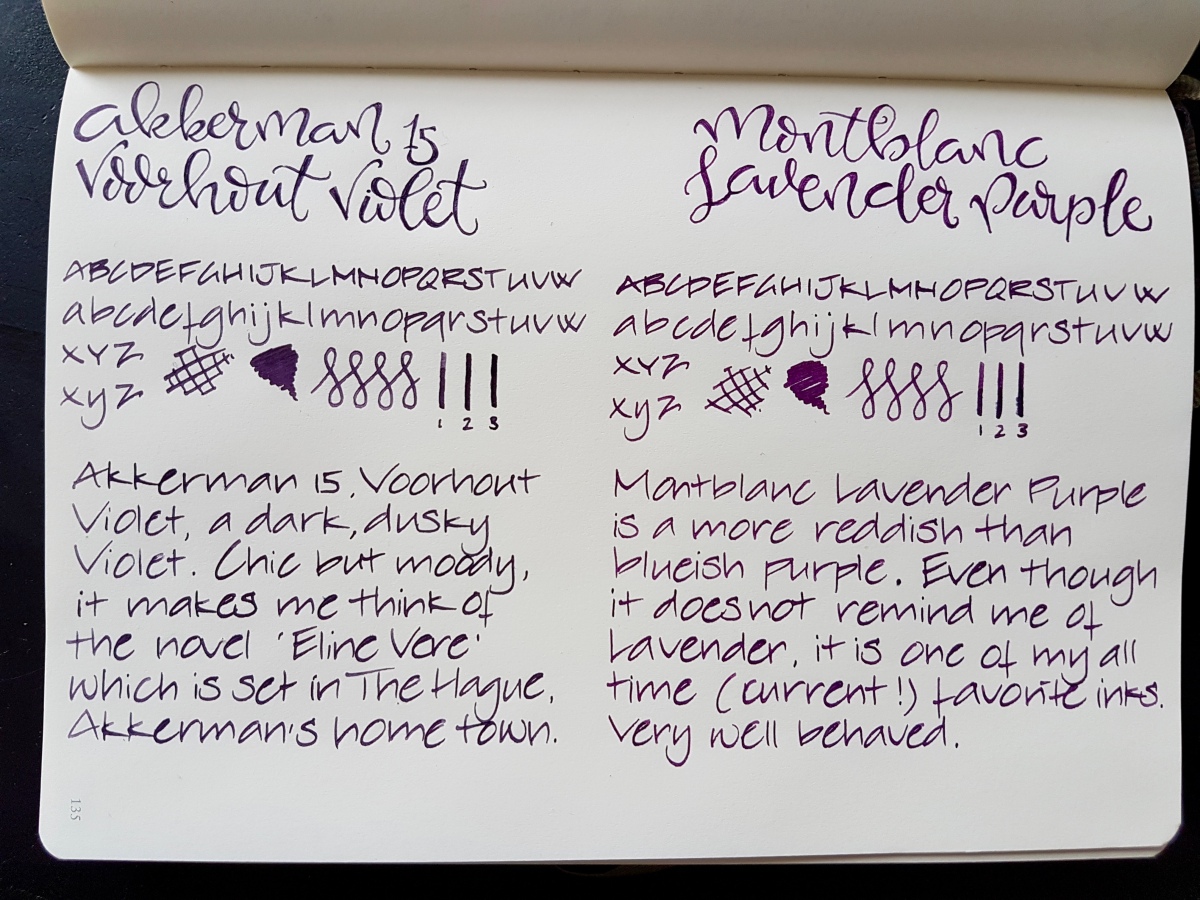
A closer look side-by-side, in natural light:
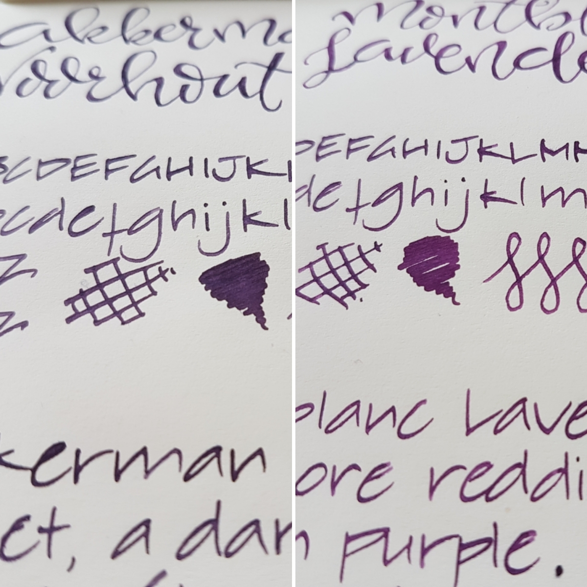
This picture shows equal qualities in shading. No sheen to speak of on this Leuchtturm paper, but both do sheen on even more ink resistant paper. Both lovely inks in their own right and I am happy to have both as a full bottle. These dark, decent purples will surely get good daily use because I consider both office appropriate.
Now for my crude chromatography, picture taken in natural light:
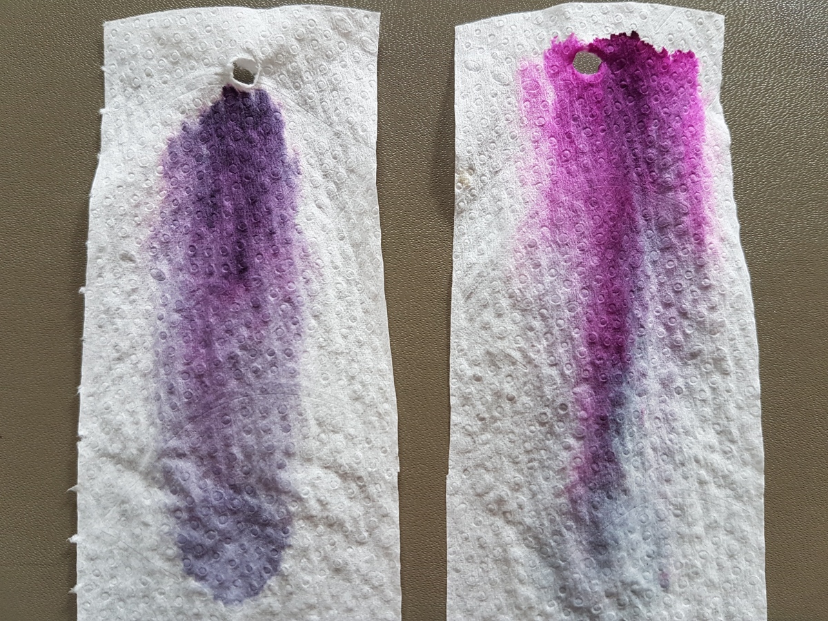
To the left the Voorhout Violet, to the right the Lavender Purple. Both show dark blue at the base, lavender hues in the middle coming up to still dark purple with a light pink halo in the Voorhout Violet. The Lavender Purple shows a bright nearly hot pink halo.
As said, I am happy to have both the inks at my disposal, and both will get a good deal of written mileage. Now that leaves just one thing… one day I will still have to go for that bottle of Groenmarkt Smaragd… The struggles of an inkaholic!
One final picture, just for the heck of it. Let me know what your purple ink of choice is. And as ever, thank you for reading!