Ink review: P.W. Akkerman Shocking Blue

20170324_161155.jpg

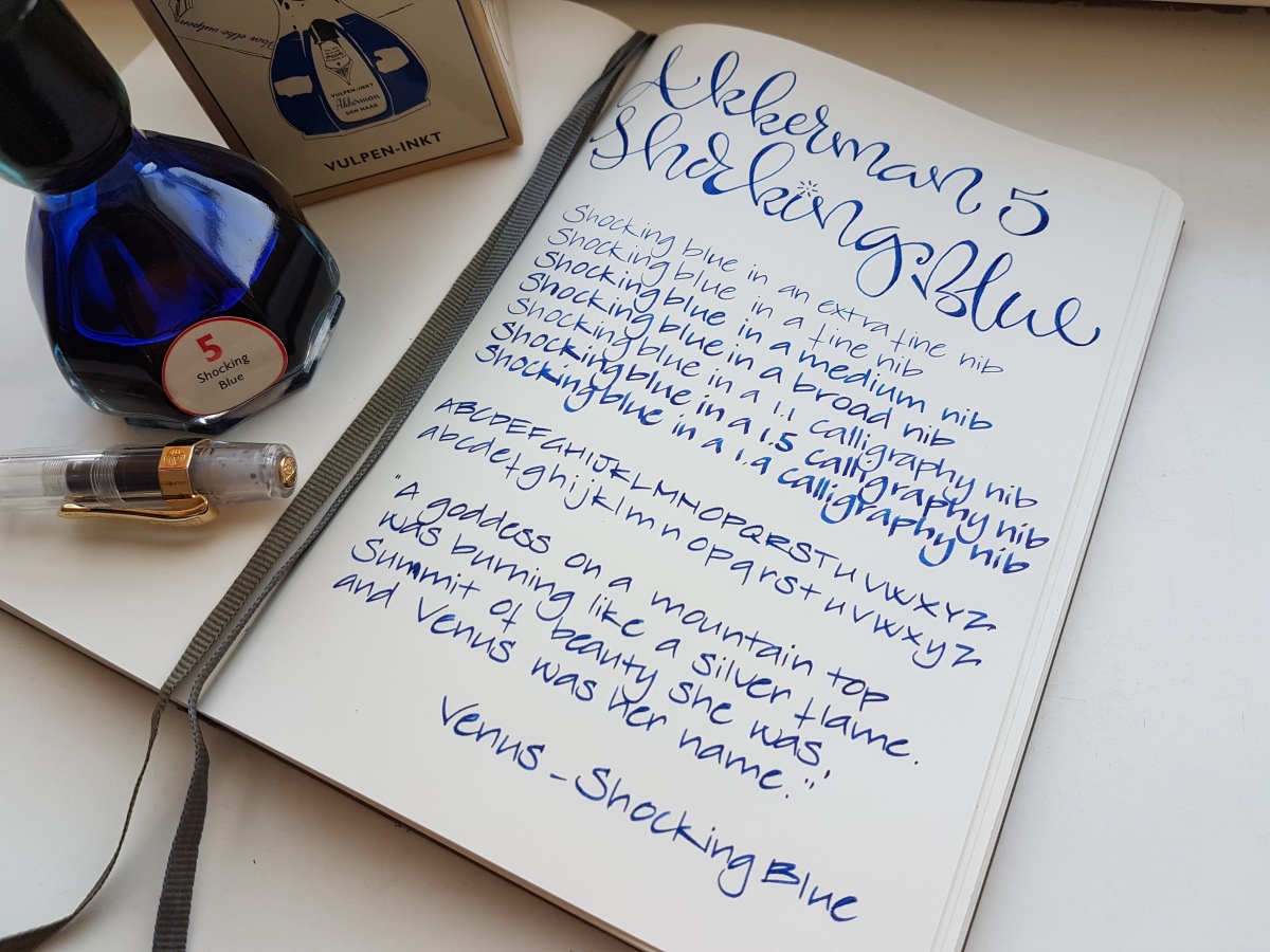
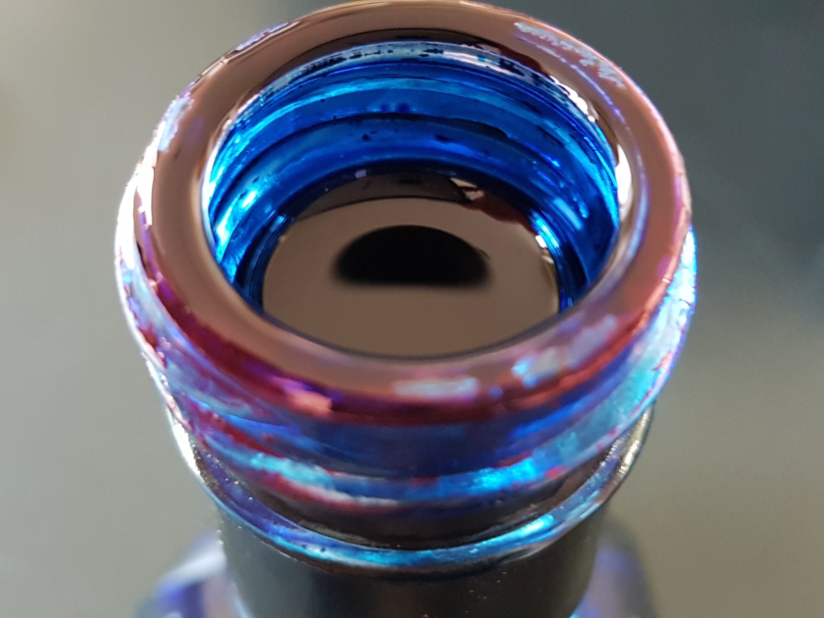
A rim like this on your ink bottle neck surely looks promising! P.W. Akkerman’s #5 ink, Shocking Blue, is the most loved and best known of the Akkerman inks. A deep, bright blue you just cannot go wrong with. Before we take a look at the writing samples, let me tell you about the name of this ink. Perhaps you are already aware of this fact, or it is new to you, but P.W. Akkerman is one of Holland’s oldest fountain pen stores, located in The Hague in one of Holland’s very first “malls”. Akkerman uses names for their inks that are all associated with the town’s phenomena. The Hague was Holland’s birth ground of quite a number of blues bands in the 60s. The Golden Earring for example, who you may know from their song Radar Love, Brainbox who covered Summertime in a bluesy-funky way and Shocking Blue, who had a hit in 1968 with Venus. Some of you may know the Bananarama cover version of that song. I used a couple of lines in my writing samples. Enough of that, on to the ink!

fullsizeoutput_43b

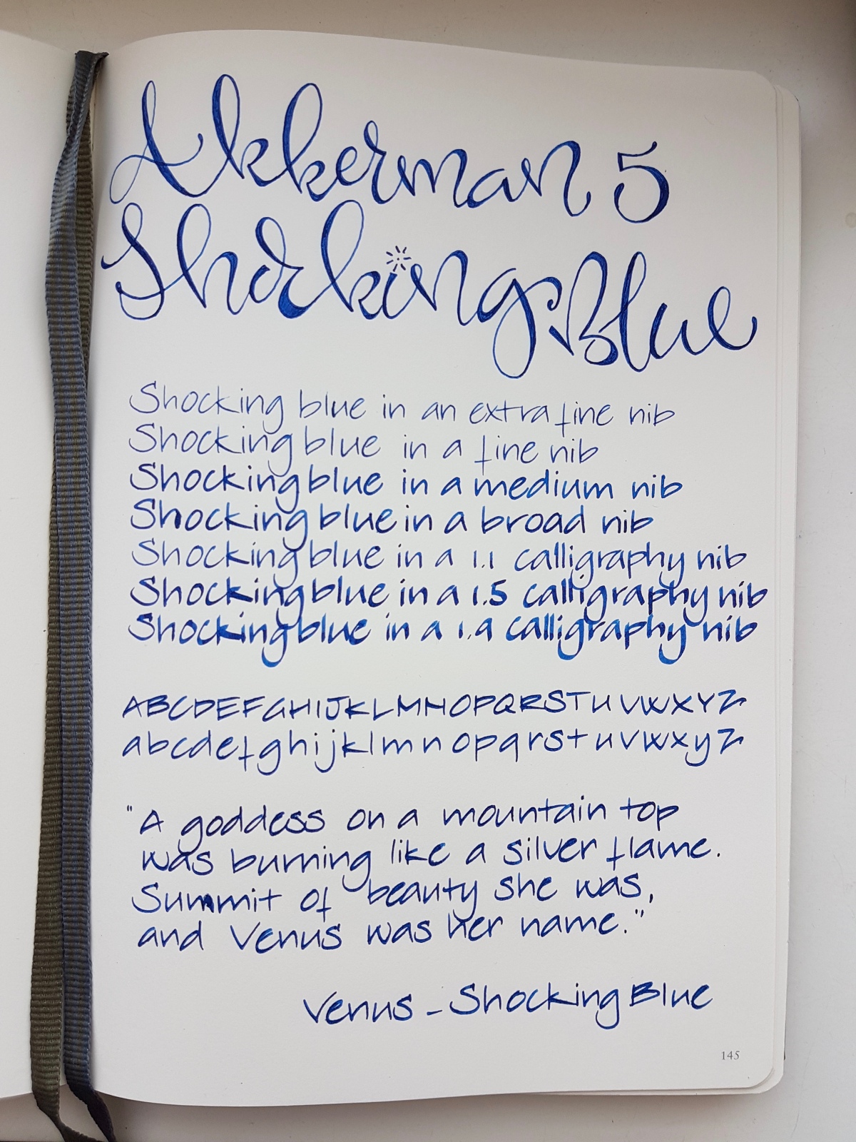
Shocking Blue is a classic, intensely deep royal blue with its renowned red sheen. As you can see above, it almost pops of the page! The ink behaved decently in all nibs sizes and has relatively quick drying time, especially in finer nibs. My husband is a lefty overwriter and always has his TWSBI Eco inked up with Shocking Blue. Another reason he loves this ink is a matter of ritual. The Akkerman inks all come in that very distinctive marble-in-the-bottleneck ink bottle. You tip the capped bottle upside down so that some ink gathers in the top part of the bottle from where you fill your pen. This was the ink his parents used many years ago, so refilling the pen from the bottle brings back memories for him.

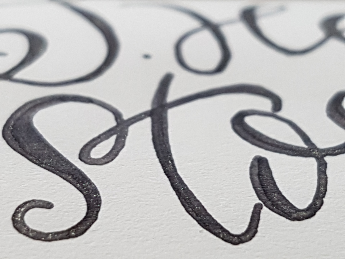
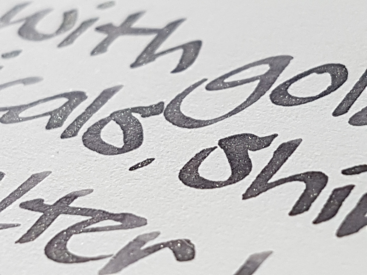
Let’s look at the writing up close to find that illustrious sheen!

20170324_15574220170324_15562920170324_160358

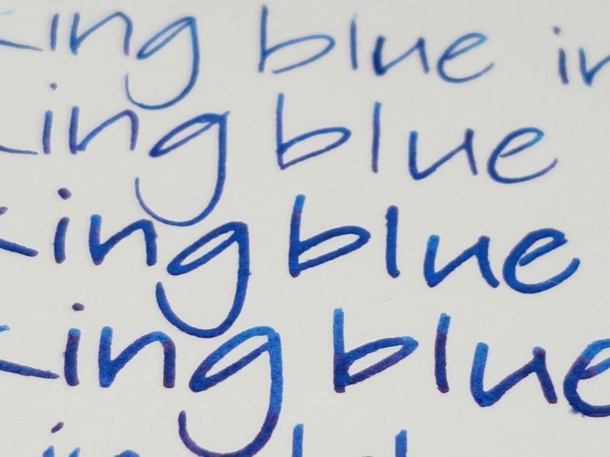
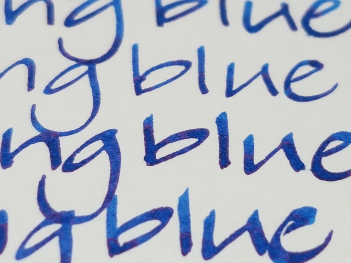
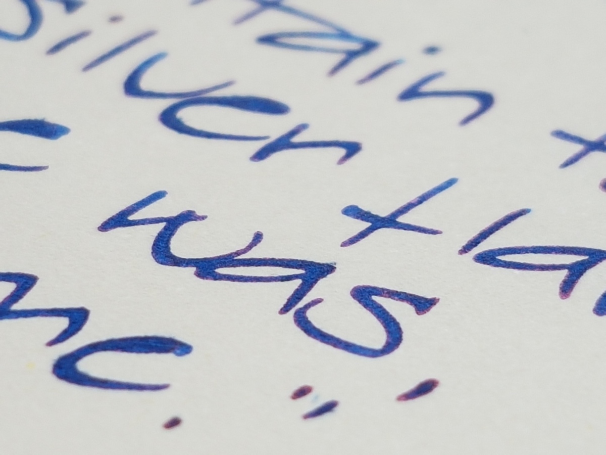
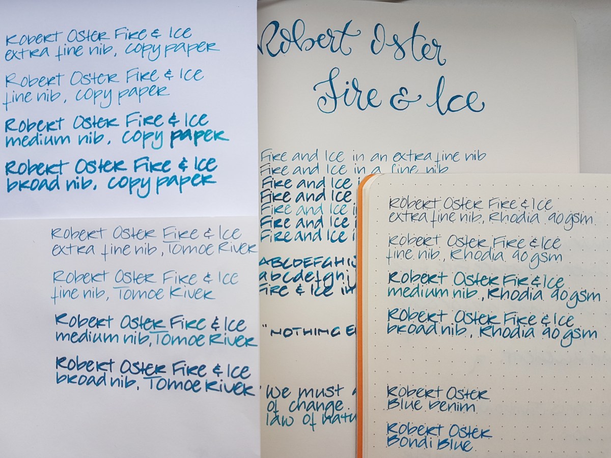
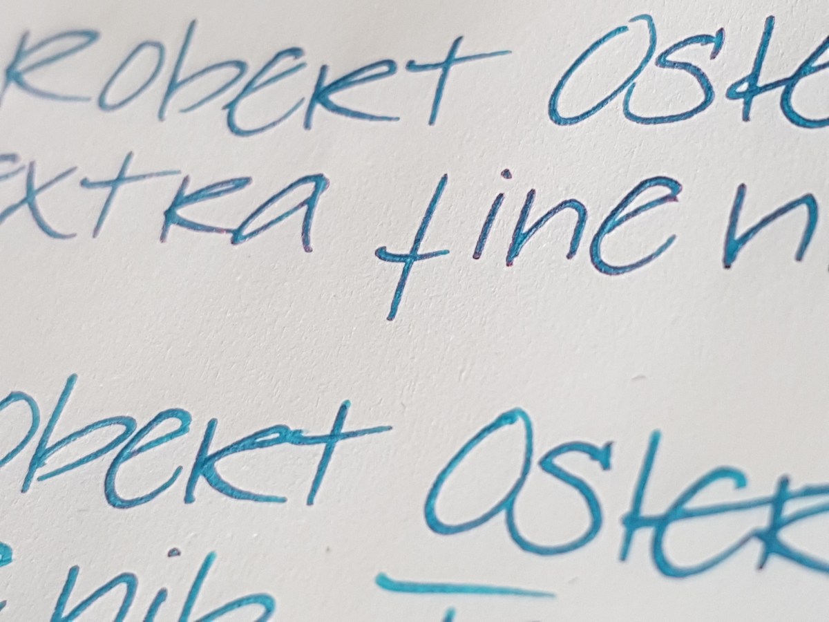
Yes, a wonderful deep deep blue ink, really vibrant with a lovely red sheen and outline. It pops up in every nib, especially on more absorbing paper. I made a rim stamp in my Leuchtturm journal to show the ink’s sheening capacity.

20170324_161416

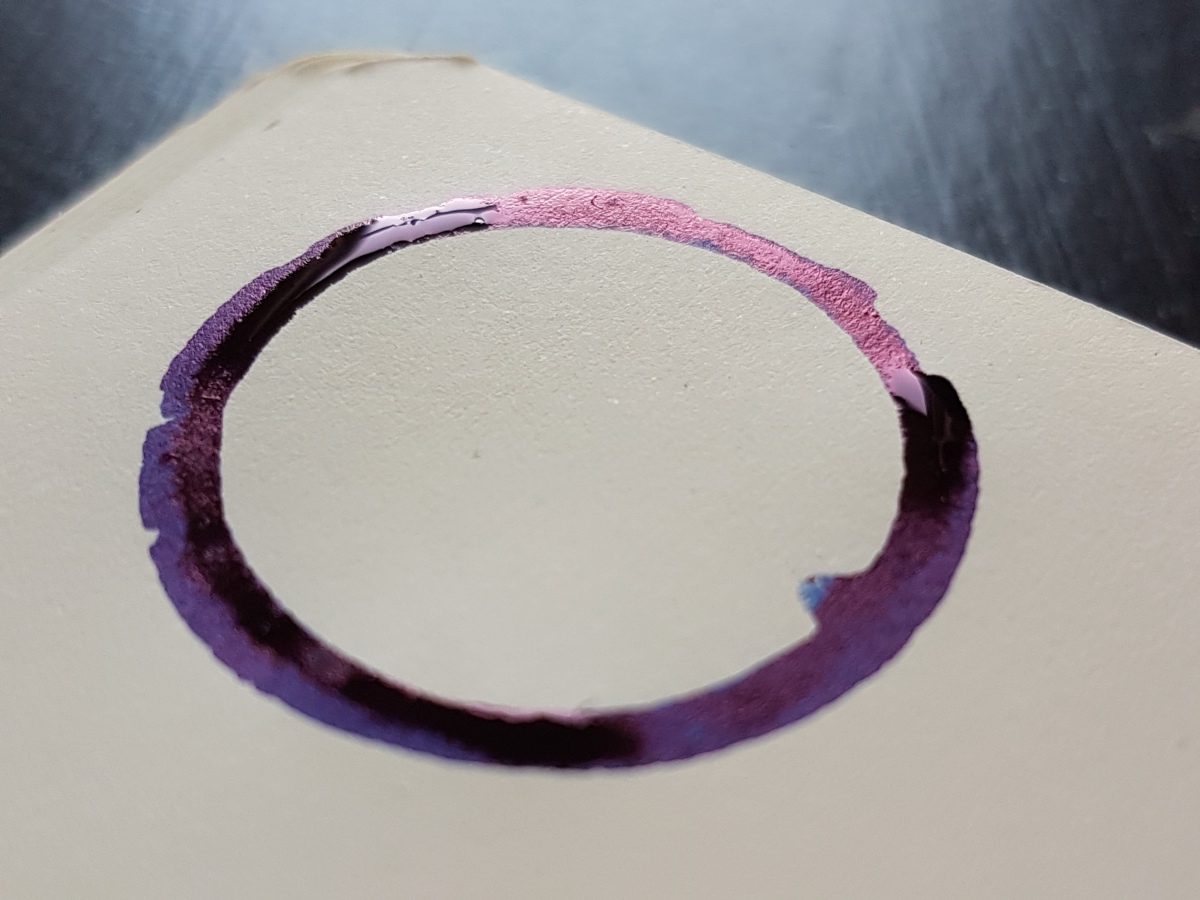
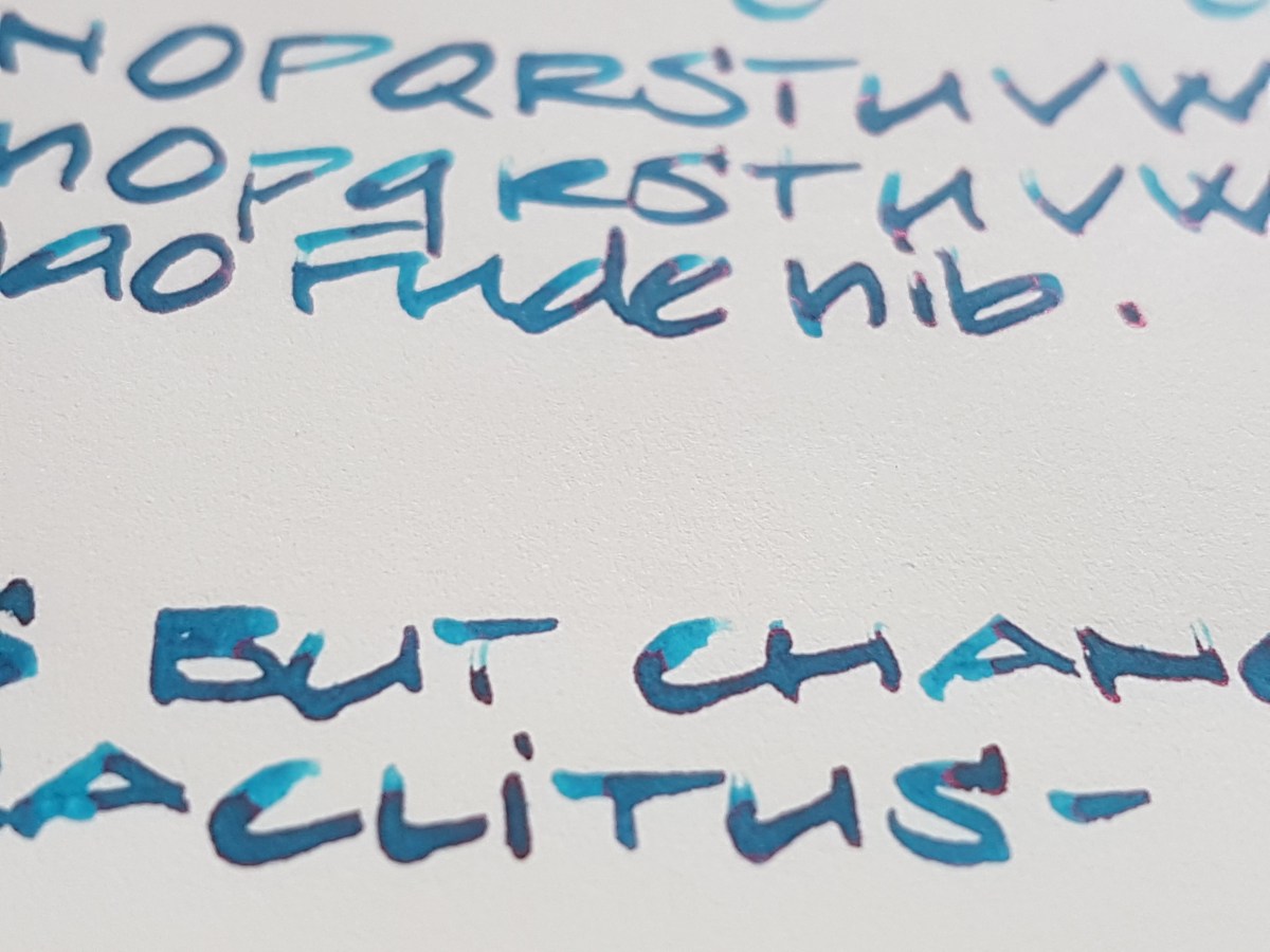
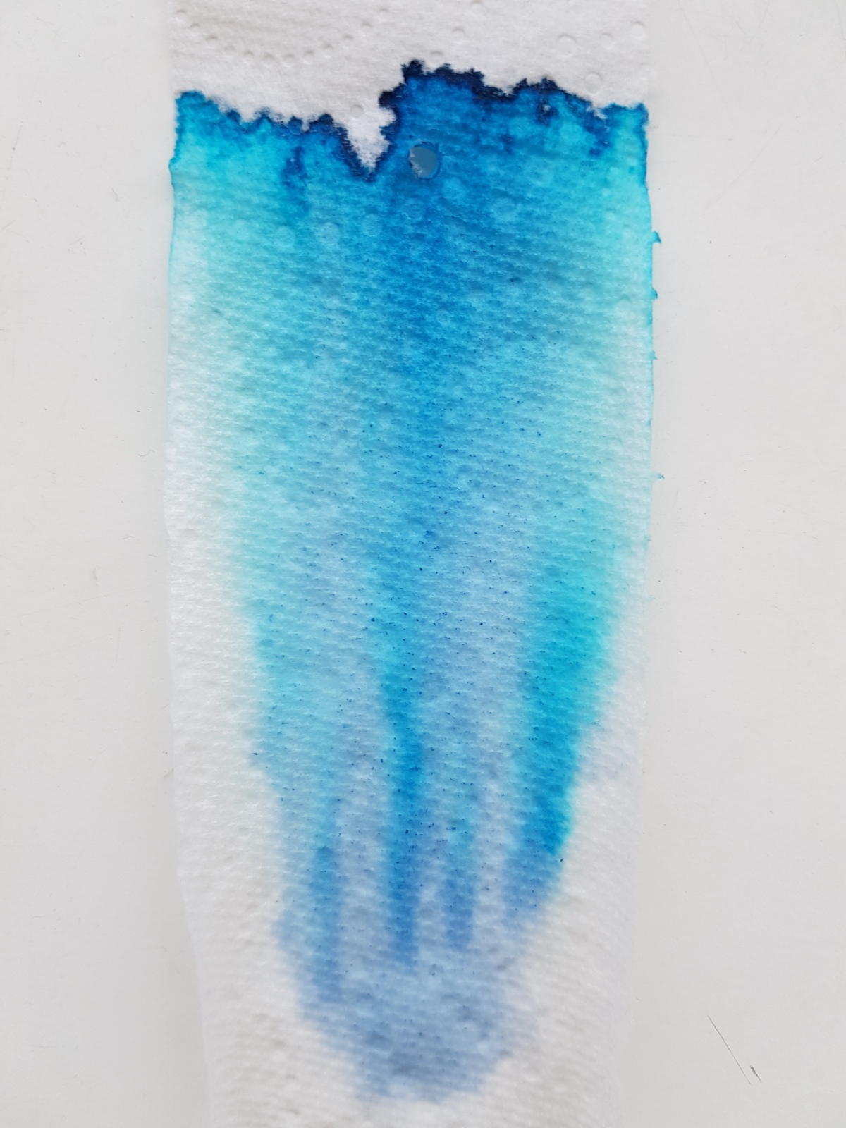
Oh yes, here we see that the ink is so intense that it leans towards a purple. The sheen is nice and thick, almost oily. The chromatography shows the purple aspects in the lavender hue in the base. The ink trail develops into a bright blue and ends in a dark blue outer line where the pigments are deposited.

20170324_170241

This ink is usable in most situations -apart from those where you want your ink to be waterproof, it isn’t- school, university, the office, personal use, correspondence that doesn’t require bulletproofness. It is a crowd pleaser! And I can see why. It is blue without being run-of-the-mill.

How about you, do you have a deep royal blue with a red sheen of choice? Let me know, so I can do a side-by-side at some point.

Thank you as ever for reading and until the next post!

All pictures taken in natural light, no filters used.

Disclaimer: I bought this ink wit my own money for my own use. No affiliate links.

Tools used:

  • Leuchtturm A5 blank notebook;
  • Akkerman Shocking Blue ink;
  • Platinum Preppies EF, F, M;
  • Lamy Vista B, 1.1, 1.5, 1,9;
  • Kaweco Classic Sport BB architect grind;
  • a strip of paper kitchen towel;
  • Samsung S7 phone camera.

20170324_160313

Montblanc JFK Navy Blue Ink

Rumor has it that amongst fountain pen lovers there are those who are able to maintain a respectable office position. Kudos to you if you are one of them! And if you have a decent job, you will need at least one decent ink. An ink that will confirm your office appropriateness. Montblanc JFK Navy Blue is just such an ink. But even if you cannot or do not use fountain pens at your place of work, this is a great ink to have in your collection/hoard/walk-in ink closet. This is not a boring blue-black or navy blue ink. Plenty of shading and sheen going on here. And depending on your nib width of choice, Montblanc JFK shows a nice range of blues. Let’s have a look.

fullsizeoutput_414.jpeg

Depending on the nib width and the dry- or wetness of your pen, JFK shows quite a lovely range of cool dark blues. I would even classify this as a new-pair-of-denims blue. Dark enough where the ink pools and lighter at the edges and frays. The ink shows a nice sheen in particularly wet nibs, as the line in my vintage Pelikan 140 OBB (yes, I did the eclectic thing and put a Montblanc ink in a Peli…)

fullsizeoutput_413

This gusher of a nib puts down a near black ink line, very nice! So this ink gives you a range of colors from near black via dark royal blue to a light indigo.

Even office appropriate inks can have hidden aspects. It’s a good guy with a bad boy edge. Is that why it was named after JFK?

fullsizeoutput_418.jpeg

The ink is a special edition Montblanc ink and has been re-launched (we’re speaking end of 2016 – early 2017) at a number of pen sellers. In the Netherlands, it is currently sold at Akkerman and in the USA I have seen it on the Anderson site. Not affiliated, just to let you know should you want to go after this ink. On auction sites it goes for triple or quadruple its store price, so be aware of that. It is sold in the special edition 30 ml bottles, which isn’t much for an ink of this color, I think. It is so multi-purpose, you will finish the bottle in no time.

I do love the look of these elegant ribbed special edition bottles, I think it suits the elegance of the ink color itself very well. Although I have yet to experience what it is like to get the last drops out. But you can always transfer it to an ink miser or sample vial for those final drops. The box is very stylish, a clear white box with the Montblanc mount and logo in gray, JFK in navy black blue with a gray outline, John F. Kennedy below that and navy blue in small caps at the bottom. On the sides the capitals JFK are repeated in a glossy finish, a lovely detail.

fullsizeoutput_417.jpeg

I always keep my inks boxed to protect the color from sunlight and moist. I am sorry this particular box is slightly dented and have to convince myself that is not a valid reason to get another bottle of this ink. For practical reasons, yes, because I always have one pen inked up with a color that I can use for all occasions, as this ink absolutely is. It is also reasonably waterproof by the way; holding a written piece under running water somewhat diluted the ink but the writing was still legible.

Let’s finish this review with a look at the chromatography. As expected with a blue, the largest part of the pigments is blue as it is a primary color. fullsizeoutput_419.jpeg

The blue pigment has been darkened with pigment that looks to be an oily greenish gray, a color that reminds me of Noodler’s El Lawrence or Diamine Salamander, to obtain the blue-black/navy blue hue. It stayed pretty low in the chromatography while the blue pigments all shot upwards with the water absorption.

So, a work appropriate ink with a nice dark edge, interesting shading and sheen. A classic if you ask me and I would very much like to see this become a regular Montblanc ink.

Do you have a limited edition ink (of any brand) that you would like to be a regular?


Robert Oster Signature Fire & Ice

Now that I have “invested” in an extra-fine, fine and medium Platinum Preppy and tweaked my Lamy steel broad to actually write like a broad nib, I feel sort of kitted out to do an ink review. By the way, before I continue with the ink: the step up from the fine to the medium Preppy is quite a substantial one. Have you experienced that as well? Anyhow, back to the ink. I thought it would be nice to do a genuine “it” ink, an ink of the moment: Robert Oster Signature Fire & Ice (we’re talking February-March 2017, if you are reading this blog in future years). The first runs were sold out in no time and I have seen new batches ready for shipment to dealers. So if you are waiting for yours, hang on just a little bit longer. It’s on its way!

fullsizeoutput_406.jpeg

Above is a full page view of Robert Oster Signature Fire & Ice in a Leuchtturm A5 blank journal. At first glance this is a very becoming, dark side of light blue ink, if you catch my drift. It does not have enough green in it to be a true turquoise and it is a lot more more grayish than a royal blue. It has beautiful shading qualities as well as a red sheen and outline. When used in a wet nib and on the right paper, I must add. I tried the ink in the same nibs on different paper qualities, to see how it behaved.

fullsizeoutput_407.jpeg

Above the various paper qualities next to each other. Clockwise from top left: cheap copy paper, Leuchtturm A5 blank, Rhodia 90gsm dot grid, Tomoe River white loose sheet A4. By the by, bottom right are writing samples of Robert Oster’s Blue Denim and Bondi Blue.

Let’s have a closer look.

fullsizeoutput_408.jpeg

Oh my! This paper does not do the ink justice. Not even that much shading, to be honest. Well, I’d suggest not using this lovely ink for your office notes, unless you absolutely cannot do without this color. The extra-fine nib, which seems slightly wetter than the fine (I have another fine nib on the way, don’t worry) already shows quite (un)impressive feathering. I write in a slightly large hand but as soon as I write in this broad, it becomes nearly illegible.Flipping the page showed substantial bleed-through. Next!

fullsizeoutput_40a.jpeg

This is the Leuchtturm journal paper. I’m a lot happier with this! Hardly any feathering, very nice shading and some fiery red outline with wet and broad nibs. Some bleed-through though. But I expected that from Leuchtturm paper, so I am not surprised about that.

20170303_104033.jpg

The Jinhao Fude nib shows the fire best, although you really don’t need a paint brush nib like this fude to bring out the sheen. Take a look at the extra-fine Platinum Preppy on the Tomoe River:

fullsizeoutput_40b.jpeg

There is definitely a fiery outline on this extra fine ink line. Even a very slight outline on the fine. Very subtle, but it’s there.

fullsizeoutput_409.jpeg

What about the ink on Rhodia paper? Loads of nice shading (yes, I wrote “Fir” with the medium… blame a slow eye-brain connection), no feathering, no bleed-through. Slight outline and sheen on the very wet pooling bits. Definitely an ink that deserves an decent base. Not a standard work horse ink, unless you bring a Hobonichi with Tomoe River paper or a Rhodia journal to the office. So, just to top that off, a Tomoe River overview of nib lines:

fullsizeoutput_40c.jpeg

A nice and calm ink when viewed from above, with a surprise fiery edge when viewed from aside. I’d say: a great ink for art journaling and art work, where you can really bring out that sheen by generously applying it to good paper. A great ink for letter writing, because a pageful is quite pleasant and calm to the eye, but with that lovely sheen as a bonus. A great ink for making special entries in your journal or diary, or on fountain pen friendly greeting cards. Just use a waterproof ink to address the envelope, because this ink is not waterproof.

Talking about waterproofness, let’s take a look at the chromatography.

20170303_093932.jpg

All blues, with the concentrated pigment on the edge of the tissue forming the illustrious outline. The bottom shows the more grayish aspects while at the top the bright bright blue almost leaps off the tissue. No greens or yellows peeping out at the top, so just blue pigment, making for the outline and sheen where it concentrates on the paper. It cleans out pretty easily.

All in all, a well behaved ink for special-occasion-writing on old quality paper. I have said on Instagram before that Robert Oster has revamped and de-dulled blue inks and I stand by that. Not only this Fire & Ice, also the bright and happy Bondi Blue, the new take on a shading blue-black with Blue Denim, the sunny Australian Sky. All blue colors to make you fall in love with blue inks all over again.

Have you used any of his inks? Please let me know if you would like to seen another Robert Oster Signature reviewed.


Ink comparison: J. Herbin Stormy Grey and Diamine Sparkling Shadows

Today I started out by prepping a review of the J. Herbin 1670 Stormy Grey only. But was frustrated to once again find the Lamy fine putting down a broader line than the medium and a much wetter line than the broad. So, single ink reviews will resume once I get a fine and extra fine that are actually more true to size in general. Until that time, I’ll do comparisons and the odd Page of Shame (that is a page filled with writing samples of all currently inked pens… *blush*… that’s usually a sizable number of pens with me)

So, as I had already inked the Lamy Vista up with Stormy Grey, I thought it would be nice to compare it to its Diamine cousin, Sparkling Shadows. Both are grey inks with golden shimmery bits in them.

20170224_081909

To the left the Diamine Sparkling Shadows, to the right the J. Herbin 1670 Stormy Grey. Looking with the naked eye (I am a woman of a certain age so I have to take of my glasses to take an up-close look), the particles in the Diamine look more yellowy golden and a little less finely milled than those in the Herbin. The Herbin particles look a bit more rose gold to me.

fullsizeoutput_3fd

Above the writing samples side by side. Both inks felt about moderately wet in the Lamy fine with which I did the faux calligraphy, and in the 1.5 used for the alphabets, passes and writing. The J. Herbin Stormy Grey is a darker grey that seems to have a little more depth in color than the Diamine Sparkling Shadows, although the Diamine shades better. That will be due to it being a lighter grey. The particles look to be better suspended in the J. Harbin, but with both inks you do need to give your pen a gentle shake regularly to get the shimmer to float again.

20170224_092245.jpg

Above: Stormy Grey

20170224_092311.jpg

Above: Sparkling Shadows

20170224_092348

Above: Stormy Grey

20170224_092412

Above: Sparkling Shadows

IMG_20170224_091938.jpg

Above comparison shots of the feed. Top left with Herbin Stormy Grey, bottom left with Diamine Sparkling Shadows, to the right the feed after cleaning. It does take a good couple of rinses and thorough flushing to remove the particles from the feed, but that is to be expected from an ink containing glitter. Both inks’ glitter does rub off a little on paper and hands, so be aware of that. But if you are writing something worthy of glitter, you should not mind throwing a little extra glitter around!

Let’s have a look at the chromatography I did with these inks… First a glimpse of my highly professional chromatography gear:

20170224_092735

Yes, a soy sauce dish! Everything for the “science” of it! Tonight, there will be mushroom soy sauce and light soy sauce in it again for dipping dumplings. Or perhaps tonight we’ll have pizza… Anyway, the outcome of the chromatography was pretty spectacular.

20170224_100454

Wow! The Herbin consists of separate pigments and the particles are clearly visible at the bottom of the strip. The Diamine is a single pigment ink and the particles are, well, they seem to be gone. Absorbed by the paper strip?

A closer side-by-side look:

img_20170224_100615

Well, that accounts for the shading in the Diamine and the depth in the Herbin, I suspect.

What would I use them for? Now that I have seen them side-by-side, I think I would use the Diamine for a congratulations card for a wedding or anniversary, it being a bit more subtle ink, yet it gives your message a little something extra. The Stormy Grey is more of a personal favorite and I actually use that in a Kaweco Classic Sport Demonstrator on a daily basis for journaling and for personal notes or shopping lists. At least when the subject is boring, the ink keeps it interesting.

Which is your favorite and what use did you find for your sparkly inks?