Rumor has it that amongst fountain pen lovers there are those who are able to maintain a respectable office position. Kudos to you if you are one of them! And if you have a decent job, you will need at least one decent ink. An ink that will confirm your office appropriateness. Montblanc JFK Navy Blue is just such an ink. But even if you cannot or do not use fountain pens at your place of work, this is a great ink to have in your collection/hoard/walk-in ink closet. This is not a boring blue-black or navy blue ink. Plenty of shading and sheen going on here. And depending on your nib width of choice, Montblanc JFK shows a nice range of blues. Let’s have a look.

Depending on the nib width and the dry- or wetness of your pen, JFK shows quite a lovely range of cool dark blues. I would even classify this as a new-pair-of-denims blue. Dark enough where the ink pools and lighter at the edges and frays. The ink shows a nice sheen in particularly wet nibs, as the line in my vintage Pelikan 140 OBB (yes, I did the eclectic thing and put a Montblanc ink in a Peli…)

This gusher of a nib puts down a near black ink line, very nice! So this ink gives you a range of colors from near black via dark royal blue to a light indigo.
Even office appropriate inks can have hidden aspects. It’s a good guy with a bad boy edge. Is that why it was named after JFK?

The ink is a special edition Montblanc ink and has been re-launched (we’re speaking end of 2016 – early 2017) at a number of pen sellers. In the Netherlands, it is currently sold at Akkerman and in the USA I have seen it on the Anderson site. Not affiliated, just to let you know should you want to go after this ink. On auction sites it goes for triple or quadruple its store price, so be aware of that. It is sold in the special edition 30 ml bottles, which isn’t much for an ink of this color, I think. It is so multi-purpose, you will finish the bottle in no time.
I do love the look of these elegant ribbed special edition bottles, I think it suits the elegance of the ink color itself very well. Although I have yet to experience what it is like to get the last drops out. But you can always transfer it to an ink miser or sample vial for those final drops. The box is very stylish, a clear white box with the Montblanc mount and logo in gray, JFK in navy black blue with a gray outline, John F. Kennedy below that and navy blue in small caps at the bottom. On the sides the capitals JFK are repeated in a glossy finish, a lovely detail.

I always keep my inks boxed to protect the color from sunlight and moist. I am sorry this particular box is slightly dented and have to convince myself that is not a valid reason to get another bottle of this ink. For practical reasons, yes, because I always have one pen inked up with a color that I can use for all occasions, as this ink absolutely is. It is also reasonably waterproof by the way; holding a written piece under running water somewhat diluted the ink but the writing was still legible.
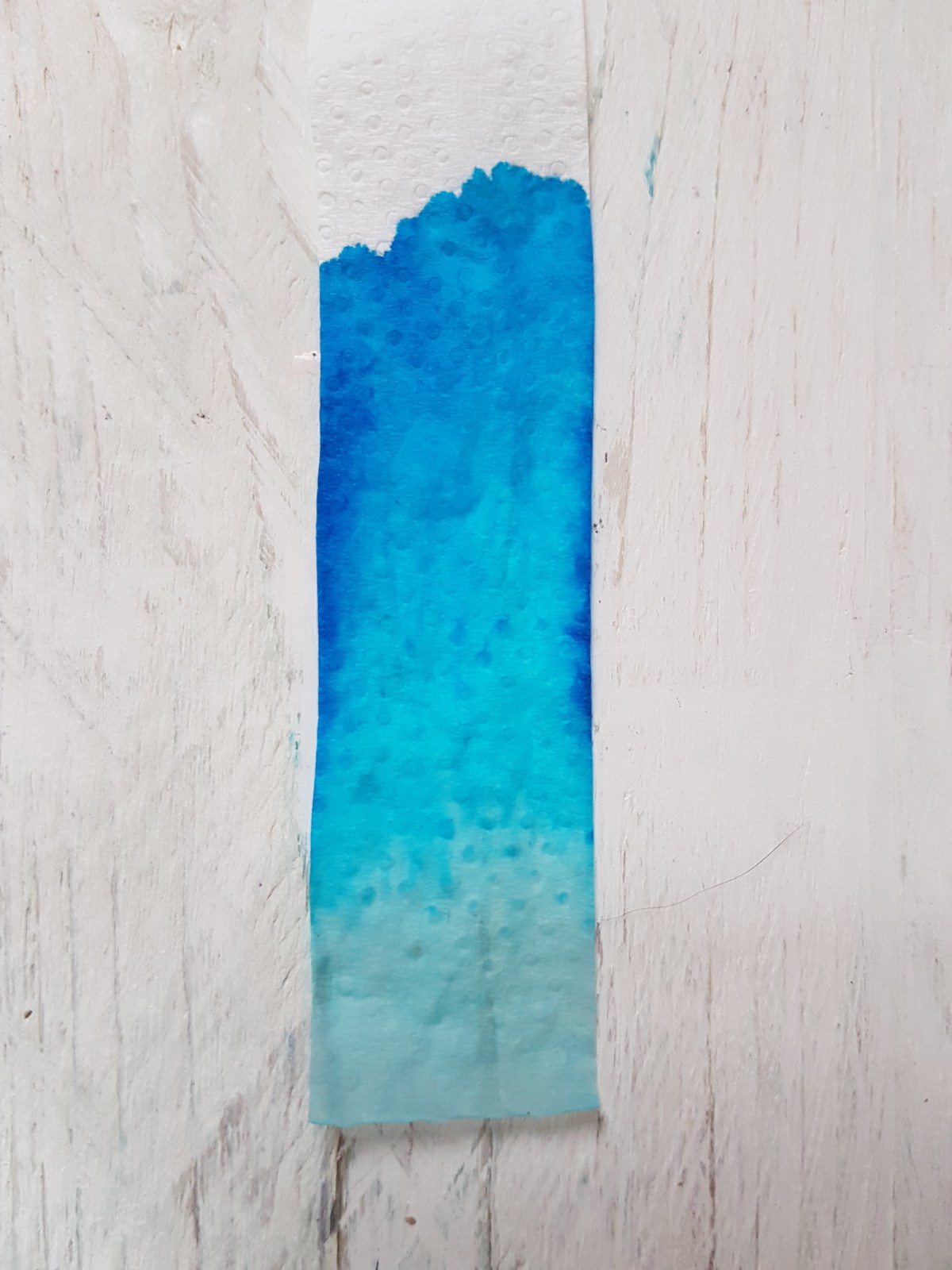
Let’s finish this review with a look at the chromatography. As expected with a blue, the largest part of the pigments is blue as it is a primary color. 
The blue pigment has been darkened with pigment that looks to be an oily greenish gray, a color that reminds me of Noodler’s El Lawrence or Diamine Salamander, to obtain the blue-black/navy blue hue. It stayed pretty low in the chromatography while the blue pigments all shot upwards with the water absorption.
So, a work appropriate ink with a nice dark edge, interesting shading and sheen. A classic if you ask me and I would very much like to see this become a regular Montblanc ink.
Do you have a limited edition ink (of any brand) that you would like to be a regular?


