Fine nib noob

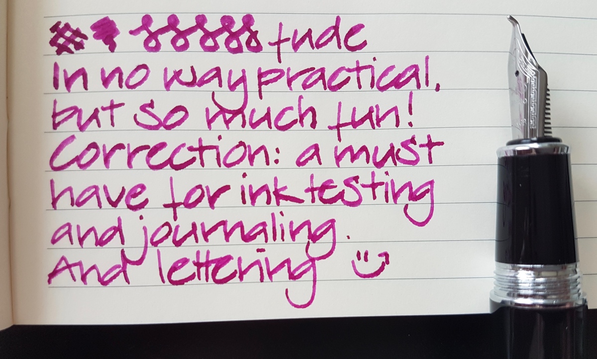
I must tell you, I am slightly confused and very much delighted at the same time. For more than a small handful of decades I have been a dedicated broad, stub, oblique, italic nib user. Yet I have always felt like missing out on something by not enjoying writing with finer nibs. It just somehow never clicked. Only recently, when switching back from a semi-cursive writing style to print lettering, and from starting this blog and doing ink swatches across the nib width board, I felt the need to give finer nibs another go. Only to find out I love them…

How did that happen? Well, first of all because I had to let go of many of the assumptions I had on fine nibs. That they would be scratchy, that my large handwriting would become wobbly and all over the place, that I would not enjoy my inks so much in them. The first extra fine and fine nibs I tried were the Lamy interchangeable steel Safari/AL nibs. However, I did not care for those and quickly changed to Platinum Preppies, which I liked a bit more. At a pen meet I got to try a fellow pen lover’s Pilot Metropolitan and Kaküno (thank you, Neseli!) and was surprised at how “friendly” the writing felt. Not too smooth, certainly not scratchy and I actually liked the ink lines they produced. So in the last couple of months I took some first steps into the world of the finer fountain pen nib. Let’s have a look at those I have tried so far.

fullsizeoutput_45f.jpeg
Esterbrook “J”, 9556 firm fine nib unit with J. Herbin Cacao du Bresil

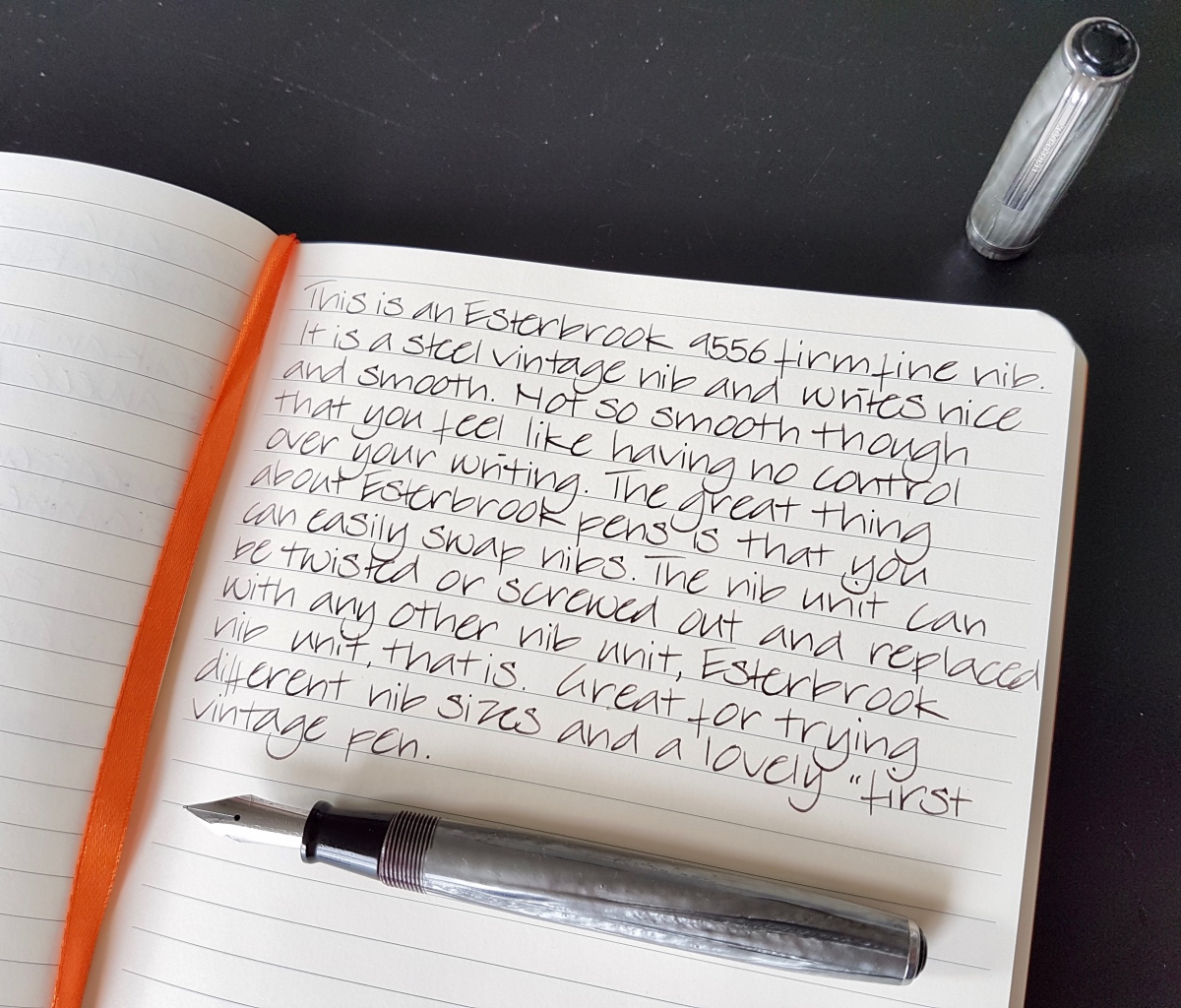
Since most of us use pens for writing pages full of text, I thought showing a written piece would give you a nice idea the “read back” of these nibs. Esterbrook is a great pen in the first place. It is a widely available and affordable vintage pen with nib units in any shape or size that are interchangeable between all models. So the risk of getting one with a nib you do not like, is a calculated one, because you can always go for another nib (which are separately available through many places online). I already owned this Esterbrook with a 2284 stub nib, which is very nice and smooth, by the way, and recently was gifted this 9956 Firm Fine nib by a fellow Estie fan. I switched them out immediately and am loving this firm fine. It has a slightly architect-esque nib shape -as I found out many finer and extra fine nibs have- so just a nice hint of line variation. What I mean by that is that the nib has slightly elongated tipping, which makes for a thin downstroke and a slightly wider sidestroke. Very elegant, if only ever so slight in these finer nibs.

fullsizeoutput_460.jpeg
Pilot Prera Vivid Pink, fine nib with KWZ Ink Raspberry

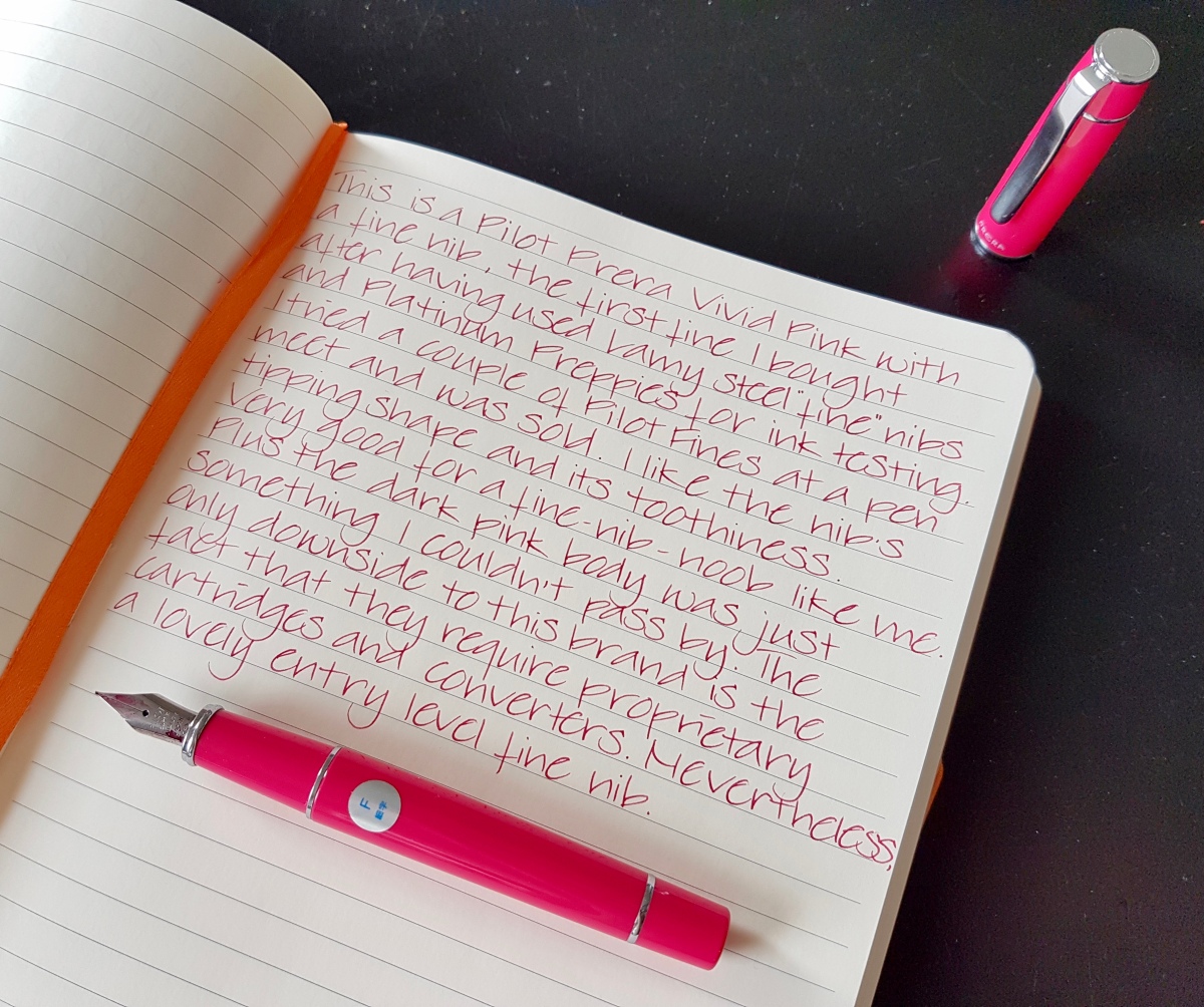
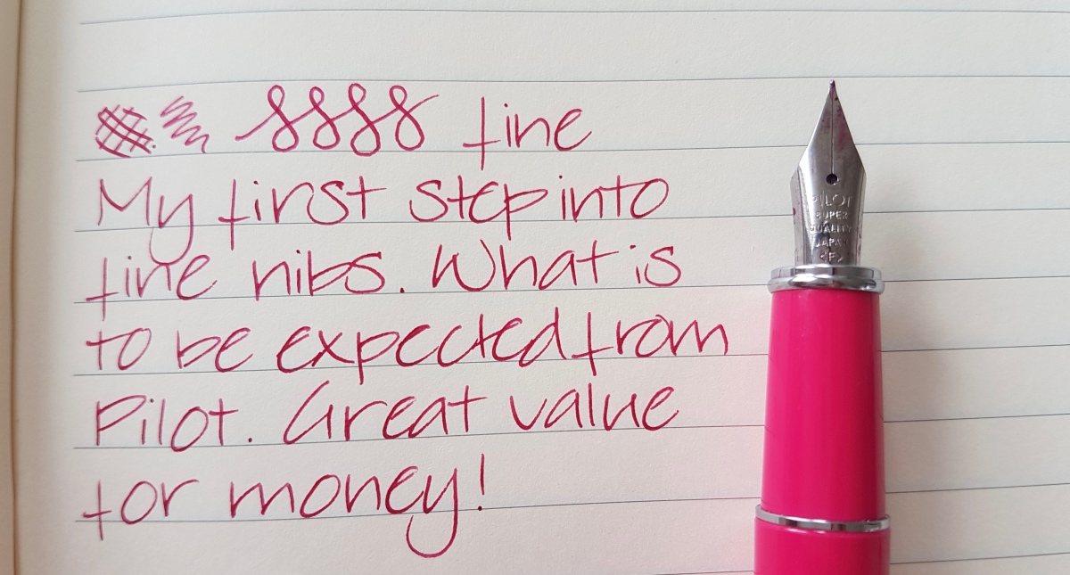
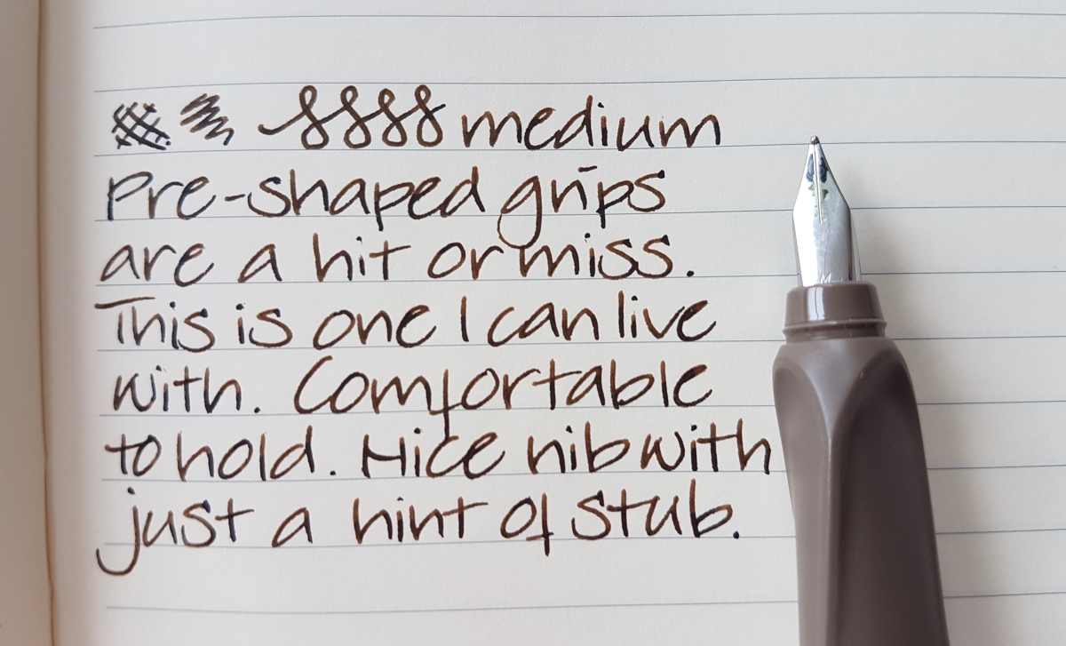
Having tried the Pilots at the pen meet, I tried to look for a fine Metropolitan but only found medium nib pens in the vicinity. Then I saw the Prera in a couple of videos online and looked around for one of those. I found a Japanese seller through Amazon.de that would ship them internationally at no extra charges. The pen arrived after about a week, which was surprisingly quickly. It had a complementary pack of cute tissues included as a “thank you for shopping with us” gift, a sweet gesture that definitely rings my bell. As described in the picture, I liked this nib from the start. It wrote straight out of the box. I had had no issues with the writing experiences so far. The only thing is that it didn’t come with a converter, which I ordered separately. I do belief that the Pilot MR (the European Metropolitan) is designed to take standard international cartridges/converters. Please leave a comment if you happen to know more about that. — In the mean time, readers have commented their experiences in the comments. I recommend reading the comments if you want to know how they got along with the MR, cartridge and converter wise. —

fullsizeoutput_45e.jpeg
Delike New Moon, extra fine nib with Noodler’s Dragon’s Napalm and Diamine Marine

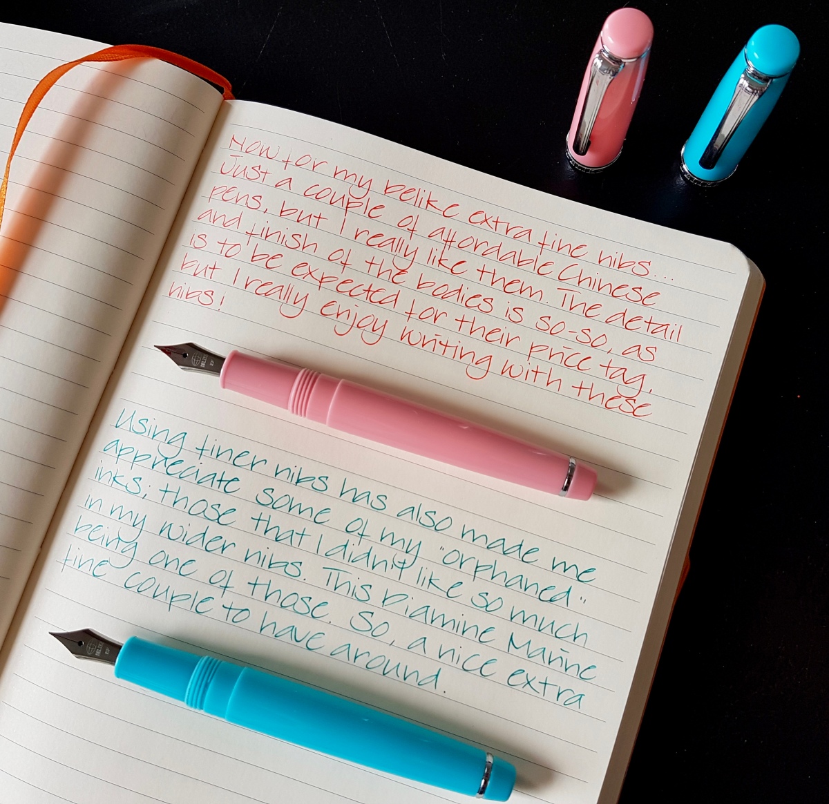
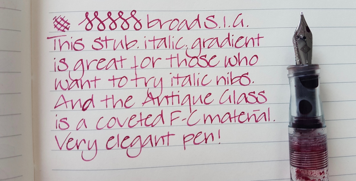
There is already a more extensive post on the Delikes on my blog if you want to read more about these pens. All I want to add here is that -for the money- these are lovely little pens. What I especially love about these extra fine nibs is that the inks I would hardly use because of the harsh read back a full written page would produce, I now love to use in these finer, thinner lines. So I will get more out of the inks that I do not like so much in my broader nibs! These are very much “inspired” by Sailors like the Lecoule and Pro Gear Slim, so I felt somehow justified to go after the next pen…

fullsizeoutput_461.jpeg
Sailor Professional Gear Slim Pink, fine nib with Noodler’s Ottoman Rose

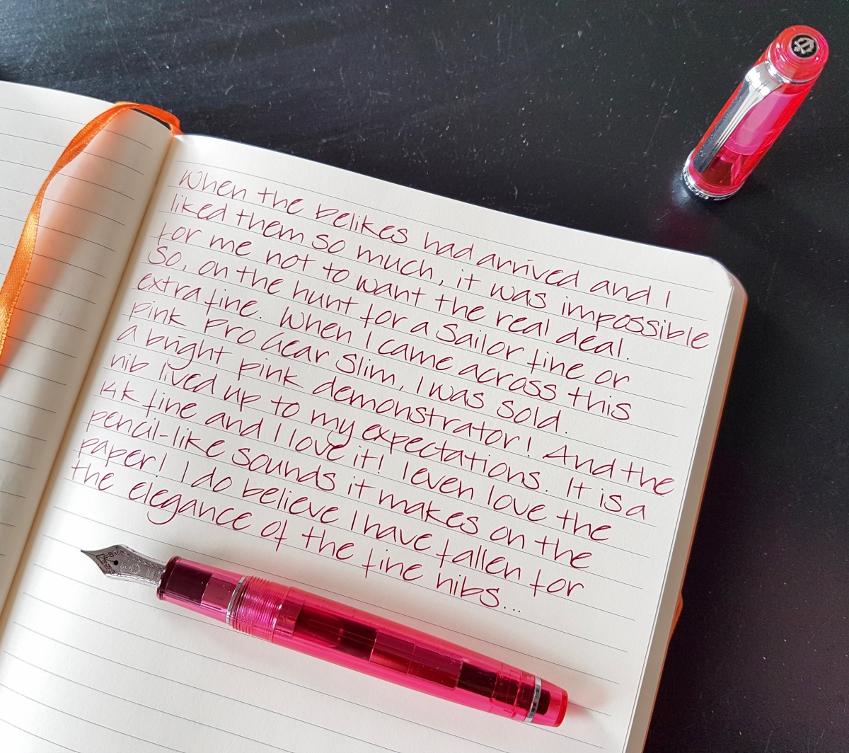
Oh, guys… this pen. I knew from having a 1911 Standard I would like it, but that nib has came to me meistered by John Mottishaw, so I was curious what an out-of-the-box fine would feel like. And I so love it. The feeling of writing with this pen is and sounds like a pencil. Writing with this nib is a pleasure to the senses. I have always found writing a very sensuous activity to begin with, but using a nib as tactile as this… It’s a very, very nice writing experience. Okay, you get my point. I can see more fine or extra fine Sailors in the future, perhaps even a Saibi Togi. Mama needs a new pen money jar, kids!

What I have found to enjoy most about the finer nibs is the read back experience, the look of a page after you have filled it with writing, as Brian Goulet has formulated it. Especially with brighter, bolder inks, the look of the page is much more pleasing to the eye, which also makes more inks office or work appropriate. Plus, the already widely acclaimed pro of writing on not so FP-friendly paper and writing in between printed lines for comments and editing. And I have always enjoyed writing on dot grid or graph paper, which means my big print is more easily legible with a finer ink line. So, in conclusion, I must admit at having been converted into finer nibs. That does not mean I love my broader, stubbiest, italic wide-a** nibs less. It just means there is more to love!

How about you? Have you changed nib sizes drastically at some point or do you stay true to one size? I would love to hear from you.

Thank you as ever for reading and until the next post!

Janine

Four more nibs plus one extra

Hi everybody and Happy Mothers Day if you live in a country that celebrates it today! Over here we Mothers Day is celebrated in May, but I do have the house to myself right now and I am going to make the most of that by taking it pretty easy in this post. I feel a cold coming on so I’ll be taking a load off after posting this by rewatching some amazing YouTube videos on Japanese Masters of Fountain Pens. So relaxing!

But first four nibs plus one extra. Why one extra? Because the writing sample of the fifth didn’t fit on the written page as shown above. Practicality first! Because of the budding cold I am keeping it mainly to writing samples and nib shots of:

  • Delike New Moon extra fine nib (for which I was completely inspired by Instagram’s @pixiegeek. Go check out her feed if/when you’re on Insta, follow and give her some FP love!);
  • Pilot Prera Vivid Pink fine nib;
  • Pelikan Twist Bronze medium nib;
  • Franklin-Christoph broad stub.italic.gradient (S.I.G.);
  • Jinhao 159 fude nib.

So as you can see, there’s a nib size for everybody in today’s post. I think writing samples are great references for nib performance, plus I really enjoy doing them. And I always enjoy seeing other people’s writing online. I have a couple of handwriting crushes, but I will go into that in a later post. Let me know if you do!

The paper used is a Rhodia Soft Cover A5 lined journal.

Hope you enjoy the pictures, and if you have any questions, please do leave a comment. I always enjoy reading your messages!

Delike New Moon extra fine nib

fullsizeoutput_441.jpeg

Pilot Prera Vivid Pink fine nib

fullsizeoutput_440.jpeg

Pelikan Twist Bronze medium nib

fullsizeoutput_43f.jpeg

Franklin-Christoph M65 Antique Glass broad stub.italic.gradient (S.I.G.)

fullsizeoutput_43e

Jinhao 159 fude nib

fullsizeoutput_43d

fullsizeoutput_43c

Thank you for reading (watching :-)) this post and until the next one!

Freshly inked and first impressions

It’s a lovely sunny, activity-filled Sunday, so a quick post of some freshly inked pens and a couple of first thoughts of pens that came in over the last couple of weeks.

fullsizeoutput_41b.jpeg

From top to bottom:

  • Pen: Aurora Optima Burgundy, medium nib. Ink: Aurora Black. I love this pen-and-ink combination, I have started using it as my bujo pen and ink, because I find that the simple bujo style in black suits me best. More on that next Sunday when I’ll update you on my bujo experiences.
  • Pen: Bexley Gaston’s Angels, stub nib. Ink: Noodler’s Lexington Gray. I needed a bulletproof ink in one of my pens, but I will not hang on to this combination. The Lexington Gray is just too wet in the Bexley, even for my taste. Might try it in the much dryer-writing black Kaweco later.
  • Pen: Montegrappa Fortuna Mosaico Marrakech, medium nib. Ink: Private Reserve Lake Placid Blue. I really like this pen and ink combination, the ink complements the blue hues in the lovely material of the Marrakech. The ink tends to run dry in the nib pretty quickly, so it needs to be used regularly.
  • Pen: Kaweco Skyline Sport Black, medium nib. Ink: Graf von Faber-Castell Deep Sea Green. I bought this pen because I wanted to try the medium Kaweco nib. I was not happy at all with how it wrote out of the box. Dry, scratchy and more like a fine. So I rinsed the pen, flossed the tines and feed with a brass sheet. Didn’t help. Then I stubbed the nib and the ink line has slightly improved. Next ink in is the Noodler’s Lexington Gray, to see if that will give a better ink flow.
  • Pen: Sailor 1911 Standard, Zoom nib, ground to an architect by John Mottishaw. Ink: Blackstone Barrier Reef Blue. Another great shading and sheening Blackstone ink in this pen after the Sydney Harbour Blue I had in it before. I only have samples of both inks, so now I’m contemplating which to get as a full bottle…
  • Pen: TWSBI Eco Clear 1.1 stubby italic nib. Ink: Robert Oster Signature Forest Green. A lovely combination, I think. The ink sloshes around like a lovely jewel in the piston filler and the flow is excellent. Nice calm green, good shading but not much sheen on this paper (G. Lalo Verge de France).
  • Pen: Pilot Prera Vivid Pink, fine nib. Ink: KWZ Ink Raspberry. This is my now favorite modern fine steel nib. It feels just right, this is definitely a fine nib that suits people with largish handwriting like I have when writing in this style. Great pen for office use on not so great paper. The pink of the body is very hard to capture in photos, so if you are one for hot pink pens, this is one for you. I love the combination with the bright yet still eye-friendly pink Raspberry ink.
  • Pen: Pelikan Twist Jungle, medium nib (comes in only this nib size) which I ground into a fine-medium architect. Ink: J. Herbin Poussiere de Lune. The soft violet ink combined with the light taupe of the pen is a combination that speaks to me. The Pelikan writes very well for an 8-9 Euros pen. I liked it so much, I ordered the final pen in this list not long after…
  • Pen: Pelikan Twist Bronze, medium nib. Ink: Kaweco Caramel Brown. I have not worked on this nib, because I like it as it is. And you cannot grind all your nibs into architects. That would not be sane… right…? Anyway, this nib has a slightly stubby feel to it so there is some very slight line variation. I love the Kaweco ink in this pen. The cola-colored ink suits the bronze Pelikan very nicely. It’s a nice pen if you are looking for an ergonomic grip but you are not after a kiddy-colored pen. Even though those are darn cute as well! This grip suits both right- and left-handed writers, by the way.

Would you like to know more about these or other pens or inks on my blog, be sure to send me a comment. Have  great week and thank you as ever for reading! As always much appreciated! OK, one more pic…

fullsizeoutput_41a.jpeg