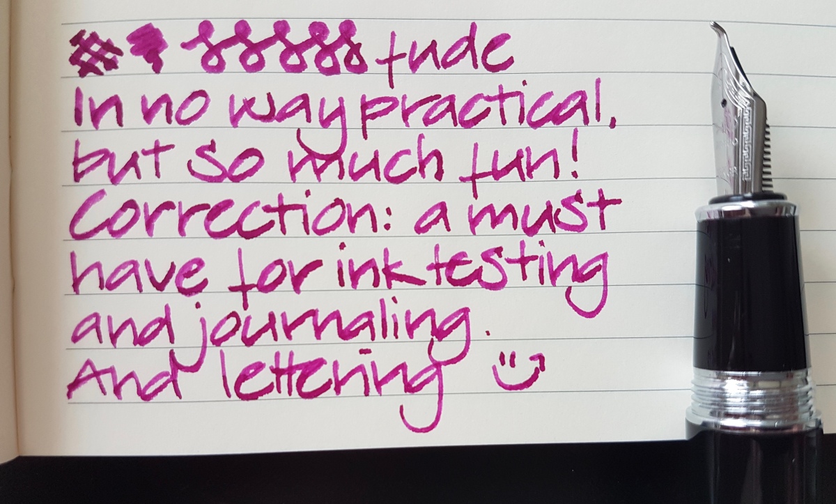
Lately you might have caught me basically fan-girling over fine nibs. As it turns out, I really, really like writing with finer nibs, especially on densely written pages. However, that doesn’t mean that my crazy big wide “unpractical” nibs are forgotten. Far from. So for today’s post, we’re taking a look at two Asian pens with fude nibs. No, spelling checker, not dude nibs, nude nibs, fuse nibs or oude (Dutch for old) nibs… Fude nibs! Wait, I’ll show you:

A sideways close-up of fude nibs. As you can see, it looks like they took a nose-dive from my desk and folded over on impact. However, these nibs are bent like this for a purpose. Fude is Japanese for “writing, or painting, brush”. In Asian calligraphy, a brush was and is an important tool for drawing the characters. So as soon as the fountain pen came along and had proven its practicality, it was no more than logical to try and mimic a brush stroke with a fountain pen nib. In my opinion, by simply bending the nib, that effect has pretty much been achieved. Of course there are fountain pens with brush nibs available, but this is a very practical solution as far as I am concerned.
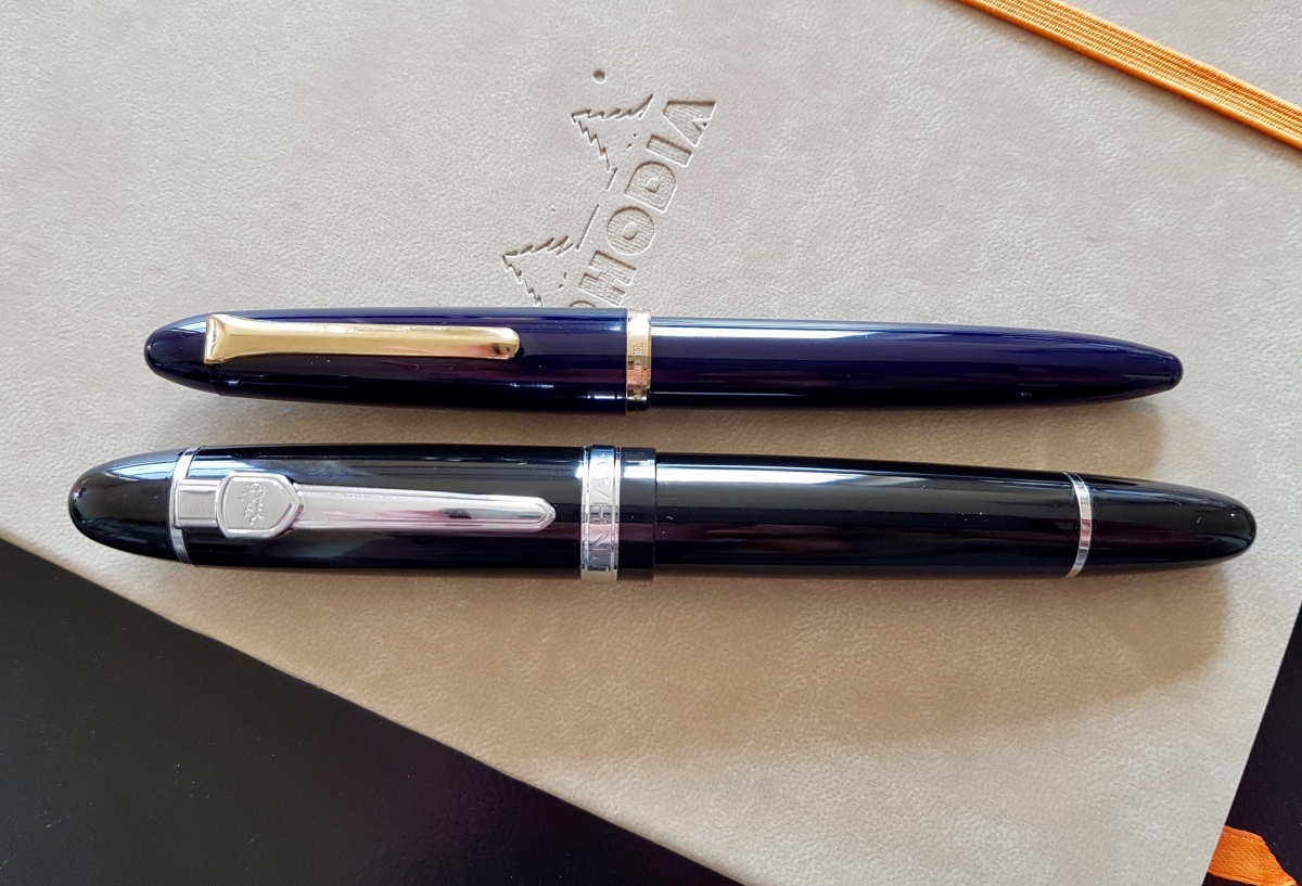
The two pens
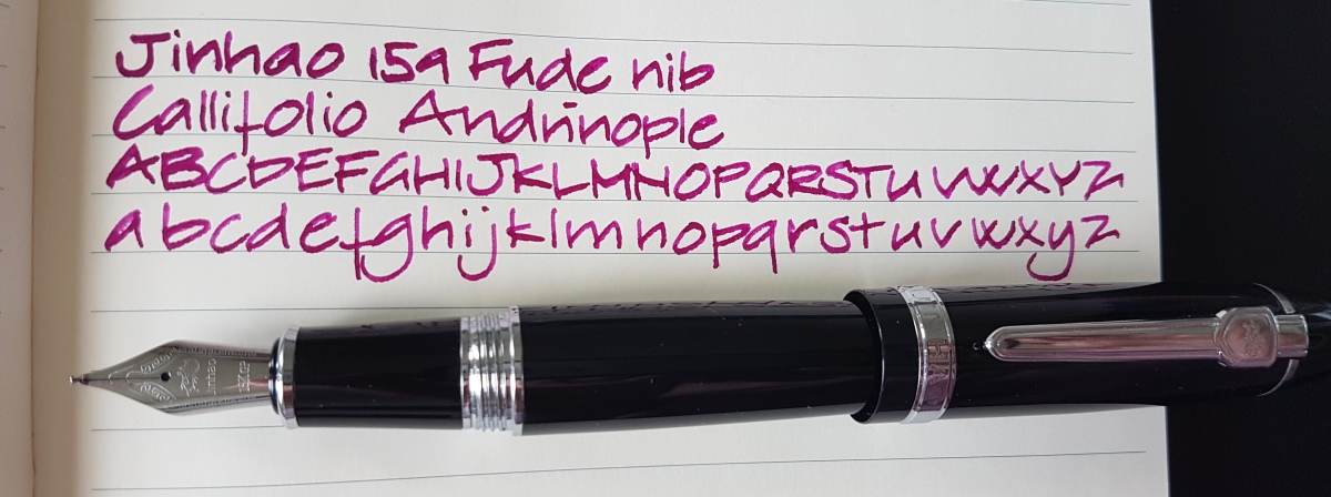
The pens I am using in this comparison are the Jinhao 159 (bottom) and a Sailor Fude pen (top). Both pens are ” entry level” pens, both have steel nibs. Still, they are quite different, in use as in the resulting ink line. The Jinhao 159 Fude, as well as other Jinhao models with a fude nib, are available online through eBay and possibly through other mega-sellers as well. The vary in price from around $10-15. The Sailor Fude is more widely available through online pen dealers as well as brick-and-mortar shops. In Europe, it is around $25-29. Lucky me was gifted this Sailor by a wonderful pen friend at a pen meet. I am in his debt for this gesture as well as his encouragement to start this blog. Thank you, Dries!
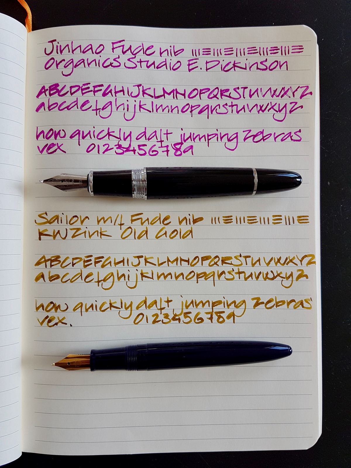
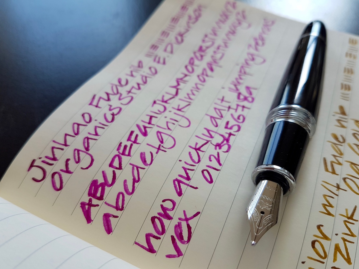
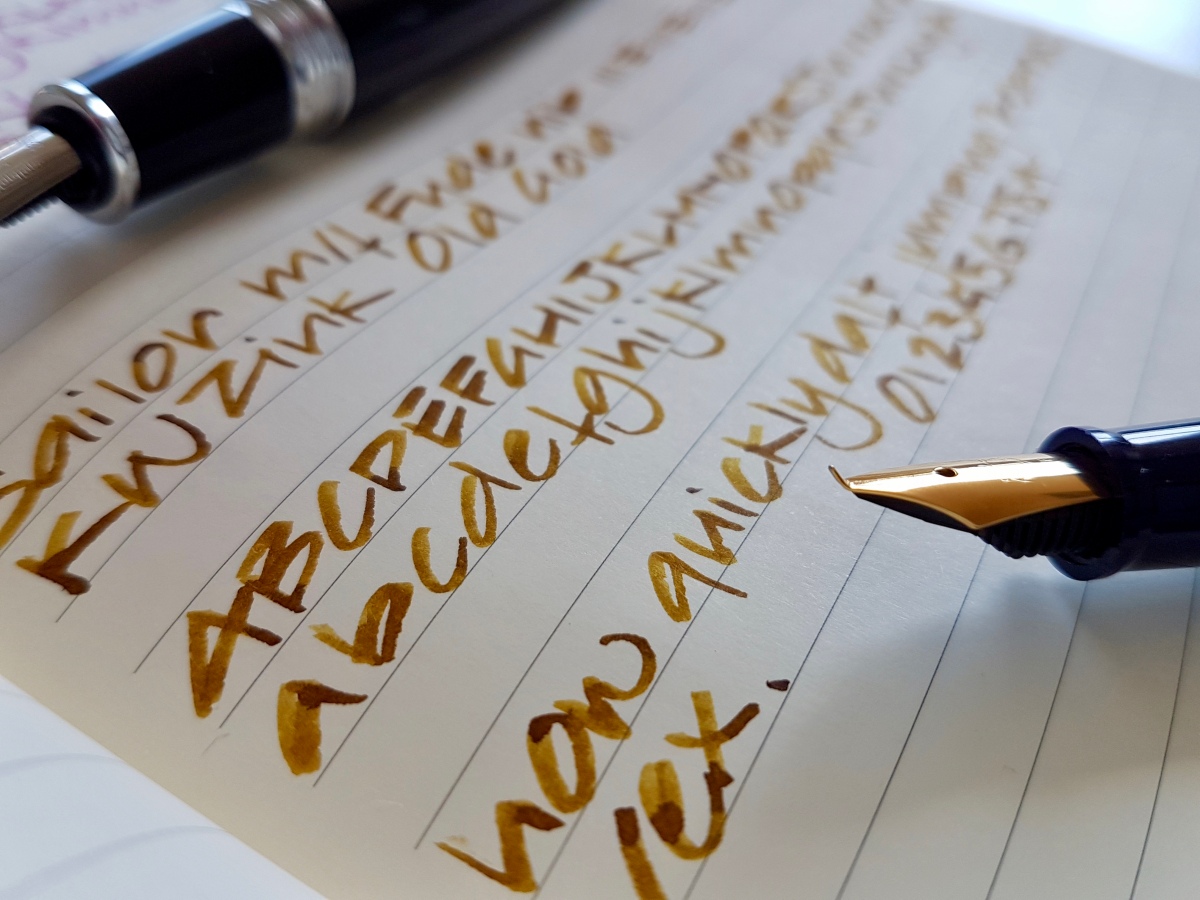
Above a bird’s eye view of the writing samples of the pens side-by-side. I used a Rhodia soft cover lined A5 notebook for these writing samples. As you can see, the line width both nibs produce will differ a lot with the angle the pen is touching the paper. That not only goes for how you hold the pen, it also goes for the shape of the page. At the left of the page, where the paper tends to bulge a bit, your ink line will be wider because the paper embraces the nib and as such picks up a fat line of ink. The more you hold the pen upright on flat paper, the thinner the ink line becomes because less of the bent surface touches the paper. The lower you hold the nib, the more surface touches the paper, the fatter the ink line. It is a fun tool! Unfortunately, I have no Asian calligraphy skills, so I kept it to my regular architect-ish print. How did these nibs perform?
 The Jinhao 159 Fude
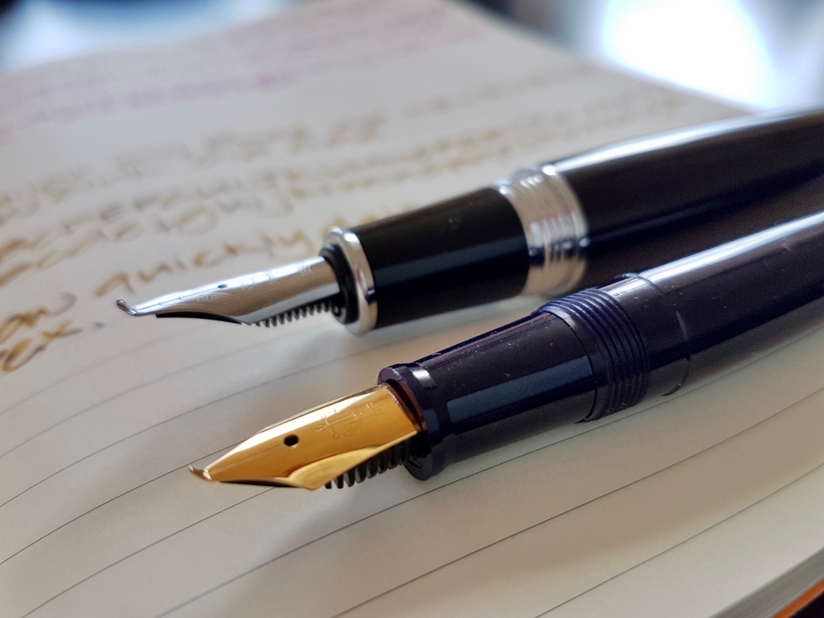
The Jinhao 159 is a big and heavy pen. It imitates the Montblanc 149 and it is a show-off kind of pen. The body is metal, the standard nib size is a #6. Which means you can swap with other nibs, if you want to use this pen for more regular writing as well. The pen usually comes with a standard international converter and takes standard cartridges as well. The standard Jinhao nibs are a bit of a gamble. You might get a decently functioning one or you might have to tweak it a bit. I have bought and used three Jinhao 159 Fudes and all functioned rather decently. The nice thing about Jinhao nibs – and that goes for the fudes as well – is that they have a decent amount of spring. Not flex, but a good deal of bounciness. So writing with the Jinhao Fude is nice, with a bit of spring for extra line width. This can result in railroading, as you can see in my writing sample. The plastic feed cannot keep up with the ink demanded by the nib. However, when you want your ink line to look like it is painted on with a brush, the odd bit of railroading just adds to that effect. So I did not mind but if railroading gives you the creeps, you are warned. The brush effect is also emphasized by the regular kugel (round) medium tipping on the tines. This slightly curvaceous tipped nib gives a bit of extra structure to the writing.
The Sailor Fude
The sailor Fude is a plastic pen, the size of a 1911 Standard, so quite a bit smaller and lighter than the Jinhao. The body is molded plastic, which shows by a “weld” line on the section where the two halves were stuck together. Considering the price point, this is not a major issue for me. The nib is a gold-plated steel MF Sailor nib with the tip bent upward. Where the Jinhao still has tipping, the Sailor is untapped and therefore produces a much smoother ink line, with quite a bit of width difference depending on your angle of writing – how high you hold the nib towards the paper – as well as on the angle of your writing stroke. The Sailor gives great definition to your ink line and shows off shading and sheen to the max. By the way, the Sailor is also – proprietary -cartridge/converter filled.
Which of these I prefer? If I want a nicely ruffled brush line and I don’t have to use it for prolonged writing, I grab the Jinhao. If I want a pen that is more comfortable for me, grip wise as well as weight, with a slightly smoother ink line, I whip out the Sailor. I use these nibs for ink swabbing, the odd high-lighted/faux hand-lettered name on envelopes, headers in journals. Not your everyday writer, but if you want to see what your inks are capable of, if you are a lettering artist or make art work with ink, journal or make mixed media art, investing in (one of) these affordable fun pens is something I heartily recommend.
Before I forget, you can also write with the nibs flipped upside down!
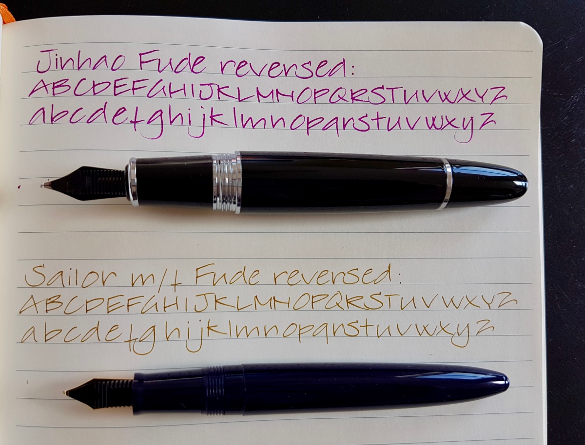
This produces a finer line. The Jinhao however felt a bit rubbery on the upstroke, very weird. The Sailor gives a nice line, but the sweet spot is very small and deviating from it results in scratching your paper. A look at the reversed nibs:
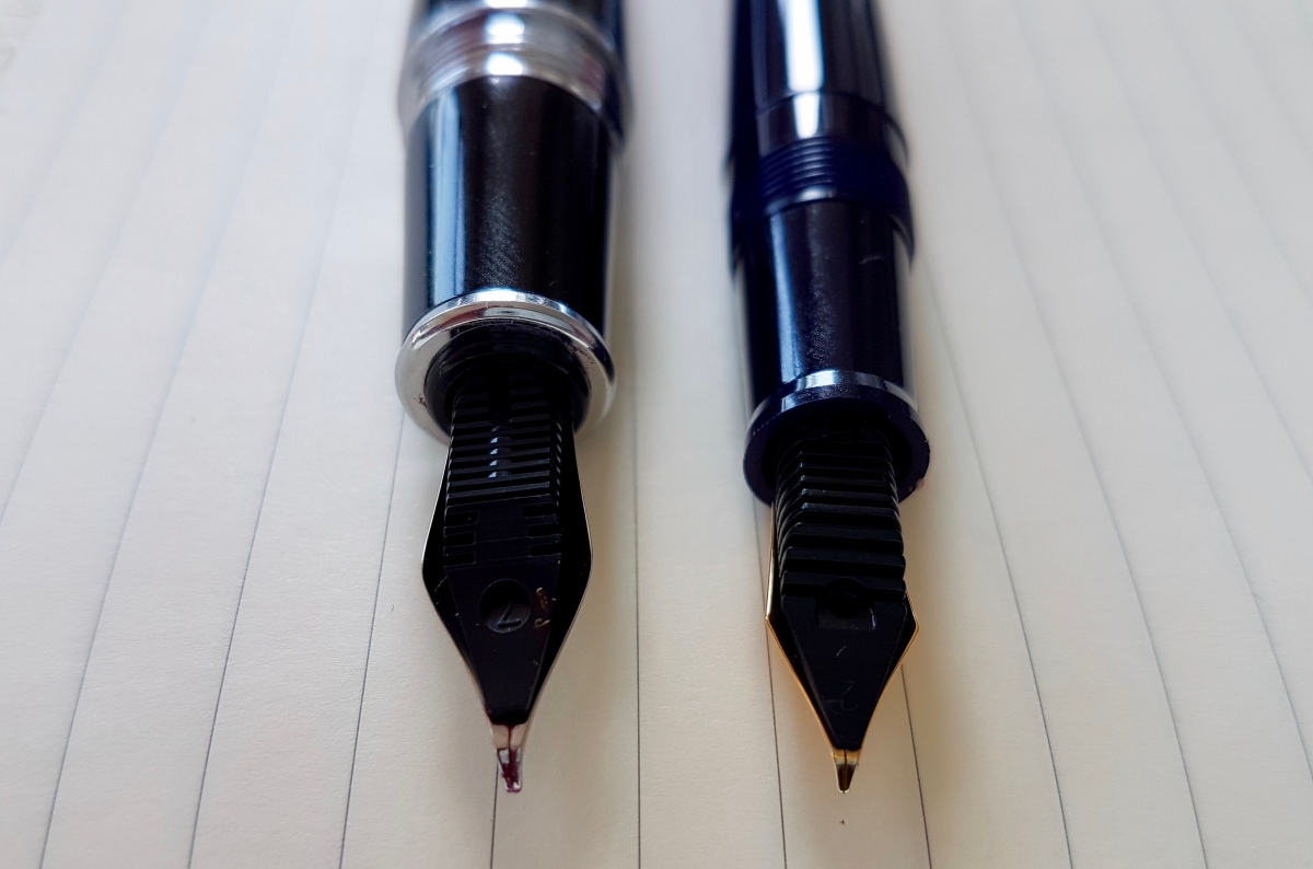
Fingerprints… yes, the inevitable result of using one’s pens… One more to look at the upturned nibs side by side.
Once more, in short, a recommended pen (either of them) of you want to play with inks, make inky art, journal or want to hand letter envelopes in a jiffy.
Thank you as ever for reading and until the next post!
Janine