
One of my first blogposts was on a style of print lettering, which is inspired by the architect style lettering. The philosophy of this style of lettering is that it is clear, easy to reproduce and easy to read. Some time ago I started using a stick-and-ball lettering type when helping my kids with their homework but still writing in a semi-cursive hand for regular writing. I had been using all caps mostly throughout secondary school and uni and only started writing in cursive again at work. Still I used all caps whenever writing post-its to colleagues. I love the regularity of all caps and stick-and-ball writing styles. Since trying my take on a stick-and-oval, architect inspired style, I almost always use this style when not doing some form of (faux) calligraphy.

Ever since I did that first blogpost, I wanted to expand on it a bit more and break the style down into manageable shapes and forms. So I sat down this morning and started to ‘dissect’ the letters into the basic shapes and forms with which you can build the alphabet. Now, I could describe all the letter shapes here in a painstaking, wordy and utterly befuddling manner, so I thought it best to try and capture it in image.
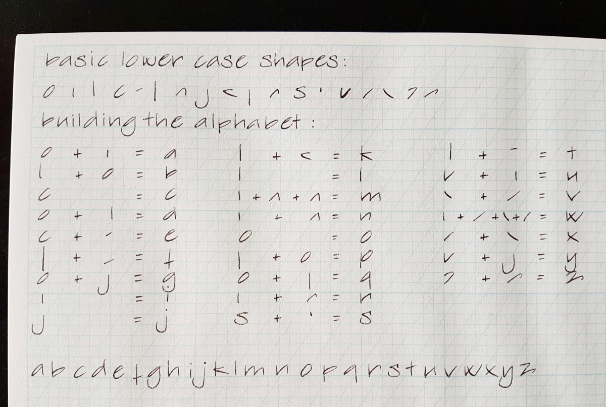
Above is the lower case alphabet, broken down in 18 basic shapes with which you can ‘build’ all the letters in the alphabet. To make it an easy visual, I have made sums of shapes to show the letters as the sums are added up. The angled guide lines on these calligraphy practice sheets are at 56º to the x-line. You can see I loosely follow those, but since it is handwriting, not a computer font, deviations and personal quirky handwriting attributions are allowed, as far as I am concerned. The same goes for you if you want to practice this style. Do not force your personal letter shape into the exact same shapes, but follow the general direction of the shapes and forms to acquire your personal style of this type.
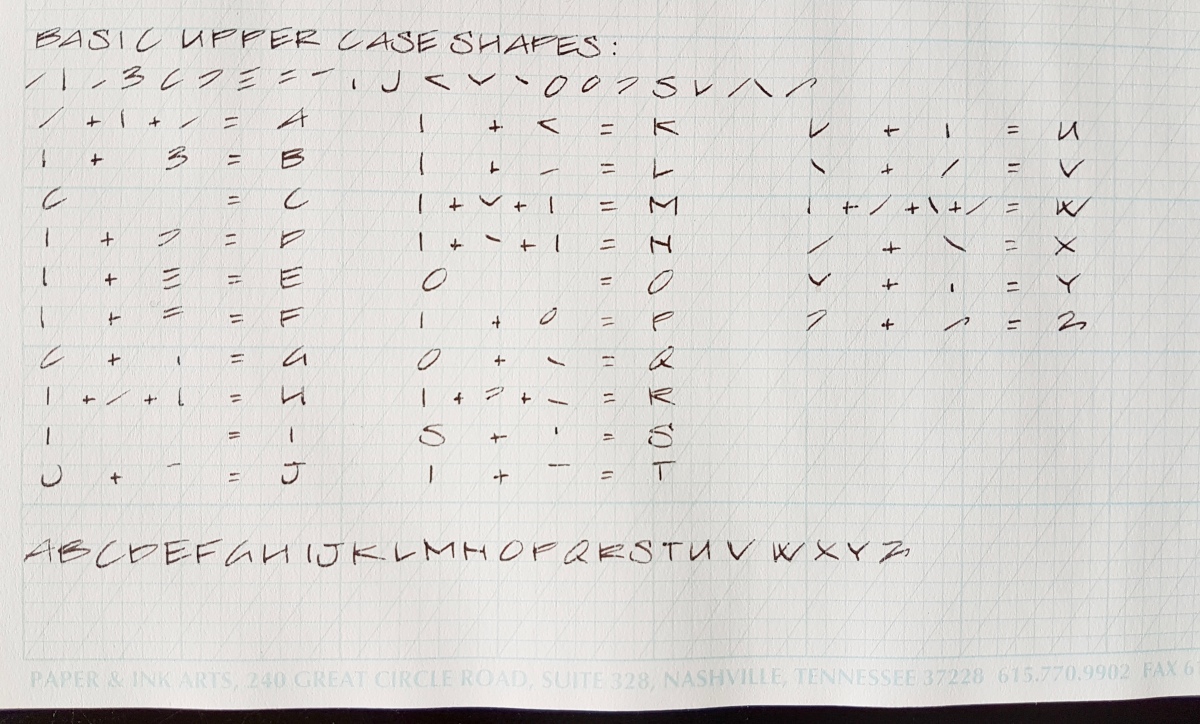
And of course the basic upper case shapes, which I broke down into 22 shapes. For the upper case letters I also made sums to arrive at the letters. If all 22 are really necessary is debatable, but I wanted to keep the sums per letter manageable for you as well as myself.
Let me know if this was helpful and if you would like to see more handwriting styles explained. I very much enjoyed doing this post and am also thinking of doing something downloadable in the future. Would you be interested in that? I would love to know!
Tools used in this post:
- Paper & Ink Arts guide line practice sheets
- Esterbrook “J” with a 9556 firm fine nib
- J. Herbin Cacao du Brésil ink
Of course, any paper and writing instrument will do to practice.
Thank you as ever for reading and until the next post!
Janine
