Five random nibs

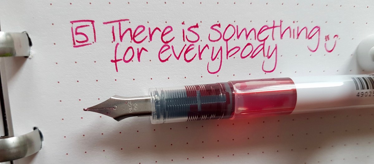
One of the very democratic aspects of fountain pen writing is that there is a nib for all hands and for all tastes. There are those who prefer to stick to one size or one shape, but even then you encounter the differences between how much tipping (that is the part of the tines that touches the paper and distributes the ink) a brand or nib maker puts on the end of the tines, and how they do that final grind or tuning.

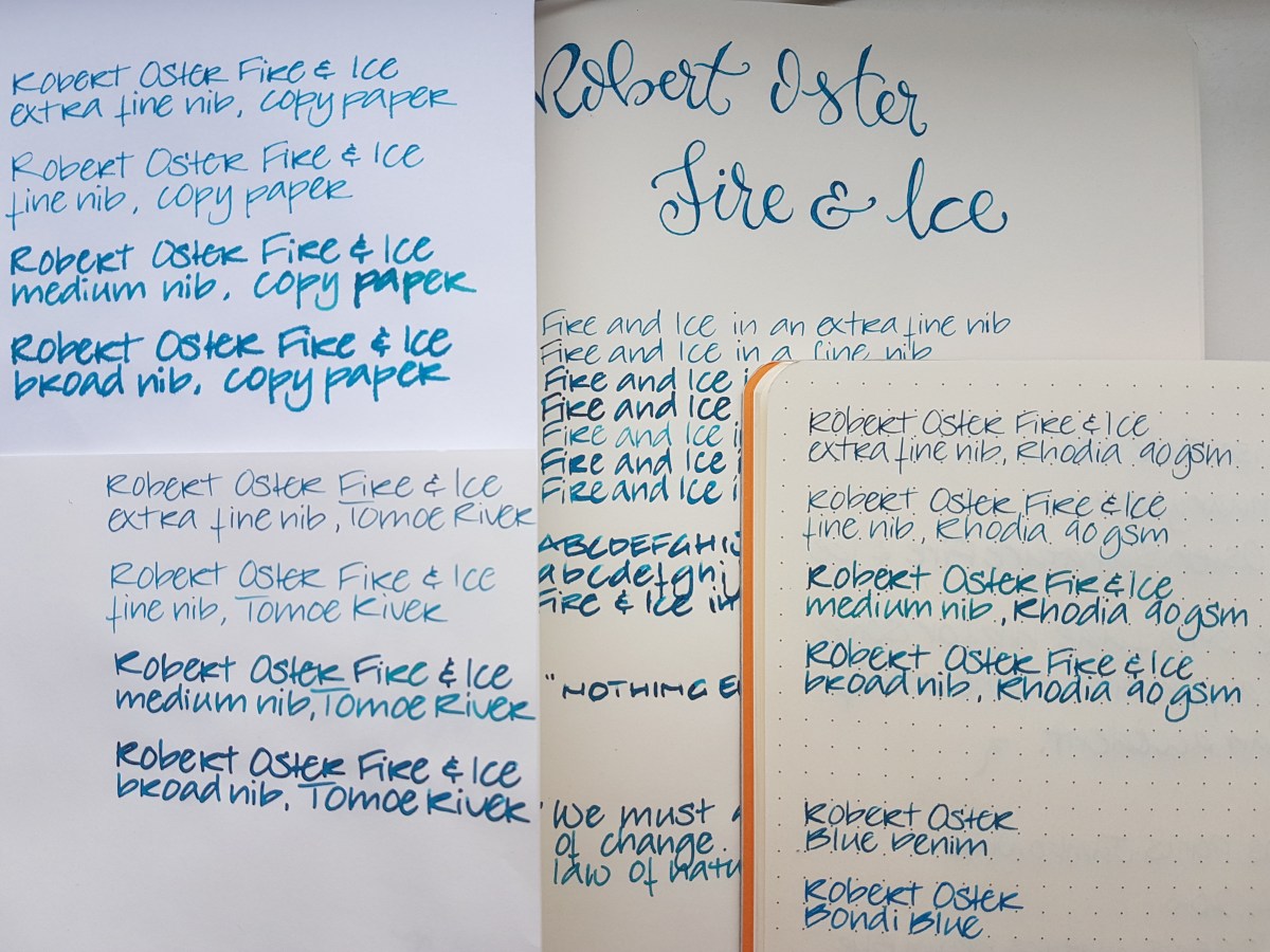
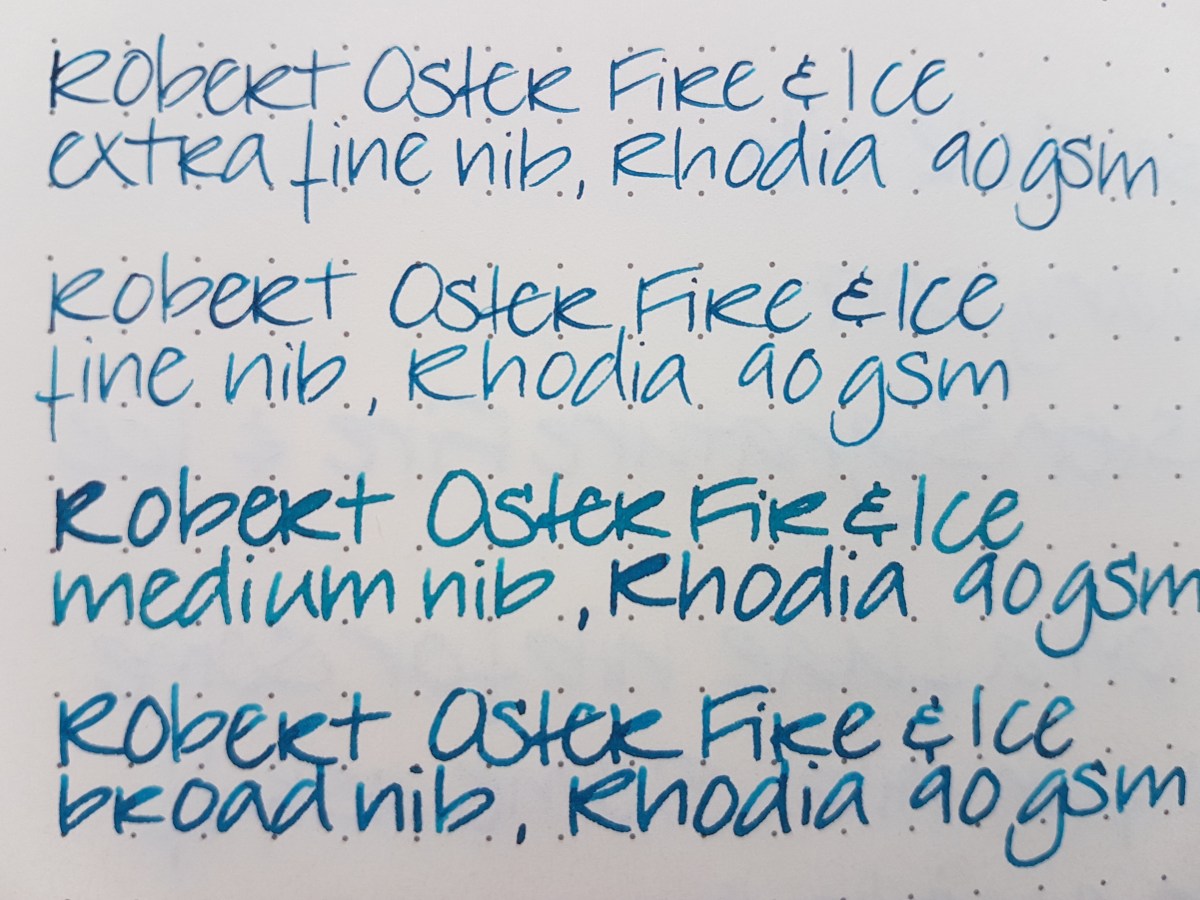
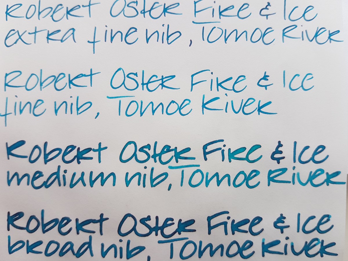
In this post I would like to focus on some randomly chosen nib shapes or nib sizes and random brands, modern and vintage. I plan to do more of these posts, either focusing on various nib sizes or nib sizes between brands or a one brand focus. All written samples are done on Tomoe River paper.

Starting with the first pen on the left: the Sailor 1911 Standard Demonstrator. Sailor is a brand that offers an amazing range of nib sizes. The sizes available for this model are the usual EF through B (including a medium-fine) and a three tined music nib which looks like a stubby italic and a zoom nib. This particular pen came with a 14k gold zoom nib, a big blob of tipping shaped to write with different strokes when held at different angles. This zoom nib was ground by nibmeister John Mottishaw of Nibs.com into an architect shape.

IMG_20170307_162008.jpg

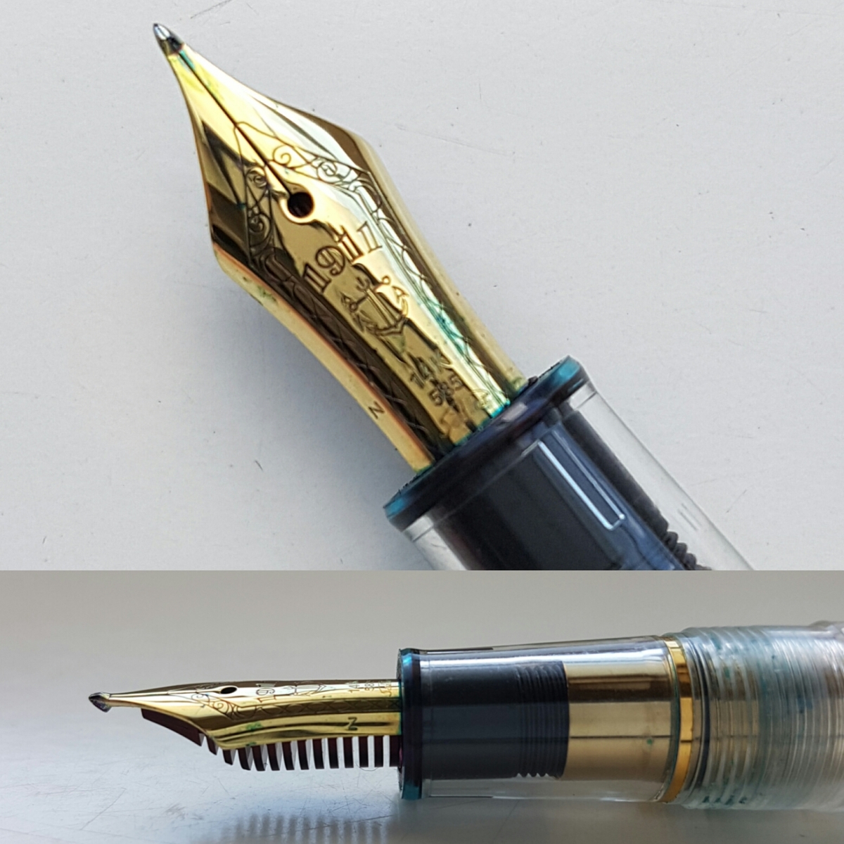
As you can see, the nib is slender in length but still has enough tipping left to make for a very interesting ink stroke.

fullsizeoutput_40e.jpeg
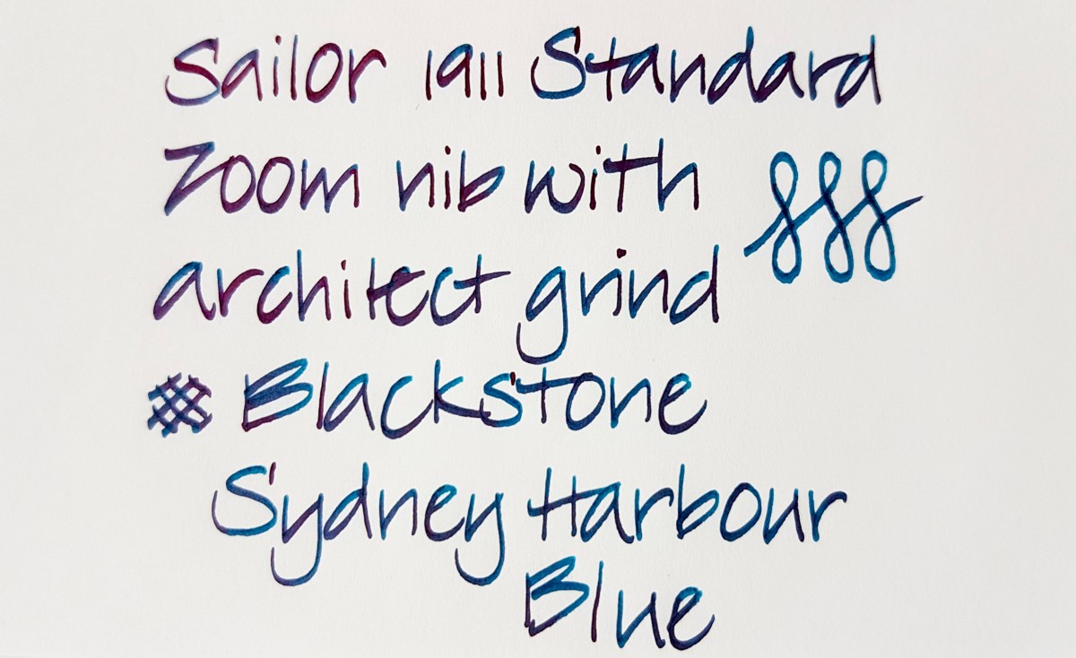
The down stroke is narrow and the side stroke is wide. I think it produces a very elegant ink line. It is one of my very favorite nibs to write with, also for daily writing and especially with a nicely wet and shining ink as the Blackstone. This pen model is still available, should you be interested. The Standard is a rather small pen though, so if you have bigger hands, you might want to look into a Sailor 1911 Large.

Second from the left is my favorite pen for drawing, doodling and faux calligraphy, the Aurora Optima in Burgundy. This nib is a standard Aurora factory medium. It writes with a medium to wet ink line and the nib has some tooth, which makes it a very comfortable writer if you like to have control over your ink line. The 14k gold nib has been rhodium plated to match with the silver colored trimming of the pen.

IMG_20170307_162050.jpg

The nib gives a mostly regular line with a very slight stubbiness due to the flattened tipping. The edges are perfectly smooth though, so your ink line will be mostly consistently even with the slightest bit of swirl where you lift the nib off the paper.

fullsizeoutput_40f

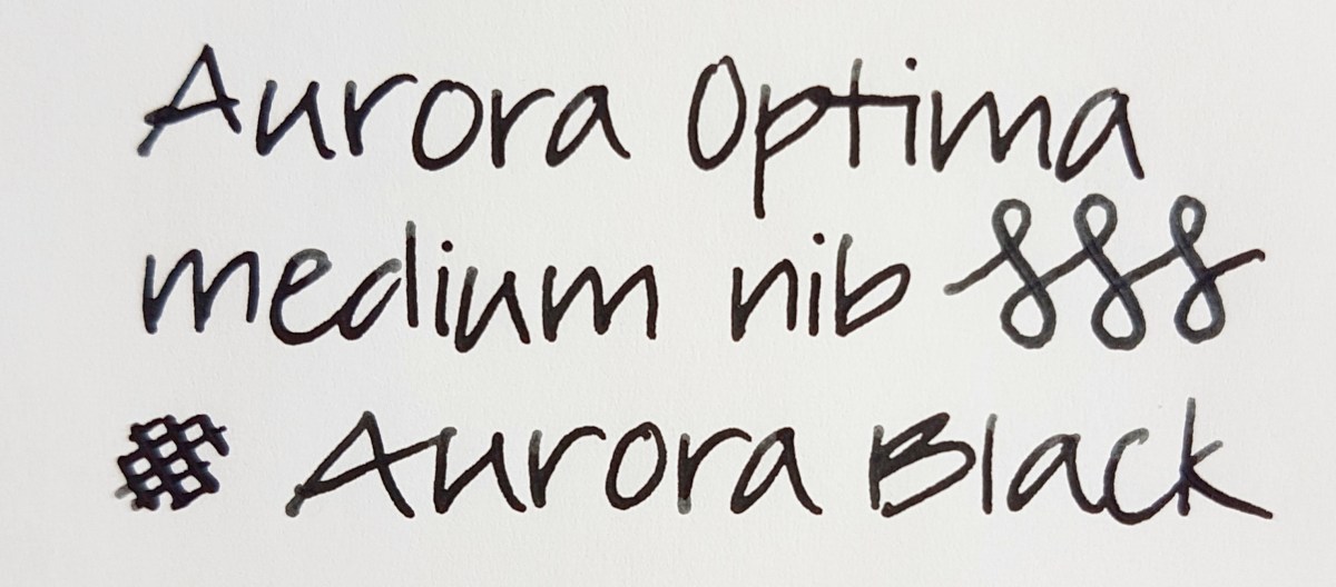
The regular writing shows a consistent inks line. So an ideal nib if you are looking for a writer that puts down such a line. The figure-eights are done with a hint of pressure on the down stroke. I did the same with the cross-hatches, to give you an idea of the possible line difference. The nib is responsive, but absolutely not a flex nib. Should you be interested in that, Aurora has recently issued a flex version. Aurora offers a very wide range of nib choices, for that matter, including stubs and italics. Hip hip hooray for modern brands that still dare to offer other nib sizes besides F through B! I love the Aurora black ink in this pen, because I use it mostly for doodles in black. The ink is not waterproof, but I do not use colors when doodling, so to me that is not a problem.

The middle pen is actually an antique, as it will be around 100 years old. It is a Mabie Todd Swan 1500 eye-dropper pen with an over- and underfeed on the nib. Eye-dropper means the ink goes straight into the body. This gold nib was meant to be flexed and has an over- and underfeed to supply the tines with a steady ink flow.

IMG_20170307_161826

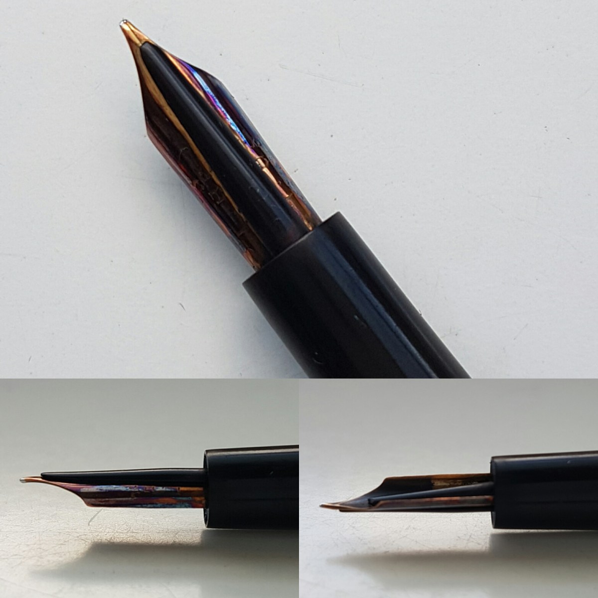
The nib can use some cleaning, but I am hesitant what to clean it with. Should you have a pointer into that direction, please let me know in the comments or contact me.

This is one pen I cherish a lot. I bought it from one of my first Instagram friends and I keep it boxed in the box it came with. I ink it up or dip it for special use. I love the line variation this nib offers.

fullsizeoutput_410.jpeg

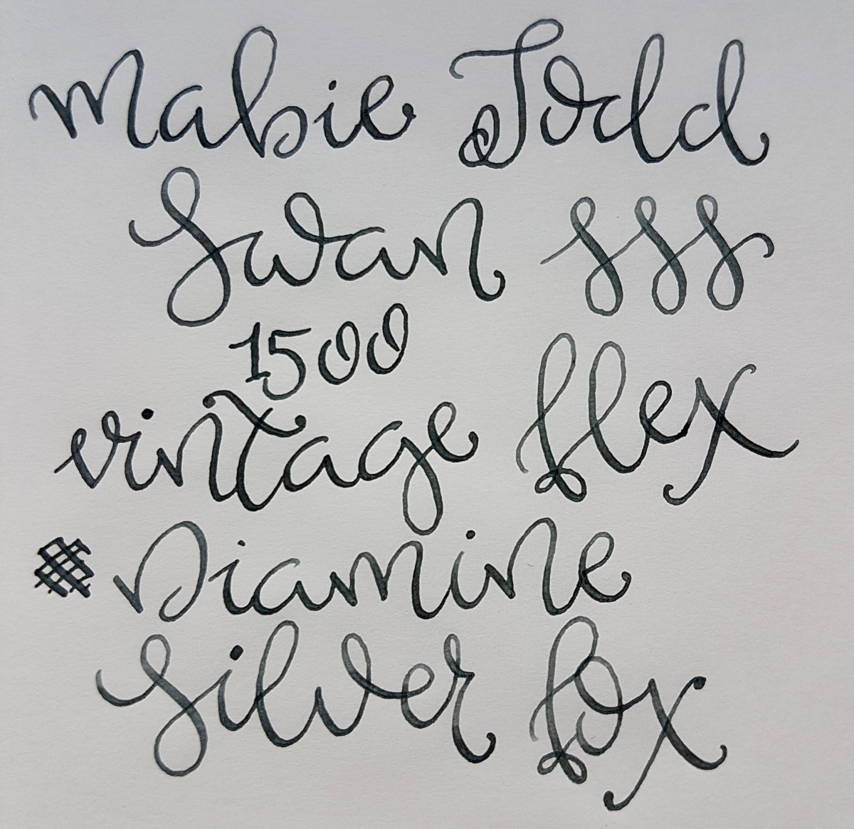
Sorry for the wobbly lines, I did not take the time for a proper warm-up. This is a lovely nib for practicing freestyle or traditional calligraphy, or even for regular letter writing if you have a cursive hand. This is a pen that is available at pen shows or at specialized dealers. If you are new to the vintage game and are looking for decent vintage flex, I recommend checking with a trusted vintage pen dealer.

Second from the right is the very charming Bexley Jim Gaston Holiday 2002. If you follow me on Instagram, you will have no doubt seen this pen before and might even know it is the first pen I bought at my first Pen Show at the table of the One Man Pen Show, Sarj Minhas. He is an extremely knowledgeable vintage and modern pen dealer and a nice guy extraordinaire! I asked him if he had brought any nice stubs and he handed me this red and silvery-white beauty. I was happy because I wanted my very first pen show acquisition to be something special. This pen ticked that box.

IMG_20170307_161912

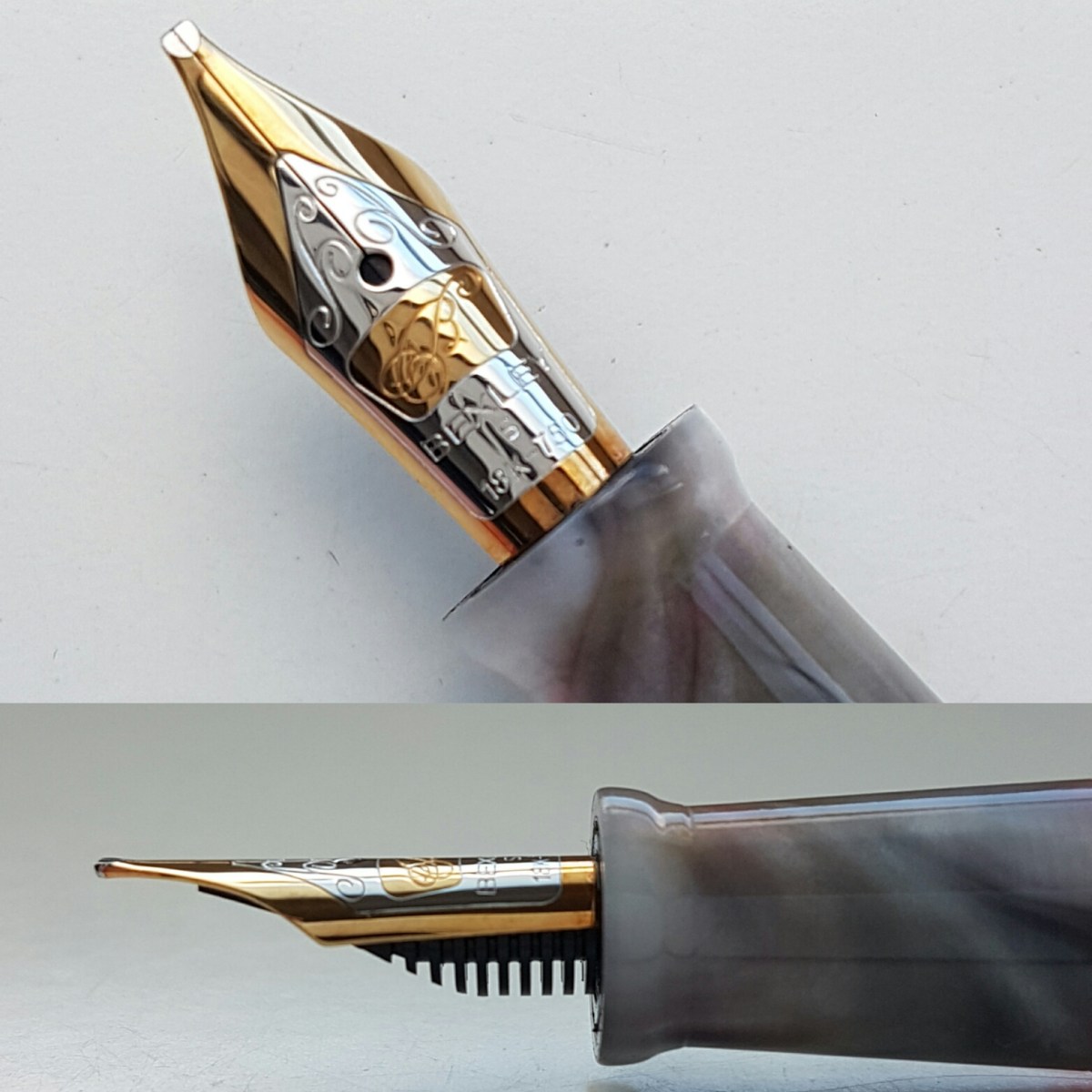
The tipping work on this 18k gold nib is just amazing. I love the careful grinding and smooth edges. It has a lovely bounce to it and is a very wet writer. I have had this pen in my EDC since I bought it. It truly graces the paper.

fullsizeoutput_411.jpeg

It gives inks the most lovely shading and depth. I have yet to come across an ink that does not work in this nib. If you are looking for a Bexley, try Vanness Pens or Nibs.com. Be aware that not all Bexleys are still supplied with the Bexley nib if you are looking for a specific nib size.

The pen to the right is – I assume – the Quasi Imperial (330?) model Sheaffer with the iconic inlaid nib. If you know the name of this model (I bought it online for a steal with a twin stub brother and the seller did not know the model), please let me know so I can offer full info to other readers. The nib  is a factory oblique italic, but thicker than most italic nibs I have seen on other pens. Perhaps more a very crisp oblique stub.

IMG_20170307_161944.jpg

I have loved these inlaid nibs since my sister first got a Targa. I later was given a Targa when I went to university but it was borrowed there permanently. So I was extremely happy to find this great nib in perhaps a lesser spectacular model pen, but oh my, does this nib write… Sheaffer makes some of the best ground and tuned factory nibs out there.

fullsizeoutput_412.jpeg

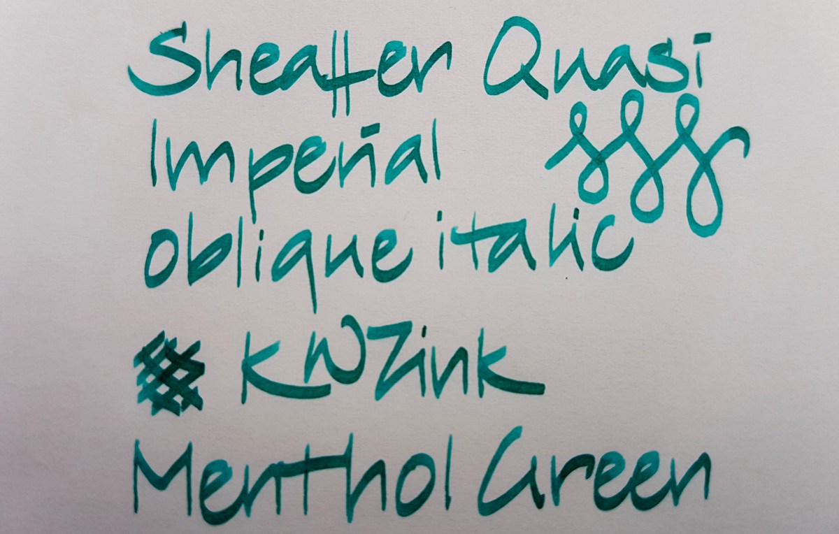
This pen cost me next to nothing compared to the writing quality it offers and I will never part with this one or its stub brother, if I can help it. It writes incredibly smooth for a steel nib, even though it is quite crisp. I have never experienced getting caught in the paper. I’m telling you, if you come across one of these oblique Sheaffers, buy it. You will not regret it and if you do, by all means let me know.

Guys, it was a lot of fun doing this post so it will definitely be followed by anther “random nibs”. Let me know if you would like to see any nib size or shape in particular. Thank you once again for sticking it out!

Robert Oster Signature Fire & Ice

Now that I have “invested” in an extra-fine, fine and medium Platinum Preppy and tweaked my Lamy steel broad to actually write like a broad nib, I feel sort of kitted out to do an ink review. By the way, before I continue with the ink: the step up from the fine to the medium Preppy is quite a substantial one. Have you experienced that as well? Anyhow, back to the ink. I thought it would be nice to do a genuine “it” ink, an ink of the moment: Robert Oster Signature Fire & Ice (we’re talking February-March 2017, if you are reading this blog in future years). The first runs were sold out in no time and I have seen new batches ready for shipment to dealers. So if you are waiting for yours, hang on just a little bit longer. It’s on its way!

fullsizeoutput_406.jpeg

Above is a full page view of Robert Oster Signature Fire & Ice in a Leuchtturm A5 blank journal. At first glance this is a very becoming, dark side of light blue ink, if you catch my drift. It does not have enough green in it to be a true turquoise and it is a lot more more grayish than a royal blue. It has beautiful shading qualities as well as a red sheen and outline. When used in a wet nib and on the right paper, I must add. I tried the ink in the same nibs on different paper qualities, to see how it behaved.

fullsizeoutput_407.jpeg

Above the various paper qualities next to each other. Clockwise from top left: cheap copy paper, Leuchtturm A5 blank, Rhodia 90gsm dot grid, Tomoe River white loose sheet A4. By the by, bottom right are writing samples of Robert Oster’s Blue Denim and Bondi Blue.

Let’s have a closer look.

fullsizeoutput_408.jpeg

Oh my! This paper does not do the ink justice. Not even that much shading, to be honest. Well, I’d suggest not using this lovely ink for your office notes, unless you absolutely cannot do without this color. The extra-fine nib, which seems slightly wetter than the fine (I have another fine nib on the way, don’t worry) already shows quite (un)impressive feathering. I write in a slightly large hand but as soon as I write in this broad, it becomes nearly illegible.Flipping the page showed substantial bleed-through. Next!

fullsizeoutput_40a.jpeg

This is the Leuchtturm journal paper. I’m a lot happier with this! Hardly any feathering, very nice shading and some fiery red outline with wet and broad nibs. Some bleed-through though. But I expected that from Leuchtturm paper, so I am not surprised about that.

20170303_104033.jpg

The Jinhao Fude nib shows the fire best, although you really don’t need a paint brush nib like this fude to bring out the sheen. Take a look at the extra-fine Platinum Preppy on the Tomoe River:

fullsizeoutput_40b.jpeg

There is definitely a fiery outline on this extra fine ink line. Even a very slight outline on the fine. Very subtle, but it’s there.

fullsizeoutput_409.jpeg

What about the ink on Rhodia paper? Loads of nice shading (yes, I wrote “Fir” with the medium… blame a slow eye-brain connection), no feathering, no bleed-through. Slight outline and sheen on the very wet pooling bits. Definitely an ink that deserves an decent base. Not a standard work horse ink, unless you bring a Hobonichi with Tomoe River paper or a Rhodia journal to the office. So, just to top that off, a Tomoe River overview of nib lines:

fullsizeoutput_40c.jpeg

A nice and calm ink when viewed from above, with a surprise fiery edge when viewed from aside. I’d say: a great ink for art journaling and art work, where you can really bring out that sheen by generously applying it to good paper. A great ink for letter writing, because a pageful is quite pleasant and calm to the eye, but with that lovely sheen as a bonus. A great ink for making special entries in your journal or diary, or on fountain pen friendly greeting cards. Just use a waterproof ink to address the envelope, because this ink is not waterproof.

Talking about waterproofness, let’s take a look at the chromatography.

20170303_093932.jpg

All blues, with the concentrated pigment on the edge of the tissue forming the illustrious outline. The bottom shows the more grayish aspects while at the top the bright bright blue almost leaps off the tissue. No greens or yellows peeping out at the top, so just blue pigment, making for the outline and sheen where it concentrates on the paper. It cleans out pretty easily.

All in all, a well behaved ink for special-occasion-writing on old quality paper. I have said on Instagram before that Robert Oster has revamped and de-dulled blue inks and I stand by that. Not only this Fire & Ice, also the bright and happy Bondi Blue, the new take on a shading blue-black with Blue Denim, the sunny Australian Sky. All blue colors to make you fall in love with blue inks all over again.

Have you used any of his inks? Please let me know if you would like to seen another Robert Oster Signature reviewed.


Six reasons to love and use fountain pens

We all know why we read or write blogs like these. We fountain pen people all suffer from penvangelism; the compulsive need to get everyone around us to know about the joys of fountain pen writing. And we all want to acknowledge the quirks that come with using fountain pens as “normal behavior”. Apart from the quirks, there are quite a number of legitimate reasons for using fountain pens. I kept it to six in this post, but more reasons will no doubt follow.

fullsizeoutput_400.jpeg

Feeling connected with what you are doing

The connection many of us have with our fountain pen(s), is a very intimate one. Whether you use your pen at school, at work or at home, the minute you put that nib on the paper, it is your brain, your hand and the pen working together. Capturing the essence of a lecture, of your plans or thoughts is so much more intense with that pen forcing you to slow down and be connected to what you are doing there and then. It is almost like meditating while being productive in school or at the office or contemplative while journaling or writing a journal, a letter, a note or even a shopping list.

fullsizeoutput_401.jpeg

Individuality – treasuring what makes you you

A fountain pen is an ideal tool to express your individuality. You choose your instrument, your nib size, the ink. Your handwriting makes your pen a completely individual instrument. Whether your write in print, stick and ball, cursive or calligraphy, the ink line you put down there and then will never be repeated anywhere else at any time. Even if you work in a conservative environment, you can choose which shade of chic blue black you ink up your pen with. Using an ink that cost more than your boss’s socks can be somehow gratifying. Why not dazzle those colleagues with the brightest and heaviest sheen in an otherwise very respectable blue or express your closet alternative streak with the darkest of black inks. It’s all up to you. As a teacher you might want to shake up grading papers with a purple or orange instead of a red. Or just use the bloodiest of reds there is…

fullsizeoutput_402.jpeg

Treasuring the craftsmanship

Fountain pen design and production still involves a large human component. The process for designing a new pen, whether high end or mass production, requires a team of people deciding the pen’s purpose, audience, characteristics. As long as there are fountain pens, there will be people who know all about nibs and feeds, tuning, ink filling systems, cebloplasts, celluloids, precious resins, wood, precious metals. Even when the first fountain pens are churned out by a 3D printer, there is still a person determining how the pen will look and function. The craftsmanship may shift to new and digital processes, the principles of how a fountain pen works will remain largely the same. It is all about controlling that ink leak into a beautiful line on paper.

fullsizeoutput_403.jpeg

Supporting small makers

Even as we sadly see fountain brands disappear, the number of small makers appears to be growing. There are quite a few independent pen turners out there either making a viable business for themselves or earn a few pennies through an out-of-control hobby. I don’t know about you, but I am all for supporting small businesses and mom-and-pop enterprises. The great thing about the internet is that you don’t necessarily have to stick to local makers, you can order your pen from anywhere in the world. Now if only import duties would be a little more considerate of small makers… Nevertheless, I really enjoy using an instrument that was lovingly crafted by an enthusiast who turned a pastime into a means of living and who will turn our money into new ideas or development of their product.

fullsizeoutput_404.jpeg

There is something for everybody

There is a pen to suit all tastes, life styles, budgets, purposes. You could be a student, refilling your Preppy until the nib has worn down to a stub, or an artist using the finest of nibs to cross-hatch your shadows, or a business person signing that all important deal with a Montblanc 149, or a new mom keeping a journal with a Hello Kitty fountain pen, or vice versa… it is all good! You could be all about the minimal and never be parted with your Lamy 2000 or be all about the steampunk and write with a pen that looks like a prop from Lemony Snicket’s. That pen is your pen and it helps you to achieve your goals.

fullsizeoutput_405.jpeg

You can make it your own

You can make that pen your own, not just by choosing the brand, material, nib size or ink color. You can have the nib tuned by a nibmeister into the tool that brings out the best in your handwriting. Or, if you are a bit of a tinkerer like myself, you can venture your own tinkering. I suggest starting out with pens like the V-pen in the picture above or getting a Noodler’s fountain pen, which where designed with the pen tinkerer in mind. Ruining a nib that will only cost you a couple of bucks to replace is actually a lot of fun. You can try your hand at making your nib write wetter or drier, grinding it into an italic or architect nib shape (more about that in a future post).You do not need to be an engineer to go about tinkering, and there are plenty of YouTube videos out there with every day users sharing their experiences with fountain pen tuning. All at your own risk though. Just promise me you will send that precious pen/nib to a legit nibmeister to get it done. Although a lot of them started out right here. With putting that V-pen to the Dremel…

What are your reasons for using fountain pens?

Page of Shame February 26, 2017

What is a Page of Shame… it is a page filled with pens currently inked. 32… yes, a sizable number. These are all pens I have in rotation at the moment, especially with InCoWriMo2017 going on. I must be honest and tell you that there are four fude pens inked, which I have not included on this page. Purely for aesthetics.

So, 32 pens inked… let’s got to it!

fullsizeoutput_3fe.jpeg

Top to bottom:

  1. Esterbrook Grey “J” nib no. 2284, Blackstone Black Stump
  2. Kaweco Classic Sport Demonstrator, double broad architect nib, J. Herbin 1670 Stormy Grey
  3. Jinhao 159 Germany iridium point italic grind, Rober Oster Signature Purple Rock
  4. Bexley Jim Gaston Holiday 2002 stub nib, Robert Oster Signature Melon Tea
  5. Jinhao 159 original nib, Noodler’s Lexington Gray (bulletproof)
  6. Pelikan Pelikano medium, Kaweco Caramel Brown
  7. Mabie Todd Swan 3250 oblique medium/broad, Noodler’s Kiowa Pecan
  8. Montblanc Meisterstuck Chopin oblique double broad nib, Rober Oster Signature Copper
  9. TWSBI Eco White 1.1 stub nib, Rober Oster Signature Ng Special ’16
  10. Pelikan 400 oblique broad nib, Diamine Autumn Oak
  11. TWSBI Diamond 580 broad (crisp grind) nib, Pelikan Edelstein Mandarin
  12. ASA Pens Nauka Translucent 1.1 stub, Diamine Coral
  13. Montblanc 264 oblique double broad, Diamine Sunset
  14. Sheaffer Quasi Imperial italic stub nib, Diamine Crimson
  15. Franklin-Christoph m45 Cherry Ice IPO S.I.G. medium, Kyo-iro Cherry Blossom of Keage
  16. Kaweco Skyline Sport Pink double broad architect nib, Noodler’s Cactus Fruit Eel
  17. Online medium architect nib, Organics Studio Emily Dickinson
  18. Franklin-Christoph m45 Italian Ice Organics Studio Jane Austen
  19. Sailor 199 Standard demonstrator zoom architect nib, Blackstone Sydney Harbour Blue
  20. Pelikan 140 oblique double broad nib, Akkerman Deep Duinwater Blauw
  21. Montbland 254 oblique medium nib, Sailor Jentle Yama Dori
  22. ASA Pens Porus Jumbo White Acrylic flex nib, Rober Oster Signature Blue Denim
  23. Franklin-Christoph m66 Stabilis Solid Ice broad cursive italic nib, Rober Oster Signature Fire & Ice
  24. Bexley Gaston’s Angels stub nib, L’Artisan Pastellier Callifolio Olifants
  25. TWSBI Eco Clear 1.1 stub nib, Rober Oster Signature Bondi Blue
  26. Sheaffer Quasi Imperial oblique italic stub nib, KWZ ink Menthol Green
  27. Italix Parson’s Essential oblique italic broad nib, Organics Studio L. Frank Baum
  28. Inoxcrom Agatha Ruiz de la Prada fine architect nib, Graf von Faber-Castell Deep Sea Green plus a blob of green ink left over in the feed
  29. Kaweco Skyline Sport Mint double broad architect nib, Ackerman Groenmarkt Smaragd
  30. Jinhao 159 Noodler’s flex nib, Diamine Shimmertastic Green Oasis
  31. Lamy 2000, medium (crisp grind) nib, Rohrer & Klingner Alt Gold-Gruen
  32. Franklin-Christoph m40 fine cursive italic nib, Kyo-iro Koke-iro.

What is your number of inked pens?

fullsizeoutput_3ff.jpeg

Ink comparison: J. Herbin Stormy Grey and Diamine Sparkling Shadows

Today I started out by prepping a review of the J. Herbin 1670 Stormy Grey only. But was frustrated to once again find the Lamy fine putting down a broader line than the medium and a much wetter line than the broad. So, single ink reviews will resume once I get a fine and extra fine that are actually more true to size in general. Until that time, I’ll do comparisons and the odd Page of Shame (that is a page filled with writing samples of all currently inked pens… *blush*… that’s usually a sizable number of pens with me)

So, as I had already inked the Lamy Vista up with Stormy Grey, I thought it would be nice to compare it to its Diamine cousin, Sparkling Shadows. Both are grey inks with golden shimmery bits in them.

20170224_081909

To the left the Diamine Sparkling Shadows, to the right the J. Herbin 1670 Stormy Grey. Looking with the naked eye (I am a woman of a certain age so I have to take of my glasses to take an up-close look), the particles in the Diamine look more yellowy golden and a little less finely milled than those in the Herbin. The Herbin particles look a bit more rose gold to me.

fullsizeoutput_3fd

Above the writing samples side by side. Both inks felt about moderately wet in the Lamy fine with which I did the faux calligraphy, and in the 1.5 used for the alphabets, passes and writing. The J. Herbin Stormy Grey is a darker grey that seems to have a little more depth in color than the Diamine Sparkling Shadows, although the Diamine shades better. That will be due to it being a lighter grey. The particles look to be better suspended in the J. Harbin, but with both inks you do need to give your pen a gentle shake regularly to get the shimmer to float again.

20170224_092245.jpg

Above: Stormy Grey

20170224_092311.jpg

Above: Sparkling Shadows

20170224_092348

Above: Stormy Grey

20170224_092412

Above: Sparkling Shadows

IMG_20170224_091938.jpg

Above comparison shots of the feed. Top left with Herbin Stormy Grey, bottom left with Diamine Sparkling Shadows, to the right the feed after cleaning. It does take a good couple of rinses and thorough flushing to remove the particles from the feed, but that is to be expected from an ink containing glitter. Both inks’ glitter does rub off a little on paper and hands, so be aware of that. But if you are writing something worthy of glitter, you should not mind throwing a little extra glitter around!

Let’s have a look at the chromatography I did with these inks… First a glimpse of my highly professional chromatography gear:

20170224_092735

Yes, a soy sauce dish! Everything for the “science” of it! Tonight, there will be mushroom soy sauce and light soy sauce in it again for dipping dumplings. Or perhaps tonight we’ll have pizza… Anyway, the outcome of the chromatography was pretty spectacular.

20170224_100454

Wow! The Herbin consists of separate pigments and the particles are clearly visible at the bottom of the strip. The Diamine is a single pigment ink and the particles are, well, they seem to be gone. Absorbed by the paper strip?

A closer side-by-side look:

img_20170224_100615

Well, that accounts for the shading in the Diamine and the depth in the Herbin, I suspect.

What would I use them for? Now that I have seen them side-by-side, I think I would use the Diamine for a congratulations card for a wedding or anniversary, it being a bit more subtle ink, yet it gives your message a little something extra. The Stormy Grey is more of a personal favorite and I actually use that in a Kaweco Classic Sport Demonstrator on a daily basis for journaling and for personal notes or shopping lists. At least when the subject is boring, the ink keeps it interesting.

Which is your favorite and what use did you find for your sparkly inks?


Montblanc 254 oblique medium

fullsizeoutput_3fc

There are fountain pens that seem to do nothing for you when you first see them. Some of those pens grow on you and some may even become a slight obsession. The Montblanc 25X is one of those pens, for me. It’s because of that nib. The Montblanc 25X wing, with its broad shoulders, or rather, chiseled chin, above a neck that wraps around the feed, is very distinctive. When I first saw one, I thought I didn’t like it. Or perhaps I just had to get used tot the idea of the wing nib, because it was intriguing. And like looking at a picture that is slightly scary, I had to look it up again. And again. By then, I had already bought a 50s Montblanc 264 OBB and a naughties Montblanc Meisterstuck Chopin OBB. The 264 was quite good, the Chopin had horrible baby’s bottom (a term of frustrated endearment, when the tipping has been polished to such an extend, that the tines have become rounded like a tooshy and the ink line doesn’t always reach the paper, making for hard starts and skipping). So I was very curious to know if the 254 would be a better nib.

20170221_204134.jpg

The 25X series was produced by Montblanc in Germany in the late 1950s, alongside their Meisterstuck line, to offer more affordable pen models. The materials used however, are the same black resin as used in the Meisterstuck range. The trims are gold plated, with a single band between section and body, a band and clip on the cap and two cap lip bands, the lower broad and the upper thin. The pen is a piston filler with the nib size and model number engraved on the piston turning knob. Under the gold band on the section where the pen body begins, there is a clear blue ink window. The pen is torpedo shaped, but the cap dome is less pronounced than that of the Meisterstuck. The cap does have the snow dome, a little off-white in color. The wing nib is of 14ct gold and rests on an ebonite, rounded feed. The feed slopes towards the tines as a flat surface between the typical ribbed feed sides.

Anyhow, I ran across a 254 oblique medium in an auction and was surprised by the low bidding. Checking out the item description I found out that was because the cap had the logo of the German electrical goods company AEG on the cap. The 25X and other 2XX and 3XX series were often used as corporate gifts, so there will be more AEG Montblancs out there. Next to this cap engraving, the turning knob, which is engraved with the nib size, read “f”. So this was a doctored pen, with either a changed turning knob or a changed nib. Anyhow, these facts kept the price well under three digits, so I decided to take the leap.

fullsizeoutput_3fa.jpeg

As you can see above, the G of AEG has almost worn off. This pen was well-used before it reached me – and I won’t bore you with the story of why it took a month to get to me, only that the seller was very helpful at retrieving it from a lost items warehouse somewhere in Germany – and in reasonably good condition. A thing with these pens is, because the caps are slip-on caps, they are prone to cracking. This cap may be engraved, it is not cracked, so I was very pleased with that. This is also something to look into should you be looking for a 25X online: make sure the cap has not cracked.

On the other side of the cap, there is a nice Montblanc engraving, with the snow dome between “Mont” and “blanc”. The cap also has the famous white snow cap on a slightly rounded cap end. It is not as pointy as the Meisterstuck finials, which makes the pen rather soft in appearance when capped.

fullsizeoutput_3f9

As soon as I could lay my hands on the pen and ink it up, I was enthralled by how smoothly it wrote and how good it looks IRL. It looks like a little “Incredibles” face above the section, with its broad jawline. It really writes like a little superhero! The nib is so springy, it boarders on flexy (don’t full flex it, though, that’ll ruin the tines). It writes all the time. No hard starts, no skips. The feed makes for a very steady ink flow and the tipping is just shaped enough for an interesting ink line. Nothing too freaky, nothing too boring. A nice office pen. Because it is not pristine, I have no problem taking it with me to the office or any place else I might need to write in a not too crazy ink line.

It’s a smallish pen, as you can see in the top picture’s dimensions, and perfect for me for writing long sessions. The girth as not too thin, otherwise it would be too small for me and I have small hands. If you are looking into this model and you have larger hands, you might want to consider the larger brother, the 256. Just let me know when you find an OB(B) or B(B) and you want another nib size, because I’m after one of those!

All in all, if you are looking for a vintage Montblanc with a fantastic nib, I can heartily recommend the 25X series. Just mind the cap.

20170221_204255

Bullet journaling, will I ever get the hang of it…

Saturday February 18 2017, at the first Dutch Pen Meet, I was reminded of the joys of bullet journaling by a few other ladies there. I frankly stated that the elaborate tracking and journaling wasn’t for me. With three kids, a job and a handful of online shenanigans going on, I simply do not have the time to color in the glasses of water I drink each day (one, to be exact, in the morning after rising, lukewarm preferably, and perhaps one at night if the food was salty) or track my level of happiness. I already keep a gratitude log, and that works pretty well for me.

But I have tried the bujo thing on and off and just never sat down to think of a very minimalistic system that would allow for some embellishment when I felt like it. So this morning, my head still slightly spinning with all the impressions from the Pen Meet, I decided that I just wanted two places to make entries: a monthly spread to have a full overview of the most important activities and plans for that month, plus the classic bullet journal daily entries. I took a sheet of copy paper and made a rough draft of what I wanted to go for regarding the monthly spread.

fullsizeoutput_3f2

After a bit of tweaking with the line spacing and the subjects I wanted to incorporate, I came to the above spread. Some thoughts on that layout:

  • I like the balanced look of this layout;
  • I have no idea if all of the items in the right banner will remain there. Time and experience will tell;
  • I might still find a space to add week numbers. I’m thinking the left border would be a good space for that;
  • The empty fields at the start and end of the month can be used to transfer activities from one month to another;
  • I like the basic frame and text to be black and in print. That way the entries can be done in any ink color and in any style.

I will keep you posted on how this spread is working for me and the tweaks I will incorporate.

Now for the daily entries. I have no idea if I will continuously use the look I chose for the first entries. The nice thing about bujo is that that doesn’t matter. If you want to shake up the look of your daily entries, you can do so on a whim. In previous bujo attempts I got fed up with hourly trackers and elaborate weather doodles. For the new daily, I’ve deleted the hourly tracker. I like a quick doodle, so a very simple weather doodle has survived. I love to do faux calligraphy, so I decided to use my regular style for writing down days and dates.


fullsizeoutput_3f4

A couple of thoughts on the daily entry:

  • The spacing between the day and month needs to be a bit wider, but so be it for these entries;
  • I feel the space in between the grid is a bit restrictive, so I might just write in my natural letter height from Monday on;
  • I feel uncomfortable using elaborate decorations, washi tape, stickers, stamps… I love seeing those in other people’s bujos, but I still have to feel my way around with them. Even thought I have loads! If it turns out I’m simply not using them, I’ll do a giveaway at some point, because I don’t like not seeing them used. So I put the doggie post-it in on purpose, to see if those will work for me. If not, I will just have to record future tasks in the dailies and check those regularly for items not yet crossed off. Or put them on the monthly spread;
  • I like the thick lettering of the headers, that way I don’t have to draw separate dividers. I am comfortable with this faux calligraphy style, so that will not take up too much time.

As a little extra, to show you how I do this style, here are some process pictures:

fullsizeoutput_3f5

I start by simply writing out the full text with a liner or marker such as this wonderful Artline 0.3. On this Rhodia paper, it doesn’t bleed or show through. I might give the 0.2 width a try, to force myself to write a bit smaller to fit in Wednesdays and such.

fullsizeoutput_3f6

Step 2 is adding the embellishment lines. I actually like the letters like this as well. It allows for another color to be used to add in if I feel fancy and have time to spare, or to make a special day stand out from the other entries.

fullsizeoutput_3f8

Step 3 is coloring in the railroad lines to give the false flex effect. You can add this effect to any writing style to give your writing a bit of an umpf.

Well, fingers crossed for finding the stamina to keep this style up. (Crunching face into quizzical expression…..) I’ll keep you posted on this. Not every Sunday, because on Sundays I have allowed myself to post on whatever takes my fancy or for whatever I actually do have time.

Hope you enjoyed this and do let me know if you have tips or tricks on how you keep up bullet journaling!

Private Reserve Daphne Blue

20170216_125826

Private Reserve is an artisan ink maker based in Zionsville, Indiana USA. Terry Johnson and Susan Schube, at the time working at Avalon Jewelers, wanted to offer their fountain pen department customers a wider range of colors than those available through pen brands. According to the Private Reserve website, where I gained this knowledge, they started making inks in their basement. Every aspect of the production process, as is often the case with small ink makers, is done by hand. Their inks became a big success and they had to relocate to a larger facility in Zionsville. At this point in time, Private Reserve offers 53 shades of ink, bottled or in international standard short and long cartridges. Some iconic Private Reserve inks include Shoreline Gold, Avocado, Spearmint and DC Supershow Blue. If I can get my hands on these, reviews will follow and be linked to this item.

20170217_164502

Private Reserve Daphne Blue is a light sky blue, leaning towards turquoise. The simple chromatography above leads me to believe that this ink is dyed with one pigment.

Even though it is light in color, it seems quite saturated as it hardly shades in my Lamy nibs. Only in the two broadest calligraphy nibs, this ink shows some nice shading. Perhaps the single pigment accounts for that aspect. If anyone can add to this assumption, please post a comment.

20170216_125748

A written pageful is very pleasant on the eye, and I could very well see this ink being used for writing personal letters, gratulation cards for new-borns or in journaling. It is a fun school color and I will and have used it at the office to use as a mild highlighter or comments ink.

It is not waterproof and as such cleans easily. I have had two bottles of Private Reserve inks for over a year and have not experienced any gooey bits or sediment in both (this Daphne Blue and Lake Placid Blue)

fullsizeoutput_3f1

The writing samples above are all done with a Lamy Vista, using the Lamy nibs extra fine through the 1.9 mm calligraphy nib. The faux calligraphy title was done using a fine nib to write the basic letter shapes. Then I emphasized the down strokes where a flex nib would put down a thicker line by adding that effect by hand. Where I colored the flex effect in, you can see slight shading.

20170216_125939

Some similar inks in my possession are shown below. I think Sheaffer Skrip Green comes pretty close, as does Robert Oster Bondi Blue, which is not included in the picture below. I will link to a review of that ink once that is up.

img_20170207_062244_633

The paper is a Leuchtturm A5 blank journal.

Thank you for reading. Let me know if there are inks you would like to see reviewed.

Stubbalicious!

The number of pens in my possession with regular – i.e. fine, medium, broad- nibs can be counted on one hand. Perhaps one hand and a finger or two. I love expressive nibs. Italic, oblique, flex… I have tried them all and I own at least a few of each. Don’t worry, all these nibby attributes will be dealt with in due course. But the nib type I love best is the stub. Why? Most of all because of the smooth writing experience and the beautiful ink line good stubs put on the paper. Let me tell you how that stubby love came to pass.

When I was a teen and just as occupied with handwriting as I am today, I happened upon a nib (the pen was rather nondescript, a simple all black, plastic pen) that I thought was worn to a peculiar angle. I cannot for the life of me remember how I got it, I think it came from a box of old pens of my father’s, but the angle of the nib intrigued me. Nowadays I would classify it as an inlaid oblique stub; there was definitely tipping on the tines. That pen allowed me to write with line variation, and I fell in love with that boring black pen just because of the nib. No matter which other, much fancier pen I wrote with, I kept coming back to that crazy nib. Until the body cracked. And I started doctoring with the section, I put it on any other pen body it would fit on, until the nib one day just stopped writing. Whatever I did to clean it, the nib just did not want to write anymore. My pen heart broke.

That is when the hunt for the perfect nib started. Many pen people are forever on the hunt for the perfect pen and as such, a perfect nib. Because we all kid ourselves that once we have that pen, we will never ever need another new pen again. Ha, who are we kidding! Our partner? Bank account? Conscience? Forget it, they all know better by now. Anyway, no digressing here. My hunt for the perfect nib started then and there. The looks were secondary, the nib had to fit my ever changing writing styles, the section had to be comfortable and looks? OK, I fell for a pretty pen every now and again, but at heart I knew and know if the pen will get used by taking a look at the nib.

So, how did I move from that worn-out oblique to stubs? At the time I had no idea about nib types. Nib sizes I knew, types not so much. Then I saw Sheaffer calligraphy pens. Hooray, a nib that in shape somehow, if only faintly, resembled my old pen. As I wanted to get a similar line variation, I turned the nib a bit toward me while writing. See the picture for the writing angle I adopted to get the oblique effect.

fullsizeoutput_3ee

Sheaffer calligraphy nibs have zero tipping. Those are pretty crisp italics so I snagged many a page using those nibs. Until I thought I might as well grind off the sharp edges… So out I took my nail files and ground ground ground until the files were dull and the edges of the nibs behaved more decently. I was secretly ashamed that I ‘ruined’ my nibs and saw it as my shortcoming that I could not use them as they were. Not that I did ruin my nibs. I always liked them better afterwards and as such used them. So unbeknownst to myself I had started to take another step towards the stub. As well as to a very crude form of nib grinding.

But just to clarify some terminology. If you are new to the pen game, I will show you in a very crude drawing of the tip of an italic and stub nib, seen ‘full frontal’.

fullsizeoutput_3ef.jpeg

Excuse my ‘in your face’ letters here. Well, a stub is much like an italic nib, only most often with some tipping on the end of the tines for a smoother writing experience. The edges are ground round in each direction, so snagging your nib on the paper is much less likely with a stub. There are a number of ‘ in between’ nibs, which I will get to another time.

Next step to stubbalicious writing were the Online calligraphy nibs, those nibs are also untipped, but the the tines were a lot thicker than the Sheaffers’ and the grind was also a lot more stub-like. Then at some point the TWSBI 1.1 nibs happened. Granted, the 1.1 Eco is much more like an 0.8 Online nib, but the 1.1 580 was already a good deal more towards my beloved stub. And every time I felt I had purchased THE pen. No Sir Ree Bob! Many more followed the latest great stub.

Now, you ask me, what is your favorite stub? Hhhnnggg, that’s hard. Because it depends. It depends on the ink, the paper, the occasion, the weather… But let’s say in general. All things considered. Well, okay, here are my five favorite stubs. For now. In no particular order:

fullsizeoutput_3f0.jpeg

  • There is the Sheaffer Quasi Imperial. A magnificently juicy stubbalicious stub. Ever so slightly leaning towards a crisp. But does that tip ever glide across the paper! Not in an uncontrollable annoying way. That nib writes with every ink, every time, all the time. Plus that inlaid nib…
  • The Lamy 2000. A classic. One of those pens I thought I never wanted to own, but then I took a second look at the beautiful torpedo design. I tried one and I fell in love with the surprising spring in that hooded nib. Not long after I bid on one online. It came in a set with the ball point and an odd Lamy roller ball. Odd as in not a 2000 model. For around 100 Euros I was the new owner of a pre-loved Lamy with a medium nib. I stubbed the nib myself and it is one of the loveliest writers I own.
  • Bexley Jim Gaston Holiday 2002. This will always have a special place since it’s my first Pen Show buy. I hovered around Sarj Minhas’ table at the Tilburg Penshow 2016 and asked if he had a nice stub. He handed me the bright red and greyish-white Bexley with its beautiful ‘factory’ Bexley stub and I knew I was sold. I say factory here, because a lot of the still available Bexleys out there come with a Bexley 18ct stub nib option. I use this pen every day. It is always in my leather ‘pocket pen carry’. Very close to THE pen. But once you have one of THE pens, you want more of them. And so…
  • Bexley Gaston’s Angels, no. 31 of 100 happened. I saw it at a very tempting price point at Vanness and waited a month. Then I still wanted it and the pen was still available with a stub, so then I felt justified to order it. It is even smaller than the Holiday 2002, but with my small hands that is not a problem, not even unposted. This nib is also an 18ct stub and it writes just as beautifully as the Holiday. The material is the same, only with a red end cap and finial on a white body and cap, where the Holiday 2002 has a white end cap and finial on a red body and cap.
  • Franklin-Christoph model 45 Italian Ice with a Masuyama broad stub. I chose this grind because I was curious. Franklin-Christoph offers so many intriguing grinds, that you want to try them all. At least, I do. This pen is also always with me. The stub writes on the dry side, compared to the above pens, but at the office I find that pretty practical. Also the broad is a very usable broad. It is not like you are writing with a ceiling brush or a water hose. It puts down an well-behaved line with just enough line variation. Definitely a favorite.

So, that is how I moved from a worn-down oblique to stubs. Obliques have entered my pen hoard as well, but those are another story for another time. You are so brave and kind for sticking around to read through this ramble on stubbalicious nibs. If you want to know more or if you have a specific question, please feel free to contact me.

Thank you for your time and attention and until the next time!

Architect handwriting

If you follow me on Instagram, you will have seen that recently I have been posting a lot of writing samples using my take on the architect handwriting font. It is not claiming to be an official type or font, it is my way of lettering in an architect style font. Many of you seemed to like it, so I will attempt to explain how this font is built up. I am by no means a typographer, nor an architect, just an enthusiastic amateur trying to help you in case you like to know a bit about how you can try and write in this style yourself. I will update this post as I go along and learn more about it.

The architect print font was and is used for written descriptions on designs and blueprints because of its legibility. Michelle on Instagram rightly added that architects use the uppercase lettering. I use the lowercase lettering because then my kids can read my handwriting, my co-workers can decifer my notes and I am forced to take concise notes because the lettering is slower than cursive writing. It is a universal style that can be learned by everybody because of its simple basic elements. The basic shapes are “stick and oval”, vertical sticks and oval shapes that tilt slightly forward. The angle at which the oval shapes tilt, may vary with your personal writing style.

Images speak louder than words, so let’s take a look at the uppercase alphabet.

20170211_144640

As you can see, all uppercase letters stay within the height of twork dot grid lines. This gives a very structured visual. The stick verticals are upright in most letters, except those that are written in an angle, such as the A and X. The vertical sticks are the basic support for the oval shapes. The angle of the ovals may vary with your natural hand, just keep legibility in mind.

Let’s take a look at the lowercase letters:

20170211_145716

For the lowercase letters, the same basic shapes apply: the upright vertical sticks serves as a base for the letters that include an oval to complete the letter. These sticks may peek at tiny bit over the upper dotted grid line. The verticals that drop down, are about the same length as the upward verticals.

Remember to make quick, sharp strokes and ovals. Each letter is written separately. As soon as you get comfortable, you can include ligatures (lines that join certain letter combinations) if you wish. When I write quickly, I tend to use those more. However, personally I prefer the separate strokes style.

As said before, I will keep this post updated, so please let me know what is missing or what is unclear.

Hope you enjoyed this and don’t forget to keep the fun number one in practicing!