Page of Shame revisited

Some time ago I posted a Page of Shame of 30+ inked fountain pens. I know…. That was becoming a bit too much for daily use, even for my doing. So I did the inevitable and had my pens undergo a “fountain pen triage”. I divided them in pens to keep in my EDC (or at least at hand), pens to clean and store and pens to consider for sale. Now deciding which pen to store was hard enough, but deciding which to sell… That is still really hard. There is one pen I have decided to put up for sale some time ago, because I just do not use it enough. I’ll mention that pen later on.

Most of the pens I cleaned and stored are vintage pens, TWSBI’s and a couple of my numerous Jinhaos. I love them all, but wanted to store the vintage just to be a little more careful with them, the TWSBI’s because I already have a lot of stubs and demonstrators in action and the Jinhaos because they take up a lot of room in my EDC. For cleaning I first flush the pens under a running tap and drain the pen by flushing it with water a couple of times from a cup or glass, then a spin in the sonic cleaner (a jeweler’s cleaner, available at jewelers and drug stores) and then a final flush with clean water and putting them out on a towel to dry.

Let’s rather go over the pens I kept inked or re-inked and why.

fullsizeoutput_449.jpeg

Clockwise from the left:

  • Aurora Optima Burgundy; this pen has been inked up since I received it last Winter.  Sometimes with burgundy inks, but I usually keep it inked with Aurora Black because I love how this combination behaves. I use it for doodling, faux calligraphy and bullet journaling.
  • Bexley Jim Gaston Holiday 2002; my first Pen Show acquisition from the dangerous tables of Sarj Minhas. This stub is so juicy and generous, it makes your writing look amazingly effortless. I love using it for addressing envelopes and packages.
  • ASA Pens Galactic; a recent acquisition so I need to get a few more writing miles under my belt to tell you how this is working for me. First writing impressions are very favorable.
  • Pelikan Twist Bronze; I first bought the Jungle you will see later on online from Germany and liked it so much I ordered this Bronze within 24 hours… It has a really lovely medium nib, not too wet, certainly not too dry. I just love these “adult”  Pelikan Twist versions. Good pens to just chuck in your bag.
  • Mabie Todd Swan 3250; one of the first vintage pens I bought just from looking at the nib and the writing sample the seller provided. This is a great writer. It is not much of a looker, but every time I put nib to paper, I don’t care about that. Usually inked with a deep burgundy or brown ink.
  • Sheaffer 330 “Quasi” Imperial; one of two Sheaffers bought in one lot. The other one is an oblique and I cleaned and stored that one. This is a beautiful crisp stub and I love having shading red inks in this pen.
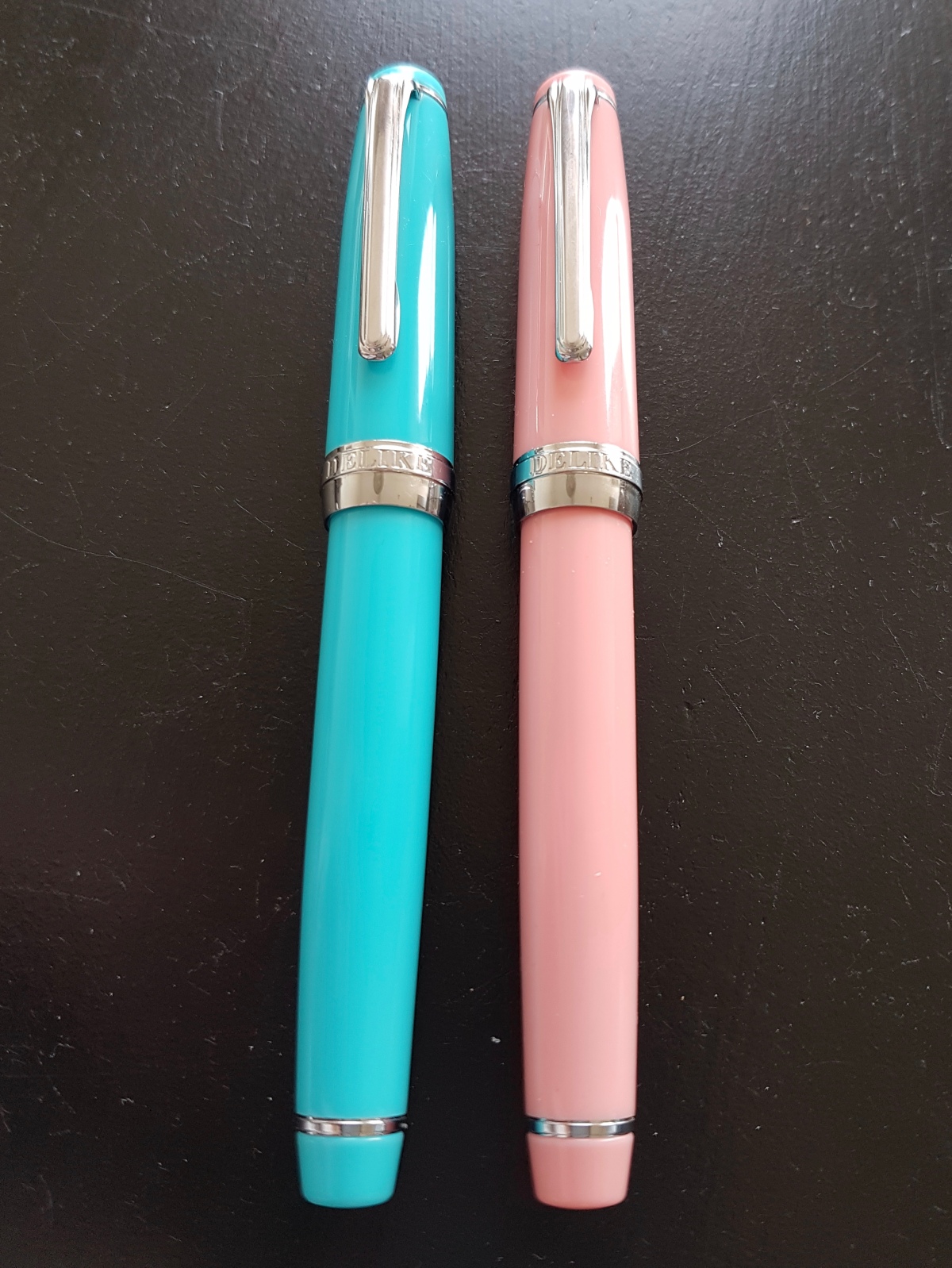
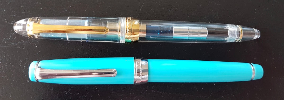
  • Delike New Moon Pink; if you want to know more about this pen, please click here for a full “first impressions” review.
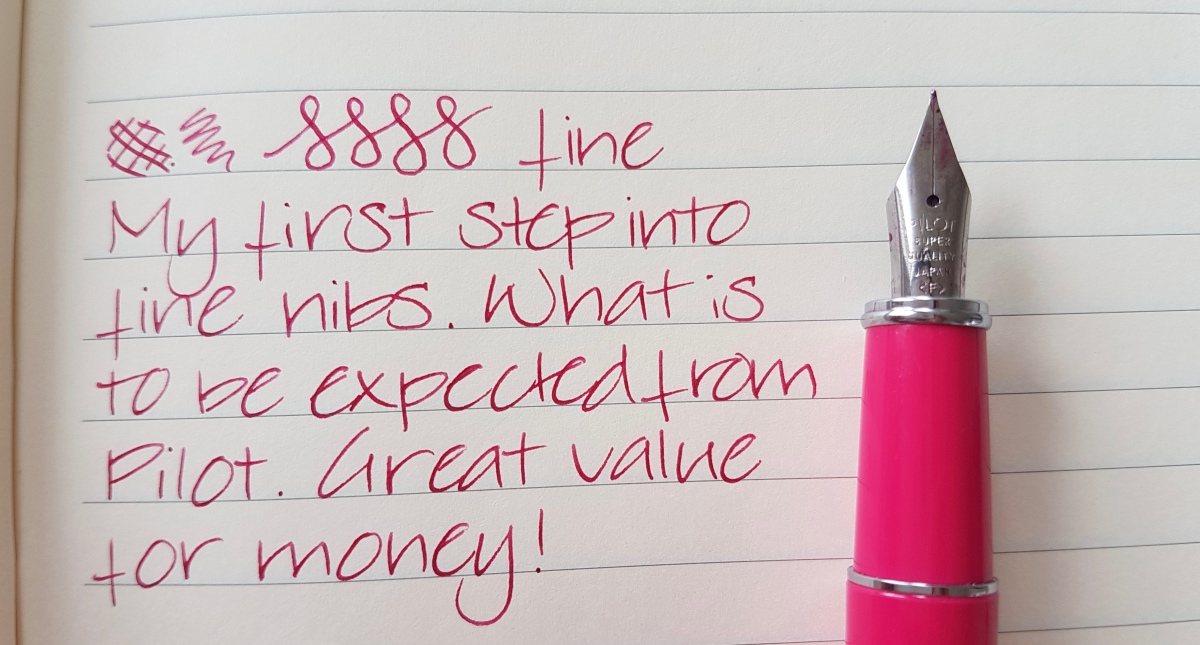
  • Pilot Prera Vivid Pink; bought after falling in love with fine Pilot nibs I tried at a pen meet. If you are a broad nib lover, Pilot fines are good fines to try. The Kanuno, Metropolitan or MR also come in fine.
  • Franklin-Christoph M65 Antique Glass; I really loved getting a FC pen in this material so when I was in time for a sign-up waiting list, I was over the moon. More on this and other FC’s in this link.
  • Franklin-Christoph M45 Cherry Ice; a lovely little pen and one of the Stub.Italic.Gradient FC nibs. Also more on this pen under the link in the previous bullet.
  • Kaweco Skyline Sport Pink; I love Kaweco Sports for nib grinding. This has the final drops of a Noodler’s sample. I’ll be sorry when that is gone.
  • Online Germany; also a victim of my nib grinding exercises. A colorful pen. I used to get an Online fountain pen fix every now and then wen my boys where babes and the money mostly went to diapers.
  • Franklin-Christoph M45 Italian Ice; one of my favorite color-model combinations from the Franklin-Christoph range. Also more on this pen here.
  • Pelikan Twist Jungle; a stealthy pen that suits every situation. It will even stand up for itself in the boardroom.
  • Montegrappa Fortuna Mosaico Marrakech; no picture does the depth in this material justice. When the pen arrived, the nib wrote on the dry side, but I tuned it up and it’s a great writer. I am always on the hunt for the perfect blue to match up with the material.
  • Montblanc 254 oblique medium; this nib is something else, in shape as well as in performance. Read all about it here.
  • Franklin-Christoph M66 Stabilis Solid Ice; the first FC I ordered and a beautiful expressive nib.
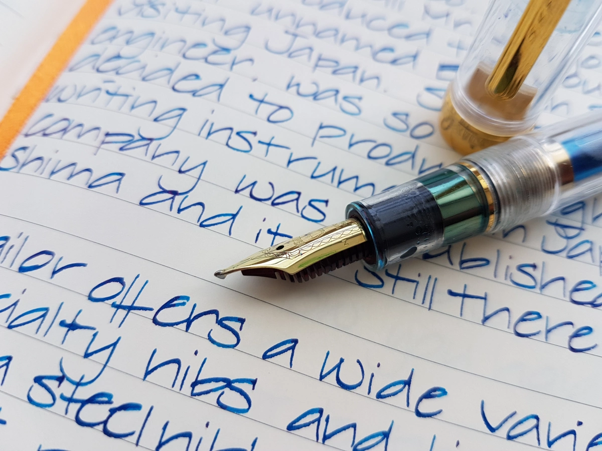
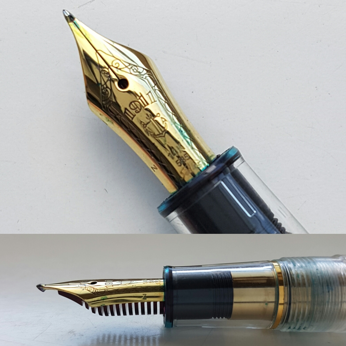
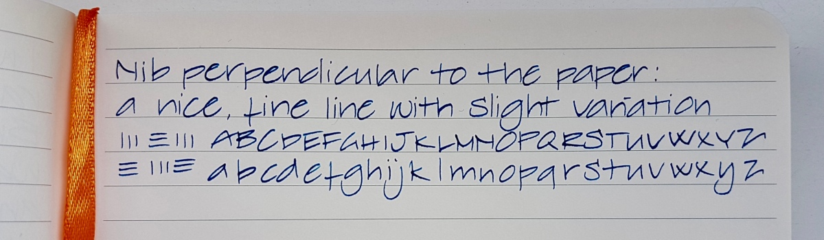
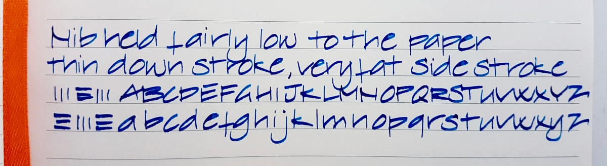
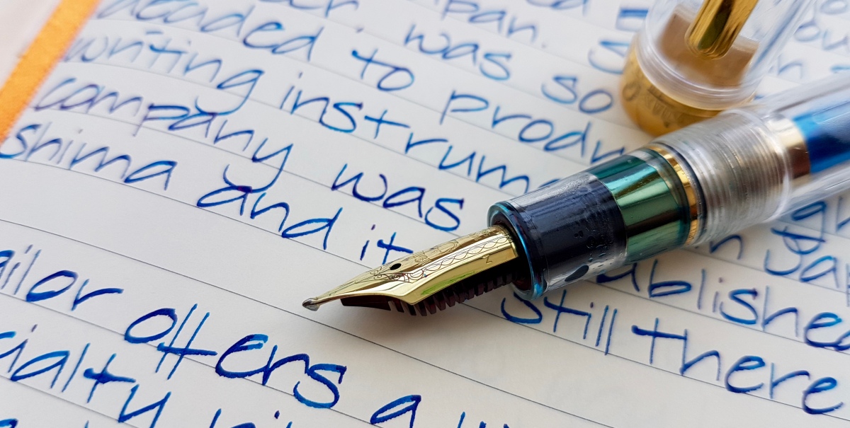
  • Sailor 1911 Standard Zoom Architect; always in my EDC. A nib that offers stunning line variation. Read more about this pen here.
  • Delike New Moon Sky Blue; a great first extra fine nib.
  • Inoxcrom Agatha Ruiz de la Prada; just a fun pen. I was mostly lured to it because of the polka dots but the nib isn’t half bad.
  • Kaweco Skyline Sport Mint; these fifties colors are so cheerful and suit this pen shape very well. Another double broad ground into an architect.
  • Lamy 2000; what can I say. A pen that many of us female pongees thought just a bit “meh” at first. But then I really fell for that torpedo shape and when I had the opportunity to try one, I was smitten and hunted one down at an online auction. I believe it is a medium but I gave it a crisp stub. It is surprisingly springy for a hooded nib.
fullsizeoutput_44a.jpeg
Writing samples of the pens that survived my triage. Plus an Emily Dickinson ink blob on Emily Dickinson… 

Now I have one more pen on its way, to be completely honest. If I write one of the above dry in the mean time, that one will be switched out for the new pen. To see which pen is currently in transit… keep an eye out on my Instagram feed.

Unfortunately I do not have one pen case to carry all 22 and still fit in my work bag, so here’s a bird’s eye view of the current pen cases. Usually I choose which to bring to work the night before.

fullsizeoutput_447

The pen I will be putting up for sale is a Montblanc Chopin (145) from the year 2000 with an oblique double broad nib. It is a beautiful pen but I just do not use it enough to justify keeping it. If you are interested, please contact me for pictures and price.

If I will be able to continue whittling down my EDC… I will keep you posted.

Thank you as ever for reading!

Delike New Moon fountain pens

Had I not started this blog, I would not have thought twice about trying extra fine nibs. I have been a broad, stub, italic, gushing nibs user for most of my fountain pen life. But when writing reviews, you have to look past your own preferences. And when doing ink reviews I like to show what the ink looks like in most nib sizes. The hunt for the finer nib began. At first I got all Lamy nibs from EF through 1.9mm, but the quality of those nibs, especially the size accuracy on the EF through B nibs left a lot to be desired. Then I ordered three Preppies in EF through M. Those will do nicely for ink reviews, but I wanted to try more fine nibs to get more comfortable with them.

Then I saw a lovely Instagram pic by @pixiegeek and was smitten. Not only by her beautiful handwriting, but especially by the ink line from a particular extra fine pen she used, a Delike New Moon. It looked like the finest of architect grinds. And I love the line effect of the architect. Thank you for enabling, Christiana! I looked them up online and found a great deal on eBay, two pens, including shipping from China, for about 32 Euros. The color options included a mock celluloid material and a sky blue and pink solid plastic set. I opted for those. The close-ups of the nibs gave the impression of two very thin metal disks pressed together, indeed much like very fine architect grinds. Hardly any tipping at all! So for the blog’s sake, I ordered them straight away.

20170328_130445.jpg

About two weeks later the package arrived and much to my surprise it also included a powder blue PU leather pen case. The pens were wrapped in individual plastic sleeves that mention “Hero”  but I am yet to find out if Delike is a Hero sub brand. Please comment if you know more about this. The pen case is quite nice, but the elastic strap offers only room for one and a half pen, so I usually put one in the strap and I let the other sort of roll around next to it. At this price point, I’m not too bothered about that.

20170328_130743.jpg

The case also has a little top and bottom flap to protect the pen that is lucky enough to be put in the strap, from scratching by the zipper. Still, a nice extra and the great thing is, the case doesn’t smell too much like PU… I am afraid though that hoisting this around in my bag will make the edges fray so I will not use it as an office pen case. Plus, it looks nice just sitting at my desk.

On to the pens. Since there aren’t many reviews around about them, here are some measurements and statistics:

  • weight capped and filled: around 12 grams;
  • length capped: 123mm;
  • length uncapped: 110mm;
  • length posted: 135mm;
  • cap band diameter: 14mm;
  • section (grip) diameter: 9mm.


fullsizeoutput_444.jpeg

The pens have a screw-on cap, the cap posts pretty securely. I like the pens having the same color plastic throughout, so no black section or blind cap. The blind cap has a silver colored decorative ring. It does not screw off. The clip has enough spring to be functional and can be lifted up with the same hand while holding your pen. It is tight enough to secure your pen to a pocket. There is a slight hollow rim between the cap ring and the plastic but not enough to make it fragile or to be aesthetically annoying. The cap screw thread on the section has some leftover loose plastic bits from thread turning, but those are easily wiped away. The cap band has “DELIKE” stamped beneath the clip and “New Moon” on the opposite sight. A nice detail, let’s say “borrowed” from Japanese pen models. To which this pen bears quite a resemblance… So a nice pen to “fake it until you make it” as they say. All in all, this pen is about as refined as you might expect for the money. Still, refined enough to bring to school, uni or even the work place.

fullsizeoutput_442.jpeg

Another pleasant surprise was that the pens came with a converter. There is a small metal band around the nipple and a broad metal band with a nice flower stamped on above the turning nob. Pretty decently performing converters so far. I haven’t yet tried standard international cartridges in the pens, but judging from the converter nipple, those will fit.

fullsizeoutput_443.jpeg

For a size comparison, I put the Delike New Moon next to my Sailor 1911 Standard, which is already a relatively small pen. This makes the Delike a nice writer for people with smallish hands, like myself. So if the 1911 Standard is too small for you, you will feel the same about the Delike. Still, when posted it might just be comfortable enough and girth-wise they are the same.

20170328_131900

The steel nib has a sphere-like engraving over “DELIKE” and “EF” under the breather hole. The tines end without any noticeable tipping and this makes for the very slight line variation effect. This also gives the writing experience a slight bit of feedback. I have not experienced either nib as being scratchy but with these very fine nibs I have found keeping a very light hand works best. Which is good practice for me because normally I write with quite a bit of pressure.

20170328_133718
Delike writing sample in a lined Rhodia Soft Cover A5 notebook

I have found writing with both pens a pleasant surprise. These nibs are not the wettest writers as you can see from the smeared wriggles and I could feel the difference between the Diamine in the sky blue pen and the much more lubricated Noodler’s in the pink pen. The pink pen as a result writes a tiny bit more smoothly, but if I were to put a more lubricated ink in the blue pen, I bet I would get the same result. I love that these pens are comfortable for me when writing in my usual largish hand as well as when writing small. I am not good at small writing, and I bet experienced small writers can get these pens to write even smaller. Ideal pens for starters in the pen world who have to write on paper that they cannot choose themselves, for maths, bullet journaling or just to have around with some pretty inks in them.

In conclusion, I was very happy to be enabled in this starter’s investment into extra fine nibs. The only problem is -and don’t tell me you don’t recognize it- that now I am curious about other extra fine Asian pens. Well, that’s fountain pen life for ya! I’ll be sure to keep you posted on further extra fine experiences from this spot as well as on Instagram. And if you have any pointers on good (extra) fine nibs out there, be sure to share!


Four more nibs plus one extra

Hi everybody and Happy Mothers Day if you live in a country that celebrates it today! Over here we Mothers Day is celebrated in May, but I do have the house to myself right now and I am going to make the most of that by taking it pretty easy in this post. I feel a cold coming on so I’ll be taking a load off after posting this by rewatching some amazing YouTube videos on Japanese Masters of Fountain Pens. So relaxing!

But first four nibs plus one extra. Why one extra? Because the writing sample of the fifth didn’t fit on the written page as shown above. Practicality first! Because of the budding cold I am keeping it mainly to writing samples and nib shots of:

  • Delike New Moon extra fine nib (for which I was completely inspired by Instagram’s @pixiegeek. Go check out her feed if/when you’re on Insta, follow and give her some FP love!);
  • Pilot Prera Vivid Pink fine nib;
  • Pelikan Twist Bronze medium nib;
  • Franklin-Christoph broad stub.italic.gradient (S.I.G.);
  • Jinhao 159 fude nib.

So as you can see, there’s a nib size for everybody in today’s post. I think writing samples are great references for nib performance, plus I really enjoy doing them. And I always enjoy seeing other people’s writing online. I have a couple of handwriting crushes, but I will go into that in a later post. Let me know if you do!

The paper used is a Rhodia Soft Cover A5 lined journal.

Hope you enjoy the pictures, and if you have any questions, please do leave a comment. I always enjoy reading your messages!

Delike New Moon extra fine nib

fullsizeoutput_441.jpeg

Pilot Prera Vivid Pink fine nib

fullsizeoutput_440.jpeg

Pelikan Twist Bronze medium nib

fullsizeoutput_43f.jpeg

Franklin-Christoph M65 Antique Glass broad stub.italic.gradient (S.I.G.)

fullsizeoutput_43e

Jinhao 159 fude nib

fullsizeoutput_43d

fullsizeoutput_43c

Thank you for reading (watching :-)) this post and until the next one!

Ink review: P.W. Akkerman Shocking Blue

20170324_161155.jpg

A rim like this on your ink bottle neck surely looks promising! P.W. Akkerman’s #5 ink, Shocking Blue, is the most loved and best known of the Akkerman inks. A deep, bright blue you just cannot go wrong with. Before we take a look at the writing samples, let me tell you about the name of this ink. Perhaps you are already aware of this fact, or it is new to you, but P.W. Akkerman is one of Holland’s oldest fountain pen stores, located in The Hague in one of Holland’s very first “malls”. Akkerman uses names for their inks that are all associated with the town’s phenomena. The Hague was Holland’s birth ground of quite a number of blues bands in the 60s. The Golden Earring for example, who you may know from their song Radar Love, Brainbox who covered Summertime in a bluesy-funky way and Shocking Blue, who had a hit in 1968 with Venus. Some of you may know the Bananarama cover version of that song. I used a couple of lines in my writing samples. Enough of that, on to the ink!

fullsizeoutput_43b

Shocking Blue is a classic, intensely deep royal blue with its renowned red sheen. As you can see above, it almost pops of the page! The ink behaved decently in all nibs sizes and has relatively quick drying time, especially in finer nibs. My husband is a lefty overwriter and always has his TWSBI Eco inked up with Shocking Blue. Another reason he loves this ink is a matter of ritual. The Akkerman inks all come in that very distinctive marble-in-the-bottleneck ink bottle. You tip the capped bottle upside down so that some ink gathers in the top part of the bottle from where you fill your pen. This was the ink his parents used many years ago, so refilling the pen from the bottle brings back memories for him.

Let’s look at the writing up close to find that illustrious sheen!

20170324_15574220170324_15562920170324_160358

Yes, a wonderful deep deep blue ink, really vibrant with a lovely red sheen and outline. It pops up in every nib, especially on more absorbing paper. I made a rim stamp in my Leuchtturm journal to show the ink’s sheening capacity.

20170324_161416

Oh yes, here we see that the ink is so intense that it leans towards a purple. The sheen is nice and thick, almost oily. The chromatography shows the purple aspects in the lavender hue in the base. The ink trail develops into a bright blue and ends in a dark blue outer line where the pigments are deposited.

20170324_170241

This ink is usable in most situations -apart from those where you want your ink to be waterproof, it isn’t- school, university, the office, personal use, correspondence that doesn’t require bulletproofness. It is a crowd pleaser! And I can see why. It is blue without being run-of-the-mill.

How about you, do you have a deep royal blue with a red sheen of choice? Let me know, so I can do a side-by-side at some point.

Thank you as ever for reading and until the next post!

All pictures taken in natural light, no filters used.

Disclaimer: I bought this ink wit my own money for my own use. No affiliate links.

Tools used:

  • Leuchtturm A5 blank notebook;
  • Akkerman Shocking Blue ink;
  • Platinum Preppies EF, F, M;
  • Lamy Vista B, 1.1, 1.5, 1,9;
  • Kaweco Classic Sport BB architect grind;
  • a strip of paper kitchen towel;
  • Samsung S7 phone camera.

20170324_160313

Franklin-Christoph broad steel nibs with grinds compared

Ever since I received the Model 65 Antique Glass recently, I knew I would be doing this blog post and so I held out on flooding my Instagram feed with photos. I think I managed to keep it to one picture. And then of course the one to announce this blog post. Having three different grinds on broad steel Franklin-Christoph nibs, a comparison is in order. Let’s start with the largest pen and the biggest nib. These writing were done in a Rhodia lined soft cover A5 notebook.

Franklin-Christoph Model 66 Stabilis Solid Ice, broad nib with a cursive italic grind by Mike Masuyama (BCI)

fullsizeoutput_434.jpeg

First, the Franklin-Christoph steel nibs are made of a company specific alloy called HPS, which stands for High Performance Steel. It is said to give a gold nib-like writing experience. The nibs are very beautifully polished with a laser engraved Franklin-Christoph logo and stamped (I presume) scroll-work. You will find the original nib size at the base of the nib where it meets the section.

The nib on the quite large Model 66 is a #6 steel nib, ground by nib meister Mike Masuyama into a broad cursive italic. When you order a pen from the Franklin-Christoph website, having a Masuyama grind is an option that is offered in the drop down nib choosing menu. The nib grinds are priced pretty decently, but there is no conferring up front on your writing preferences such as wetness or writing angle, so the grind comes as it is. Masuyama is a master at nibmeistering, so you can be assured that the italic is going to be super crisp and the stub is an actual smooth stub. The crispness is clear from the fact that there is no tipping material left on the tip of the nib after this grind.

The ink line that this broad cursive italic puts down is a really crisp italic. This means practicing to get your angle of writing so that you do not get the edges of the nib caught on/in the paper. I prefer holding stubs and italics in an angle (almost as if writing with an architect nib, but at a slight angle of 70-60 degrees instead of a full 90 degrees. I find I have to write with a very light hand with this nib so as not to get caught in the paper. It gives a very crisp and delicate thin stroke combined with a much broader thick stroke. Beautiful, but this is not a nib for daily note taking for me. I use it for letter writing, card messages or anything I want to write down with a certain flair. The nib is not scratchy, the pen stroke actually feels like writing with a freshly sharpened pencil that will not wear. Even when you have small handwriting, you can use this broad nib and remain legible.

Franklin-Christoph Model 65 Antique Glass, broad nib with a Stub.Italic.Gradient (S.I.G.) grind

fullsizeoutput_435.jpeg

The Model 65 is quite a bit smaller than the 65 and has an elegant #5 nib. For my Antique Glass FC (aka Coke Bottle) I opted for a broad stub-italic gradient, largely because I wanted to try that grind. And I am not disappointed. This is a great grind if you are used to stubs and want to venture into italic territory. It has the user-friendliness of a stub with just a dash of crispness to lure you into italic writing. The crispy touch of this nib fits this print writing style nicely. It will also work great for cursive writing. This nib and the nib that is up next, the stub, are fighting over which is my favorite broad FC nib so far… So, up next, the stub.

Franklin-Christoph Model 45 (XLV) Italian Ice, broad nib with a stub grind by Mike Masuyama

fullsizeoutput_436.jpeg

This is the most democratic of the grinds compared in this post. This stub has a boxy grind as you can tell from the picture above, which is just the way I like it. It is very forgiving and I use it daily. It has a smooth line with a hint of interesting line variation caused by the stub grind. As you can see, for a Western broad nib all broads nibs here are more like Asian nib sizes, so all are pretty nicely usable on paper that is not very fountain pen friendly. Although I would use fountain pen friendly paper for the broad cursive italic, or you might find yourself shredding copy paper while learning to wield that nib. These are broad nibs that are suitable for smaller handwriting, if you want to get the most shading out of your ink without your handwriting becoming illegible.

Let’s look at the ink lines side by side:

fullsizeoutput_43a.jpeg
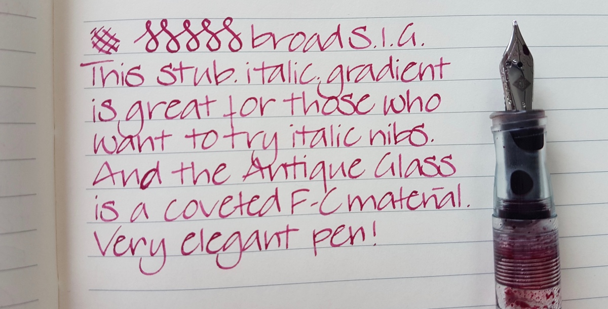
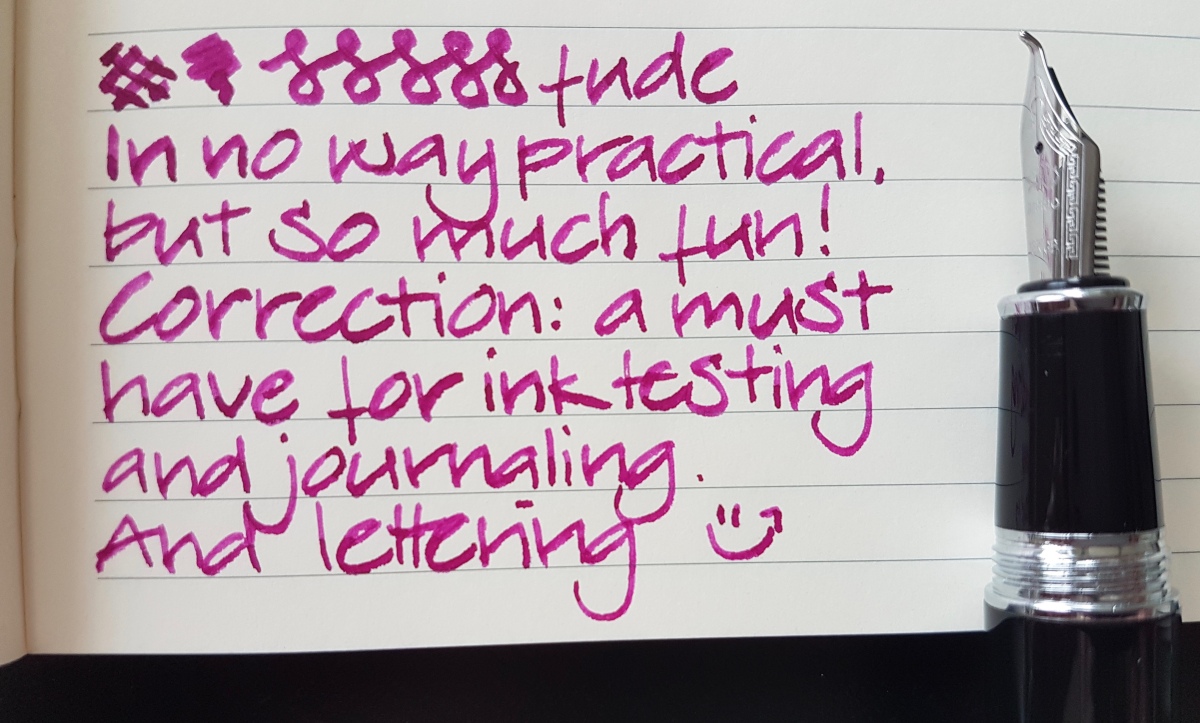
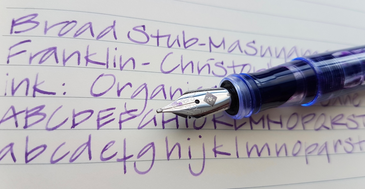
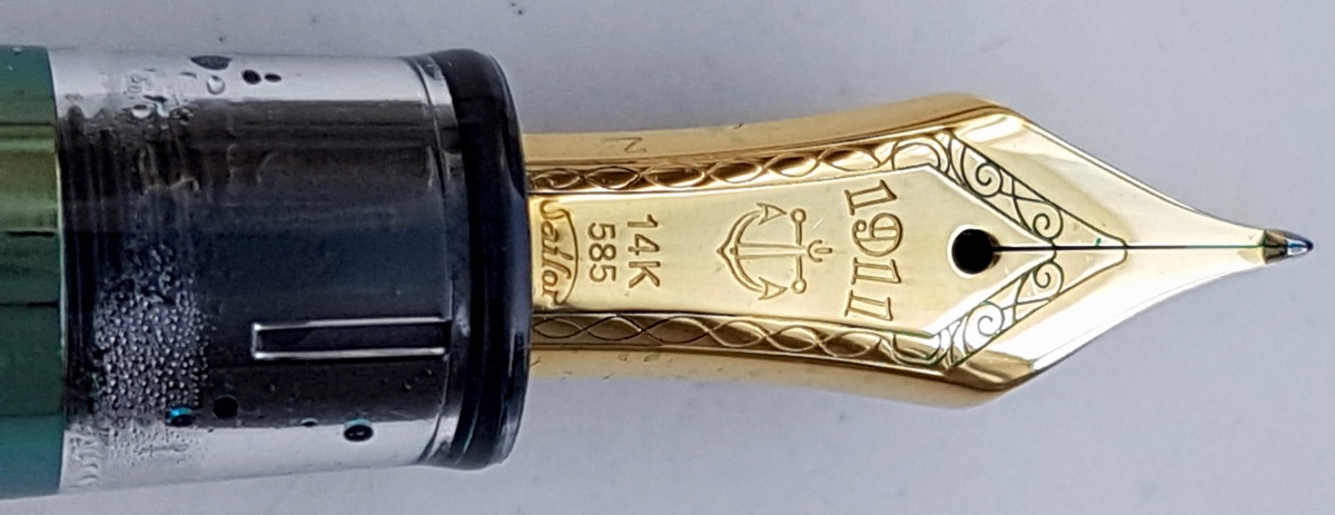
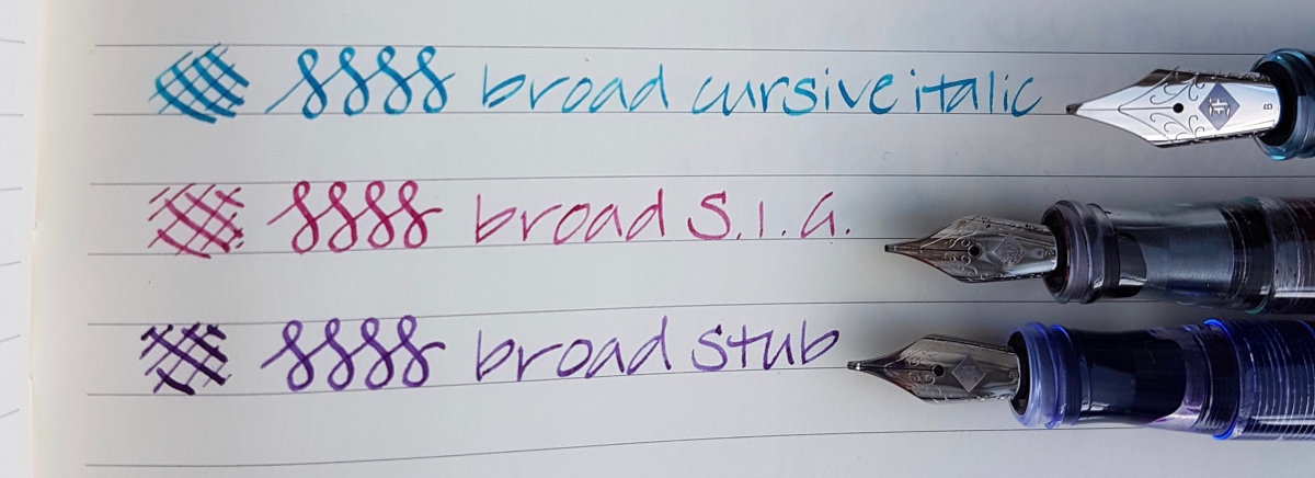
The line variation is clearly most pronounced in the broad cursive italic. The S.I.G. is italic on the upside of the nib and a stubbish bottom nib where there is a tiny bit of tipping left. The stub has tipping material left on the upside of the nib and on the bottom. The uttermost tip of all broads is pretty flat to account for the line variation. All pretty interesting nibs and I am happy I chose them. The BCI gets its use on special occasion writing and the S.I.G. and stub are pretty much daily writers.

Do you want to know what other nib options and nib grinds Franklin-Christoph offers? Check their site in this link. (Not affiliated, just an FC fan)

Have you used a specific grind by either Franklin-Christoph or from other nib misters? Be sure to leave me a comment.

As ever, thank you for reading!

Ink comparison: Akkerman 15 Voorhout Violet and Montblanc Lavender Purple

At the end of the first Dutch Pen Meet-up, when we had besieged Akkerman The Hague, we were graciously given a wonderful goodie bag plus an Akkerman ink of our choice. I went back and forth between Voorhout Violet and Groenmarkt Smaragd, but finally opted for Voorhout Violet, Akkerman ink no. 15. One of my fountain pen friends from that meet-up, Neseli, asked if I could do a comparison between this ink and Montblanc Lavender Purple and I hereby happily oblige.

fullsizeoutput_42f.jpeg
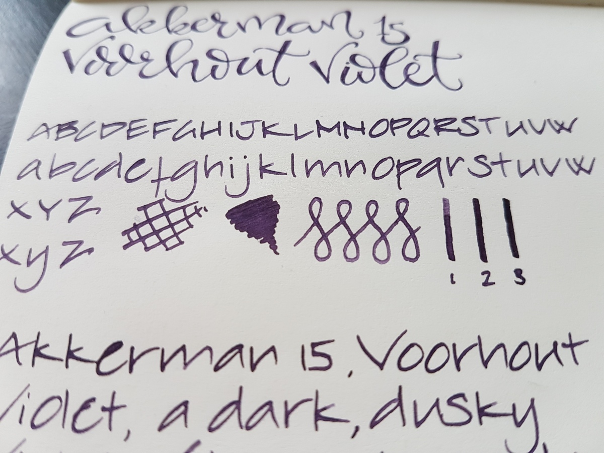
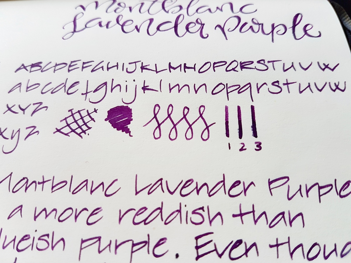
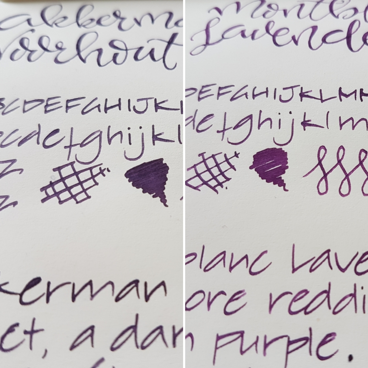
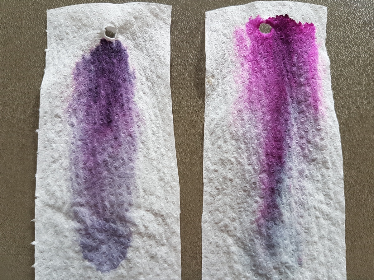
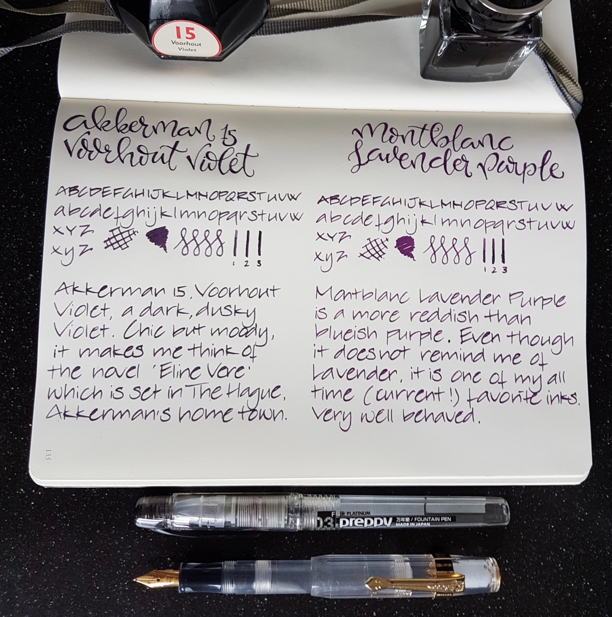
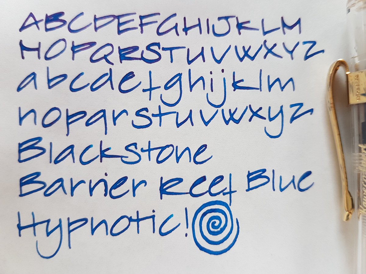
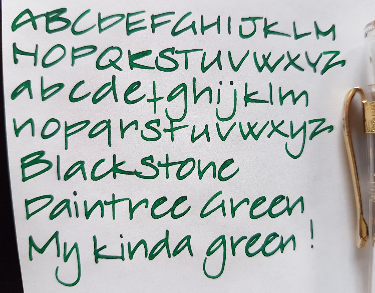
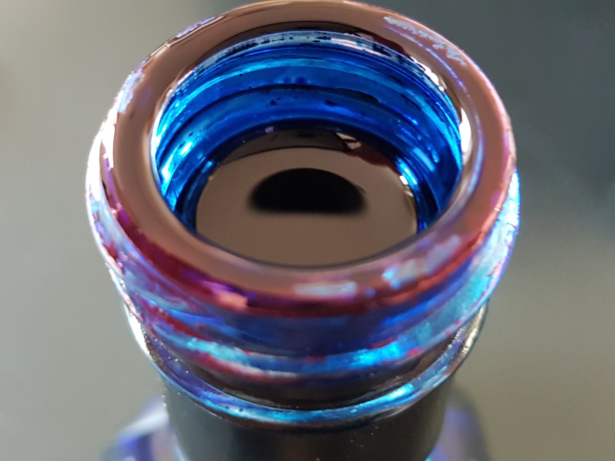
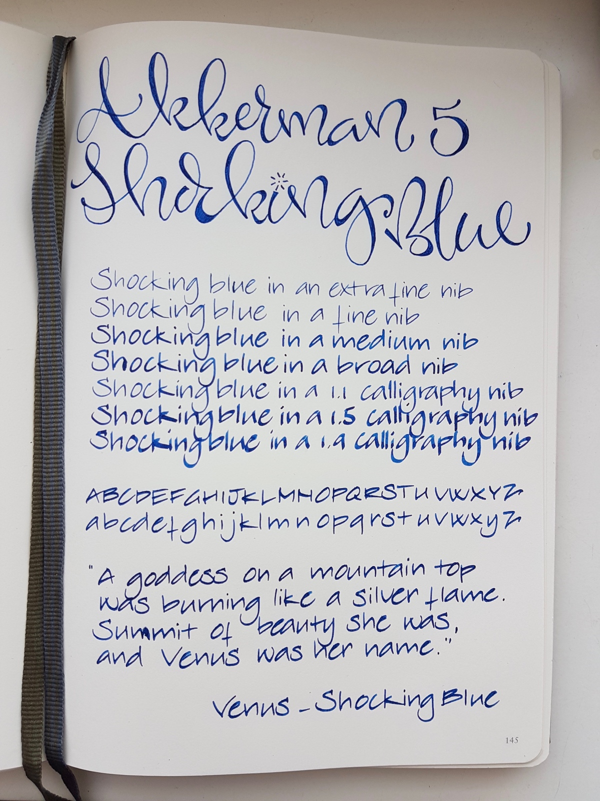
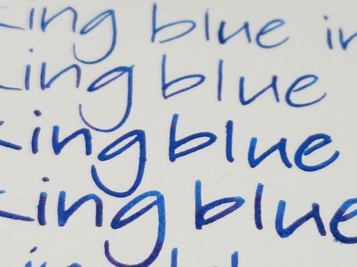
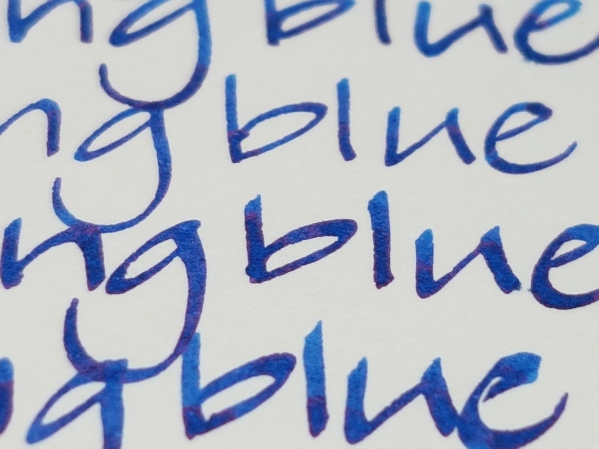
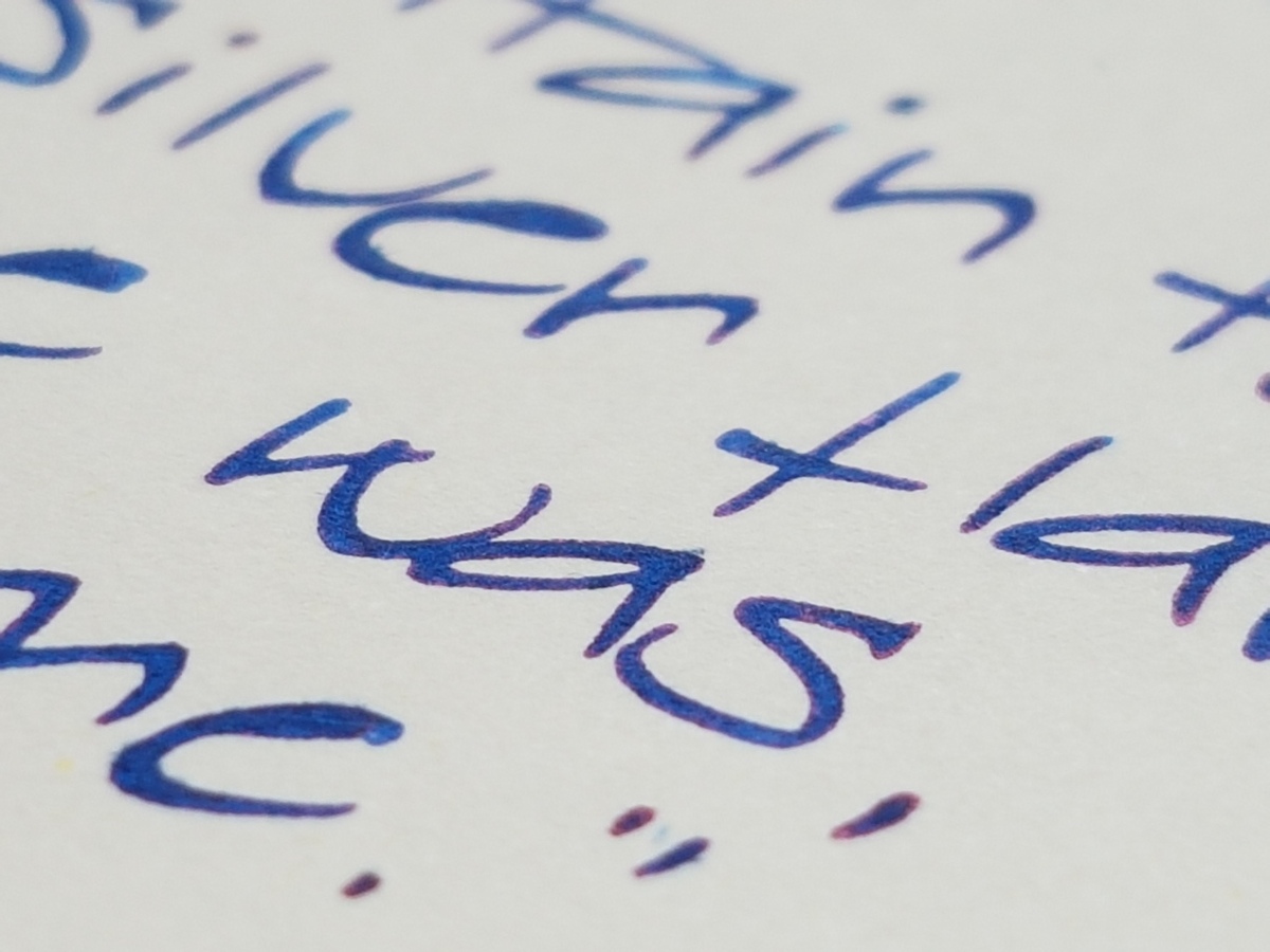
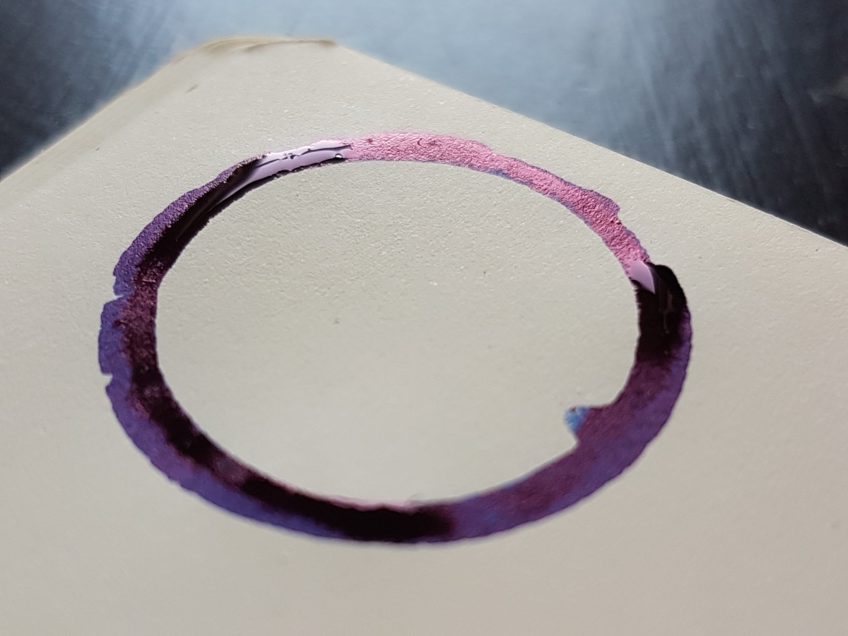
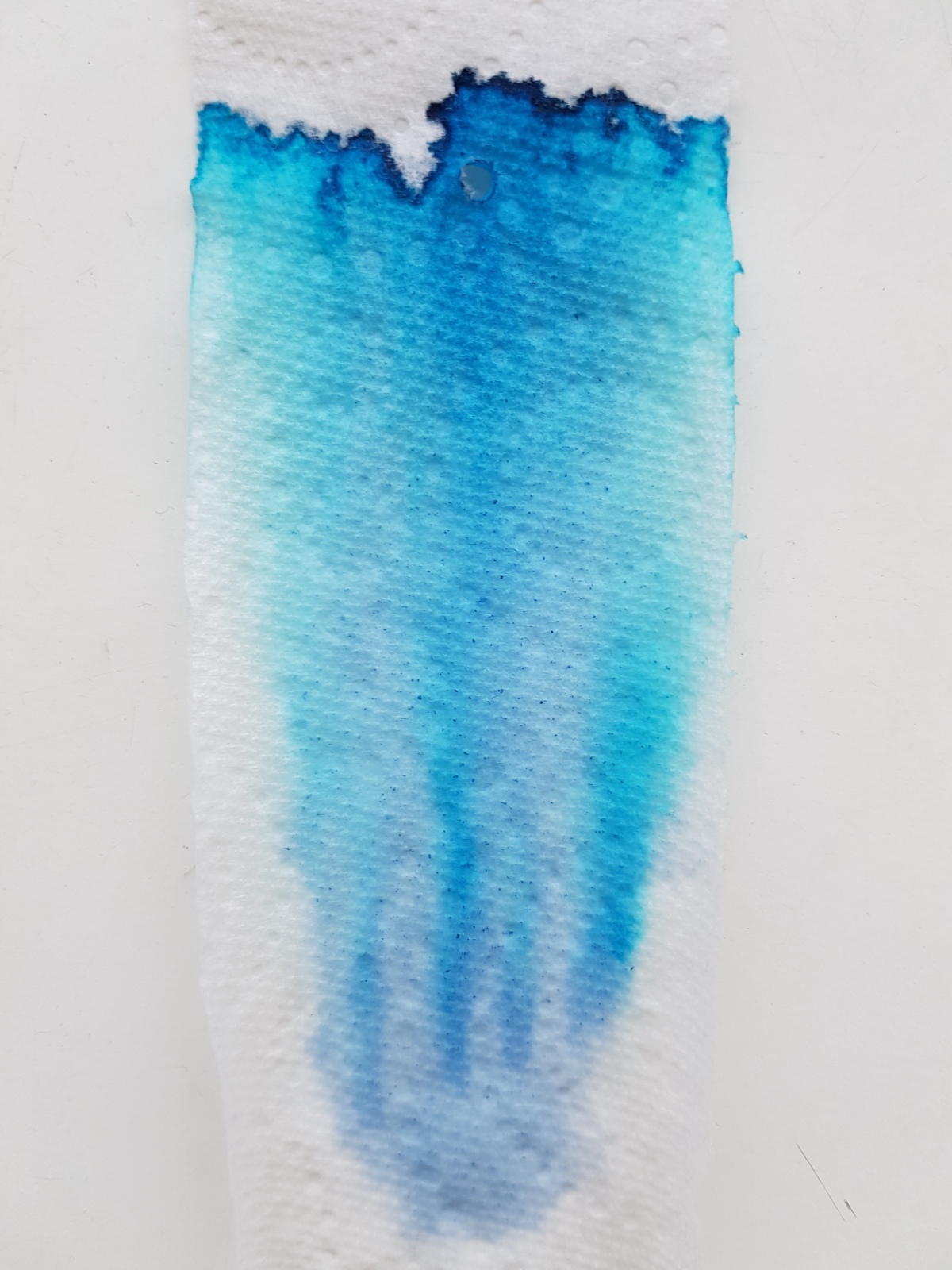
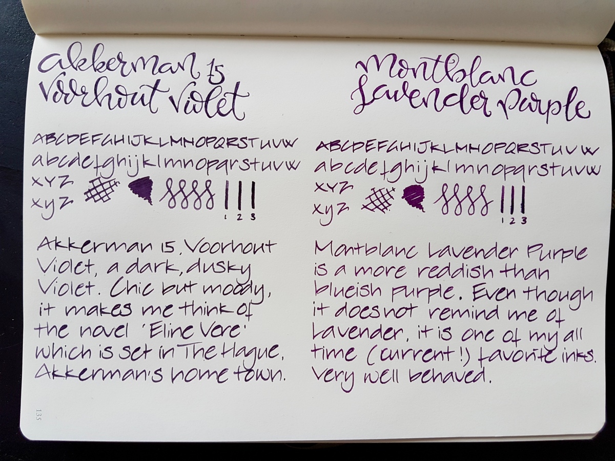
Both inks are of very good quality, decently behaved, easily cleaned and both are not waterproof. Both come in a 60 ml bottle. The bottles are very distinctive and good looking bottles in their own right. Dry times on this Leuchtturm paper was about the same for both inks. On Tomoe River the Montblanc dries more quickly. In the Netherlands, the price of both inks fall in the same 15-20 Euros category, the Montblanc being about 3 Euros more expensive for 60 ml.

Seen from above in natural light, the inks both are dark purples. So let’s take a closer look at them. Pens used, by the way, are a fine Preppy for the faux brand calligraphy and a Kaweco BB with an architect grind for the alphabets, squiggles and scribbles.

20170319_093114.jpg

The Voorhout Violet is a dusky violet purple on the blueish scheme. It is actually pretty close to the darker shades in the pansy after which it was named. Voorhout is a chic avenue in The Hague and the ink reminds me of Eline Vere, a novel named after its main character by Dutch fin-de-siecle novelist Louis Couperus. Eline Vere was quite a hysteric character, misled by her day dreams and misplaced romantic illusions, fed by her male equivalent cousin. A beautiful novel that portrays the ennui of the upper classes in The Hague at that time pretty impressively. This ink fits the atmosphere in that novel very well. Ill-lit rooms, crammed with dusty expensive furniture and people stifled by their bourgeois rules. Chic, but gloomy. I love the novel and I love this ink. Great for letter writing on good quality paper, journaling and I would consider it office appropriate.

fullsizeoutput_430.jpeg

The Lavender Purple is a much pinker, redder purple than the Voorhout Violet. It reminds me of the dark purple that was fashionable in the 70s, but a little more subdued and fit for everyday use. To me it is much more purple than lavender. Lavender in bloom tends to lean more to the blueish spectrum. Nevertheless, a beautiful ink. I love using it as an office ink in my Hobonichi office planner, because it dries pretty quickly, even in a broad nib. I would qualify the Lavender Purple as a bit more cheerful than the Voorhout Violet, without jumping off the page in screaming purpleness.

A closer look side-by-side, in natural light:

IMG_20170319_102213.jpg

This picture shows equal qualities in shading. No sheen to speak of on this Leuchtturm paper, but both do sheen on even more ink resistant paper. Both lovely inks in their own right and I am happy to have both as a full bottle. These dark, decent purples will surely get good daily use because I consider both office appropriate.

Now for my crude chromatography, picture taken in natural light:

fullsizeoutput_431.jpeg

To the left the Voorhout Violet, to the right the Lavender Purple. Both show dark blue at the base, lavender hues in the middle coming up to still dark purple with a light pink halo in the Voorhout Violet. The Lavender Purple shows a bright nearly hot pink halo.

As said, I am happy to have both the inks at my disposal, and both will get a good deal of written mileage. Now that leaves just one thing… one day I will still have to go for that bottle of Groenmarkt Smaragd… The struggles of an inkaholic!

One final picture, just for the heck of it. Let me know what your purple ink of choice is. And as ever, thank you for reading!

fullsizeoutput_433.jpeg


Blackstone ink samples

Ever since I got around to color labeling a full rack of ink samples, I have been wanting to do writing samples of the Blackstone samples I had ordered from Appelboom Pennen quite some time ago. I will do full reviews on what I have left of the samples, but for now a nice quick overview of a handful of alphabet scribbles. I must say, I’m quite smitten with them…

The Blackstone ink line consists of two waterproof inks: the Barrister Black and Blue, as well as six inks which are highly saturated new takes on regular colors, black, blue, turquoise, red, green and yellow. The only ink from the Blackstone line that is missing in this overview is the yellow, Golden Wattle, which I traded in an ink swap. I will add that ink to this post once I get another sample. Without further ado: Blackstone inks! All writing samples are done with a Kaweco Classic Sport BB, which I ground into an architect shape, to show thicker and thinner lines in the writing samples.

Barrister Black

fullsizeoutput_425.jpeg

A black ink just as I like them: opaque and no shading. An intense black black. Since it is waterproof, it should be nice for layering in mixed-media art and adding detail to watercolor or other ink art. Mind you: when I rubbed it with a wet finger, it gave off a gray wash, but the words remained legible. So be aware of that when using with other materials. Perhaps adding detail when the other layers have been applied and are dry. Unless you are after the washed out effect, of course.

20170317_094123.jpg

The ink is so opaque that the sheen is silvery, as you can see above. The smell is an intense inky smell, the smell of the desks at my elementary school in Delft, which still had ink bottle cubby holes.

Black Stump

fullsizeoutput_426.jpeg

Black Stump is actually a quite interesting black ink. It has a heavy brown-red hue when used in a very wet and broad nib. The Kaweco does not show that as well as my Esterbrook 2284 does. The term Black Stump is said to mean an imaginary landscape marker beyond which uncivilized territory lies. But since the origin of the term is much discussed, please don’t hold me accountable for this explanation.

20170317_094206.jpg

Because the reddish hue shows better in a broader nib, I’m keeping the ink for use in a broad gusher. If you are after a nice “warm” black ink that does not have to be waterproof, this is a good one.

Uluru red

fullsizeoutput_427.jpeg

This is a very intense red. Only a smudge of shading. A much bluer red than the earthy red color of its name sake, Uluru – or Ayers Rock. I love a dark red like this, but it is an accent or lettering color for me. It is too heavy to use as a daily writer ink for me, because a pageful would be quite harsh to read. A stunning red though.

20170317_094111.jpg

A red like a classic lipstick. If you want to write a couple of seductive words but still in the best possible taste, this is your ink.

Barrister Blue

fullsizeoutput_428.jpeg

The most sensible of the Blackstone inks, if you ask me. A classic waterproof blue, nudging toward blue-black so that it has an almost purplish hue. A nice bit of shading to make it interesting enough. It writes the driest of the Blackstone inks, so suitable for crappy office paper, if you have to suffer through that kind of ordeal. Plus the waterproofness makes it a suitable signature ink.

20170317_094104.jpg

I could live with this ink as a workplace ink. It also has that typical inky-ink smell. So if you are bothered by your colleague’s peanut butter sandwich, just take a quick sniff o’ the nib.

Sydney Harbour Blue

fullsizeoutput_429.jpeg

This ink is fiercely competing with the next for being my favorite of the Blackstone colors. From above, -it appears to be just a very dark tealish blue-black with a heavy red sheen and outline. But mind you, it’s not an ink for the faint of heart. This ink is so saturated and flows so thick, there is hardly any shading but who cares! Look at that sheen!

20170317_093946.jpg

Each letter is set apart by a very distinct red outline. If you have to write on ink-sucking paper, don’t waste this beauty on that. You’ll be through your converter within a single page. This is nice paper – special letter – journaling ink. Now which one do I like best, this one or…

Barrier Reef Blue

fullsizeoutput_42a.jpeg

This is a slightly darker than regular turquoise ink, bordering on intense sky blue. Some shading, a heavy shining blue ink, like its darker brother. This ink does not only make me very happy to look at, it works slightly hypnotic even.

20170317_094023.jpg

Isn’t that a looker! If I use this, I can’t help but taking a sideways glance at it. An immediate picker-upper. I have had both this and the Sydney Harbour blue in the architect Sailor 1911 and I cannot decide which I like best. Might have to get both bottles when my samples have been squeezed dry of their final drops.

Daintree Green

fullsizeoutput_42c

This is a green ink for people who think they do not like green inks. It is cheerful and bright, but not blinding or sickening. It has a very lovely red sheen, but not so much that it makes you dizzy. It is named after the Daintree Rainforest and if you still do not like green inks, at least look up the pictures of this rainforest online. Those are instant stress relievers.

20170317_093959.jpg

This ink would make a very nice daily writer, as well as a great accent ink for journaling. If you love green inks, this is a great addition to your green stash. It’s the next to go into my mint Kaweco when I’ve finished the current load of Akkerman Groenmarkt Smaragd.

Have you tried Blackstone inks or any of the other Australian ink brands currently on the market? I’d love to hear what you think if them.

Quick disclaimer: I bought these samples myself, for my own use, pleasure and testing. I am not affiliated with Blackstone or Appelboom.

Thank you as ever for reading and until the next post!

My first Sailor

Or, a careful step towards a Sailor Specialty Nib…

Oh, those Sailor specialty nibs… every now and again I will go through SBRE Brown’s Sailor nibs writing sample YouTube videos, or window shop in an online store, pretend-deciding which nib I would buy, if I could spend as much on a nib as on a bike…

But first things first. Let’s start with a short look at the brand. I’ve always wondered why Sailor is named “Sailor” and only took the trouble of looking that up when I did some research for this blogpost. The Sailor Japan website tells us that in 1911, a respected engineer by the name of Mr. Kyungoro Sakata, met with a British sailor who introduced him to the concept of the fountain pen. Mr. Sakata was so impressed with this tool, that he vowed to produce them in Japan with the best engineering and design possible. He started a fountain pen company in Hiroshima. This is still the company’s home town today.

20170314_122236

Sailor offers a wide range of pens, from simple plastic bodies with steel nibs for school use or to get acquainted with fountain pens, up to collector’s items with artful Maki-E and Urushi lacquers. The nib range for most pens is quite versatile, from EF through Broad, Music and the enormous Zoom nib. But there is more… the Sailor company employs Master Nib Designer Nobuyoshi Nagahara, who has been with the company for over 60 years. He re-introduced the Naginata – Togi nib (“long sword”) and began combining multiple tipping points to arrive at nibs that have crossing ink slits to put down an impressive ink line. Stunning nibs that are great for hand-letterers and (Eastern) calligraphy artists. Not your everyday note taking nibs. But then again, why not? More about the nibs on the UK Sailor Pen page.

So now for the disappointing bit… I do not own or can show you the use of any of the specialty nibs. Believe me, I wish I could. I have had the immense fortune and pleasure to try some of a pen friends’s impressive Sailor collection during a pen meet – for which I am still grateful! Should you be reading this, Marco, many thanks for trusting those beauties to my trembling hands. What I came away with that nib tasting session that although I always thought a Cross Point would be at the top of my wishlist, but it got knocked off by a Cross Music nib. The even more narrow nib stroke of the Cross Music makes it more usable for everyday writing in my hand.

Anyhow, back to my first Sailor. After having ogled the SBRE Brown Sailor nib videos many many times and traipsing around the internet for good places to hunt for decently priced Sailors, I came across a video on YouTube of John Mottishaw, grinding a very different nib on a very different pen – a stub on a Pelican I believe – and took a look at the nibs.com site. I was happy to find decently priced Sailors with the possibility of an in-house nib grind and decided to go for a Sailor 1911 Standard Transparent with the zoom nib (check the tab Service Price List on the Nibs.com site, if you want to know more about their services), to be reground into an architect or Hebrew nib shape. The pen arrived about two weeks after placing the order and I was very impressed with that relatively short processing and shipping time.

fullsizeoutput_420

The Sailor 1911 Standard is a relatively small pen, with a total capped length of 134 mm, a section width of 9 mm and the broadest part being the cap band with 14 mm. The pen is made of PMMA with gold-plated metal trimmings (which sort of clash with the steel of the converter, if you care about these matters) and weighs a mere 19.8 grams capped. The 14k nib comes in sizes EF, F, M, B, Music and Zoom. The Zoom was the basis for this regrind.

IMG_20170307_162008

The pictures above give an impression of the regrind shape. The nib stroke gives you a thin down stroke and a wider side stroke, depending on how high or low you hold the section. A couple of writing samples, because those tell more than a thousand words (so I’m trying to keep this blog under 900 words, haha):

Holding the pen almost perpendicular to the paperfullsizeoutput_421

Holding the pen at a regular position on the sectionfullsizeoutput_422.jpeg

Holding the pen rather flat to the paper, so very near where the section meets the bodyfullsizeoutput_423.jpeg

This nib will be a joy if you like achieving different ink lines and seeing some versatility in your writing. This pen is nearly always in my daily carry, it is a wonderful pen for note taking as well as writing a special message with a bit of expression, even on paper that tends to feather. Then you just hold the pen a bit more towards the nib to get a thinner ink line.

fullsizeoutput_424

One of my all time favorite writers and the inspiration to try my hand at grinding a couple of my easily replaceable steel nibs into architects, something I love trying my hand at every now and again. as you will no doubt have noticed if you follow me on Instagram.

As ever, thank you for reading and if you have any questions regarding the above or other writing matters, please like, comment or send me a message.

Freshly inked and first impressions

It’s a lovely sunny, activity-filled Sunday, so a quick post of some freshly inked pens and a couple of first thoughts of pens that came in over the last couple of weeks.

fullsizeoutput_41b.jpeg

From top to bottom:

  • Pen: Aurora Optima Burgundy, medium nib. Ink: Aurora Black. I love this pen-and-ink combination, I have started using it as my bujo pen and ink, because I find that the simple bujo style in black suits me best. More on that next Sunday when I’ll update you on my bujo experiences.
  • Pen: Bexley Gaston’s Angels, stub nib. Ink: Noodler’s Lexington Gray. I needed a bulletproof ink in one of my pens, but I will not hang on to this combination. The Lexington Gray is just too wet in the Bexley, even for my taste. Might try it in the much dryer-writing black Kaweco later.
  • Pen: Montegrappa Fortuna Mosaico Marrakech, medium nib. Ink: Private Reserve Lake Placid Blue. I really like this pen and ink combination, the ink complements the blue hues in the lovely material of the Marrakech. The ink tends to run dry in the nib pretty quickly, so it needs to be used regularly.
  • Pen: Kaweco Skyline Sport Black, medium nib. Ink: Graf von Faber-Castell Deep Sea Green. I bought this pen because I wanted to try the medium Kaweco nib. I was not happy at all with how it wrote out of the box. Dry, scratchy and more like a fine. So I rinsed the pen, flossed the tines and feed with a brass sheet. Didn’t help. Then I stubbed the nib and the ink line has slightly improved. Next ink in is the Noodler’s Lexington Gray, to see if that will give a better ink flow.
  • Pen: Sailor 1911 Standard, Zoom nib, ground to an architect by John Mottishaw. Ink: Blackstone Barrier Reef Blue. Another great shading and sheening Blackstone ink in this pen after the Sydney Harbour Blue I had in it before. I only have samples of both inks, so now I’m contemplating which to get as a full bottle…
  • Pen: TWSBI Eco Clear 1.1 stubby italic nib. Ink: Robert Oster Signature Forest Green. A lovely combination, I think. The ink sloshes around like a lovely jewel in the piston filler and the flow is excellent. Nice calm green, good shading but not much sheen on this paper (G. Lalo Verge de France).
  • Pen: Pilot Prera Vivid Pink, fine nib. Ink: KWZ Ink Raspberry. This is my now favorite modern fine steel nib. It feels just right, this is definitely a fine nib that suits people with largish handwriting like I have when writing in this style. Great pen for office use on not so great paper. The pink of the body is very hard to capture in photos, so if you are one for hot pink pens, this is one for you. I love the combination with the bright yet still eye-friendly pink Raspberry ink.
  • Pen: Pelikan Twist Jungle, medium nib (comes in only this nib size) which I ground into a fine-medium architect. Ink: J. Herbin Poussiere de Lune. The soft violet ink combined with the light taupe of the pen is a combination that speaks to me. The Pelikan writes very well for an 8-9 Euros pen. I liked it so much, I ordered the final pen in this list not long after…
  • Pen: Pelikan Twist Bronze, medium nib. Ink: Kaweco Caramel Brown. I have not worked on this nib, because I like it as it is. And you cannot grind all your nibs into architects. That would not be sane… right…? Anyway, this nib has a slightly stubby feel to it so there is some very slight line variation. I love the Kaweco ink in this pen. The cola-colored ink suits the bronze Pelikan very nicely. It’s a nice pen if you are looking for an ergonomic grip but you are not after a kiddy-colored pen. Even though those are darn cute as well! This grip suits both right- and left-handed writers, by the way.

Would you like to know more about these or other pens or inks on my blog, be sure to send me a comment. Have  great week and thank you as ever for reading! As always much appreciated! OK, one more pic…

fullsizeoutput_41a.jpeg

Montblanc JFK Navy Blue Ink

Rumor has it that amongst fountain pen lovers there are those who are able to maintain a respectable office position. Kudos to you if you are one of them! And if you have a decent job, you will need at least one decent ink. An ink that will confirm your office appropriateness. Montblanc JFK Navy Blue is just such an ink. But even if you cannot or do not use fountain pens at your place of work, this is a great ink to have in your collection/hoard/walk-in ink closet. This is not a boring blue-black or navy blue ink. Plenty of shading and sheen going on here. And depending on your nib width of choice, Montblanc JFK shows a nice range of blues. Let’s have a look.

fullsizeoutput_414.jpeg

Depending on the nib width and the dry- or wetness of your pen, JFK shows quite a lovely range of cool dark blues. I would even classify this as a new-pair-of-denims blue. Dark enough where the ink pools and lighter at the edges and frays. The ink shows a nice sheen in particularly wet nibs, as the line in my vintage Pelikan 140 OBB (yes, I did the eclectic thing and put a Montblanc ink in a Peli…)

fullsizeoutput_413

This gusher of a nib puts down a near black ink line, very nice! So this ink gives you a range of colors from near black via dark royal blue to a light indigo.

Even office appropriate inks can have hidden aspects. It’s a good guy with a bad boy edge. Is that why it was named after JFK?

fullsizeoutput_418.jpeg

The ink is a special edition Montblanc ink and has been re-launched (we’re speaking end of 2016 – early 2017) at a number of pen sellers. In the Netherlands, it is currently sold at Akkerman and in the USA I have seen it on the Anderson site. Not affiliated, just to let you know should you want to go after this ink. On auction sites it goes for triple or quadruple its store price, so be aware of that. It is sold in the special edition 30 ml bottles, which isn’t much for an ink of this color, I think. It is so multi-purpose, you will finish the bottle in no time.

I do love the look of these elegant ribbed special edition bottles, I think it suits the elegance of the ink color itself very well. Although I have yet to experience what it is like to get the last drops out. But you can always transfer it to an ink miser or sample vial for those final drops. The box is very stylish, a clear white box with the Montblanc mount and logo in gray, JFK in navy black blue with a gray outline, John F. Kennedy below that and navy blue in small caps at the bottom. On the sides the capitals JFK are repeated in a glossy finish, a lovely detail.

fullsizeoutput_417.jpeg

I always keep my inks boxed to protect the color from sunlight and moist. I am sorry this particular box is slightly dented and have to convince myself that is not a valid reason to get another bottle of this ink. For practical reasons, yes, because I always have one pen inked up with a color that I can use for all occasions, as this ink absolutely is. It is also reasonably waterproof by the way; holding a written piece under running water somewhat diluted the ink but the writing was still legible.

Let’s finish this review with a look at the chromatography. As expected with a blue, the largest part of the pigments is blue as it is a primary color. fullsizeoutput_419.jpeg

The blue pigment has been darkened with pigment that looks to be an oily greenish gray, a color that reminds me of Noodler’s El Lawrence or Diamine Salamander, to obtain the blue-black/navy blue hue. It stayed pretty low in the chromatography while the blue pigments all shot upwards with the water absorption.

So, a work appropriate ink with a nice dark edge, interesting shading and sheen. A classic if you ask me and I would very much like to see this become a regular Montblanc ink.

Do you have a limited edition ink (of any brand) that you would like to be a regular?